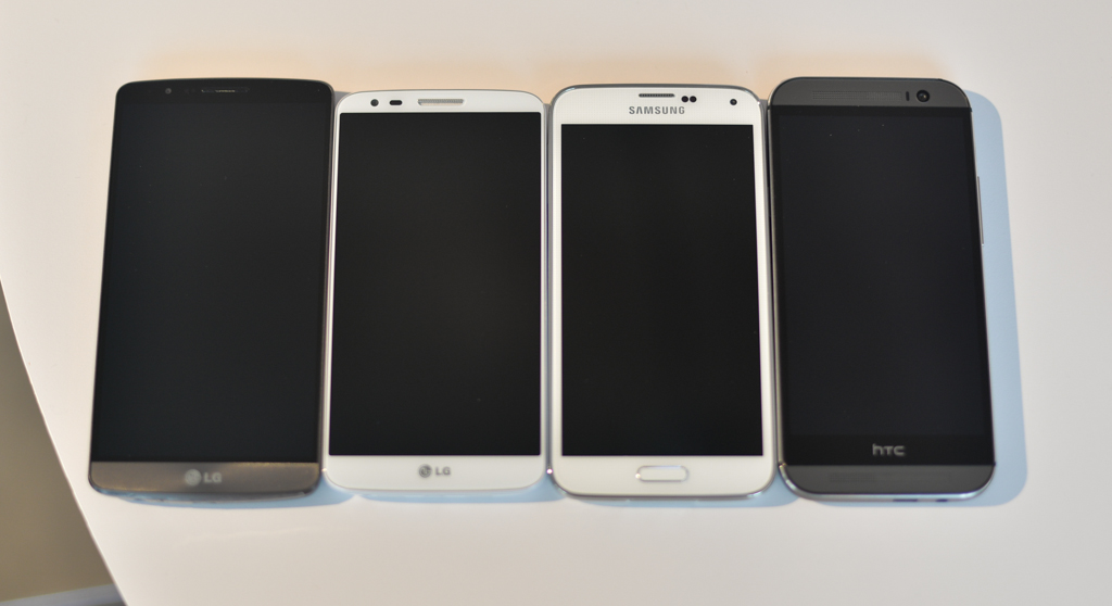
At the LG G3 event earlier this week, we had a chance to array the Korean company’s newest flagship with three other big-name devices, the LG G2, HTC One M8 and Samsung Galaxy S5.
What we discovered is that despite the G3’s seemingly-gargantuan screen size, it is only a hair bigger than the One M8, and certainly not overwhelmingly bigger than the Galaxy S5. Indeed, the Galaxy S5 looks practically old-fashioned, with its large bezels and hardware home button, next to the sleek G3, which features a dual-tone front colour scheme and rear buttons.
While I generally take issue with manufacturers indiscriminately increasing the size of their phones — we’ve approaching the point where they can’t get any larger without sacrificing usability — LG seems to be the one company increasing screen volume without bloating the device itself. That the G3’s screen comprises almost 77% of the front of the phone is remarkable, especially when compared to the One M8, whose parent company made the choice to include stereo speakers on the front.
The decision to simplify (perhaps too much so) the G3 may come back to haunt LG, though. While the device looks stunning from the front, such a design necessitated keeping the volume and power controls on the back, a usability consideration that many will be reluctant to conform to. It will be very interesting to see if LG can convince more customers, in the second generation of this design decision, to dump their former devices for this one.
What do you think? Is the LG G3 too big for human hands, or does it hit the right mark?
MobileSyrup may earn a commission from purchases made via our links, which helps fund the journalism we provide free on our website. These links do not influence our editorial content. Support us here.


