Like many of its social networking counterparts, Tumblr’s Android app has traditionally paled, both in speed and functionality, to its iOS equivalent.
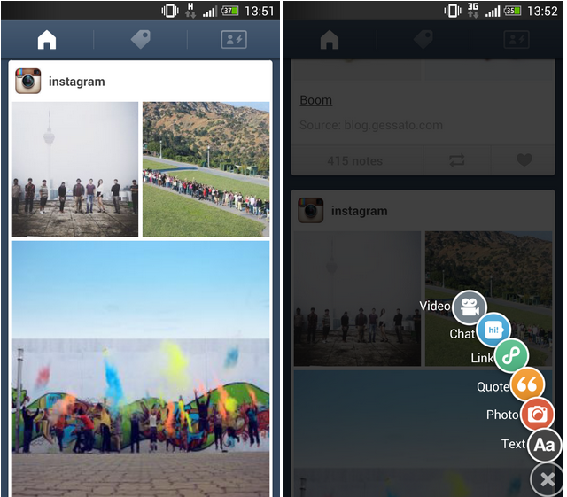
While Tumblr 3.3 doesn’t address every absent feature, it now stands up to the iPhone app in terms of speed and design. Introduced today is a new interface, with a pop-out posting button that doesn’t take up any room on the screen. Introduced in apps like Path 2.0, the single button at the bottom right expands into a set of colourful widgets, prompting you to decide in what format — video, chat, link, quote, photo or text — you’d like to convey your message.
Vertical navigation through the feed feels smoother now, much like Facebook’s transition from HTML5 to native code. You can also swipe horizontally to transition to the search page and , on the far right, the profile page.
Unfortunately, this new version omits the iPhone’s best feature: photo sets. The option to post multiple mobile-friendly photos in one post has led to a surge in quality magazine-style blogs, and its absence from Android, especially after this redesigned version, is disappointing. Nevertheless, this is the best Tumblr has ever looked or performed on Android, and we can only hope now that the base is here the team will work on adding missing features.
Download Tumblr for Android here.
MobileSyrup may earn a commission from purchases made via our links, which helps fund the journalism we provide free on our website. These links do not influence our editorial content. Support us here.


