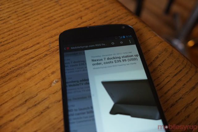
Though the situation is less dire than it was a year ago, Android has traditionally lacked for apps that emphasized both design and user experience. Indeed, for a long time — especially prior to the release of Ice Cream Sandwich — it was often assumed that an Android app would either be a messy port of its cleaner iPhone version or be made strictly utilitarian.
But since Google released its Android Design Guidelines, which emphasize a clean, gesture-friendly navigation scheme, many popular apps have been updated in kind. The category of RSS reader has been alive and well since Android was but a Donut in our mind — I still remember the first versions of NewsRob in 2009 — but developers have either forged their own design path, or created clunky variations of the official Google Reader app.
With the release of Press, Twentyfive Squares has fulfilled a promise not only to bring back the venerable Google Reader app, but a commitment to great design, usability and, most of all, making money on Android.
“We wanted to make an app that we would love to use,” says Jay Ohms, half of the two-man team behind Press for Android. “We are huge users of Google Reader,” he continues. Ultimately, he and partner Jordan Becks, who had been experimenting with Android development in earnest since Google I/O 2011, wanted to create the Reeder of Android apps.
To that end, they have created the most visually arresting and navigationally intuitive Android app of this generation. Incorporating Google’s Holo design aesthetic, Android-friendly gestures and a whole lot of love, the app immediately screams “quality!” The major reason for this — and something that the team had to come to terms with early on in the development cycle — is that the app requires Android 4.0 Ice Cream Sandwich to run. This precludes up to 65% of the Android user base from investing in the app, but the sacrifice is worth it to Ohms.
“Ice Cream Sandwich provides such a huge improvement in the experience,” he says. “Honeycomb was buggy, and it was pretty obvious to us that it was never going to take off. We are comfortable that the 30% [of prospective buyers] are the people who care most about having the newer devices,” and they’re the same users who tend to value high-quality software, investing millions of dollars in to the nascent paid Android app market.
They worked with a designer, someone who knew his way around beautiful design, focusing on things like easy navigation, high-quality typefaces and, most of all, continuity. While there are impending improvements to the app in the coming weeks, it comes to us as a fully-formed 1.0, and that isn’t something a lot of Android developers can offer from the beginning. Perhaps thanks to Google, many Android developers, especially those without a huge quality assurance team, prefer to issue a very raw first version and iterate quickly. It was immediately apparent that Ohms and Becks had nailed most of the core tenets of the app; the rest is polish.
“We went through tons of iterations,” says Becks. “We had a lot of the layout and structure we wanted — we just worked on getting it right. That’s the hard part.” He says that it’s a myth you can’t achieve good design on Android; you just have to work within the confines of the tools. It’s not a matter of taking an iOS app — which relies on a certain navigational hierarchy due to the lack of a persistent back button — and making it Android-compatible. What we’ve seen from developers since the emergence of Ice Cream Sandwich is a reliance on clean lines, high-quality fonts and, most of all, movement. Great Android apps tend to rely on the horizontal swipe; they also don’t bury important features in the menu.
And how did they come to the decision to release Press for $1.99? Ohms said it was the team’s hardest. “Pricing was something we thought about a lot, and didn’t make a final decision until a few weeks ago.” He’s always supported paying developers for quality work, and found the idea of plastering Press, which emphasizes words, with disruptive advertisements antithetic to everything they stood for.
“Android is a premium experience for people who are willing to pay for apps,” he says. “We didn’t want to have two apps, as developers often do. Press Lite and Press Pro was not an option for us.”
Simplicity: this is what attracts users and sells apps.
Press lacks a couple of features we hope to see implemented quickly: a way to navigate between articles with a swipe; and support for background updates. This would see the app supplant Google Reader as the de facto RSS reader on Android.
But even as it stands today, Press is one of Android’s finest apps, and is a must-buy for Google Reader fans.
Download Press for Android.
MobileSyrup may earn a commission from purchases made via our links, which helps fund the journalism we provide free on our website. These links do not influence our editorial content. Support us here.


