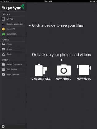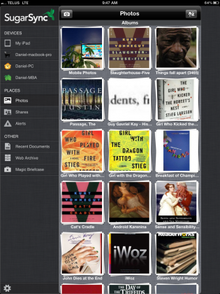

We love SugarSync. So it’s a good thing that today they’re releasing a brand new app optimized for the iPad. Designed from the ground up to actually utilize all that lovely real estate, the app employs a horizontal card overlay that resembles Twitter for iPad.
Drew Garcia, VP of Product Management at SugarSync, said “The increasing proliferation of mobile devices continues to drive the demand for solutions that give you access to all your data from whatever device you happen to have with you at that moment. At SugarSync, we continue to leadthe industry in enabling people to do more from their mobile devices via the Cloud. As the way people use their mobile devices evolves, our mobile innovations are helping people stay ahead of the curve by revolutionizing the way they access and interact with their data on the iPad.”
The interface really is much more fluid, and allows you to access folders synced to your iPad, as well as on other devices, much more quickly. You can see contents of multiple folders on a single screen and move files around, bringing the app to feature parity with its desktop equivalent. The only thing missing that we’d like to see is automatic uploads of photos and video; at the moment these have to be done manually, but can be done in batches.
If you’re a SugarSync user, the new iPad app is a tremendous addition to a growing number of fantastic mobile apps from the company. Sugarsync has recently revamped its iPhone and Android apps, and is working on a Windows Phone app for release later this year.
Download the new SugarSync from the App Store.
MobileSyrup may earn a commission from purchases made via our links, which helps fund the journalism we provide free on our website. These links do not influence our editorial content. Support us here.


