 Let me start off by stating that I was not allowed to take any pictures or video of the upcoming Bell Pre as it’s still not even launched in the States yet. Otherwise you know we would have laced our initial impressions with tons of video and images for you.
Today I had the pleasure of spending a glorious hour with the fine folks over at Palm and got a real taste of what the highly anticipated Pre is all about. Honestly, without hesitation, this “introductory” device will put Palm back on the map and really cause people and organizations to make the switch to their new webOS platform. The Pre is not even about the Pre… it’s all about webOS. There will be “lots” of new devices coming out and the Palm Pre is simply the first.
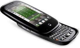
With this said the Pre is a great deal smaller than I originally expected – we compared it to the Palm Treo Pro which has dimensions of 114 x 60 x 13 mm, while the Pre comes in at 100.5 x 59.5 x 16.95 mm. While the difference is length obvious one cannot get past the simplicity of the Pre’s design. This is unlike anything Palm has done before, not just because they created both the hardware and software, but the impressive shape of the Pre is a step away from any designs from the past. The polished curved edges and ultra clean lines leaves the user wanting to grab hold of this like a Canadian grabs a Timmies. The size is actually perfect for your pocket as it won’t feel like you’re carrying around a brick. It feels very good in the hand and is also lighter than I thought too. This weighs 135 grams (iPhone weighs 133 grams). However, with every plus there’s always another side… the Pre is a glutton for fingerprints so make sure you have a cloth handy as you’ll need this often.
On the face of the device is a silver earpiece. At the base is a silver center button with and invisible “gesture area” that allows you to switch between applications by simply swiping left. The Pre has a 3.1 inch HVGA display (320×480 resolution) and comes with a full sliding QWERTY keyboard. One item to mention before we go into detail about the display and keyboard. When you flip the Pre over you’ll notice a 2 inch mirror on the back at the top that covers the width of the device, at first we thought this was for video messaging (not included) but it was added to the design to hide the tracks for the slider mechanism.
 The screen is incredibly responsive and dominates over the iPhone or Storm. Regarding the resolution I checked out a trailer for the movie 2012 and it was more enjoyable to watch on the Pre than an iPhone, perhaps due to how tight everything is fitted and how the Pre makes use of all its spare space. The sound quality was decent (speaker is located at the back) and this comes with a 3.5mm headset jack. But we must admit the best speaker we’ve heard to-date is on the BlackBerry Storm.
Even viewing pictures with the 3 megapixel camera (LED flash) was ok. I did notice when scrolling through the images it did take a couple seconds for all the pixels to get into place and show its true colours. These can be viewed landscape or portrait with by its accelerometer.
The 4 row keyboard is tight and is similar to the Palm Treo Pro or Centro. Also these keys feel “rubbery” when you attempt to type. So depending on the size of your thumbs typing may become an issue but with anything new it will take a bit of time to get used to. And on a plus note is that they have added a “copy and paste” feature so it’ll easier to get your message across instead of re-typing what you want to say.
The real story of the Pre is Palm’s new webOS, an “internet-based platform” that is the future of all Palm devices.
webOS is easy on the eyes as it has 5 application “quick launcher”, similar to widgets that can be customized. A full “Launcher” with all the application can be viewed by swiping your finger up the screen. One of the strong selling point Palm is promoting is that you can run several applications at the same time, with each application known as a “card”. I was shown the example of scheduling a lunch date, writing an e-mail all along finding a location. This was done seamlessly without any interruptions or lag time in the device.
All of the “cards” are organized beside each other and the order can be changed simply by holding your finger on the application and changing its location. To close an application all you have to do is flick the card to the top of the screen. We discussed today how it’s a power trip of sorts by saying to the app “I’m done with you”.
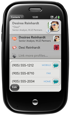
The contacts area was cool. You put all your contacts info in and when you scroll through your list you’ll notice several image icons for each contact. This means that you have more than one contact for this person. So lets say you have a home phone, cell phone, gmail and Facebook contact for your buddy. A couple days later buddy changes his contact info in his Facebook account, usually you will have to go in and physically change this. However with webOS it takes it from the cloud and does all the work for you. No need for you to change anything, updates are all done in the background.
Last but certainly not least is the “Universal Search” feature. This can be accessed from your card view or launcher and when you start to type it automatically starts bringing up all your applications and contacts. No matter what you are looking for it starts to narrow your search down with each typed letter. If you find what you are looking for you simply touch and go… but for some reason it cannot find it in your device, it’ll go to the web and try and find what/who you are looking for from a choice of either Google, Google Maps, Wikipedia and recently added Twitter. Pretty cool feature as it takes the device beyond what is loaded in the box.
A few other notes: We did not test out the call quality so we are unsure what it’s like for us Canadians but was told it’s clear. I did get my hands on the famous Touchstone inductive charging dock and can see some benefits to buying this as an accessory, especially if you’ll be using your speakerphone a great deal or watching movies.
Although we were given no dates, this will be released with Bell second half of 2009 and our insiders have said a Q3 launch.
With the 1-hour I experienced, I was very impressed with the Palm Pre and webOS. The touchscreen was very responsive, design was a massive improvement compared to past Palm devices, camera is only standard but the display and ease of use with applications should make this a promising device for Palm.
We will follow up shortly with more reviews and next time with a video!
MobileSyrup may earn a commission from purchases made via our links, which helps fund the journalism we provide free on our website. These links do not influence our editorial content. Support us here.


