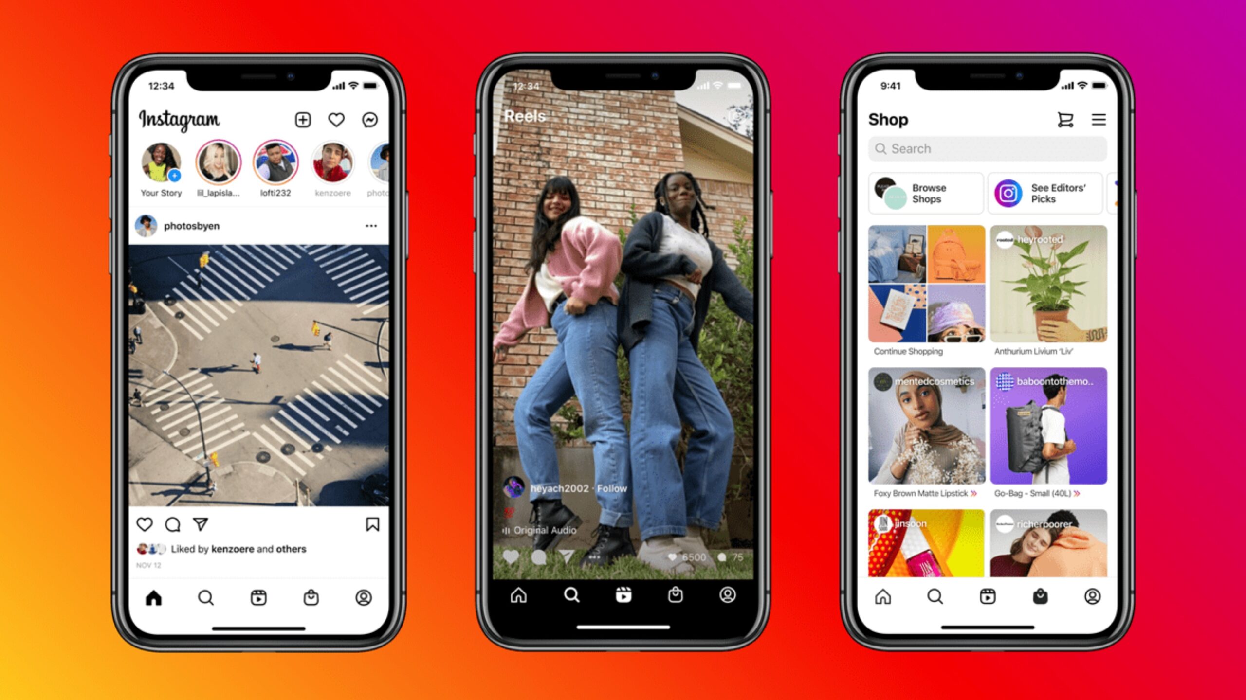
Facebook-owned Instagram is rolling out a redesigned home screen layout to emphasize shopping and its TikTok-like Reels feature.
The navigation bar will now include permanent shopping and Reels tabs. Although the social media giant tested the new layout in September, this announcement marks a permanent change to the home screen.
The Reels button is taking over the spot where the shortcut to create a new post used to be in the navigation bar. The shopping button will now be where the activity tab once was. You’ll still be able to find the activity and shortcut to create a post on the top right corner of the home screen.
In a recent blog post, Instagram CEO Adam Mosseri stated that the platform doesn’t take these changes lightly, and that Instagram hasn’t updated its home screen in a big way for quite a while.
“How people create and enjoy culture has changed, and the biggest risk to Instagram is not that we change too fast, but that we don’t change and become irrelevant,” said Moseeri.
Mosseri outlined that he believes the new design gives the app a “much-needed refresh,” and that Instagram is still sticking to its core value of simplicity.
Image credit: Instagram
Source: Instagram
MobileSyrup may earn a commission from purchases made via our links, which helps fund the journalism we provide free on our website. These links do not influence our editorial content. Support us here.


