Another small server-side update has hit the Google app, this time bringing a slight visual tweak.
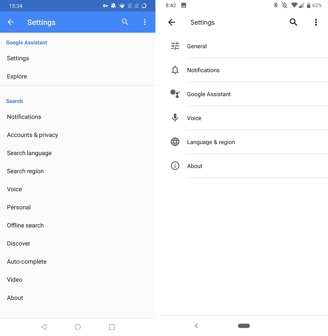
Primarily, users will notice changes to the ‘Settings’ page and the ‘More’ tab, making both sections more in line with Google’s new Material Design.
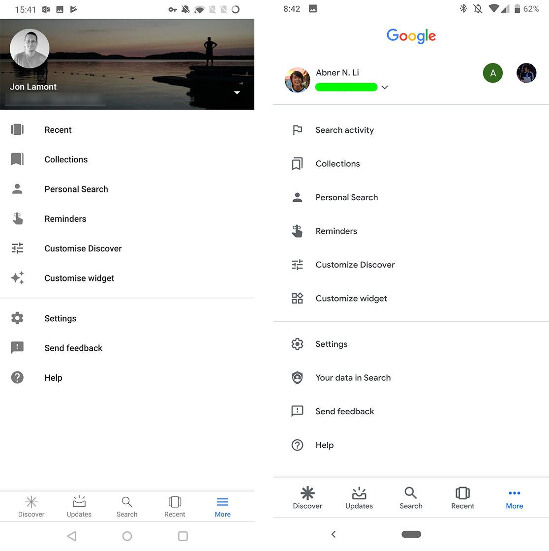
The More tab is completely redesigned now, doing away with the old layout that prominently featured your Google account and cover image. The items on the More page have also received new iconography and menus.
For one, there’s a new ‘Search activity’ shortcut in the More menu that replaces what used to be called ‘Recents.’ That feature is still accessible through the menu bar at the bottom of the app.

Google app More tab old (left) and new (right)
There’s also a new ‘Your data in search’ which links to Google’s new search data privacy tools.
Settings has also received a significant makeover, with almost all the menus merging and getting a new order. The new ‘General’ option houses most settings related to Discover, Data saver, personal search and more.

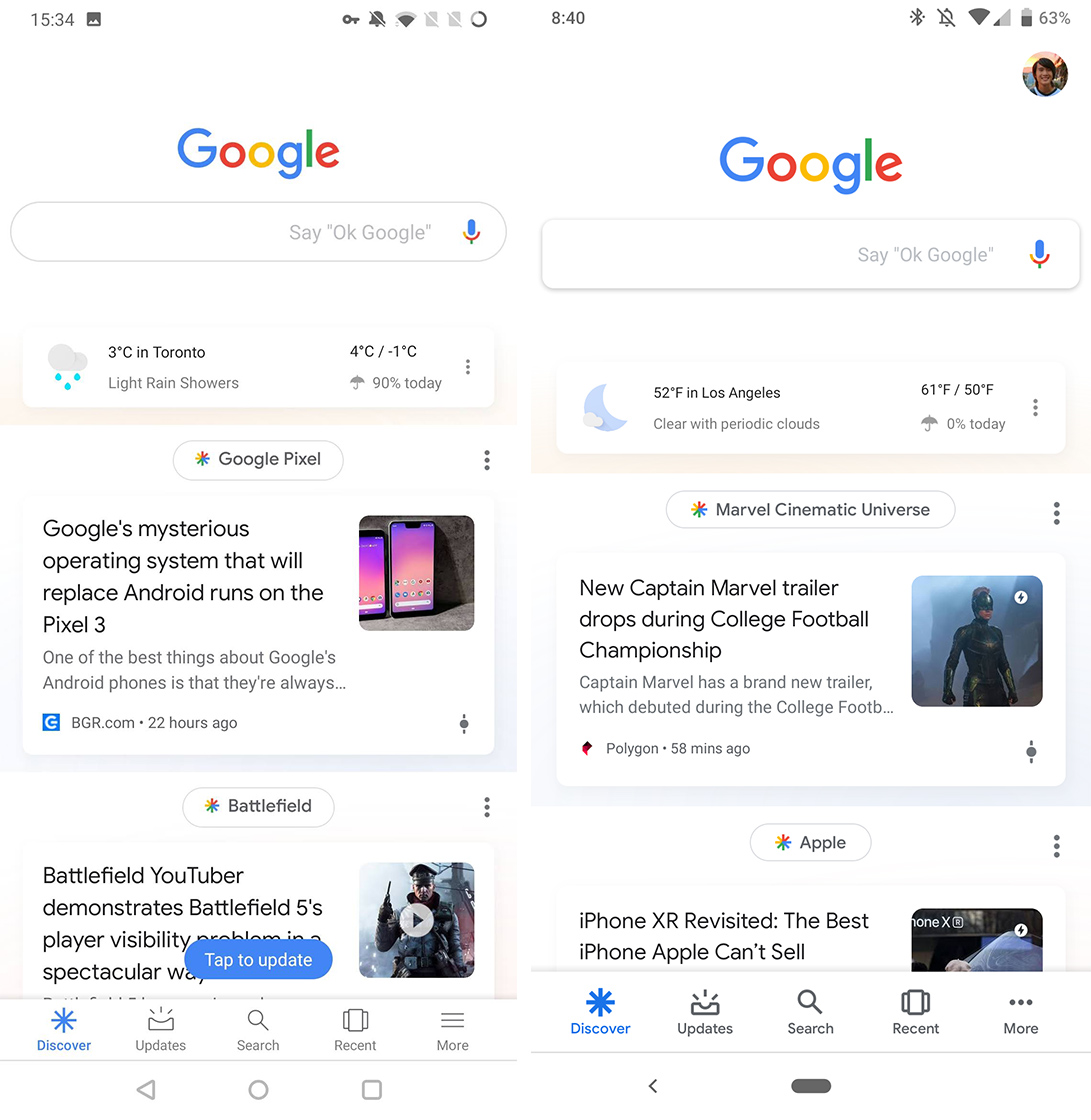
Finally, the bottom navigation bar has received a slight visual tweak with bolded icons and text. There’s also a new account switcher icon in the top right corner that contains the profile picture of your current account.
While this new tweak is rolling out more widely to users, it still appears to be part of a server-side switch. I’m running version 9.5 of the Google app beta and haven’t received the update yet, but some users on the most recent stable version of the app have seen the new update.

As usual with Google’s server-side updates, you’ll have to be patient and wait for Google to make the switch for you.
Image credit: 9to5Google
Source: 9to5Google
MobileSyrup may earn a commission from purchases made via our links, which helps fund the journalism we provide free on our website. These links do not influence our editorial content. Support us here.


