In the newest YouTube Android app update, Google has broken some things and is testing out new recommendations.
YouTube version 13.27 is rolling out to Android users with two main changes.
The first you may not notice right away — I certainly didn’t — but once you notice, it’s hard to forget. It removes the ability to tap anywhere on the seek bar to move through a video.
Now, users have to drag the little red dot to where they want to be in the video. Some may not mind the change, but for others it may be catastrophic. For myself, I primarily tapped where I wanted to go in the video. Dragging feels much slower.
A number of Reddit users are expressing their distaste for the change as well. Some even thought it was an issue with their device or their custom ROM.
However, the change is likely an intentional one from Google. It brings seek bar functionality in line with the iOS app.
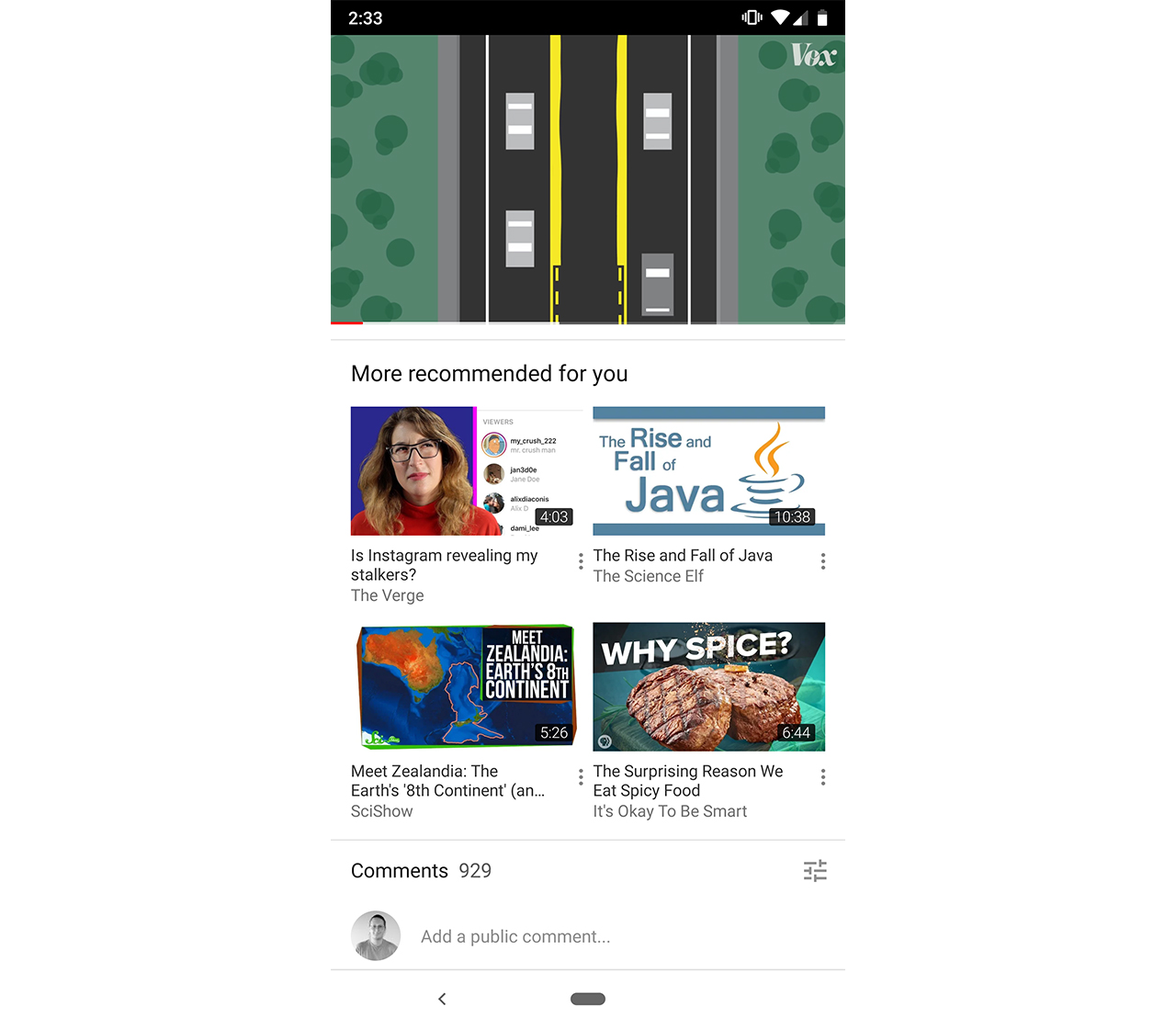
The other main change is the addition of a new two by two grid of recommended videos. Labelled ‘More recommended for you,’ the section appears beneath the ‘Up next’ section.
The four recommended videos in the box aren’t related to the video you’re currently watching. Instead, they pull from search and watch history, similar to videos on the home page.
However, this new section feels redundant — not only is there a long list of recommended videos above it, if you want to get to the comments there’s way more scrolling.
As Android Police pointed out, there should be a ‘Jump to comments’ button for users who want to skip all the recommendations.
Source: Android Police Via: 9to5 Google
MobileSyrup may earn a commission from purchases made via our links, which helps fund the journalism we provide free on our website. These links do not influence our editorial content. Support us here.


