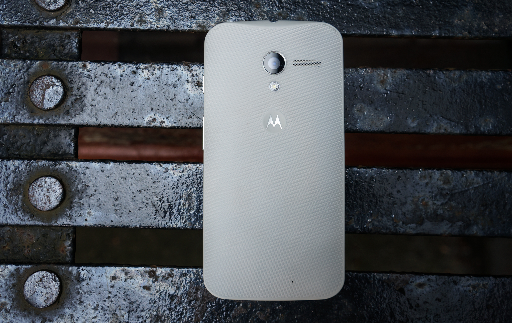
Just under two years ago, I wrote this:
“There is a semblance of the anti-Goldilocks in the smartphone world today; we’re trained to replace our devices quickly, and covet new ones even more so. What’s pleasing in our hands one day is tired the next. It’s a never-ending train of disappointment, inflicted on ourselves by the propensity to want bigger, faster, devices.
With the Moto X, I don’t get that feeling. I don’t concern myself with how quickly it will feel dated or how long it will take me to covet some new handset. Like the iPhone 4, which still today feels modern, the Moto X exists outside the venerated smartphone wolf pack. It’s not necessarily a better phone, though it exudes elements of superiority, but it’s the best whole Android experience I’ve ever had.”
The best Android experience I’ve ever had. It feels like a long time since I felt so effusive about a smartphone. Perhaps it is the ever-quickening maturity of a market so commoditized that a $200 phone can fill all the checkboxes, but as powerful as these computers-in-our-pockets are getting I really haven’t felt that way since.
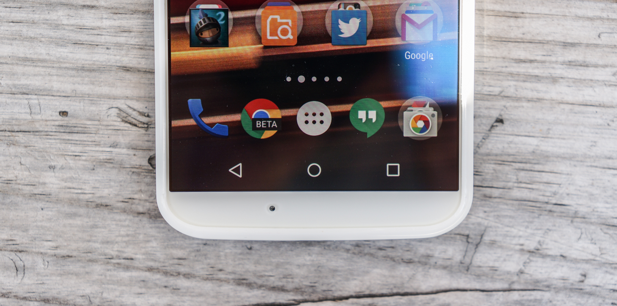
At the time, it was Motorola’s rebirth, under Google’s watchful eye, that was as exciting as its finished products. The Moto X distilled much of what made Android great into a small, intuitive design, eschewing the excess of the big names of the time. Recall that the 2013 market was full of Android excess, with companies like Samsung stuffing as many features into its phones as possible. The Moto X felt cohesively designed and, above all, thoughtful.
But time goes by and the market changes, Motorola along with it. Its Moto X successor was no longer diminutive and elegant, though it tried to scale the narrow fence between the two worlds as best it could. I tried and failed to keep the original in my pocket, but as more powerful phones with larger, denser screens entered my lab, the Moto X could not keep up.
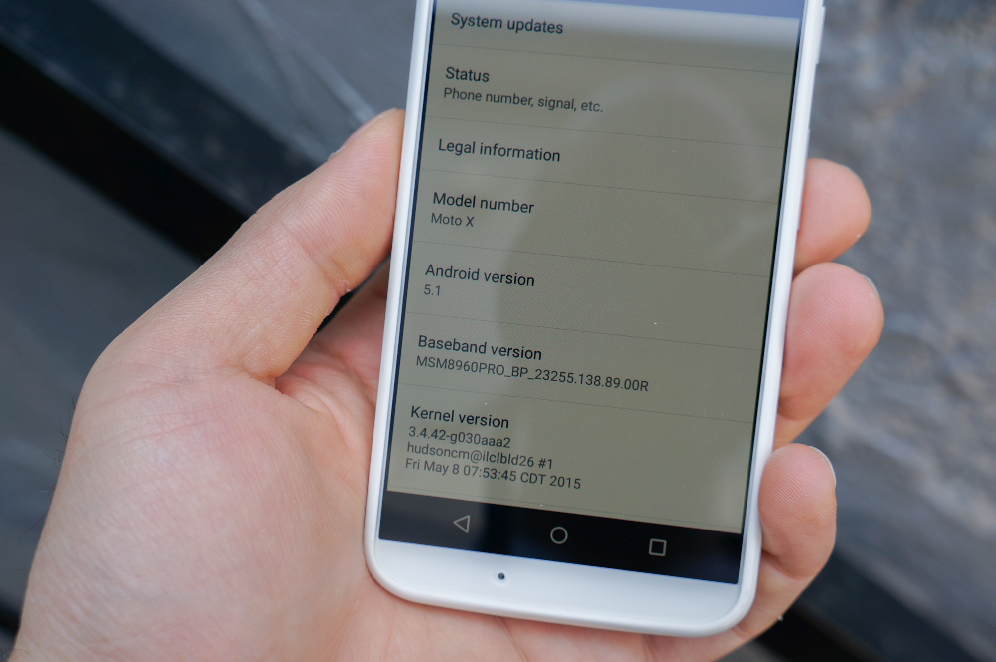
With news that the Moto X was receiving Android 5.1, a jump from Android 4.4 KitKat, before even its second-generation sibling, I cleared the dust and cobwebs away, turned it on and awaited the magic.
A comforting nostalgia washed over me as the familiar Lollipop colour scheme and button layout greeted me upon first boot. I was cautious, though: older devices often don’t take to newer versions of Android without issue. But I had no reason to fear; Motorola kept the Android 5.1 update incubating for months in order to deal with lingering performance and stability issues, and the result is a clean, largely bug-free version of Android.
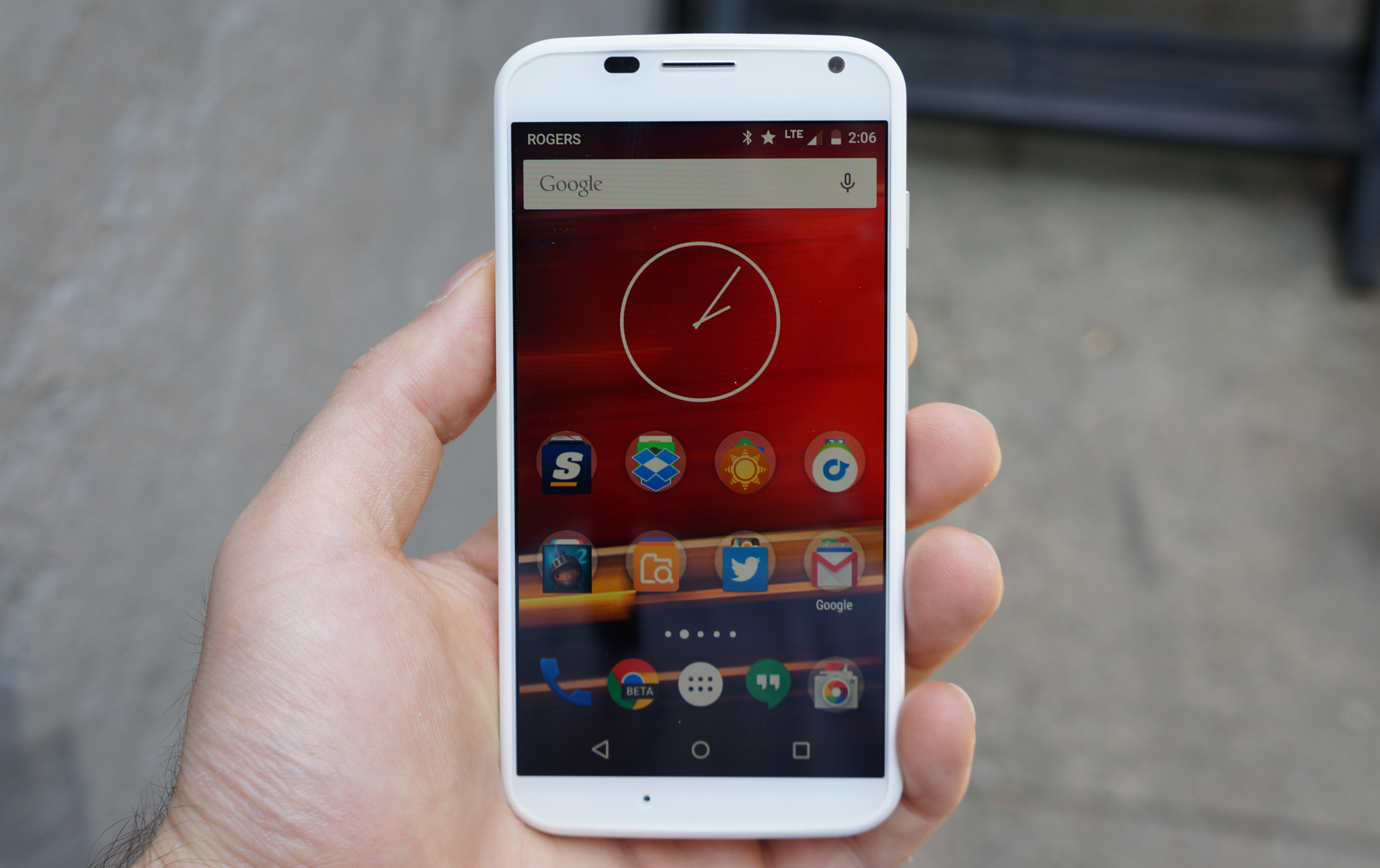
The Lollipop update to Moto X keeps it stock, just like its 2014 counterpart, while improving the Moto Display feature from one to three notifications. If you recall, Moto X debuted an innovative way of checking notifications, at the time called Active Notifications, which turned on just a small portion of the OLED display to show a small circular indentation. Tapping on it revealed the contents of the notification, which could be actioned or ignored.
For all intents and purposes, Motorola brought every software improvement from the newer Moto X to its 2013 counterpart with this update, and it benefits greatly from it. Despite the aging processor, apps load quickly, and the camera, which Motorola decoupled from the OS back on KitKat, is greatly improved. You won’t be taking award-winning stills with the 10MP sensor on the back — hardware limitations are hardware limitations, after all — but the experience, and the ability to both adjust and lock exposure, make it considerably easier to capture high-quality daytime photos. Low-light shots are still terrible, so don’t hold your breath for improvements there.
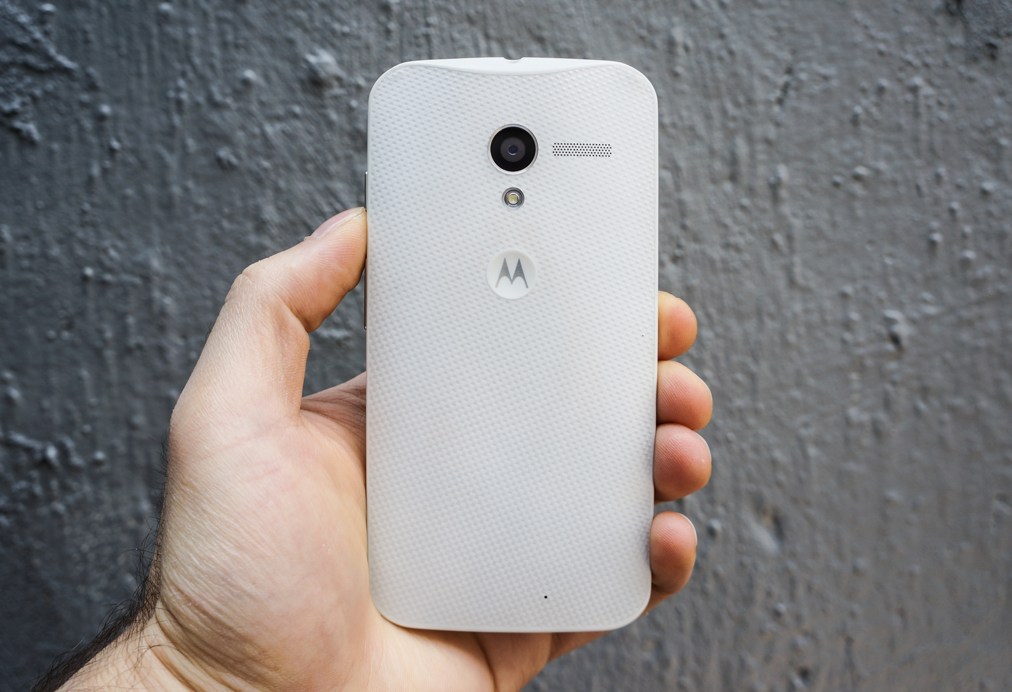
Like I espoused with the 4.6-inch Sony Xperia Z3 Compact, the original Moto X is completely usable in one hand, and it completely changes the game for me. Going back to this product was like replaying a favourite album, lost in the shuffle of the present. Being able to reach every part of the display without adjusting the device in my hand reaffirms my belief that phablets, while useful for consuming content, are not an ideal smartphone size.
But it’s the little things Motorola got right in the original Moto X, lost in the larger, louder second-gen version, that stand out to me. That dimple on the back, for instance, where you rest your finger while navigating the device, is ideally placed; the subtle curve of the back lets the phone nestle in your hand. It was not without reason this phone won my 2013 Smartphone of the Year award.
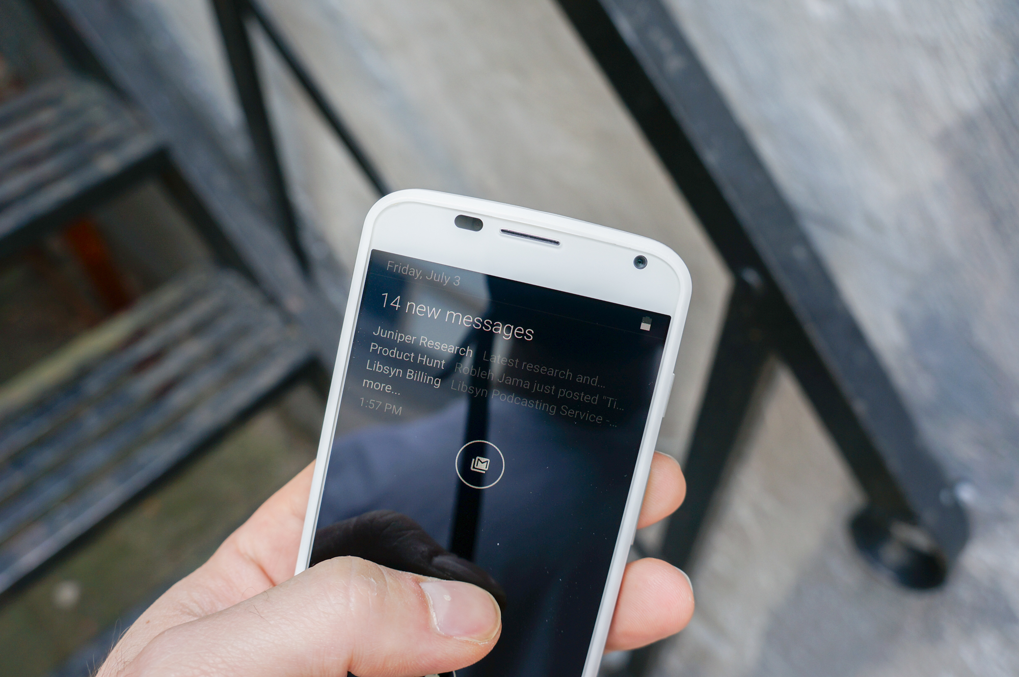
Of course, the Moto X was perfect neither then nor now, and its drawbacks are all the more apparent in 2015. Aside from the mediocre camera, the Moto X still doesn’t have the chops to last all day, and often peters out by early evening with heavy use. And the screen, criticized even then for its low resolution, isn’t so much a liability as an indication of where the industry has been moving: its 720p panel has a quarter the pixels as found on Android flagships today. But even today, 1280 x 720 pixels is more than sufficient for all but the most critical eyes, and it allows the device to maintain its high frame rates in modern games.
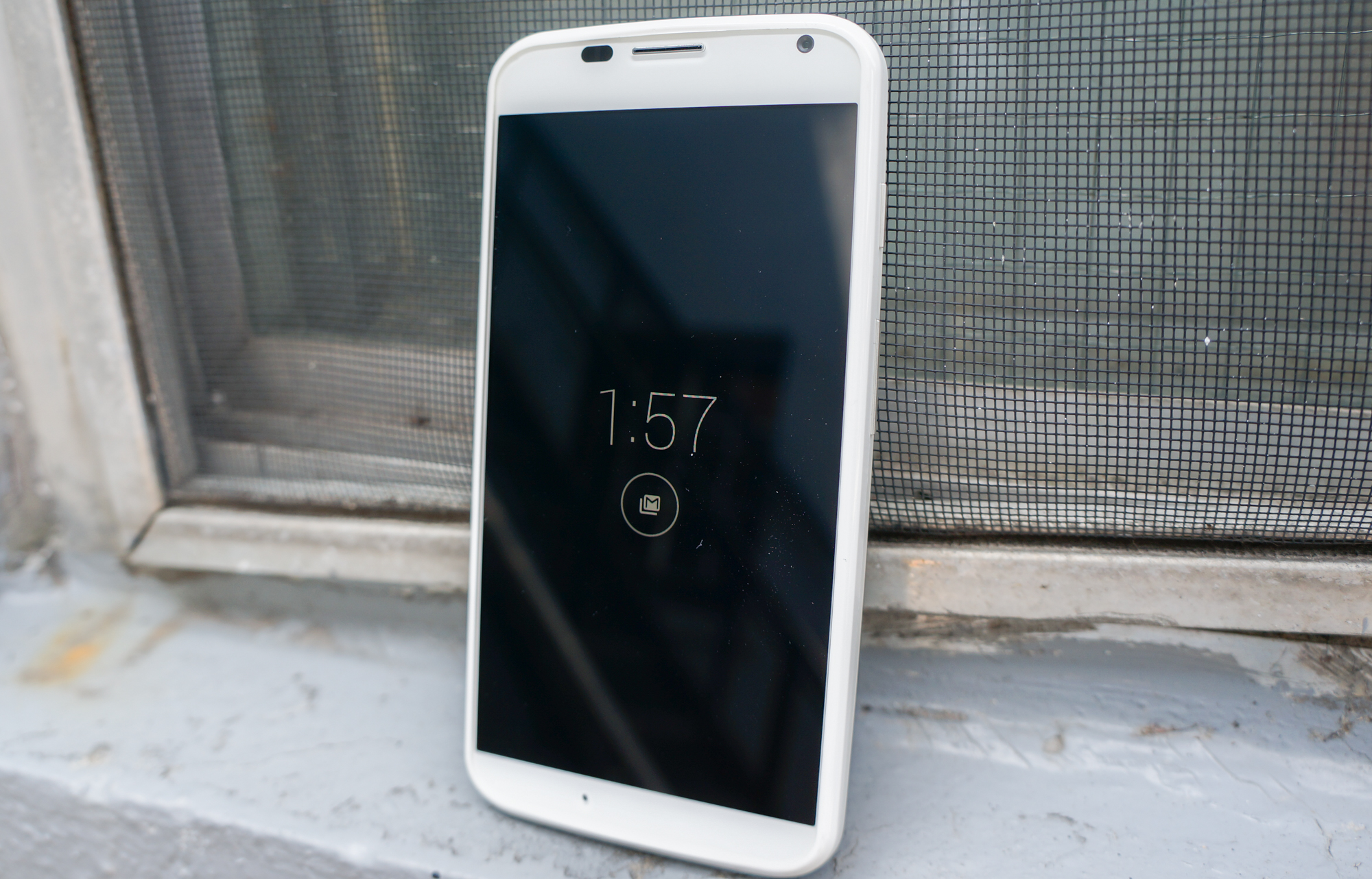
The industry has moved on. Bigger is better, and so say we all, right? But let this be a reminder that there are subjective truths and objective truths, and the objective truth of the Moto X is that its size makes it far easier to use in one hand. As we move more and more of our interactions to our wrists, which necessitate two-handed usage, let us remember how much better it was so long ago, back in 2013.
Long live the OG Moto X.
MobileSyrup may earn a commission from purchases made via our links, which helps fund the journalism we provide free on our website. These links do not influence our editorial content. Support us here.


