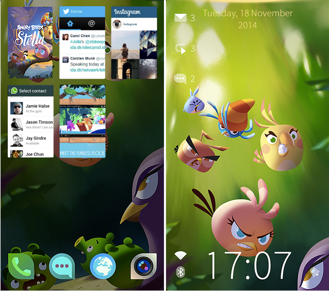
Jolla’s Android launcher is supposed to act as a springboard for the company’s Sailfish OS. In an effort to appeal to an even broader audience, the company has partnered with Rovio to produce an Angry Birds Stella version of its launcher based around the company’s female spokesbird. Though it is essentially a branded version of the launcher, there are some differences, and not for the better.
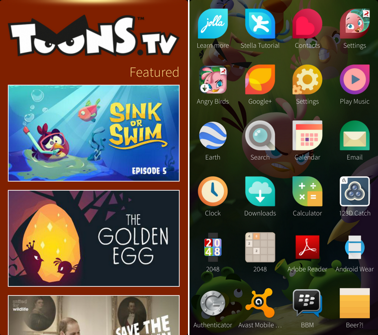
For instance, a swipe left on the vanilla launcher brings you to a theme switched that allows to flick between themes that change the wallpaper and various other things (in Sailfish themes change the accent colours, too). In this implementation, a swipe left or right brings you to ToonsTV and offers up episodes of Angry Birds cartoons. That aside, there’s also a nice Angry Birds wallpaper that can’t be changed, not even for another branded design.
That’s about it for the Angry Birds customizations. Everything else is all Jolla and it really shows how much work there is left to do on the launcher if its job is to encourage smartphone users to ditch Android for Sailfish.
My first issue is the pull-down tray from the top. This offers quick access to the dialler, the camera, and mute. The problem is that the little yellow glowing line that is supposed to say, “Hey, something interactive happens up here, interact with it,” is right on the edge of the display. If you actually swipe down from that point, all you end up doing is exiting full screen and showing the Android status and bar and back, home, and multitasking keys. A second attempt at that point just drags down the Android notification hub.
The solution is to drag downward from an invisible point below the yellow indicator, but that’s not really intuitive. Then you encounter the second issue, which is that the pulldown requires a slow movement so it can scroll through each option individually and provide a little vibration for feedback as it hops between them. This slow action is awkward and there’s nothing casual about it. A launcher should not be finicky and annoying. That is the opposite of a launcher’s job.
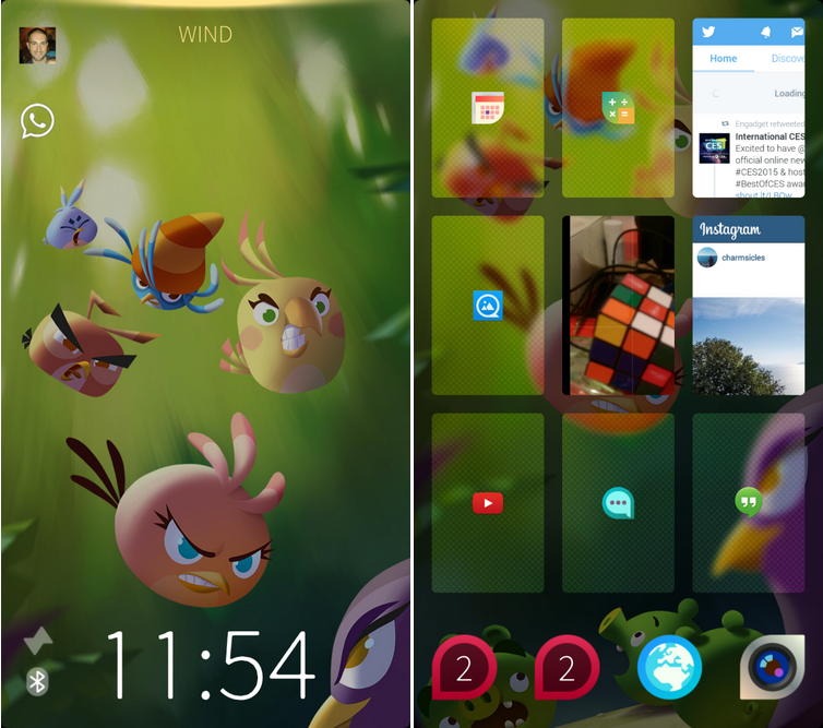
The running apps situation is also confusing (the nice thing is that you can pull down to hide them). Running apps are displayed in a grid of nine card-like slots for currently running applications. It took a while for us to figure out why some of the apps fill all the space, showing a preview of what you were doing last time you were in there, while others just show a tiny app icon in the centre of the card. Is it because they don’t want to hide those Angry Birds in the wallpaper? Is it for privacy? Are we doing something wrong? It seems so inconsistent. Here’s what we’ve figured out in the couple of hours we spent with the launcher:
- If you click on one of these cards or icons, and then click the back button, the card goes away. It disappears from your runnings apps. If you want to access that app again, you have to go through the app drawer, which is accessed with a swipe up.
- If you click on one of these cards, and then click the home button, the icon turns into a full preview card. It stays in running apps, and whatever you were last doing in that app appears on the card. Like Instagram or the camera app in the screenshot below.
- If you click on one of these cards to open an app that may have sensitive information (Hangouts, Messenger, or your photos), it closes out as the app icon but remains in the running apps trays.
What I can’t figure out is why some apps close out as app icons, even though they having nothing of interest (the calculator, the calendar), and why others that you don’t want people to see at a glance (photos, who you last called, the last thing your camera was pointed at) are in plain view as full-size cards. Wtf?
The folders implementation is also pretty bad. Because that stupid running apps grid takes up so much space, creating folders is the only way to bring your favourite apps to the forefront. Otherwise you have to scroll through the entire app draw to get to Yelp, because it’s sorted alphabetically and three screens down. Creating folders is easy enough but the resulting folders are just pink blobs with numbers, so you have no idea of what’s in each folder. And you can’t assign a ‘cover icon’ for the folder. Wtf?
Overall, the launcher just feels like it gets in the way of Android’s true functionality. If this is a window to the Sailfish OS, I want to close the blinds, which is sad because the operating ssytem has so much potential. The silver lining in all of this is that Jolla probably got a wheelbarrow full of money from this partnership, which can be invested in the further development of the Sailfish OS and production of Sailfish devices, like the company’s crowdsourced tablet.
[source]Google Play[/source]
MobileSyrup may earn a commission from purchases made via our links, which helps fund the journalism we provide free on our website. These links do not influence our editorial content. Support us here.


