Despite flying under the radar in many ways, the Moto X quickly became my favourite smartphone of 2013, and even today maintains its stunning usability in ways many Android devices can’t.
What I loved about the Moto X was its restraint: Motorola created a phone that despite not incorporating the latest technologies, used innovative methods to eke the best performance from existing ones.
Take the screen, an uninteresting 4.7-inch 720p Super AMOLED part. Sure it had slim bezels that afforded the whole device a smaller form factor than most smartphones of the same ilk, but Motorola created a new type of notification that changed the way I interacted with my phone.
When I reviewed the Moto X, I noted three things: that employing a variant of stock Android was the best move Motorola could have made to differentiate itself in this saturated market; that voice-based Touchless Control was a gimmick and would rarely be used; and that Active Notifications was of another-world genius.
Two out of three ain’t bad.
As the year wore on and Samsung launched the Galaxy S5, HTC the One M8 and, later, LG the G3, it was apparent that the Moto X wasn’t long for this world. It wasn’t as big, as fast, nor as flashy as those flagships, but I kept coming back to it for two reasons: its nearly-perfect size; and its amazing user experience, led by Active Notifications. I haven’t used it as my daily driver in months — the camera is just too unreliable in low-light, and I take a lot of photos — but it’s still one of my favourite devices.
So what does the Moto X2, or the X+1, or whatever the company deigns to call it, need to be successful? It’s less clear this year: Motorola will undoubtedly embiggen the screen, slimmen the bezels and enliven the software, but there needs to be more. Or does there?
Motorola found critical success with the Moto X, but as we quickly learned it did not spur the financial rebound the then-Google subsidiary so badly needed; it was only when the Moto G was announced that its flagging fortunes rebounded.
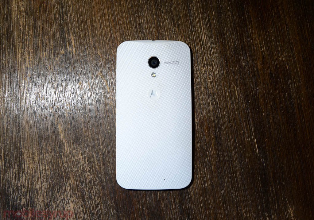
One of the phone’s biggest advantages, Moto Maker, didn’t even make it to Canada. While Rogers sold the Moto X in black and white variants, Americans, first through AT&T and later on all four major carriers, were able to customize, accent and scrawl pithy notes on the backs of their farm-fresh Moto X’s, thanks to a newly-opened Texas plant capable of turning around a custom product in four days.
When I finally got the Moto X, I loved the size, the curved edges and the fantastic screen, but quickly felt let down by the camera. With this year’s version, that’s my first request.
A better camera
The Moto X sported a 10MP camera with a great user interface and some decent capture speeds, but the quality fell apart in anything less than perfect lighting. Though it was easy to get into the app using a double twist of the wrist, once inside the lack of granular controls, coupled with poor automatic exposure settings (later corrected in future software versions) made for a very frustrating experience.
With the Moto X+1, I want Motorola to focus on fundamentals: use the newly-available APIs in Android L (or, whatever you’ve learned from the follies of Android 4.4) to improve overall photo quality. It’s not enough anymore to be fast or colour-accurate; I want the Moto X to show some intelligence in lower lighting, with a big enough sensor that won’t cripple under artificial bulbs.
With rumours of a 12MP sensor, I respect Motorola’s restraint in not increasing the number of pixels too much. I just hope that the sensor size also increases, and that the lens has a slightly higher aperture than f/2.4.
A size to love
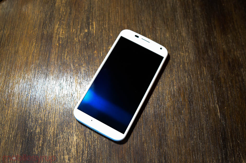
With rumours that the Moto X+1 will sport a 5.2-inch screen, I worry that the ideal size of its predecessor will be foresworn in favour of more screen real estate.
With the expected Snapdragon 801 processor inside, a 4.7-inch 1080p Super AMOLED display would be a perfect compromise, but with phone sizes ballooning across the industry it’s unlikely Motorola has maintained identical proportions to the original, but it’s possible, like the LG G3 from the G2, that the company lopped off even more bezel above, below and to the sides of the screen to limit overall chassis bloat.
Improved battery life
Motorola’s choice to include a 720p display on the original Moto X likely had more to do with battery anxiety than performance… anxiety. The Snapdragon S4 Pro equivalent was capable of running 1080p displays just fine (see the Sony Xperia Z for proof), but the battery hit would have been too much.
With the Snapdragon 801, which skips two generations from the S4 Pro, battery life should be considerably better. Coupled with a larger cell, likely afforded by the bigger screen, and the Moto X sequel should no longer be a chump in the uptime department, either.
Software advantages
Much of the reason I loved the Moto X was for its playful additions to the core Android experience. This allowed the company to issue updated considerably faster than its OEM peers, but also built on, rather than distracted from, what made stock Android so good in the first place.
With Android L coming soon, and Motorola likely building the Nexus X, it would behoove the Chicago-based OEM to continue showing restraint on the software side wherever possible. We’ve seen from devices like the OnePlus One that building on top of stock Android, rather than trying to redefine what the total experience is (like Samsung struggles to do) is quickly becoming both a selling point and consumer advantage.
An increasing number of OEMs are realizing that Google knows what it’s doing on the design side (Material Design pushes that even further), so it will be surprising to see Motorola messing with that equation next week.
I truly hope that Active Notifications is not only maintained but improved upon; let’s see more than just the latest notification, and let us configure the kinds of actions we can take with them. Remove the emphasis on Touchless Controls (which have been integrated into stock Android with the “OK Google” prompt anyway) and make it easier to navigate traditionally.
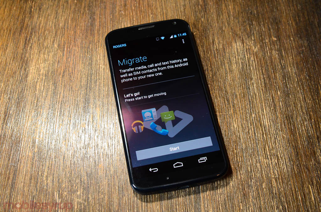
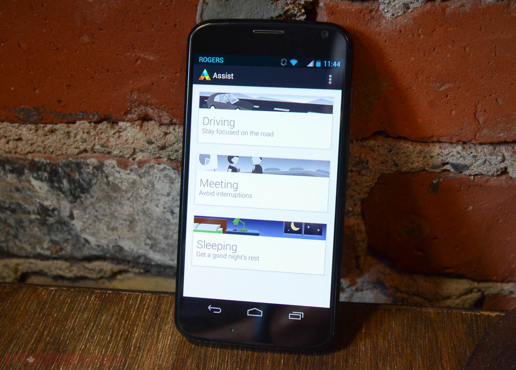
Then there are the apps, like Moto Assist, Migrate, Alert, Gallery, Camera and others that are so well designed, it almost seems like they came out of a specialty dev house. This new Motorola emphasizes simple, considerate details, optimized for small screens and quick fingers. Let’s hope that continues this year.
A great price
Motorola must know it can’t compete on price. When the Moto X was released, it was priced, at least in North America, the same as many more-powerful devices like the Galaxy S4 and HTC One M7. That was a mistake.
It was only once the price came down to below $50 on contract and under $400 outright that people began to sit up and notice its value.
Let’s hope Motorola doesn’t make the same mistake twice.
—
What are your wants for the Moto X+1?
MobileSyrup may earn a commission from purchases made via our links, which helps fund the journalism we provide free on our website. These links do not influence our editorial content. Support us here.


