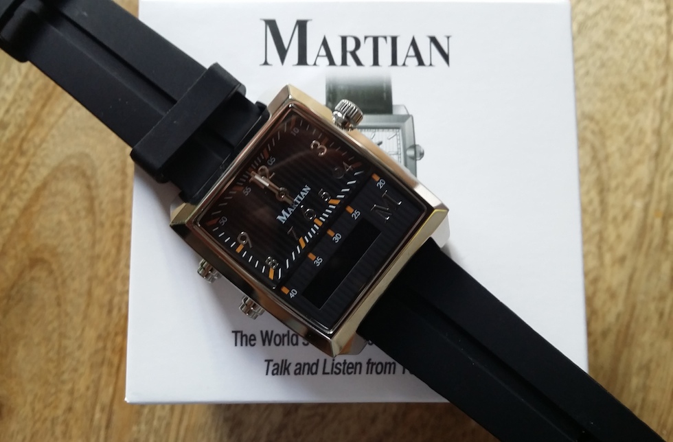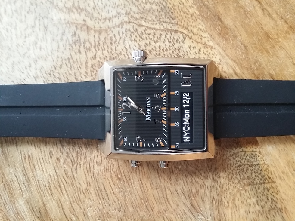
Ironically, the Martian smartwatch doesn’t feel alien on your wrist at all. The design is less futuristic than others on the market, taking a more traditional approach with a fixed watchface and mechanical arms. Its unassuming design makes the watch appealing for those that want to wear a smartwatch without announcing it to the world.
The watch part of Martian works with its own separate battery that lasts for two years, making it an extremely reliable timepiece. The downside is that there is no way to personalize the face, so if you aren’t a fan of analog timepieces, the Martian Passport isn’t for you.
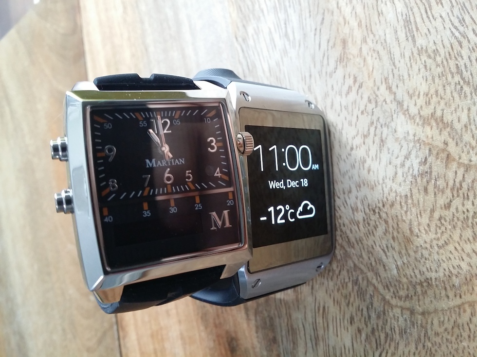
The Martian is about the same width as the Galaxy Gear but feels clunkier on your wrist in comparison. Both the Gear and the Martian are about the same weight at around seventy grams, pretty average for wristwatches. The Martian has a scratch-resistant crystal screen with a stainless steel casing, giving it a pretty classy look — and you can upgrade the silicon band to leather or stainless steel to keep with this vibe.

Like most smartwatches, the Martian requires you to download an app and connect the piece to your smartphone for access to its “smart” features. The iOS or Android app is functional but leaves a lot to be desired in terms of design. It’s here that you can set up alerts for any app on your smartphone as well as configure things like the vibration intensity and RGB LED light.
The biggest difference between Martian and its peers is the usable digital screen size. Where others like Pebble and Galaxy Gear use the entire watchface as a screen, the Martian relies on a small sliver of a display which takes up the bottom quarter of the watch.
The lack of a larger screen size means that when an alert appears, you will have to wait for the message to scroll across the screen in a ticker fashion which is painful. The scrolling speed can be configured in the app but even at its fastest I found myself losing patience. And, as the Martian has no touchscreen, you only have the option to dismiss the alert using one of the two hard buttons on the left of the watch or to let it run its course.

But to be fair, the Martian’s strength isn’t supposed to be in the display but more for its voice integration. In fact, at its core, the Martian is really a Bluetooth connected wrist speaker/microphone for your smartphone. The top hard button on the watch activates the default voice assistant on your smartphone, letting you command searches, calls or anything else you can do with S Voice, Siri or the like.
The problem, however, is that voice isn’t 100% on smartphones. So having a watch that uses this technology means that the experience is going to rise and fall on your smartphone’s voice capabilities.
In addition, taking a call on your wrist is just as annoying as talking to someone on speakerphone. Inevitably you will pick up your phone and talk to the person directly to avoid sounding like you are talking in to a tin can.
At $299, the Martian is priced just around the Galaxy Gear mark and double that of the Pebble. Although the watch looks nicer on your wrist compared to others, its sole reliance on voice puts it at a disadvantage.
MobileSyrup may earn a commission from purchases made via our links, which helps fund the journalism we provide free on our website. These links do not influence our editorial content. Support us here.


