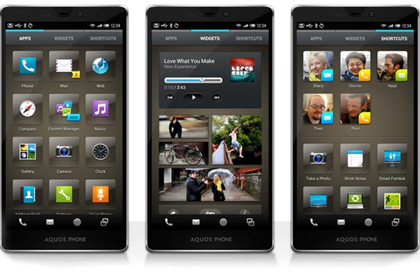
Sharp has debuted a new UI to go along with its upcoming Android devices. While it will not likely see the light of day in Canada, at least not in the near future, the company has struck a relationship with UX design firm frog for the feature set.
The lockscreen is a primary action point here, something that has become increasingly common among Android manufacturers. You’ll be able to access weather, stock and news information, and have access to a variety of widgets.
There doesn’t seem to be an “app drawer” like in traditional launchers, either. A list of apps is available in one tab, with widgets and shortcuts on the two others. Quick access to settings are also a nice touch. A permanent but customizable four-icon dock sits at the bottom of the launcher, giving you quick access to the your calls, emails, browser and whatever else you might need.
We’re not sure if all the changes are good — too many unnecessary shadows in our opinion — but it’s nice to know that manufacturers are working with great design firms, instead of trying and failing on their own, to visually further Android. Check after the break for a demo video of the new Feel UX.
Via: MobileBurn
MobileSyrup may earn a commission from purchases made via our links, which helps fund the journalism we provide free on our website. These links do not influence our editorial content. Support us here.


