For a company of LG’s size and leadership in so many areas of tech, from televisions to washing machines, having comparatively small market share in the smartphone business must chafe. The company, like its South Korean counterpart Samsung, has been making decent phones for a few years — the G2X and Optimus LTE spring to mind — but were marred by underwhelming specs and buggy software.
The Optimus G was the company’s first truly great smartphone, and they knew it. It was marketed to pieces and sold quite well, differentiating itself with an all-glass exterior and thoughtful, if not quite innovative, software inclusions. But going up against the Galaxy S3, the Optimus G was affected by poor battery life and an underwhelming camera, and lacked the marketing momentum of Samsung’s flagship.
Now in 2013, LG is at it again, dropping the “Optimus” moniker and striving for innovation in areas that many wouldn’t expect. But does this spec monster get it right where it matters? Let’s find out.
Specs
- Android 4.2.2 with custom LG skin
- 2.26Ghz Qualcomm Snapdragon 800 SoC
- 5.2-inch 1920×1080 pixel IPS display
- 2GB DDR3 RAM / 32GB internal storage (no microSD slot)
- 13MP rear camera w. Optical Image Stabilization / 2.1MP front-facing camera
- WiFi (a/b/g/n/ac), Bluetooth 4.0, A-GPS, NFC
- 3000mAh battery (non-removable)
- DC-HPSA+ (42Mbps) 850/1900/2100 MHz / LTE (150Mbps) 700/AWS/2600Mhz
- 138.5 x 70.9 x 8.9 mm
- 141 grams
Design and Display
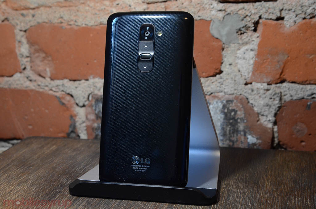
LG returned to a less remarkable design with the G2, opting for a rounded plastic chassis that feels akin to any Galaxy product you might have held since 2010. It’s safe to say that LG took a few crib notes from its Korean counterpart, but diverged in a pretty significant place: buttons.
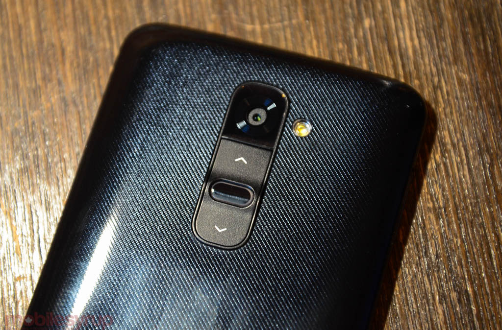
The G2 places its power and volume buttons around back, below the 13MP camera sensor. While at first disconcerting, it only took me a few hours to grow used to their placement. See, the company realized that on larger phones, the index finger is used to prop up the device from behind; our fingers rest there anyway, so why not include something useful?
In practice, it means a few false presses — hitting the volume up key when power was the target and, more than occasionally, smudging the camera sensor with your roving index. LG does make it easier to locate the power button, as it is raised above the others and has two small metal ridges rising to meet it; I found it easiest to slide my fingers horizontally along the edge of the device until I found one of those ridges.
I demoed the device with a few smaller-handed individuals, all of whom found it too difficult to reach the rear buttons than those with larger paws. The buttons are an important differentiator, both for LG and the retail sales force tapped with selling the handset, but it’s going to be divisive: those with larger hands, who appreciate the thinness and welcome curvature of the product, will likely welcome the buttons’ placement; those with smaller hands will probably miss easy access to the power and volume buttons on the phone’s sides.
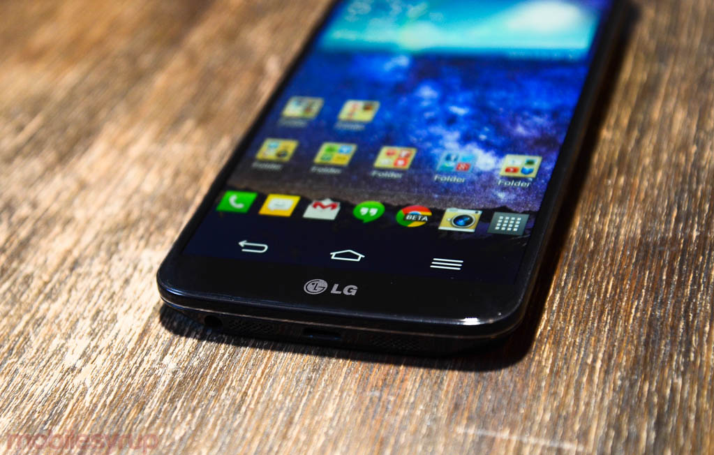
But having no buttons on those sides makes for a pleasantly minimalist aesthetic when viewed from the front. Other than an LG logo there is nothing to distract the user from a vibrant, bright IPS display. As we said of the Optimus G last year, LG makes some of the best mobile screens, and the G2 is absolutely stunning. The company opted to use a strange combination of virtual navigation buttons but in the identical presentation of the Optimus G’s capacitive keys — which brings some software inconsistencies as we’ll see later — but the screen’s viewable area itself is just stunning.
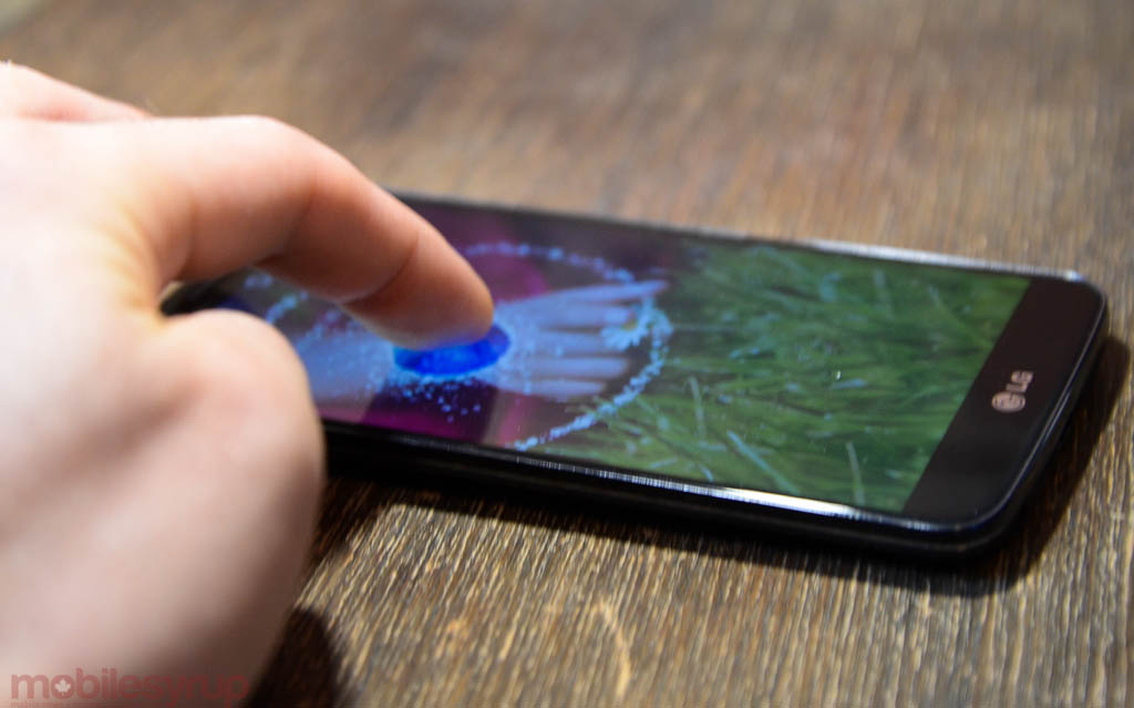
Unlike the dim, blue-tinted nature of AMOLED displays, LG’s IPS screen is incredibly bright, approaching some of the best results we’ve seen. Also excellent are the viewing angles, colour reproduction and sharpness, even though, technically, the screen is less dense than the HTC One. Comparing the two displays, I preferred the G2 every time; it was larger, brighter, less reflective and more colourful. Because the glass is fused to the LCD, which brings it closer to the surface causing less reflection, outdoor visibility was also a highlight.
The display really is the, ahem, bright spot of the hardware. LG opted to forgo glass, which we appreciate tends to crack and shatter, with the kind of plastic we’ve been complaining about on Samsung phones for years. And yet. And yet LG had an opportunity to adopt the best ideas of each OEM and create a device akin to the Moto X or Lumia 920; instead they mimicked the Galaxy S4’s worst trait. The rear is so fingerprint-prone you’d be forgiven for mistaking it for a mirror. It’s also extremely slippery; I almost dropped the G2 several times after heavy use, and those with clammy or sweaty hands will find the issue exacerbated.
What I find so interesting about this design choice is that LG knew people had been complaining about this “hyperglazed” plastic, to borrow a Samsung term, and used it anyway. Considering Nokia and, more recently, Motorola and Apple, have found ways to mould plastic into a strong, substantial material, their choice gives me tremendous pause. Even the Galaxy S4, using similar materials, does not take on these properties, nor does the backplate retain fingerprints as easily. I wholeheartedly recommend using a case with the G2, even if it adds a modicum of thickness.
We’ll leave this section on a positive note: the device, for its size, is extremely svelte. LG managed to almost eliminate the side bezels on the screen, so a 5.2-inch display fits into a body minimally larger than the Galaxy S4. Because there are no buttons to interrupt the bezels or facade, there is a compelling minimalism to the G2. The headpiece above the screen is tasteful, and the multi-coloured LED light flashes warmly. It feels much smaller in the hand than its size would indicate, and this is where the curved, glossy plastic back is actually an advantage. It’s easy to grasp it in one hand.
And for its controversial placement, the device’s rear feels uncluttered and meaningful, just as LG intended: the power and volume buttons have purpose, doubling as shortcuts for important system functions. For example, holding down the lower volume button skips the lock screen to quickly enter the camera app; it also functions as a shutter button. The top volume button doubles as a shortcut to Quick Memo, LG’s stylus-free notes and annotation app. Though not customizable, they become inextricably linked to the user’s workflow, and I found myself often taking advantage of them.
Finally, the bottom of the G2 shows off an array similar to the iPhone 5, with micro-drilled speaker and microphone holes buttressing a microUSB port and 3.5mm headphone jack. The top of the G2 contains an IR blaster and a second microphone for noise cancellation.
Software and Performance
This section is a tale of two cities, so to speak. LG has adorned the G2’s insides with much of the industry’s latest technologies, from Qualcomm’s blazing-fast Snapdragon 800 SoC, LTE speeds of up to 150Mbps (also courtesy of Qualcomm), a 13MP camera with optical image stabilization, a 1080p IPS that uses less energy thanks to a permanent amount of memory set aside for it, a stepped 3000mAh battery that uses all available space in the chassis while minimizing thickness, and a number of cool software tweaks.
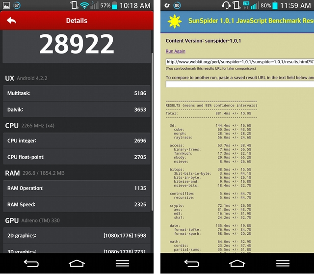
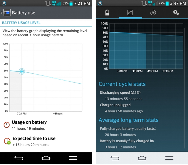
To that end, the G2 is really, really fast. Benchmarks place it between 15 and 30% above the CPU and GPU speeds of the Snapdragon 600, and over 50% faster than last year’s Nexus 4 and its S4 Pro SoC. Apps load quickly, games play beautifully, and touch performance is ideal. Battery life is also fantastic: the G2 lasted longer than any Android phone we’ve ever used.
So what’s the problem, then? I just wish LG had put as much thought into its software as it did the phone’s hardware.
To put it mildly, its software is a mess.
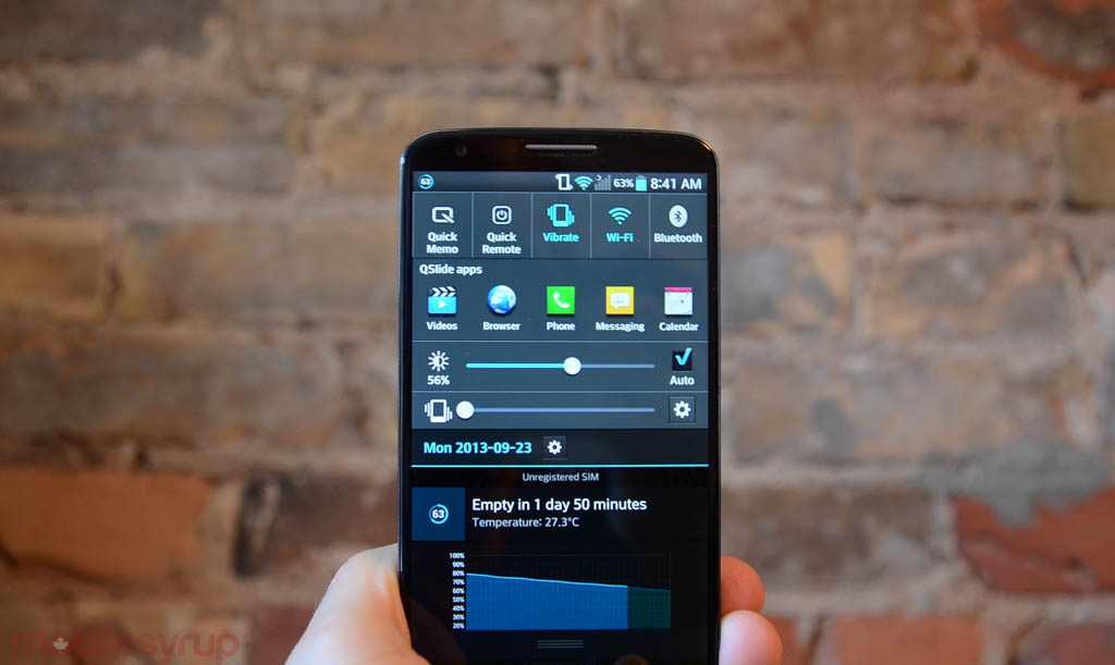
Let’s start with the immediate concerns: the notification bar contains several rows of applications, from network shortcuts to app access to sound and brightness settings. Great. But these rows cannot be removed, even if you edit their content to zero. They eat into more than half the screen, forcing you to scroll down just to see more than a couple of notifications. There are also two “cog” setting icons on top of one another, one to activate sound profiles, the other to quickly enter the Settings app. Because they look identical, I ended up tapping on the wrong one all the time.
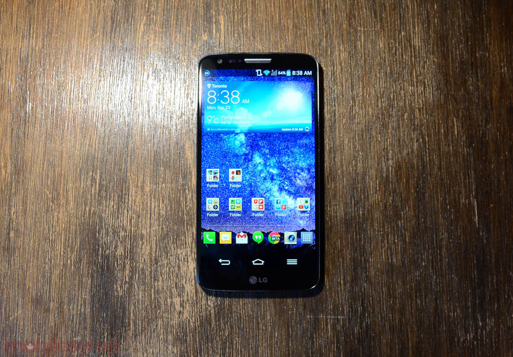
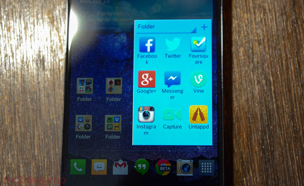
Things get worse in the launcher. The way LG displays app names within folders is embarrassing: there is space for only eight letters per icon, but instead of expanding the folder’s size, it will just cut off the name and put it on another line. So “Instagram” becomes “Instagra”-“m”, with the “m” on its own line. And unlike Apple, which attempts to categorize various folders, each new one here is just called “Folder.” Samsung fixed this issue with the GS4, omitting a name entirely until a user adds it.
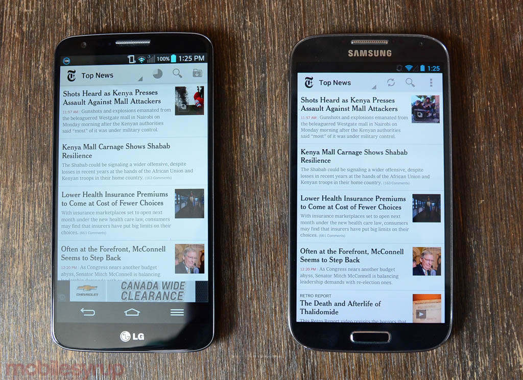
Then we get to the worst part: the virtual menu buttons. When I saw this at the G2 launch I was intrigued: “Yes!” I thought naively, LG is finally adopting Google’s standard layout. Instead, LG merely took the hardware layout of its Optimus G and transposed it virtually. Unlike on a Nexus device there is no multitasking button; in its place is a menu button, a dying Gingerbread legacy that only Samsung appears to perpetuate. Except Samsung’s layout doesn’t mess with apps.
Some apps, like Google Play, support both the hardware and software menu button, so it adapts to the device’s layout. Others, like the New York Times, get confused and think that because “hardware” buttons are present it doesn’t need to display a virtual menu. The problem is that the G2’s virtual menu doesn’t act the same way as a hardware one, so it’s impossible to enter the settings in those kinds of apps. This problem is only present in a few apps, but it shouldn’t exist at all. Developers usually test their apps with a Galaxy product because they are the most popular Android devices; it’s unlikely that they will bend over backwards to fix issues with the G2. Like the virtual menu issues with the HTC One, LG could offer a fix for this in an upcoming software update, so there’s hope yet.
Because I’ve grown used to the virtues of stock Android, LG’s software feels clumsy and looks cartoony. The SMS app often throws you back to the home screen instead of the message list and LG-made apps like Tasks and Notebook have the visual acumen of a #2 pencil: utilitarian and boring.
Ultimately, though, what saves the G2 is that it’s a really, really good Android phone. Above quirks aside, the device is rock solid, pushing the boundaries on synthetic and subjective benchmarks compared to models like the Galaxy S4 and HTC One. If you’re in the market for the fastest Android phone, this is the one to get. Benchmarks were between 15% and 60% better than last-generation devices, depending on whether the CPU or GPU was being taxed. It’s possible to play every game on the Android Market at the highest possible setting without breaking a sweat; the Snapdragon 800 processor is the first SoC for Android devices that seems to co-exist perfectly with the new generation of 1080p displays, as most games play at V-Sync levels of 60fps.
There are a number of compelling software additions as well. KnockOn negates the need to hunt for that rear power button while the device is sitting on a table. Just tap twice to turn it on, and, while on an empty part of the home screen, twice to turn it off. In practice, I found KnockOn to work 75% of the time, and the times my taps were ignored it was because I wasn’t forceful enough.
Plug & Pop is another interesting feature, as it provides a list of apps that you can customize when plugging in a pair of headphones. I have it set to show me Rdio, TuneIn Radio and YouTube, and the associated animation is lovely.
Indeed, the G2 is full of lovely animations, though they can appear overabundant. LG has taken the kitchen sink approach with this device, and while it lacks the completely superfluous eye tracking nonsense of the Galaxy S4, the Korean company lacks Samsung’s newfound design prowess; this feels like TouchWIZ circa 2012, not 2013.
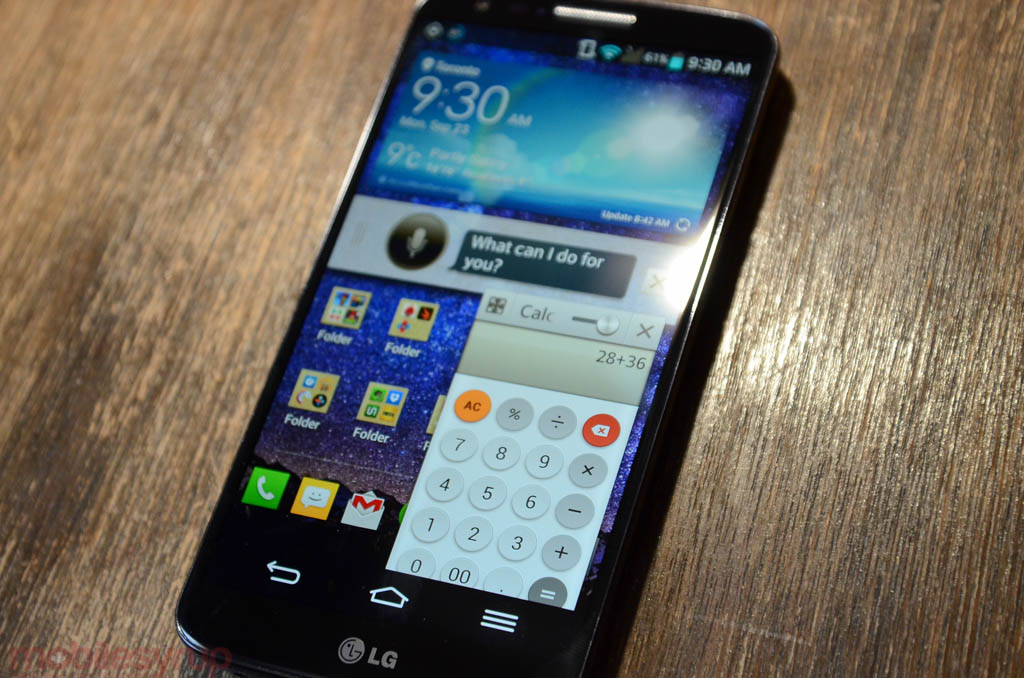
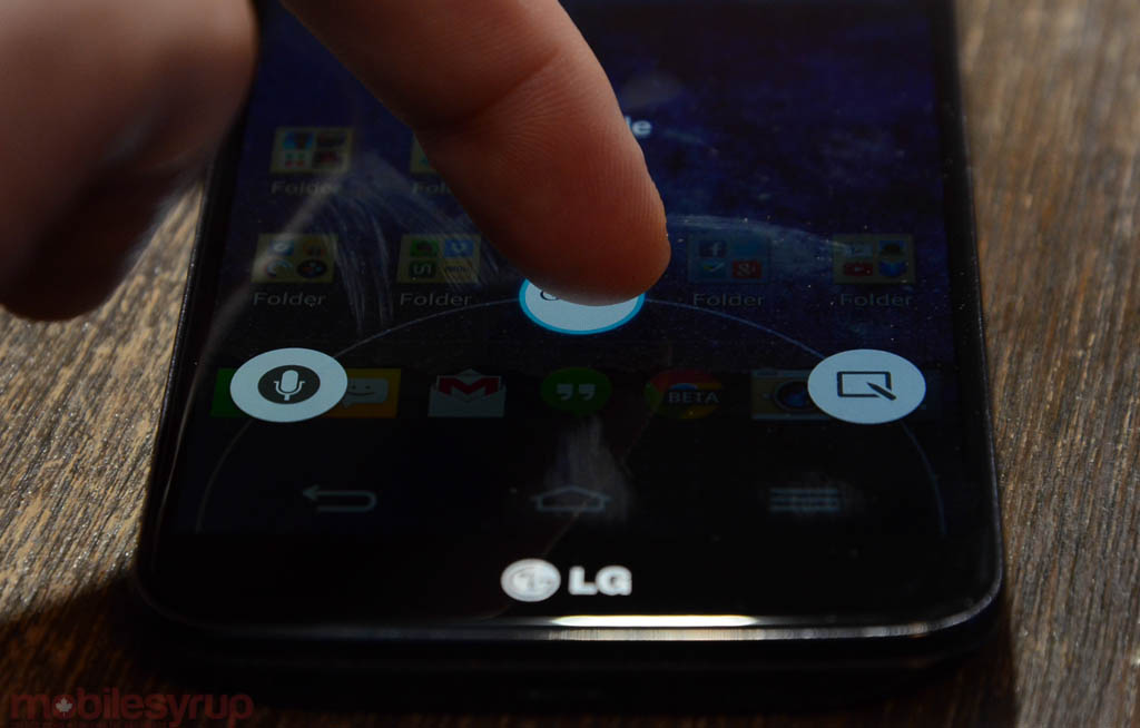
One area in which LG has Samsung beat is with the included voice controls. Part of the newly-expanded Q Slide suite of apps which launched on last year’s model, Voice Mate is powered by Waterloo’s Maluuba, which we’ve covered before. This Siri and Google Now rival takes in semantic language — “Where is the closest pizza joint?” — and spits out intelligent, often-superior results to S Voice. It’s always accessible by sliding a finger up from the virtual home button, too, one of the few advantages to LG’s layout. Other Q Slide apps include a calculator, a notepad, a small browser, video watcher, calendar widget and file manager.
And, of course, LG included Quick Memo in the G2, which works better this year thanks to more precise touch response and a significantly higher resolution panel.
The pinnacle of LG’s muddled approach to Android software is Slide Aside. Whereas users can access the regular Android multitasking menu by holding down the virtual home button for a second, Slide Aside lets you “store” three apps in more immediate memory by swiping three fingers to left and subsequently restoring them by swiping three to the right. Aside from its interesting premise, there is no explicit reason for Slide Aside to exist. It does not improve upon Android’s already-excellent multitasking functionality, nor does it restore apps more quickly than holding down the home button for a second. At best, it provides another method to switch between oft-used apps; at worst, it’s distracting and superfluous.
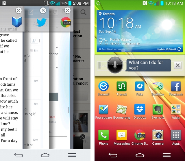
Similarly, it’s possible to edit the virtual navigation buttons by changing the default white to a more mature-looking black, or by adding a fourth button. These include a shortcut to Quick Memo, or for the small-handed among us, a button to activate the notification bar. At best, sort of useful; at worst, clutter.
LG does more things right than wrong, and with a few third-party apps (I immediately downloaded Nova Launcher and Sliding Messaging) the device feels fast, fresh and only slightly disjointed. After being spoiled with the Moto X’s stock Android experience, all I can say is that I wish more OEMs used it as a base on which to build great features.
One thing to keep in mind about the G2 is that, if the Optimus G is any indication, it’s unlikely to receive frequent updates. The Optimus G is stuck on Android 4.1.2 with no immediate plans to move beyond.
Camera
If there was one thing the Optimus G lacked, it was a great camera. The interface was passable, but photos lacked detail and, in some cases, colour. It was akin to using a permanent sepia filter.
I’m happy to report that the G2 fixes many of the issues of the Optimus G and improves the ISP tremendously. Not only does the 13MP sensor boast optical image stabilization, but the f/2.4 aperture is faster and the lens sharper than its predecessor.
What this means for the average user is that, burst mode and panorama shots aside, the G2 takes some fantastic photos in both day- and low-light situations. The latter situation especially results in usable photos, as the OIS allows the shutter to stay open for longer and capture more light. Indeed, the OIS is largely necessary since LG pulled a Samsung and delivered 1.1 micron pixels to fill the 13MP sensor; more pixels of smaller size mean less light taken in, so the shutter needs to be able to stay open longer without blurring.
In most situations stabilization helps, but the relatively small sensor cannot produce miracles; we had more than our fair share of blurry images. Still, if these are the calibre of photos Nexus 5 users can expect, the camera along will be worth the upgrade.
I’d put the G2’s camera in the same league as the GS4; better in some situations than the iPhone 5, but not quite as good as the 5s or Lumia 920. We did experience a fair amount of grain, and indoor photos were often struck with a pallor that comes from incorrect white balancing, but 95% of the photos we took with the G2 were superb.
The camera interface largely resembles the Galaxy S4, hiding myriad “modes” behind a nondescript icon. There is “Shot & Clear,” which lets you remove unwanted background objects; “Burst Shot,” which takes many photos quickly and lets you choose the best one(s); “Beauty shot,” which promises to clean up blemishes by artificially softening and applying the digital equivalent of rouge; “Dual camera,” which uses both the front and back cameras to take dual portraits; “Night mode,” which keeps the shutter open longer and applies lightening effects; and “Intelligent auto,” which in my opinion should be standard, which attempts to find the best metering, ISO, shutter speed and exposure combination for the scene.
The phone’s rear volume buttons act as shutters for both the front and back cameras. While it doesn’t work so well for the latter, taking a selfie becomes an artless process as your finger naturally cradles the back of the device in that area.
The front-facing camera is typically good, but we detected a fair amount of grain from its 2.1 million pixels. Heading to video capture, the G2 supports a few interesting modes in addition to the typical 1080p@30fps. One is called “Tracking Zoom” and it encourages users to focus on a specific moving object, after which time the software will automatically follow that person on his or her travails. In reality, it works fairly well, especially if you’re constantly trying to locate your child in the throng of a soccer match, for example. “Audio Zoom” uses one of the phone’s three microphones to capture audio coming from a specific direction. This works less well, as cutting ambient noise from microphones located this close together is a physical impossibility, but it does a tremendous job nonetheless.
Video quality was uniformly excellent for a smartphone camera, though I’ve recently been spoiled by the improved ISP in the iPhone 5s. This is likely the best you’re going to get from an Android device at the moment, and much of the high-bitrate acclaim can be attributed to the Snapdragon 800 SoC. Expect similarly great results from the Samsung Galaxy Note 3.
Battery Life & Connectivity
Ah, battery life. The constant thorn in every smartphone user’s side.
Luckily, the G2 appears to be among the first Android devices to deliver “one day plus” uptime. It wasn’t uncommon to achieve two days of moderate usage from the device, though more typical results were upwards of 16-18 hours. At the end of the day, though (literally and figuratively), I never found myself fretting about finding a power outlet or bringing along an external battery. The 3000mAh cell has been heavily optimized by LG to deliver consistently good results, and while much of it can be contributed to the Snapdragon 800 and its ability to engage all four cores at low clock speeds, or use only one core at a higher clock speed, depending on the task.
Because the battery isn’t removable, LG was able to build a custom stepped cell that fills in all the extra space in the rounded chassis; that, and its 3000mAh capacity, means that Optimus G owners should achieve nearly double the uptime. The G2 also consistently outlived the HTC One, Moto X and Galaxy S4, beaten only by the iPhone 5 in average use. Under heavy load, however, like looping a movie at 50% brightness, the G2 held out longer than all other devices, managing 10 hours of video playback.
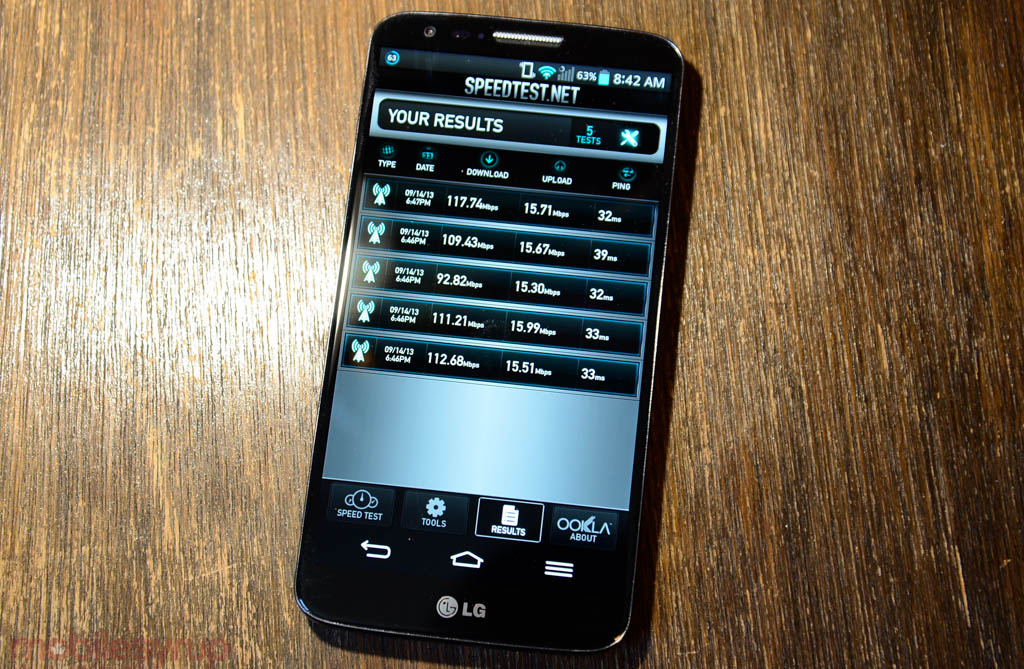
The G2 is also the first device released in Canada capable of eking out 150Mbps in the downlink. And because it is compatible with Rogers’ 2600Mhz LTE Max network, the speeds I achieved were astounding. Really, they speak for themselves. Nearly 120Mbps down and 15Mbps up.
Because it’s a Category 4 LTE device, customers on Bell and TELUS should also benefit from the more upgraded baseband chip, though the device maxes at 100Mbps over their (and Rogers’) AWS networks.
Moving to sound, I heard again and again that the G2 was the clearest-sounding phone my callers had ever heard. This praise is usually reserved for Motorola or Apple devices, so it’s nice to know that LG spent some time optimizing the handset for voice calls.
At the same time, sound from the bottom speaker was significantly lower than the competition, and we experienced a bug where the maximum volume would halve when the device was on vibrate mode.
I love that the G2 comes with 32GB of storage standard, especially because there is no microSD slot to expand it. This should become standard fare for all flagship devices, especially because, like the GS4, the system eats around 8GB of space.
Competition
There are a lot of great Android phones; there is only one iPhone are only two iPhones. When people ask me which phone to buy, they usually only have two in mind: iPhone or Galaxy. Samsung has somehow tapped into the considerable space of the other, the official alternative to the iPhone. With so many Galaxy models to choose from, too, there is sure to be one that appeals.
This is LG’s dilemma, and likely why they decided to create “the phone with the buttons on the back.” Specs no longer sell phones, and despite this being the first to market (in Canada, anyway) with a Snapdragon 800, the Note 3 is hot on its heels with moar everything. LG overreached and failed in a few ways, but succeeded in many more. They managed to make a 5.2-inch phone compact and pocketable, with a thin body and a great display that responds quickly and lasts for ages.
At this point, the Galaxy S4 is getting a bit long in the tooth, but judging from LG’s cribbing of its design and software it’s clear Samsung is enemy number one. The GS4 has held up quite well, too, aging gracefully as more devices hit the market. So too has the HTC One aged well, and with an impending update to Android 4.3, users can expect a big usability boost in the coming weeks.
My favourite Android device is still the Moto X, and as I said in the software section I feel spoiled by its unblemished stock Android experience. I wish more OEMs would more assiduously tow this line, but I understand the need to differentiate.
Apple’s iPhone 5s and 5c may not seem like direct competition for the G2, but they’re clearly going to take eyeballs away from Android over the next few weeks. With LG launching its flagship in Canada only a week after Apple’s big debut, it will be harder to sell Android’s virtues to the average user.
The Wrap-Up
The G2 is a really good device pockmarked by a few poor design choices. Its hardware is mostly sound, and I even grew used to the rear controls over time. Weeks later, it’s mainly the glossy plastic that continues to irk, while the software’s biggest flaws have been covered up by third-party alternatives. This is the beauty of Android, but not an excuse for poor decisions on LG’s part.
From the vivid screen to the ultra-fast processor to the sharp camera and outstanding battery life, the device is a powerhouse and a spec-hunter’s dream phone. With a case and some patience, this could be one of the year’s best Android devices.
MobileSyrup may earn a commission from purchases made via our links, which helps fund the journalism we provide free on our website. These links do not influence our editorial content. Support us here.

