The Pros
- Great active noise-cancellation
- Stronger design
- Balanced sound
The Cons
- Mid battery life
- Lag on computer
- Rubbery ear tips
Nothing started its journey in 2021 with the Ear (1), and the sequel shows that the company isn’t standing still.
While the wireless earbuds look very similar to their predecessors, there are essential upgrades in usability, portability and, of course, sound quality. They’re a little pricier than the original’s launch price, but they still offer fantastic value compared to the 2023 earbud landscape.
If you’re a fan of product design, things that look like they belong in Ridley Scott’s Alien universe or earbuds that just offer good value, keep reading.
Great expectations
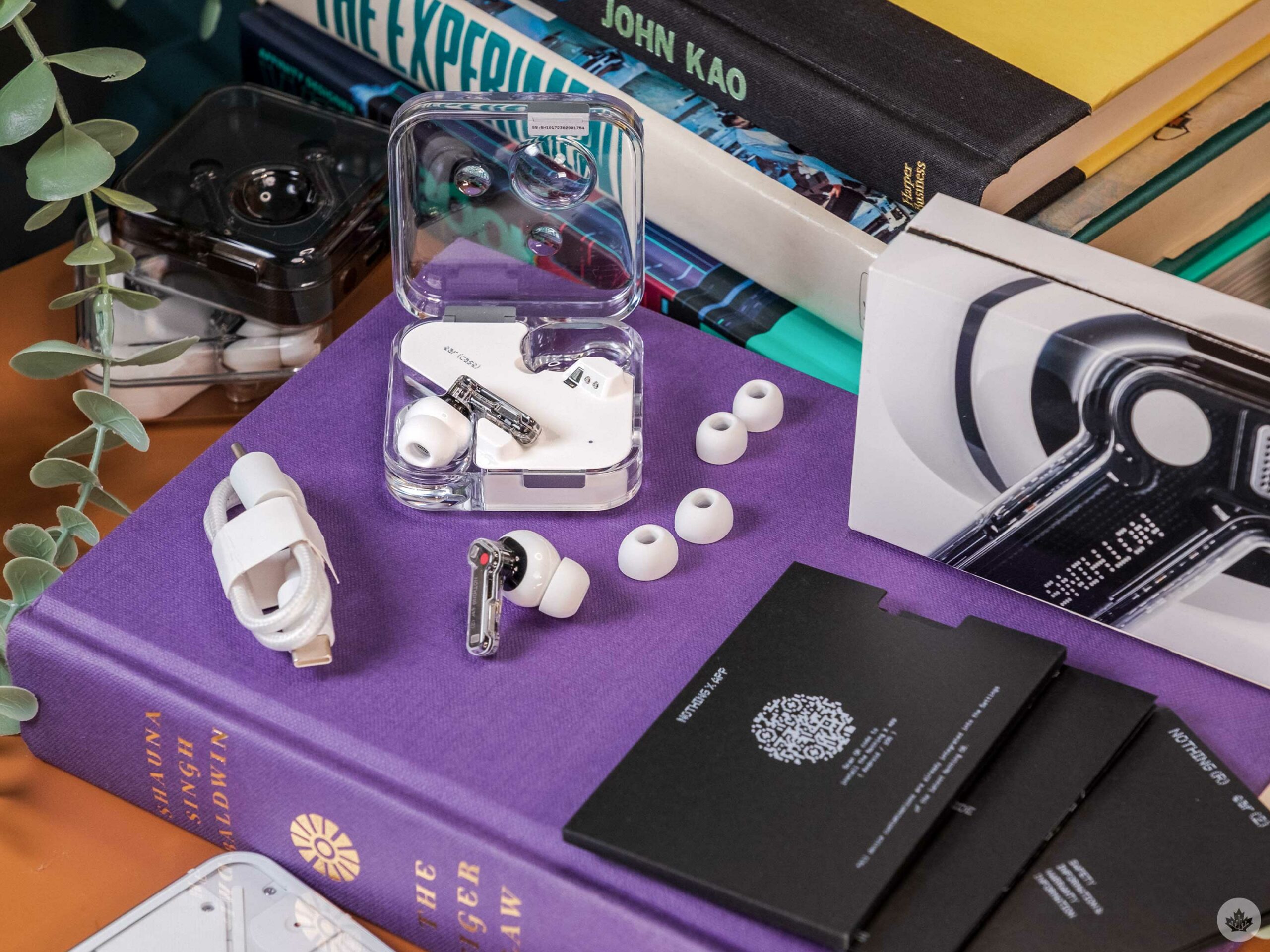
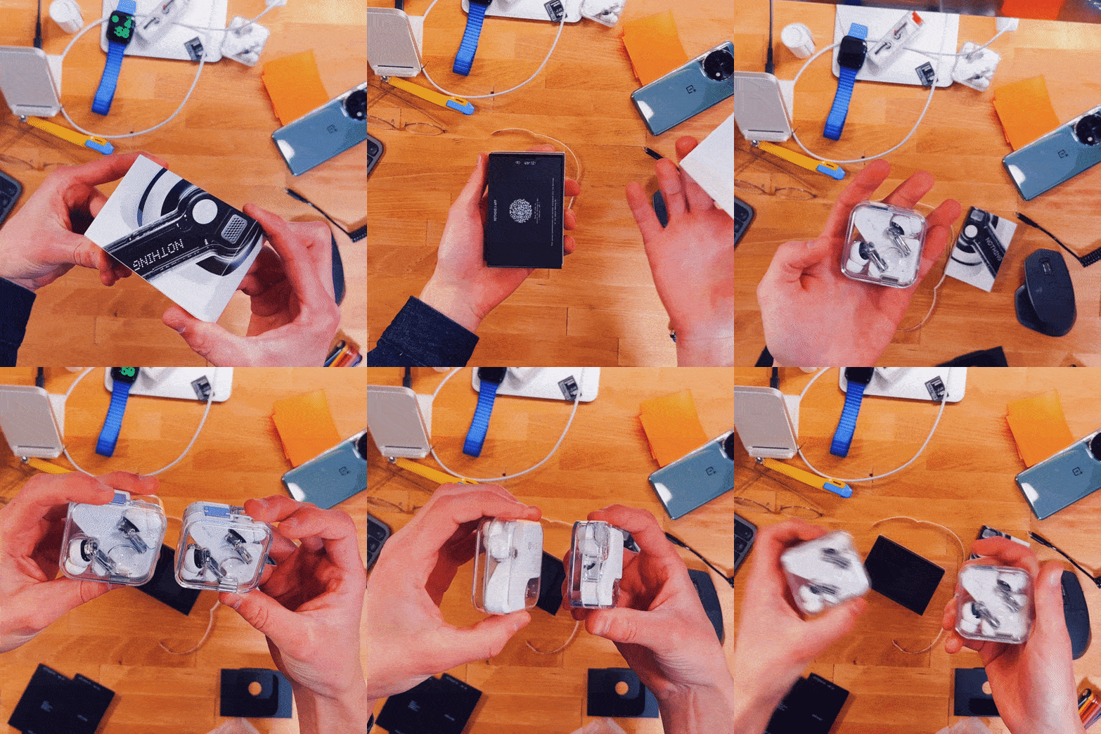
The contents of the Ear (2) box.
Nothing has never shied away from a fun unboxing experience, and the Ear (2) follows the trend. The buds arrive in a small box with a detailed macro shot of them wrapped around the top. Pull a little tab to open the box, and you’re presented with the earbuds. Digging a little deeper reveals two other earbud tip sizes and a short USB-C cable for charging.
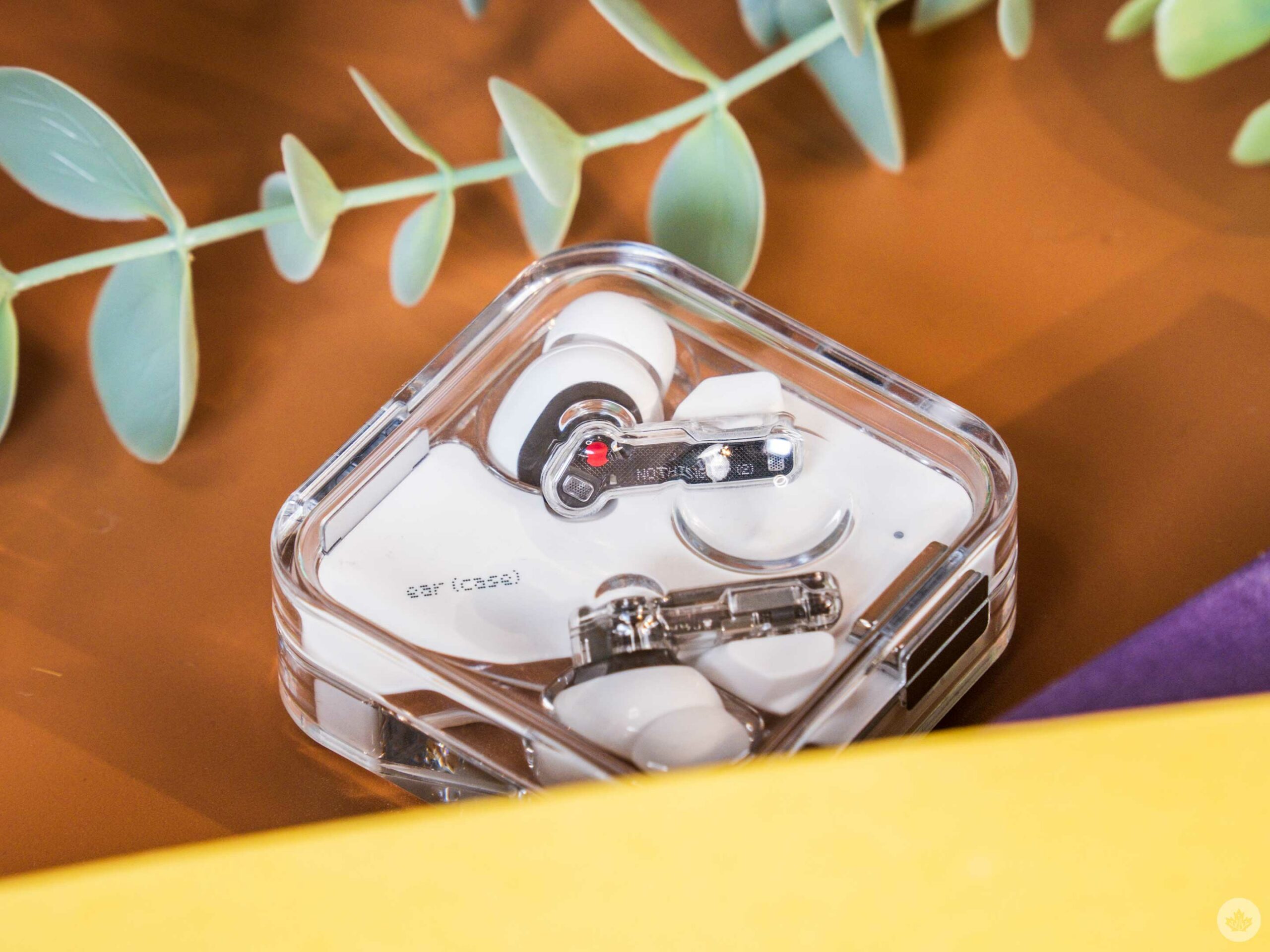
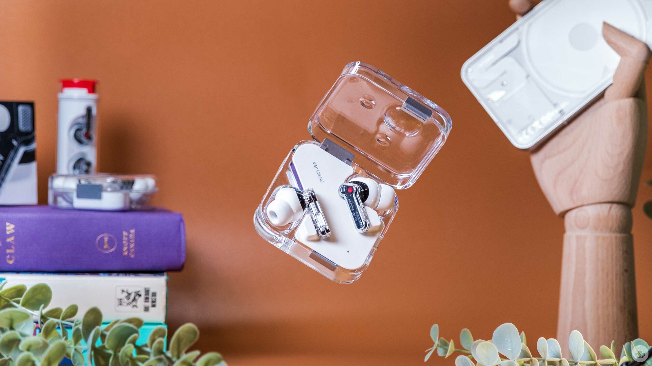
The Ear (2) charging case is a bit more compact than the Ear (1), but it’s not that noticeable in your pocket. Where it sets itself apart is in the details — or in some instances, the lack of them.
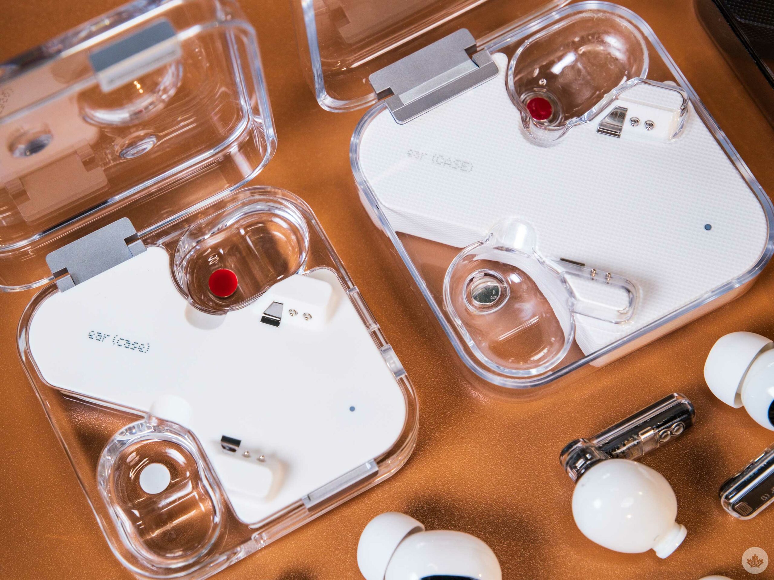
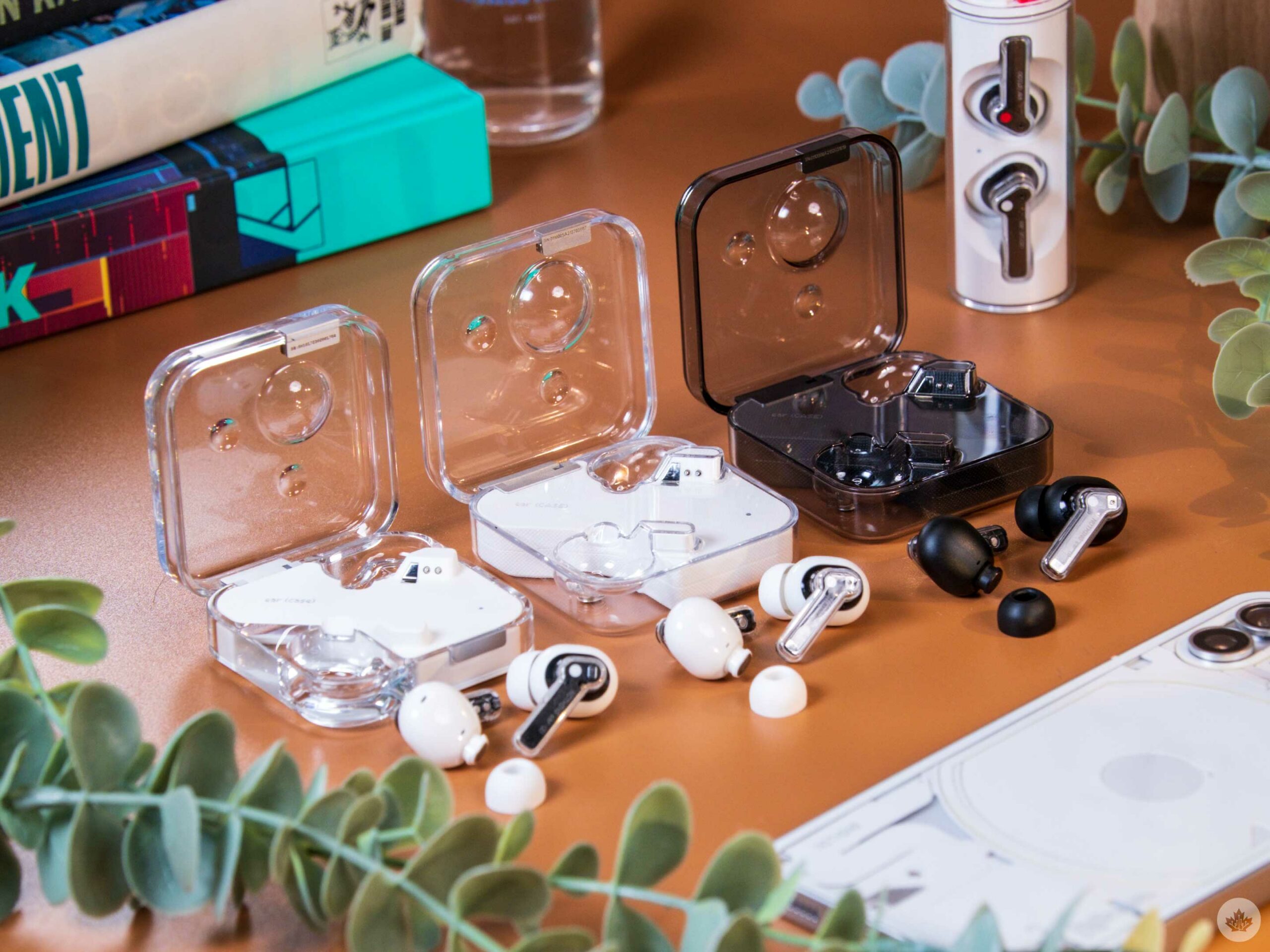
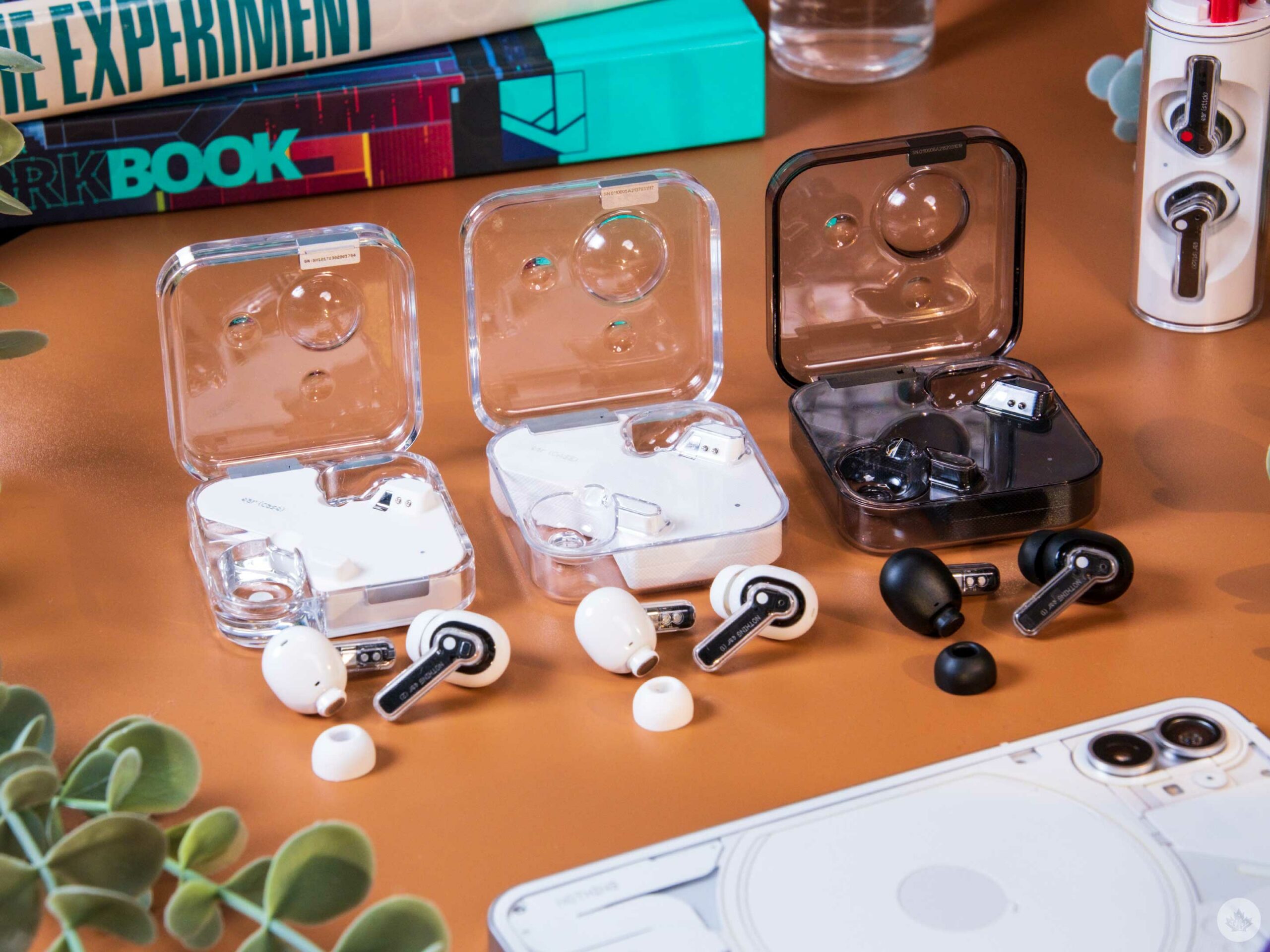
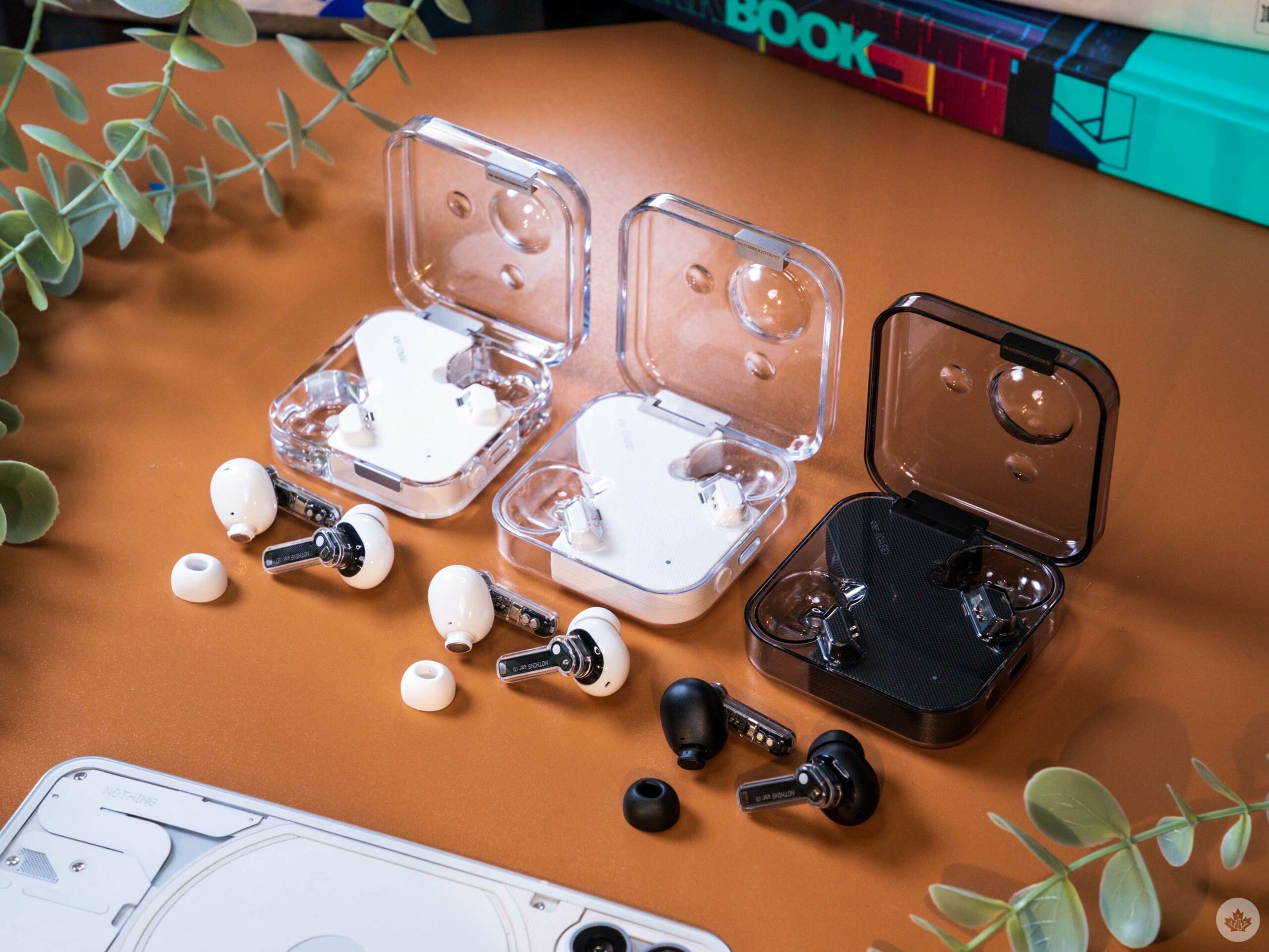
The downside of clear cases is that you need to clean them often because earwax that rubs off your buds is very noticeable. Ear (2) case pictured on the left.
Side-by-side, the new case seems to be made of more robust plastic that looks more premium than last year’s. You can still tell it’s plastic, but the case sparkles more in the sun, and from the side profile, it almost looks like the buds are submerged in water. It’s not as stunning as glass or crystal, but it feels about as close as we can get while keeping the weight and moldability of plastic.
The premium feeling continues when you pick up the case, as the lid is more snug than the flimsy top half of the Ear (1) case. On the older model, you could push the lid side to side since the tolerances on the hinge weren’t perfect. That’s no longer a problem as the lid locks in a small grove giving the case a more refined feel.
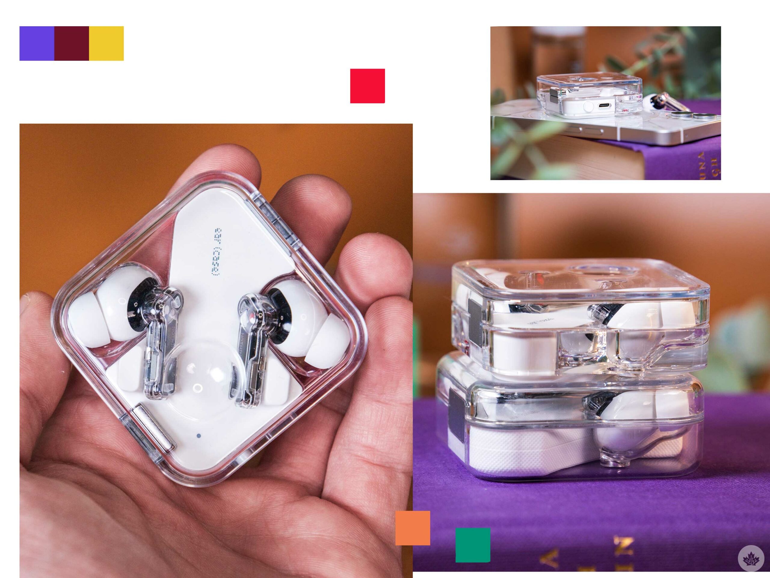 The white centre channel also acts as a foot on the bottom to raise the case’s transparent elements up a millimetre. This sounds inconsequential, but combined with the denser plastic, it allows light to pass through the case in more interesting ways, creating a slight glow around the unit. It’s a small change, but it adds to the sophisticated look. The subtle micro waffle texture has been removed from the white part of the case, which was sad to see at first, but after spending some time with the new buds, the cleaner look of the matte white helps the other details shine.
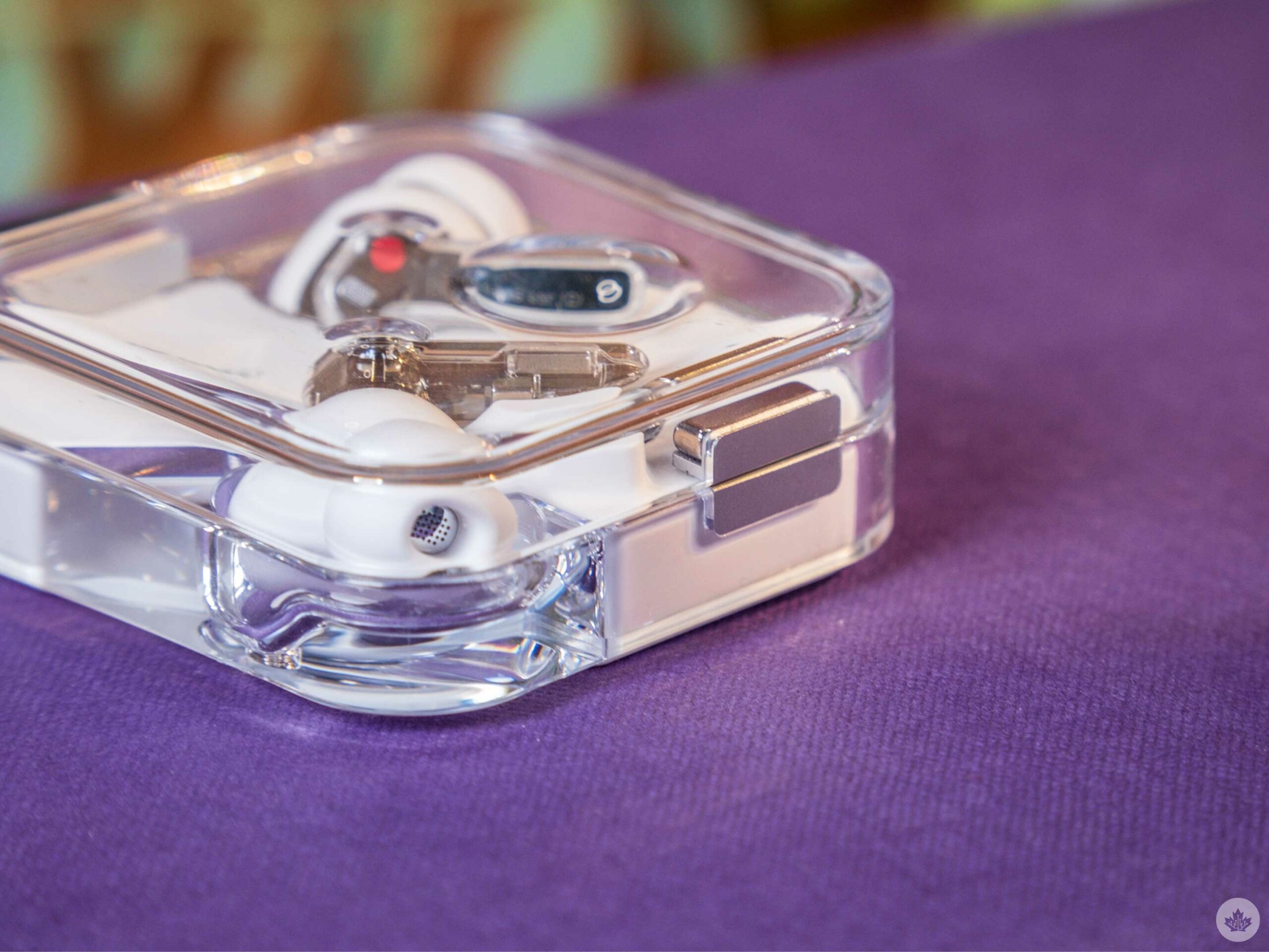
 One such detail is the new magnets holding it shut. At first glance, it looks more complete than the single magnet on the Ear (1). But when you examine the case from the top down, it reveals that this magnet rework matches the size of the hinge. Offering welcome symmetry between the front and back of the case. It’s not a perfect match, but it tells the story of Nothing’s ability to obsess over the smallest details that make its products feel more premium than their price tags.
Still the coolest buds around
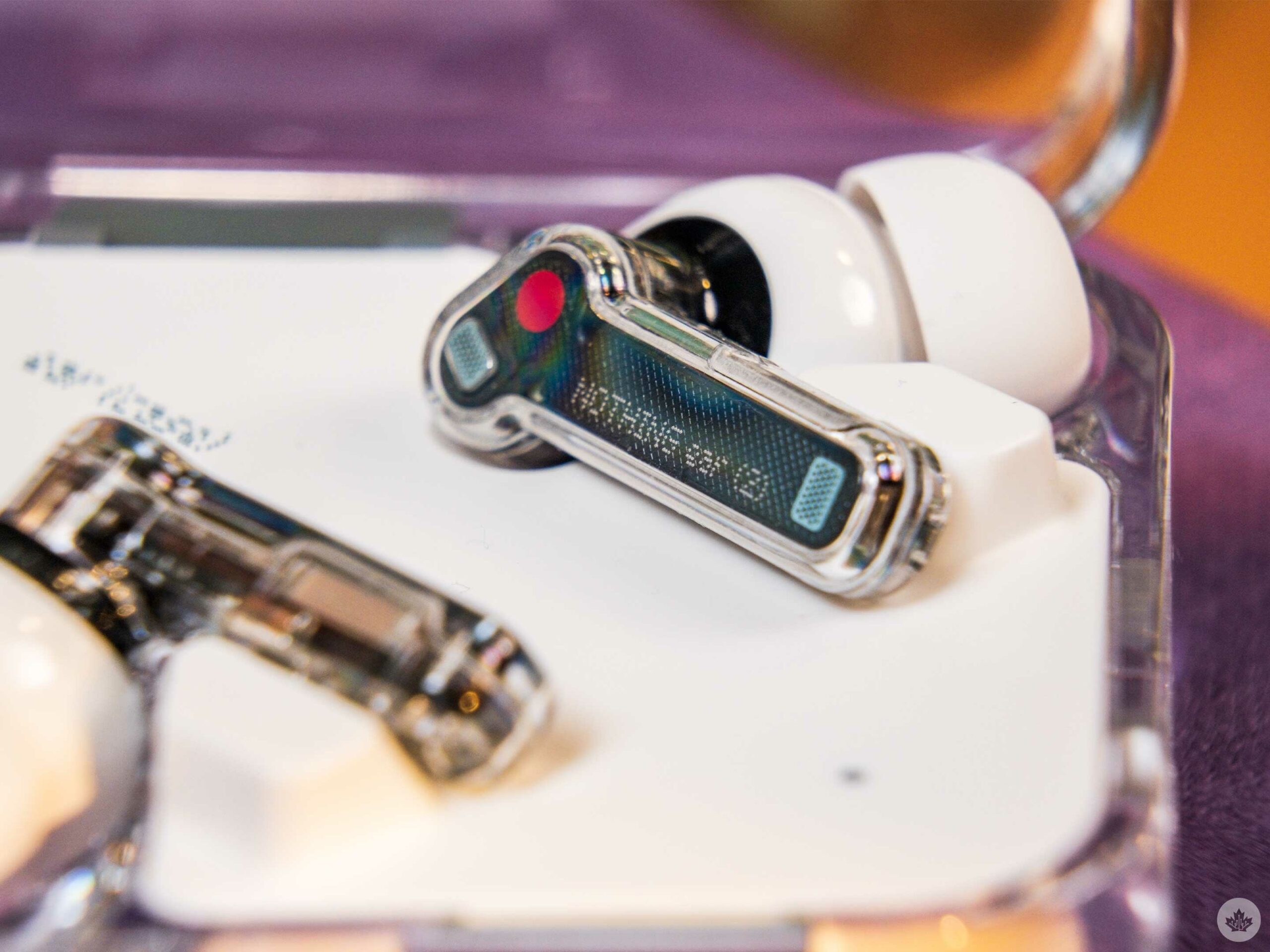
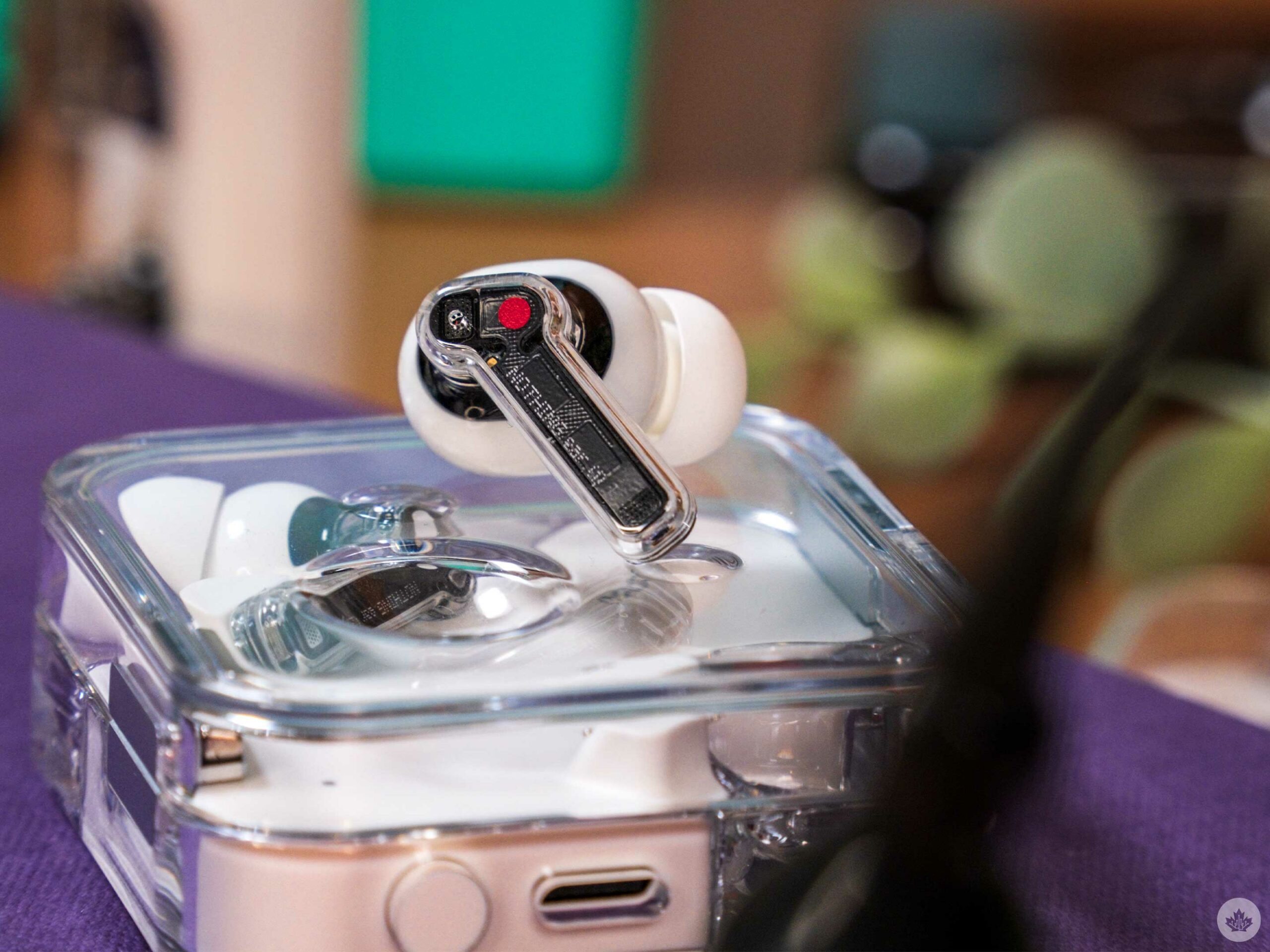
The Ear (2) still retain the semi-transparent design from the other Nothing buds, but there are tiny changes upon closer inspection.
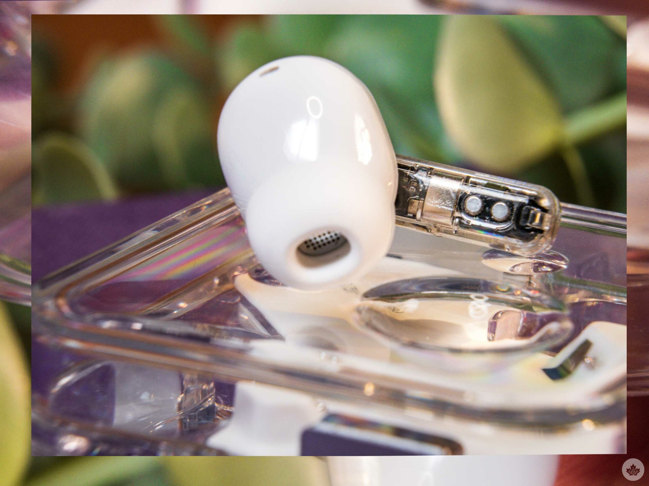
My favourite change is that the air pass-through hole on the face of the bud has been replaced with a small metal vent, giving the earbud a higher-end look. Previously this was a small hole drilled into the plastic above the vent. Now it sits flush with the plastic shell removing the need for the hole at all. It’s a small design change, but the hole on the Ear (1) felt like Nothing added the vent to look cool. Now it looks like a functional element, a more impressive achievement.
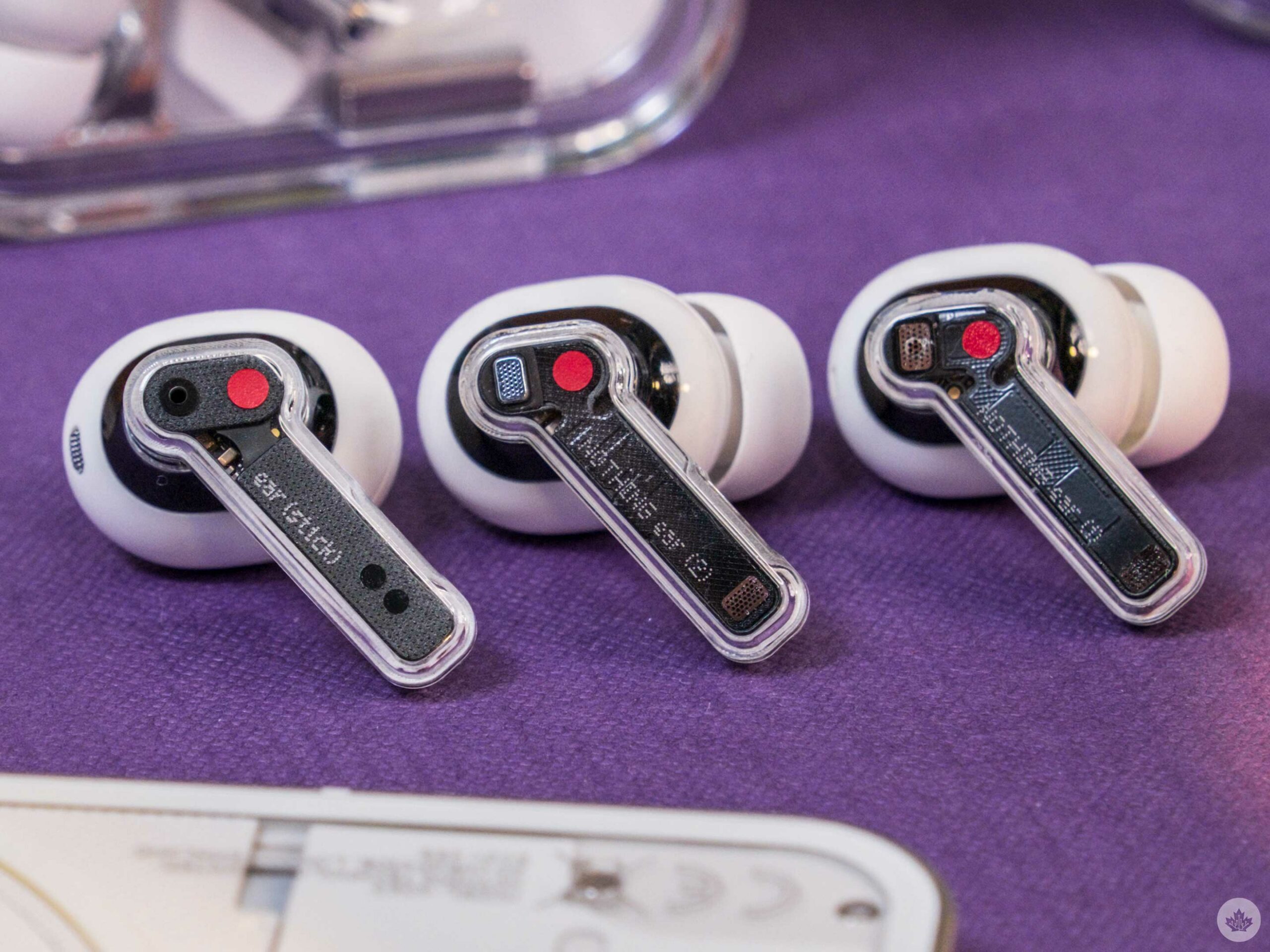
From left to right: Ear (stick), Ear (2), Ear (1).
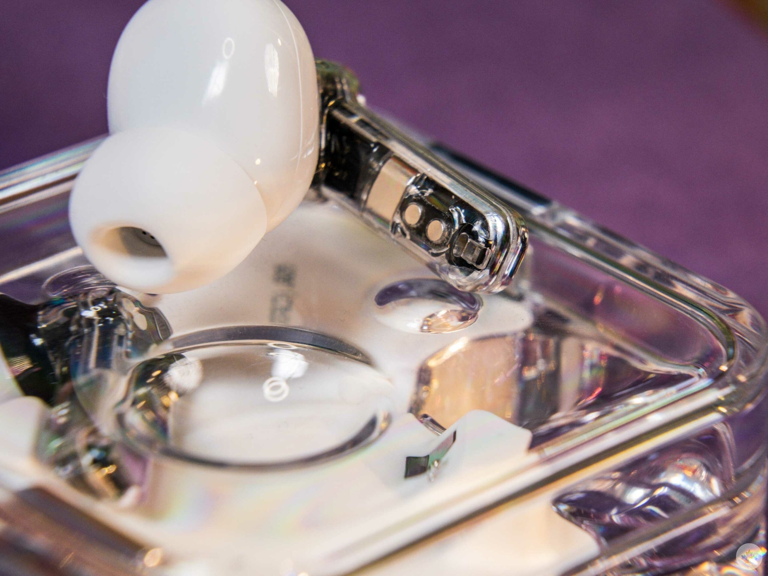
There still appears to be a fake vent on the bottom of the stem. It’s disappointing, especially after iFixit tore down the Ear (1) and revealed it would probably look cooler if Nothing showed off the small circuit board inside the buds.
When looking at the top inside of the buds’ stem, there are fewer transistors, but you really have to look closely to spot this change. Overall, these are micro changes that don’t significantly change how they feel or fit. This is a good thing for me since I found the original Ear (1) quite comfortable.
Big sound improvements
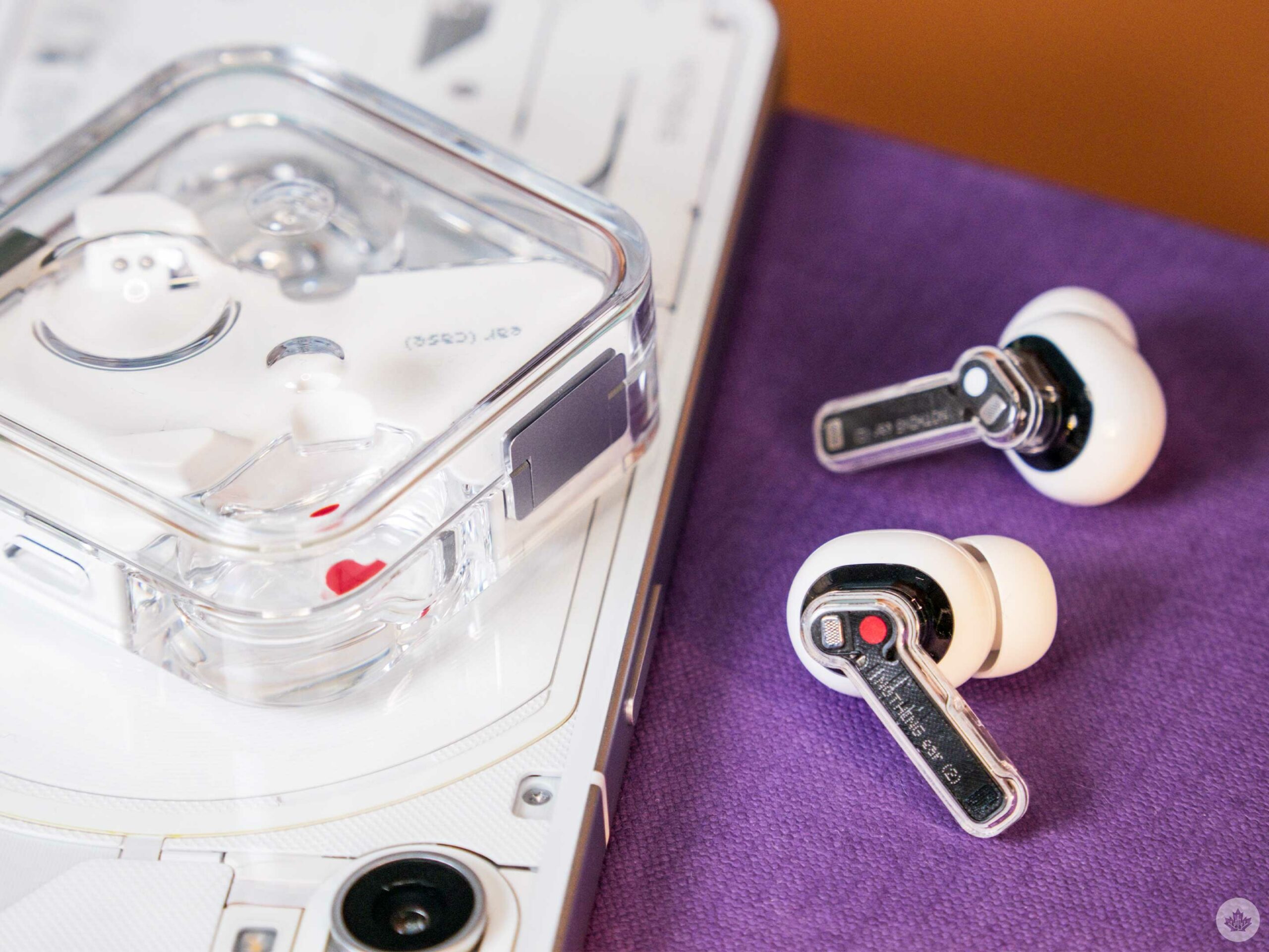
While the first generation Ear (1) was fine, the successor offers a notable improvement. The noise-cancelling (ANC) is much stronger, the performance offers more balance, less hum and a wider, more immersive soundstage. While I didn’t mind using the Ear (1), I truly enjoy listening to music with the Ear (2).
Nothing is still using an 11.6mm speaker driver, but the tuning is much better, with support for Hi-Res audio frequencies up to 24 bit/192 kHz. But I think most people will be impressed with how they sound and how much background noise they block out. It seems that something happened around the launch of the Google Pixel Buds Pros in 2022, and now most high-end buds, ranging from OnePlus to Apple, all seem to offer phenomenal active noise-cancellation. The new Nothing Ear (2) are no exception and undercuts the popular competition on price.
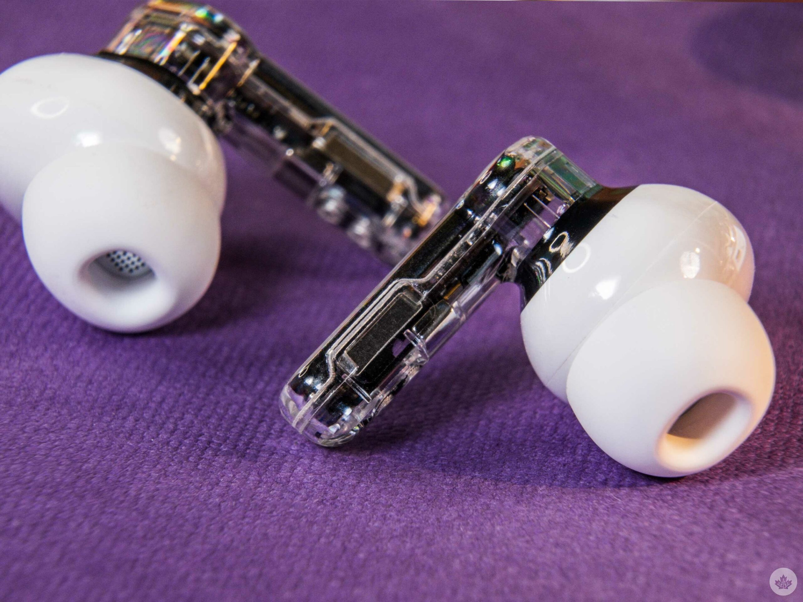
Squeeze the side of the Ear (2) to activate its controls.
The transparency mode could be better, but since I use it so rarely, it’s not something that affected me. Alongside that, users get treated to new sounds when toggling ANC and switching to transparency. Turning ANC on/off uses a subtle drum beat that’s tuned slightly differently for each function. Interestingly, when you initiate Transparency mode, the sound is a human letting out a quick breath. It makes sense since turning on Transparency feels like relief as you hear the world again, but it’s likely to be divisive amongst Nothing fans.
The lag has been reduced on the Ear (2), so watching videos is now much less frustrating, but there is still a delay when I connect them to my MacBook. On mobile, there seems to be less noticeable lag. This is a problem most wireless earbuds suffer from, but I hope Nothing works to fix it in the future. There is a low-lag mode in the app, but it’s labelled for gaming, and I don’t think there’s a way to implement it on a desktop. However, I’m still happy that I can at least watch YouTube without lag on my way to work.
The mic hasn’t changed much, but I’ve only tested it on indoor calls, and so far, it’s been passable. However, no wireless earbuds really have great mics, so I would say that the Ear (2) is usable but not for any professional audio recording.
And most importantly, Nothing has dropped its barely-functioning touch controls in favour of straightforward squeeze controls like the OnePlus Buds Pro and AirPods Pro (2nd-Gen). The company also used this superior method on its Ear Sticks.
Refinement through software
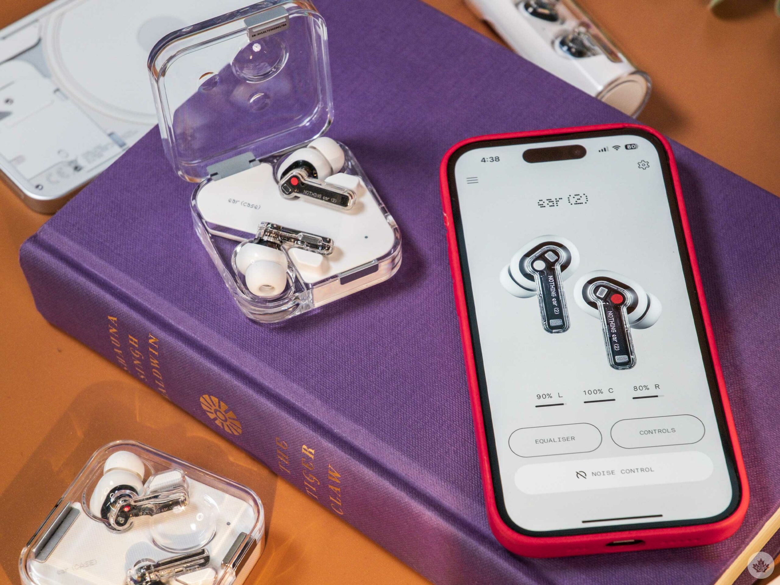
Compared to the app that launched with the original Nothing buds in 2021, the updated Nothing X app (iOS/Android) is full of features and tweaks to help users get the most out of their earbuds.
Beyond the low-latency toggle I previously mentioned, there are systems to personalize the sound levels and ANC for your hearing. There’s also a fit test, a dual connection toggle, and a button to make your earbuds chirp if you’ve lost them. This isn’t as effective as the Find My network that’s built into modern AirPods, but that’s one of the things you lose since these buds are roughly $130 less than the competing AirPods Pro.
If the music isn’t perfect, you can tune it with a standard in-app equalizer to personalize it to your taste. You can also tweak the playback controls if you’d rather have volume controls on the buds or want to tweak which bud does what.
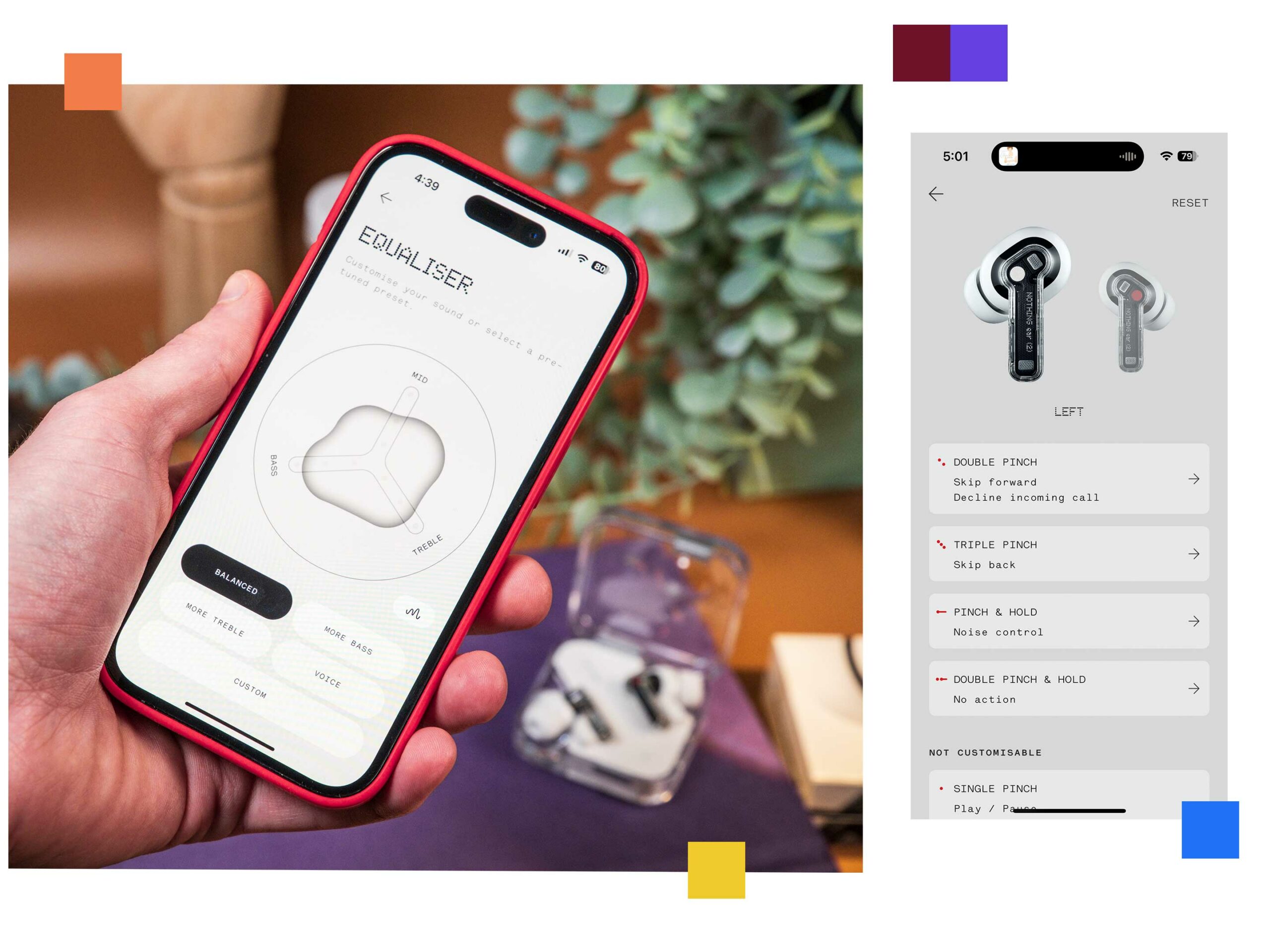
I’m sure audiophiles will be annoyed with how basic the equalizer is, but for most people, the app is easy to use and offers several controls and tweaks to help make your buds suit you. While I tried the automatic sound profile test, I ended up turning it off and bumping the bass down a notch which felt balanced to me.
Overall, there’s a lot of functionality in the app, and enjoy how much personalization you can add to the earbuds through a few tweaks in the app. It’s not much, but it gives me a nice sense of ownership over these buds compared to my Apple earbuds. With AirPods, you get what you get, and there’s a beautiful simplicity there, but the Nothing Ear (2) allows you to make them your earbuds, and combined with the care that went into the look, they feel like a product you can connect with.
Buying advice
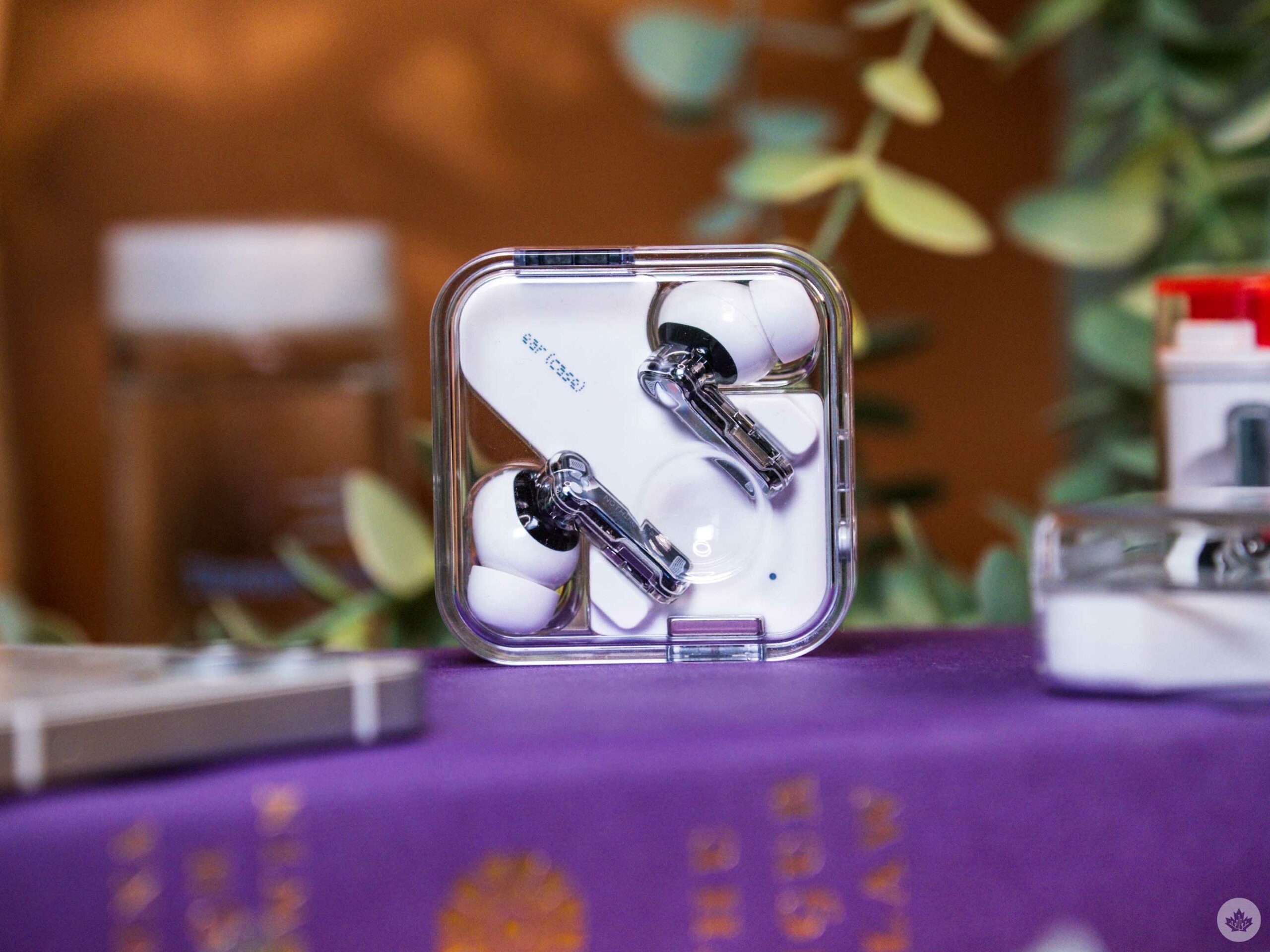
I think it's pretty clear that I really enjoy using the Nothing Ear (2) [$200]. Heck, I just love looking at them on my desk - they make me feel cool. However, Nothing has also chosen to stack these up against Apple's AirPods Pro [$329].
This time around, Nothing has come extremely close on sound quality and noise-cancelling, but the big separator here is battery life. With ANC, the Nothing buds are rated to last four hours, while the AirPods Pros can stretch out to six hours in some cases. I will caveat this by saying that I rarely find myself listening for more than two-three hours at a time, but if you know you're listening habits include long sessions, it's something to be aware of.
As mentioned before, Apple also has the lead in Find My technology with the ability to track buds and the case. Plus, all three AirPods Pro components make chirping noises if you lose them. If you live in the Apple ecosystem, I also find it more convenient to move between an iPhone and a Mac with AirPods. That said, most of the people I know with the newest AirPods Pro have complained at length about connection issues, so this might be more even unless Apple can sort out these problems.
Overall, the Nothing Ear (2) are a really compelling earbud package for a fair price at $200 in Canada. Given they undercut a lot of the competition, it's difficult not to recommend these stellar-looking buds to iPhone and Android users alike. If a good price and a great sound is all you're looking for, the Nothing Ear (2) are perfect, but if you lose buds often or value battery life for long listening sessions and live in an Apple world, the AirPods Pro might be worth the extra $130. On Android, you have more options, but for my money, I'd stick with the Nothing Buds.
"Nothing is continuing to push its fantastic product design ethos forward and this time around they sound as good as they look."
MobileSyrup may earn a commission from purchases made via our links, which helps fund the journalism we provide free on our website. These links do not influence our editorial content. Support us here.

