After spending the last few days running macOS Mojave on my work MacBook Pro I can safely say that while Apple’s upcoming desktop operating system update is mostly focused on stability improvements, there are a few interesting, quality of life features included in the public beta version of the OS.
And yes, I know installing any kind of beta software on a daily use device is not a good idea, but these are the sacrifices I make for you, MobileSyrup readers.
If you’re interested in checking out macOS Mojave’s public beta for yourself, follow this link. Apple also recently launched public betas for iOS 12 and tvOS 12.
Read on to get a quick overview of six of macOS Mojave’s most useful new features.
1. Let’s get a little dark

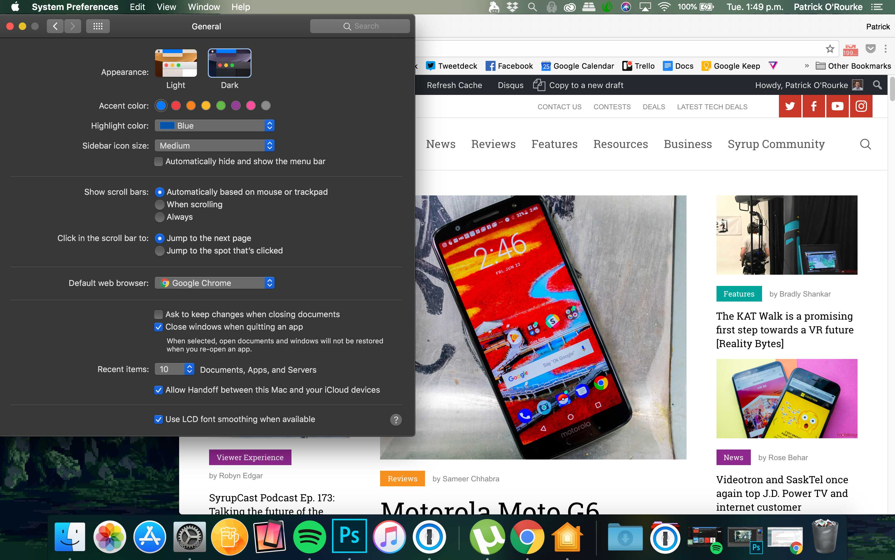
First and foremost, macOS Mojave now finally features an official ‘Dark Mode.’ While a minor change, as someone who spends a solid eleven plus hours a day staring at various screens — including at the very least, nine or so on my work computer — the darker colours are significantly easier on my often tired eyes.
To be clear, macOS 10.13 allowed users to flip the dock and top menu bars to a darker shade. Now, however, Apple’s entire desktop operating can turned to a Dark Mode.
While it’s easy to poke fun at how ridiculously excited developers were during Apple’s WWDC 2018 keynote regarding the arrival of Dark Mode, it really is a big deal for those of us who spend much of our lives glued to a computer screen.
2. Clean up that clutter, yo
I’ve always kept my desktop neat, tidy and organized into meticulous folders, but I know I’m in the minority when it comes to this. In an effort to help those that are tired of their desktop looking like a painful dumpster fire of doom, Apple has added a new feature called ‘Dynamic Stacks’ that automatically sorts similar files into specific groups.
These groups can that be arranged in terms of creation date, tags, and type, lining up on top of one another. Opening a specific stack is also easy and required a click to expand and then a double-click to launch.
Stacks are sort of like a standard folder, but also aren’t. They act as a shortcut of sorts that give access to files you frequently need to open.
Note: The red box around the recently used apps section of the Dock isn’t actually featured in Mojave. I just included it to specifically show where the most recently apps appear. That said, I did make it with the OS’ new Markup feature.
3. Doodle your life away
Signing documents digitally isn’t an easy process, with many people often moving to third-party programs to get the job done. Similar to iOS 11’s Markup feature, allowing users to add text and colourful doodles to screenshots, the same thing is now possible with Apple’s desktop operating system.
While signing documents with a saved signature through Apple’s macOS image preview app has been around for years now, making more comprehensive notes, diagrams and scribbles hasn’t been a straightforward process. In fact, most users likely turned to Adobe programs like Photoshop to get the job done.
Now with Markup coming to Quick Look in macOS Mojave, this is no longer an issue.
4. Screenshot functionality gets expanded
Snapping screenshots remains the same in macOS Mojave as it always has been, but what you’re actually able to do with an image after you’ve captured it has been expanded significantly.
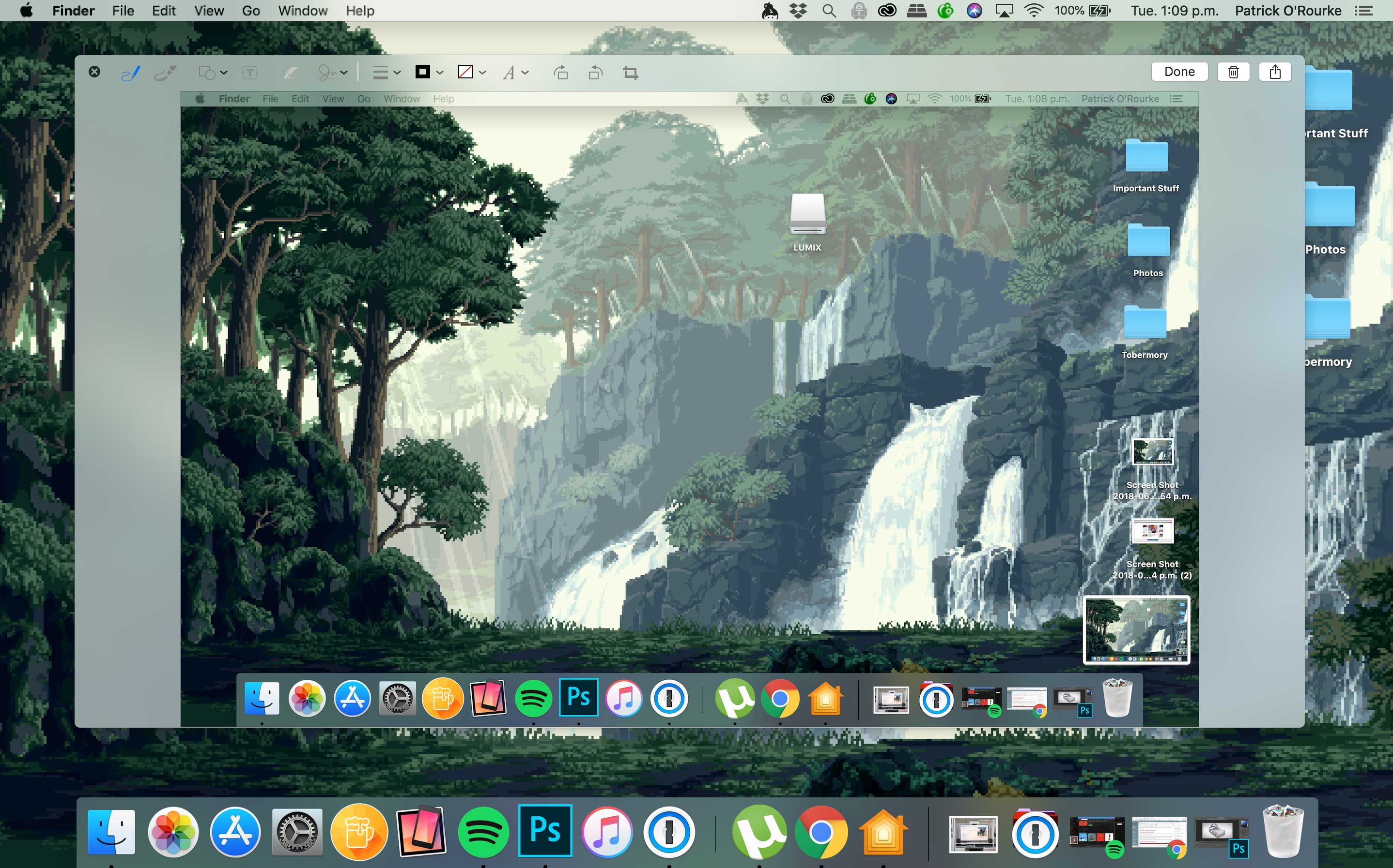
For instance, just like iOS 12 — you’re probably noticing a theme here at this point — a thumbnail now appears in the bottom right corner of the display when a screenshot has been taken. Double-clicking the thumbnail opens up the same Markup tool discussed above, allowing users to make quick edits to an image.
Further, it’s now even possible to record video directly through macOS, both full screen and specific areas of the display.
5. iOS apps finally come to macOS Mojave
While you could argue that Home, Voice Memos and Stocks aren’t exactly the best iOS apps to port over to macOS, the underlying technology that facilitated these ports is what’s more important.
macOS and iOS will never merge into a unified operating system, according to Apple. What is happening, though, is a new initiative by the tech giant to bring more quality apps to macOS’ marketplace by making the porting process easier for developers. Apple has also launched an editorial revamp of its desktop App Store, just like the company did with iOS 11 last year.
The apps themselves are a little glitchy, especially Home, which looks like a somewhat lazy direct transfer of its iOS counterpart. The important thing here is that this is the start of something really interesting for Apple. As a side note, being able to control my smart home setup’s various lights, as well as my Ecobee 4 and HomePod, all directly from my MacBook, is pretty useful.
In the U.S. Apple has also launched an Apple News desktop app, though News’ Canadian launch remains elusive.
6. Easier access to your favourite apps

Taking yet another page from one of my favourite iPad iOS 11 features, your most used apps now show up in a specific section located in the middle of macOS Mojave’s dock.
This is far from a huge change, but if you’re like me and often have a few apps open you’re constantly switching between, this makes it a little easier to jump between open programs. If you happen to not be fond of this new feature, there’s an option in ‘System Preferences’ called ‘Show Recents in Dock’ that allows you to turn it off.
Note: Yet again, that red box is not part of the actual feature.
MobileSyrup may earn a commission from purchases made via our links, which helps fund the journalism we provide free on our website. These links do not influence our editorial content. Support us here.


