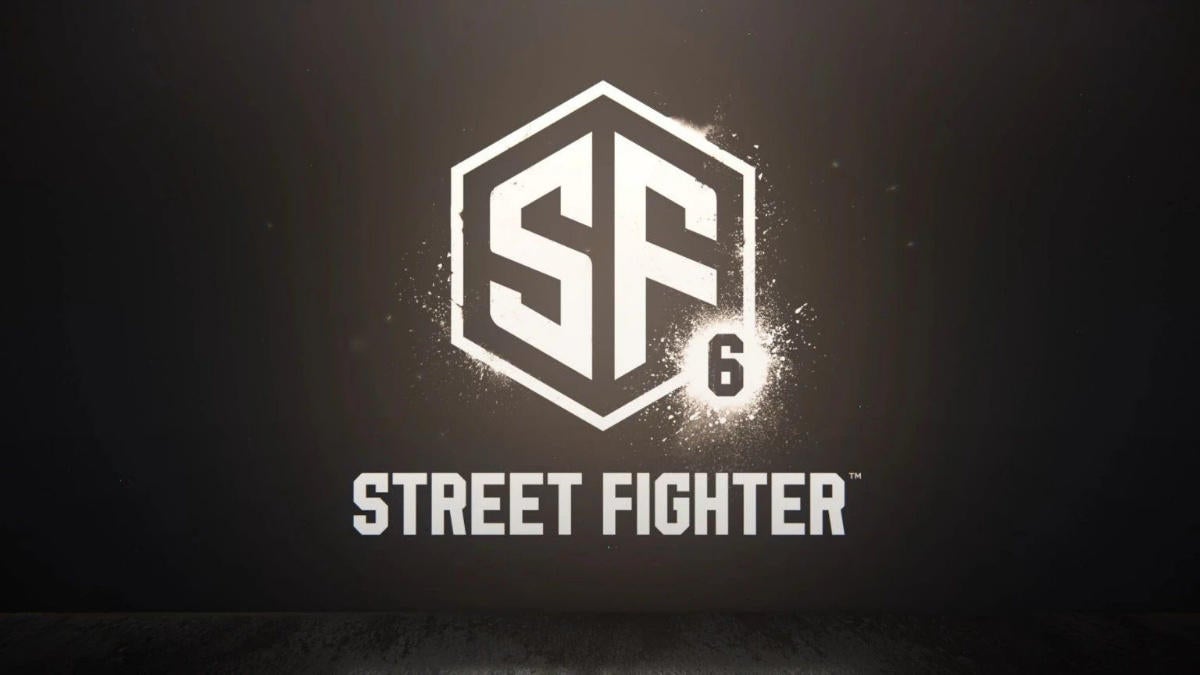
After a week-long countdown, Capcom formally unveiled Street Fighter 6 on February 21st in a short cinematic trailer.
However, one element of the reveal has received some criticism: the game’s logo. As first pointed out by Ars Technica creative director Aurich Lawson on Twitter, the Street Fight 6 logo is extremely reminiscent of an image from Adobe’s Stock site.
The new Street Fighter 6 logo is $80 on Adobe's Stock site
I don't even know what to say. I knew it was generic but I didn't realize it was this bad. They searched for "SF" on a stock logo site and rounded a couple corners and added the 6
I cannothttps://t.co/SViXFjElou pic.twitter.com/yOzYePaYfV
— Aurich (@aurich) February 21, 2022
“I knew it was generic but I didn’t realize it was this bad. They searched for “SF” on a stock logo site and rounded a couple corners and added the 6,” wrote Lawson.
Indeed, the logo is strikingly similar to the $80 USD ($102 CAD) Adobe image, which was created by a user called xcoolee. Speaking to IGN, xcoolee said they were looking to the exclusive rights to the logo to Capcom.
The design has also been used publicly before, such as in a different modified form for the SF Connexion sci-fi convention in France. Capcom has not yet commented on the logo, so it’s unclear whether this was a conscious decision on someone at the company.
For now, though, the publisher has simply said more details on the hotly anticipated fighting game will come this summer.
Via: IGN
MobileSyrup may earn a commission from purchases made via our links, which helps fund the journalism we provide free on our website. These links do not influence our editorial content. Support us here.


