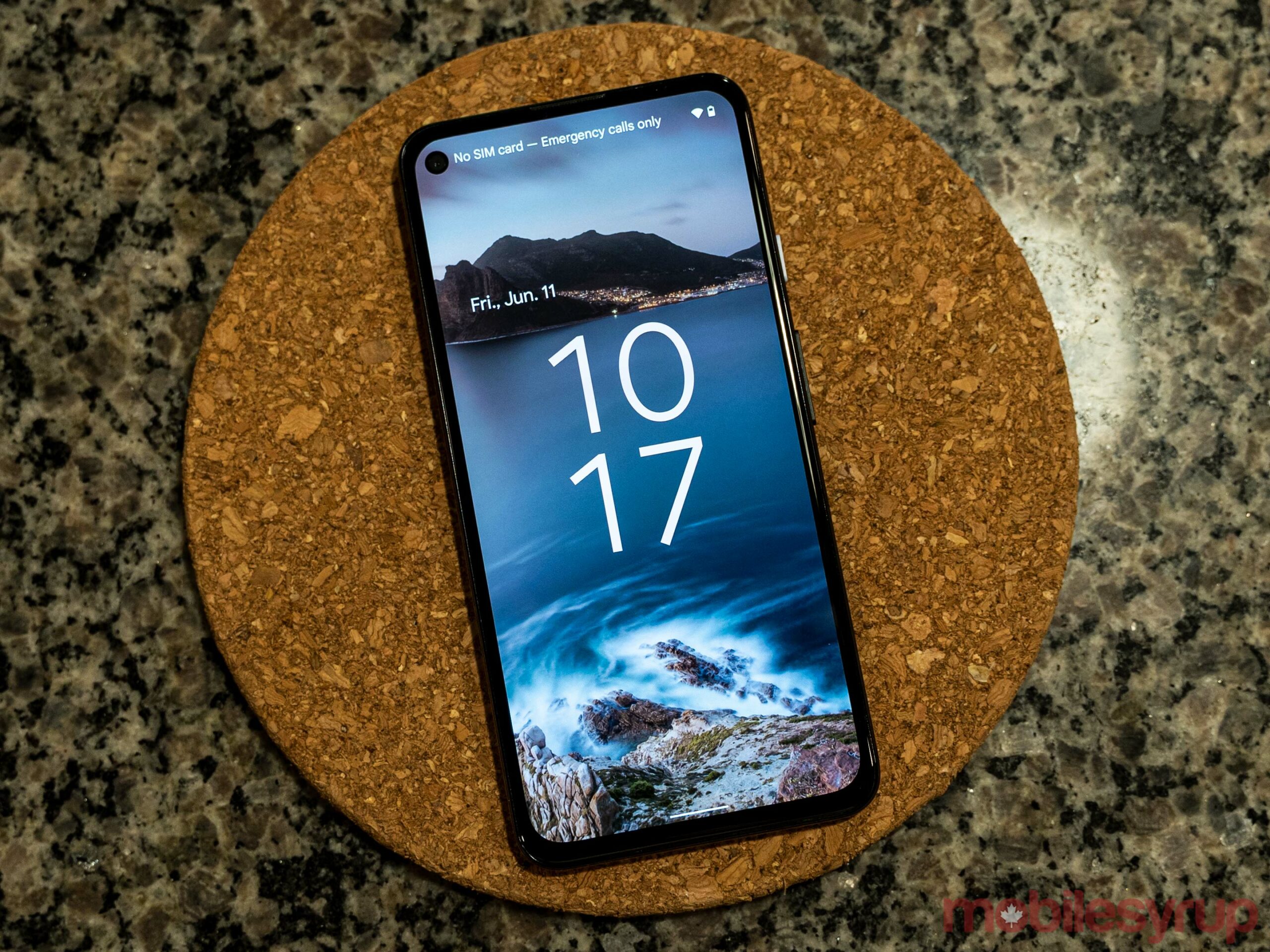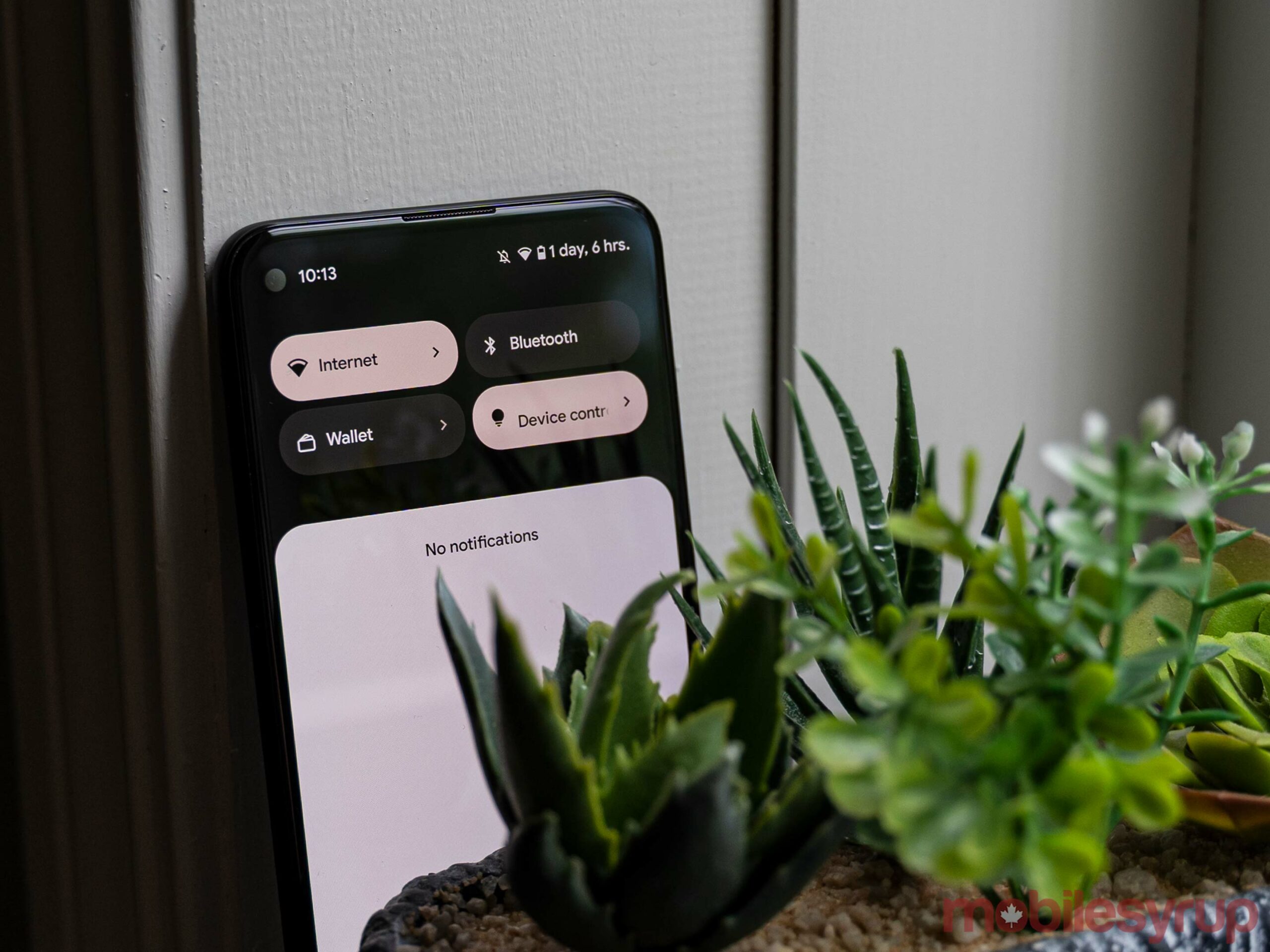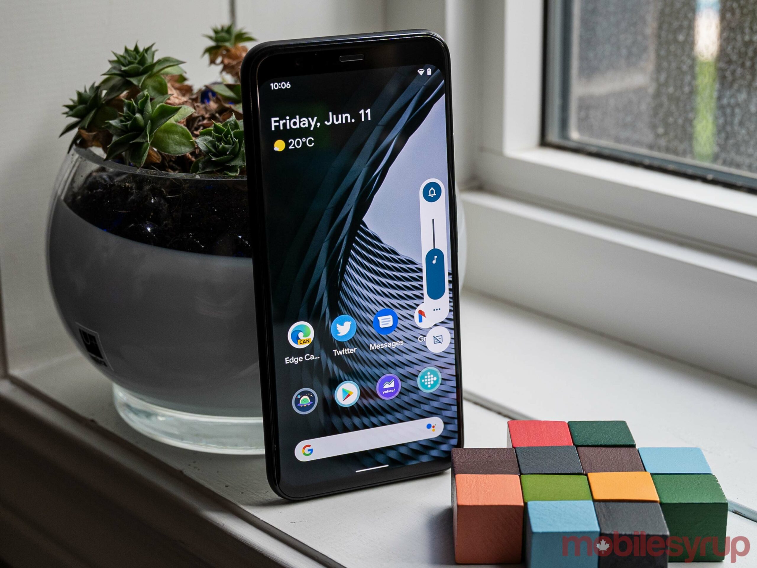
Android 12 Beta 2 brought a bunch of new features when it arrived this week, including the much-anticipated ‘Monet’ colour-changing user interface elements.
I’ve had the opportunity to play around with Beta 2 on a Pixel 4 and Pixel 4a 5G and it is really cool, if a bit buggy. I’m positive Google will work out those kinks before launch, however. If you’re interested in trying it out, you can enroll eligible Pixel phones in the beta here, although I’d recommend holding off if you’re not comfortable running beta software or troubleshooting bugs and other issues that can stem from running beta software.
The "Monet" color-changy stuff works in Android 12 now, and I would like to report that it is HOT. pic.twitter.com/tqJPRcPzIm
— Ron Amadeo (@RonAmadeo) June 9, 2021
Anyway, to kick things off, Ars Technica’s reviews editor Ron Amadeo posted an excellent breakdown of the Monet colouring in Android 12 on Twitter. It shows six different wallpapers with the corresponding colours applied by Android 12 to interface elements like the lock screen clock and quick settings tiles.

Of course, the system isn’t perfect either. Amadeo goes on to note that sometimes Monet selects colours that aren’t ideal, and this can happen more frequently with wallpapers featuring lots of different colours. However, an easy remedy for this would be if Android 12 offered a selection of colours to users so they could pick the final result.
Alternatively, Google can tweak the system more before release to avoid certain combinations of colours that don’t look good or can be hard to read.

In my own testing, I found that Android 12 often got stuck on colours after changing the wallpaper. For example, I change from a wallpaper that generated a pink-ish shade for the quick settings to a blue wallpaper — some elements, like the lock screen clock, turned blue, but the quick settings remained pink.
A reboot put things back in order, but hopefully the final version doesn’t require a reboot after each wallpaper change to fix colours.

On that note, it’s important to remember that Android 12 is still a beta, which means things aren’t final and can change. Android 12’s fancy colour-changing interface works, even if it has some issues — that should be expected in a beta. When Android 12 releases in the fall, I think Google will have resolved most of these issues.
Also, that absolute unit of a volume slider is gone now, replaced with the much nicer one seen in the pictures above, so that’s a pretty big plus.
Source: Ron Amadeo
MobileSyrup may earn a commission from purchases made via our links, which helps fund the journalism we provide free on our website. These links do not influence our editorial content. Support us here.


