Google revealed some major design changes coming in Android 12 at its I/O developer conference this week. Overall, the new design looks great, but there are some elements that people are less excited about.
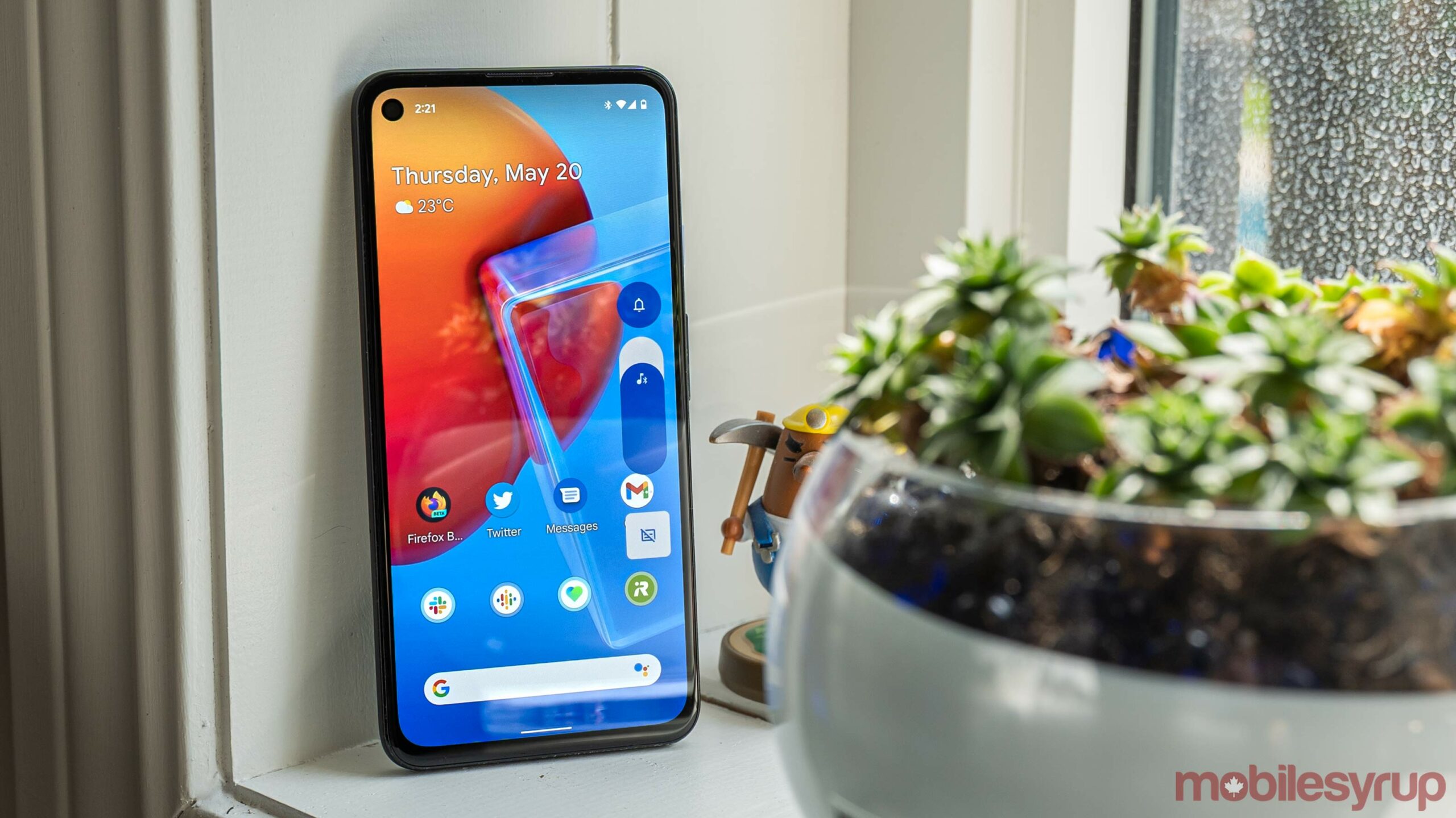
One such design element: the volume slider. If you haven’t seen it yet, it’s huge. Massive. An absolute unit. People don’t seem like it very much (I happen to think it looks nice, but it does have issues).
Well, those who dislike the new volume slider will be happy to know it’s not long for this world. XDA Developers’ Mishaal Rahman spotted a much better volume slider include in a newer build of Android 12 than the currently available beta. In the newer build, the volume slider has a similar style, but it’s much narrower.
Aside from being narrower, the slider is contained within a larger structure that also includes the vibrate/silent/ring toggle (now with all three options readily available instead of hidden behind a tap). The new volume slider also ditches the Live Caption toggle but keeps the three-dot menu button at the bottom, now contained within the volume slider structure instead of floating below.
Another look at the slightly newer volume panel coming to #Android12 pic.twitter.com/wtbGIyYcuk
— Mishaal Rahman (@MishaalRahman) May 18, 2021
Finally, the new slider features a line that more clearly indicates the actual volume level compared to the slider in Android 12 Beta 1.
Overall, the updated slider is great, albeit not perfect. The missing Live Caption toggle will likely frustrate some users, as will the missing mute button (in Android 11, you can quickly mute the volume by tapping the music note icon). If Google figures out a way to bring both those toggles back into the design, it’d make this volume slider just about perfect.
Source: @MishaalRahman Via: Android Police
MobileSyrup may earn a commission from purchases made via our links, which helps fund the journalism we provide free on our website. These links do not influence our editorial content. Support us here.
