Android 11 has finally launched, and now, Samsung is looking to update its user interface software with the pre-beta version of One UI 3.0. The pre-beta is only available for select developers in the U.S. and South Korea.
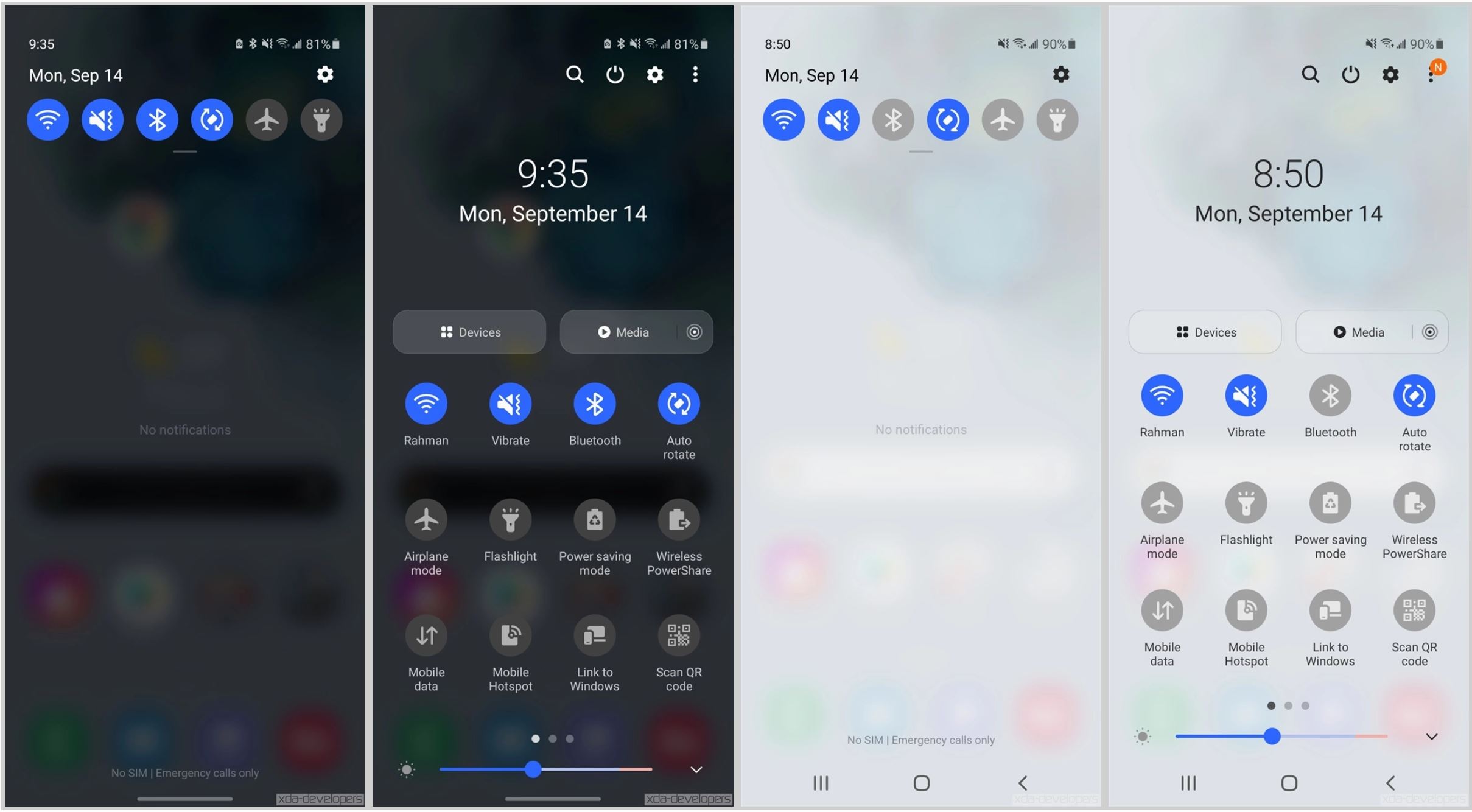
Early screenshots from XDA Developers showcase what to expect from the upcoming user interface.

First and foremost, Samsung has redesigned its ‘Quick Settings’ and notification panel while applying a blur effect behind notifications. Following that, there’s a new volume panel design with vertical sliders for different forms of media. Additionally, there’s a toggle for Live Caption. However, that’s not a feature available for all of the Samsung Galaxy devices getting One UI 3.0.
There’s also a slight redesign in the overview panel where the card that’s currently in focus gets a bit bigger.
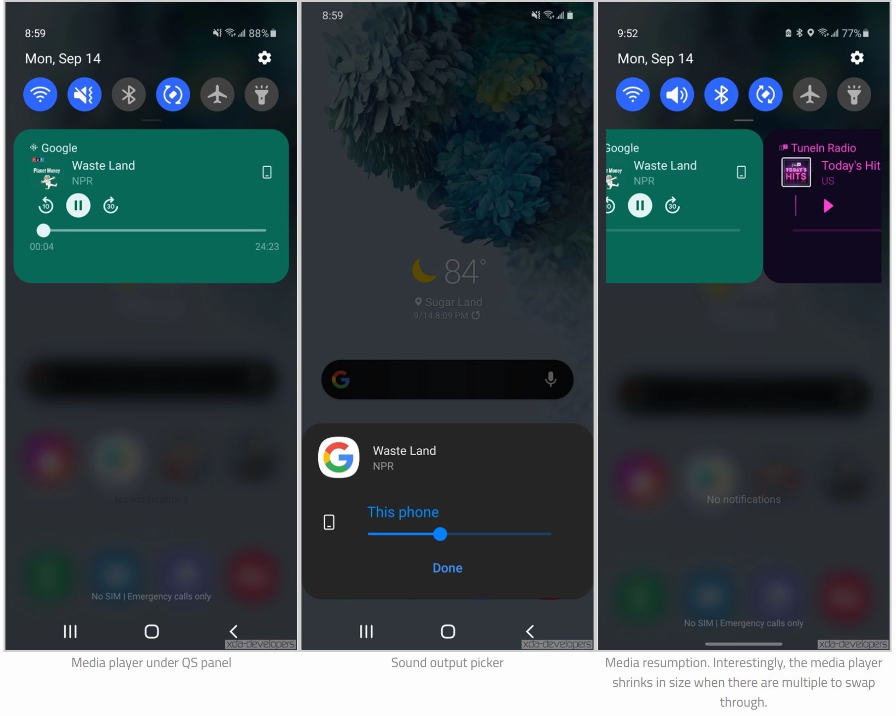
Since Samsung’s One UI 3.0 is based on Android 11, the user interface now features a media player under the quick settings panel and a sound output picker. There’s also media resuming functionality, although it gets smaller when there are multiple media players to choose from. Additionally, bubbles for notifications are available, as are notification history, conversations and more.

There also appears to be a loss of the quick access wallet feature that lets users quickly pull up Google Pay. Further, Bixby is getting some new upgrades, like being able to apply a custom icon for each routine.
There’s also an option to hold an app on your home screen to display all of the widgets that can be added to it.
The public beta will be available for the S20 lineup in China, Germany, India, Poland, South Korea, the U.K. and the U.S., but Samsung has yet to announce the release date.
Image credit: XDA Developers
Source: XDA Developers
MobileSyrup may earn a commission from purchases made via our links, which helps fund the journalism we provide free on our website. These links do not influence our editorial content. Support us here.


