Google is pushing a small design tweak for the Photos app’s navigation drawer, including a more compact account switcher.
The tweak started rolling out over the weekend. At first, it appears nothing significant has changed, but there’s more than meets the eye.
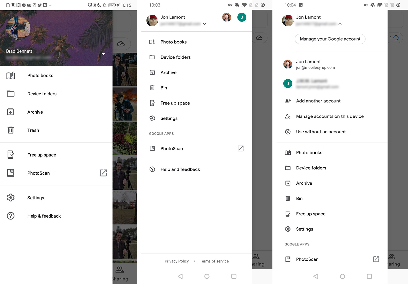
First up, Google got rid of the cover photo-style account switcher — a hold out from the recently shut down Google+ — and replaced it with a simpler option.
Now, when you slide open the navigation bar, the account switcher is a small section with your Google account photo, name and email address. It also shows the profile pictures of your other Google accounts signed in on your device.
If you tap the small arrow next to your name, the section expands so you can quickly switch to other accounts, manage your accounts or choose to use Photos without an account.

Further, Google has slightly reorganized the menu. All the options and icons are smaller than before, and Google got rid of the dividing lines. ‘Photo books,’ ‘Device folders,’ ‘Archive,’ ‘Bin’ (formerly ‘Trash’) and ‘Free up space’ still take up the top five slots. Settings rose up the menu and sits below Free up space now.
Finally, there’s a new ‘Google Apps’ section, including a link to download the company’s ‘PhotoScan‘ app.
As per usual with small visual tweaks like this, the change appears to come from a server-side update. The new look was present on a OnePlut 6T running Android Pie and a Pixel 2 XL on the Q beta here at MobileSyrup. Your mileage may vary.
Source: 9to5Google
MobileSyrup may earn a commission from purchases made via our links, which helps fund the journalism we provide free on our website. These links do not influence our editorial content. Support us here.


