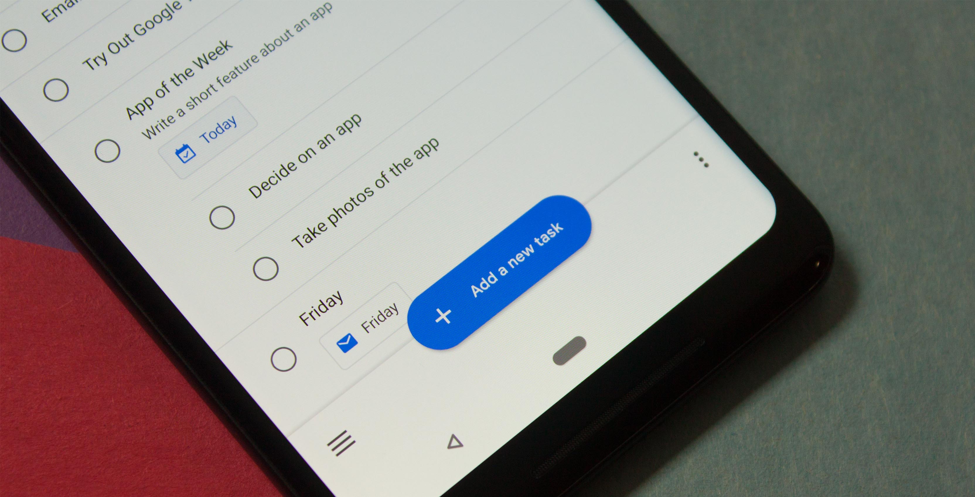
Google released a new to-do list app alongside its Gmail redesign earlier this year, a stark, white, barren app with nothing but items and boxes to check. It’s called Google Tasks.
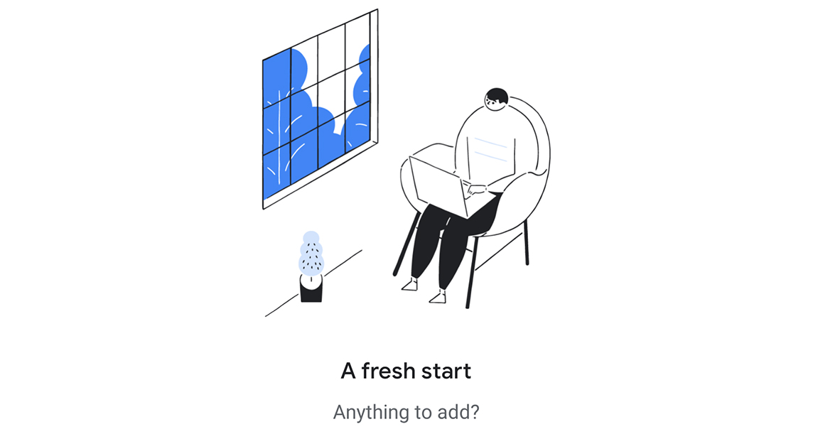
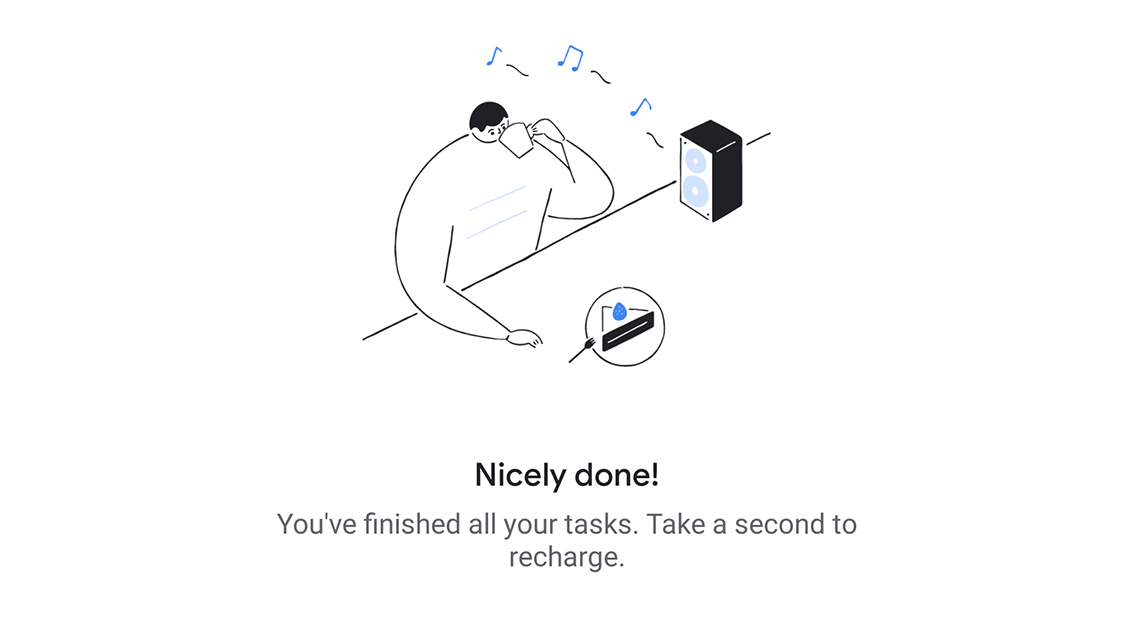
Some lament the design, understandably. The white is quite white — one might say searing, especially when witnessed at full brightness in a dark room. Other than highlights of blue, the only visually exciting elements are doodles you see when you have no tasks.
There isn’t a lot to the app. But maybe that’s exactly how you want it.
Three buttons
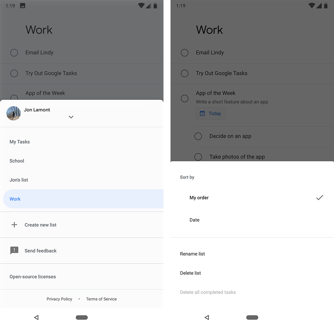
Google Tasks sports Google’s new Material Design and looks sharp doing it. Tapping one of three buttons slides a card up from the bottom of the screen.
The three buttons are simple. The left most opens a menu where you can switch Google accounts and change which list of tasks you’re looking at. The right most opens a menu where you can sort tasks by the order you set or by the date. You can also rename or delete lists.
The last button is big and blue and does one thing: adds a new task.
Adding a task is a simple process. Tap the button and type in the task. You can add a description and attach a date.
Each task can also have subtasks. Each subtask can have a description and date as well.
Clicking the date attached to a task opens a small calendar to show you how far away it is.
If you’re using the redesigned Gmail, you can select an email and click “Add to Tasks.” Gmail will drop it into Google Tasks with a button that links to the email.
That’s it. That’s all.
Not a lot to it
Of course, there are more features coming.
With the way Google’s been pushing artificial intelligence, I’m certain we’ll see some AI baked into Tasks soon. Google Assistant support and Reminders support are no-brainers as well. I’m sure we’ll see Google Calendar support too.
However, there are some features that are staple in to-do apps that are lacking in Tasks. Yes, you can set a date for a task, but you can’t set a time or a place. You can’t add tags to help sort tasks. You can’t measure progress on tasks.
Then again, Tasks is about doing. It’s stark and barren because all you’re supposed to do is fill the empty space with items, then check off the box when its done. The binary of it is refreshing.
Tasks is a good start for Google, which has nearly as many to-do apps as it does chat apps. It’s simple and plain and does what its supposed to do. To make it a real winner though, Google needs to add some spice. Don’t complicate it, just a dash of AI here, a sprinkle of integration there, and Tasks will be well on its way to dominating to-do apps everywhere.
MobileSyrup may earn a commission from purchases made via our links, which helps fund the journalism we provide free on our website. These links do not influence our editorial content. Support us here.


