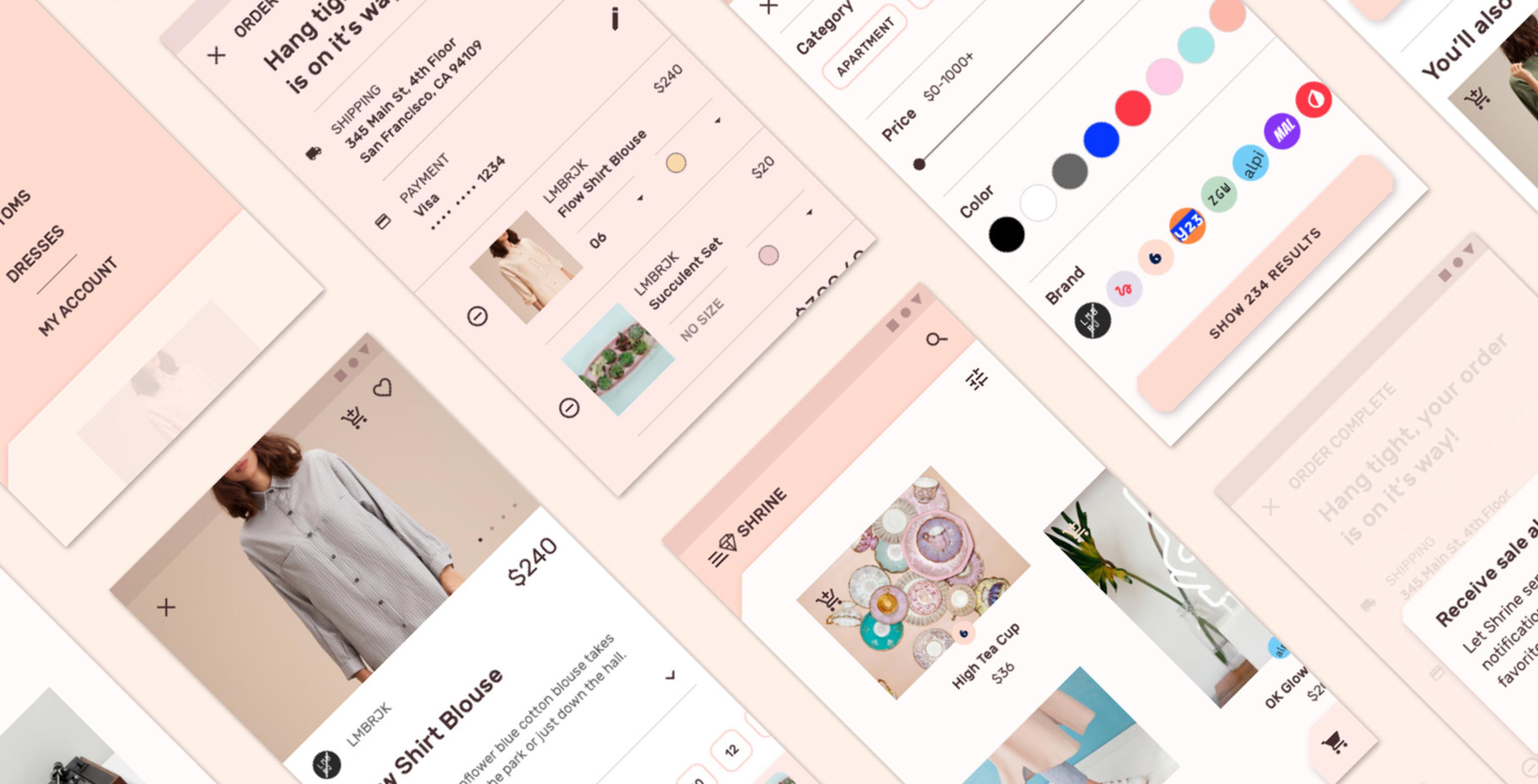
In 2014, Google introduced Material Design in an effort to unify not only its lineup of Android-related products, but also to create some sense of cohesion across the entire Android ecosystem. As is usually the case when a company attempts to impose a proscriptive system, there were unattended consequences.
“We went out with the original Material Design with what was a very fresh and opinionated style. We wanted to get attention and respect of not just of users but the design community,” said Matías Duarte, vice president of design at Google, at a press roundtable held during the company’s recent I/O 2018 developer conference.
“It was so strong, so opinionated and so successful that a lot of the developer and design communities took it as gospel.”
In short, a lot of Android apps, even ones that weren’t created by Google, started to look the same. Worse yet, even after years of Google telling developers Material Design was only a set of guidelines, some brands chose never to engage with it — Facebook is one notable holdout, much to the dismay of the Android faithful.
The new Material Design, which Google has been introducing to its products at a gentle pace, starting with products like Gmail and the new Tasks app, attempts to address the issues that came with the original Material Design.
Just don’t call it Material Design 2.
One of the most integral parts to the new Material Design is a concept called Material Theming.
Material Theming represents an expanded set of guidelines that attempts to separate style and function from software development. On an even more practical level, it’s a plugin for Sketch, one of the most widely used vector editors in the industry, as well as a variety of other tools, that allows developers, both big and small, to adopt Material Design to their exact needs.
![]()
For instance, with the new Material Theming tools, outside design teams are no longer restricted to using just Roboto, Android’s system font, which Google interface designer Christian Robertson created in 2012. Instead, they can import a typeface of their choice and the company’s Sketch plugin will take care of ensuring the font scales and functions properly in the context of an Android app.
Designers also have access 3,000 additional icons, across four different sets, to use inside of their apps. Similarly, they’re now able to employ a much more expansive set of colour palettes.
In the words of Rachel Been, creative director for Material Design at Google, Material Theming allows for “infinite possibilities of stylistic express with guardrails.”
“What Material Theming allows us to accomplish is a design system for making design systems. So that anyone, no matter how small of a developer they are or how few designers they have, can make a design system for themselves using Material as the basis,” adds Duarte.

But as much as this latest iteration of Material Design marks a new phase in Google’s relationship with Android’s developer ecosystem, it’s also an important inflection point in how the company approaches the design of its own products.
With all the tools it created, Google also had to take a step back and evaluate how it wanted users to look at its first-party offerings.
That year long process involved input from more than 30 internal design teams at Google, as well as 17 design sprints. To that end, Google focused on reworking four aspects of its take on Material Design — typography, whitespace, colour, as well as focus and elevation — all with one goal in mind.
“We wanted to signal to users that they’re using a trustworthy and innovative product that is perhaps something only Google can make for them,” says Bethany Fong, UX lead for Material Design.
Starting with typography, the company developed a new proprietary typeface called Google Sans — which is not to be confused with Roboto.
Google Sans, according to Fong, was designed to invoke familiarity with the company’s brand. Additionally, Google took into consideration how the font could scale both in terms of visual size and across mediums; the company is using Google Sans not only inside of its software products but on large billboards advertising products like the Pixel 2.
![]()
In the lead up to I/O, as Google started to roll out Gmail’s redesigned web client to users, people took notice of the new Material Design and began to question just how much white space was in the redesigned app.
But hearing Fong explain the decision, her team’s direction makes a lot of sense.
“We noticed there were a lot of different backgrounds that were proliferating across our products,” says Fong. “We wanted to cut back on the visual muddiness that was creating.”
Additionally, Fong says the white space serves to highlight the content users are creating, letting it “shine”.
Fong’s colleague, Taewan An, one of the designers that lead the News redesign Google plans to launch next week, says his team treated “white as a primary colour.”
“We didn’t treated it as a background colour,” he adds.
That said, while white space is an important part of the new Material Design, the UX team did some of its most interesting work with colour.
With its updated design language, Google wanted its signature colours — blue, red, yellow and green — to serve a purpose whenever users see them together in a software experience. “They’re not decorative whenever they appear on screen,” says Fong.
https://twitter.com/RDRv3/status/989195411352006656
In the new Gmail, for example, the compose button features the four colours together. On Android, meanwhile, the home button comes alive with colour whenever the user long presses it to activate Assistant. In both cases, one of the most important parts of each experience’s functionality is highlighted by Google’s colours.
Additionally, Fong’s team spent a lot of time thinking about accessibility, especially as it relates to the company’s use of colour. To that end, her team created tonal variations of the company’s signature colours that make them more readable to users with low-vision.
Lastly, her team tweaked Material Design’s elevation system, so that it is simpler across the board.
What we’ve seen from apps like Gmail and Tasks is just the start of the new Material Design. For apps like Maps, which have large, sprawling codebases, the move to the new Material Design is going to take time, and is more than likely going to happen bit by bit.
“The redesign process is not one that is happening overnight. That’s one of the lessons we learned from the first Material Design,” says Duarte. “We’re at a place now with nearly all of Google is on a Material foundation. We’re trying to be more accommodating to our partner teams.”
MobileSyrup may earn a commission from purchases made via our links, which helps fund the journalism we provide free on our website. These links do not influence our editorial content. Support us here.


