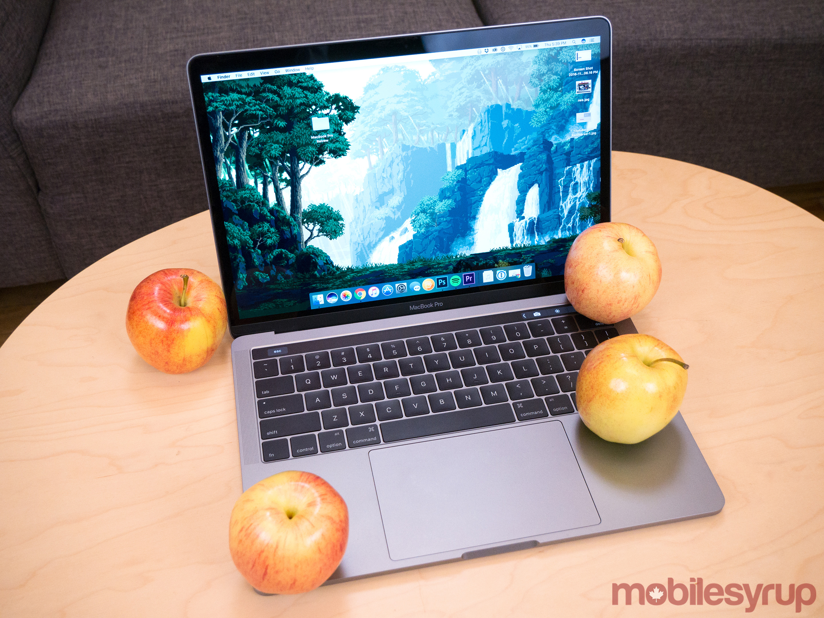
The 2016 MacBook Pro is one of the most divisive tech devices released in the last few years; it embodies everything great about Apple, but is also one of the company’s most significant missteps.
I’ve written a lot about Apple’s new lineup of ‘Pro” laptops over the last few weeks. First, taking a brief look at the 13-inch non-Touch Bar model, and then honing in on the Touch Bar iterations, as well as touching upon what it’s like to have lived the ‘dongle life’ for the past year. Now, I’m taking an overall look at the 13-inch and 15-inch MacBook Pro.
Let’s unpack a few things first: the new MacBook Pro is pricey, starting at an astounding $1,899 CAD for the 13-inch model without the Touch Bar, and then $2,229 for the 13-inch with a Touch Bar and Touch ID. The 15-inch costs even more, coming in at $2,999 to start.
Apple’s laptops have always been expensive, especially when a new iteration is launched. Remember how much the MacBook Air cost only a few years ago, or the Pro’s various minor facelifts? Still, even with that said, Apple’s new line of MacBook Pros are pricey laptops and the jump in cost has likely never been this significant.
What you get for that hefty cost may not be worth it depending on what you expect from Apple’s new line of professional machines.
Specs
MacBook Pro 13-inch with Touch Bar & Touch ID
- Starts at $2,299 CAD
- 2.9 GHz dual-core Intel Core i5 processor with Turbo Boost speeds up to 3.3 GHz
- Intel Iris Graphics 550
- 8GB of 2133MHz LPDDR3 onboard memory
- 256GB of flash storage
- Built-in 49.2-watt-hour lithium-polymer battery, 10 hours of battery life
- Four Thunderbolt 3 ports
- 3.5mm headphone jack
- Silver and Space Grey colour options
- 13.3-inch LED backlit IPS display with 2560 x 1600 pixel native resolution at 227 ppi
- 1.37 kg
- 1.49cm height
MacBook Pro 15-inch with Touch Bar & Touch ID
- Starts at $2,999 CAD
- 2.6 GHz quad-core Intel Core i7 processor with Turbo Boost speeds up to 3.5 GHz
- Radeon Pro 450/Radeon Pro 455 graphics
- 16GB of 2133MHz LPDDR3 onboard memory
- 256GB of flash storage
- Built-in 49.2-watt-hour lithium-polymer battery, 10 hours of battery life
- Four Thunderbolt 3 ports
- 3.5mm headphone jack
- Silver and Space Grey colour options
- 15.4-inch LED backlit IPS display with 2880 x 1800 pixel native resolution at 220 ppi
- Force Touch trackpad
- 1.83 kg
- 1.55cm height
The Touch Bar is great, when it makes sense
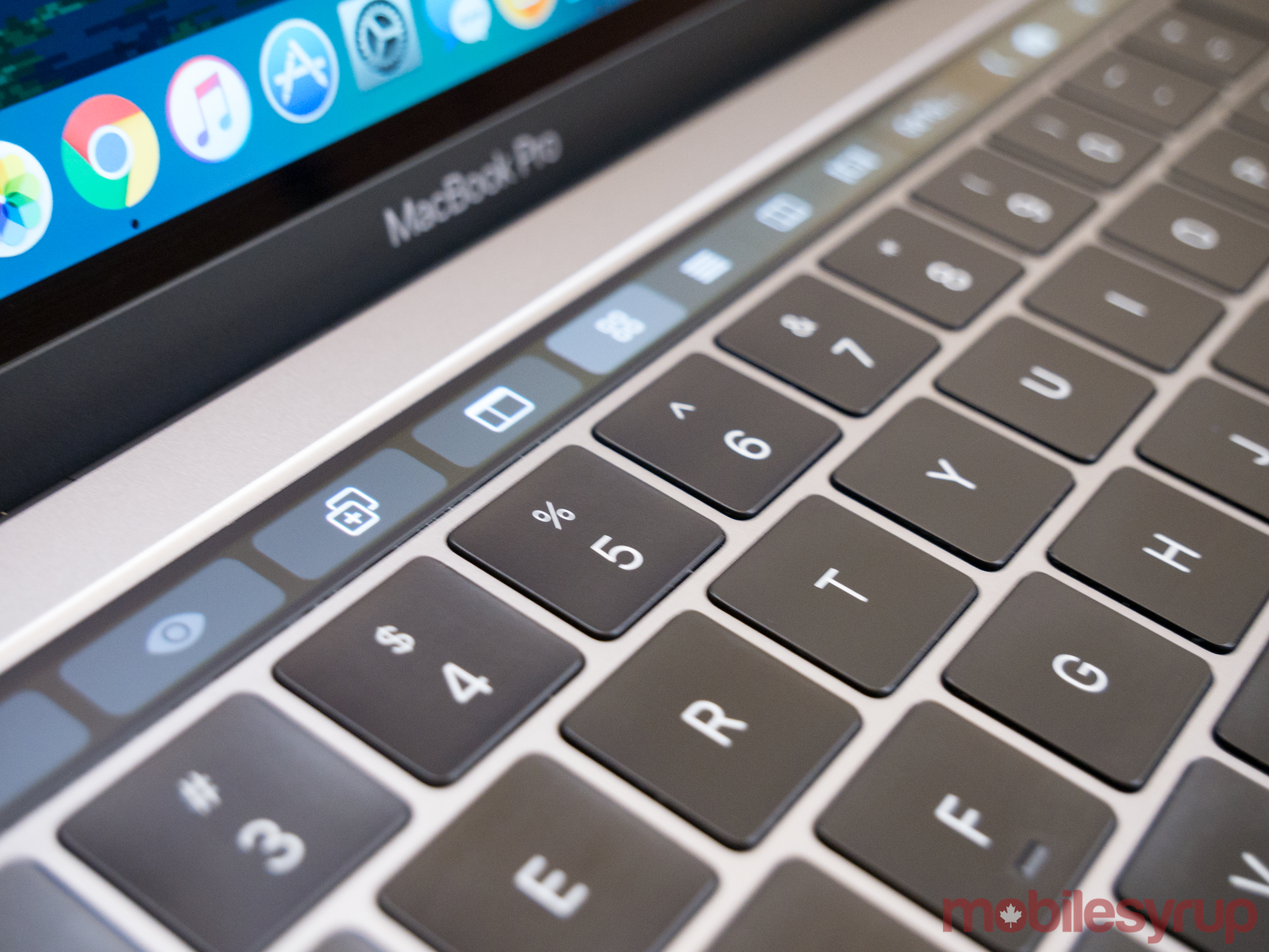
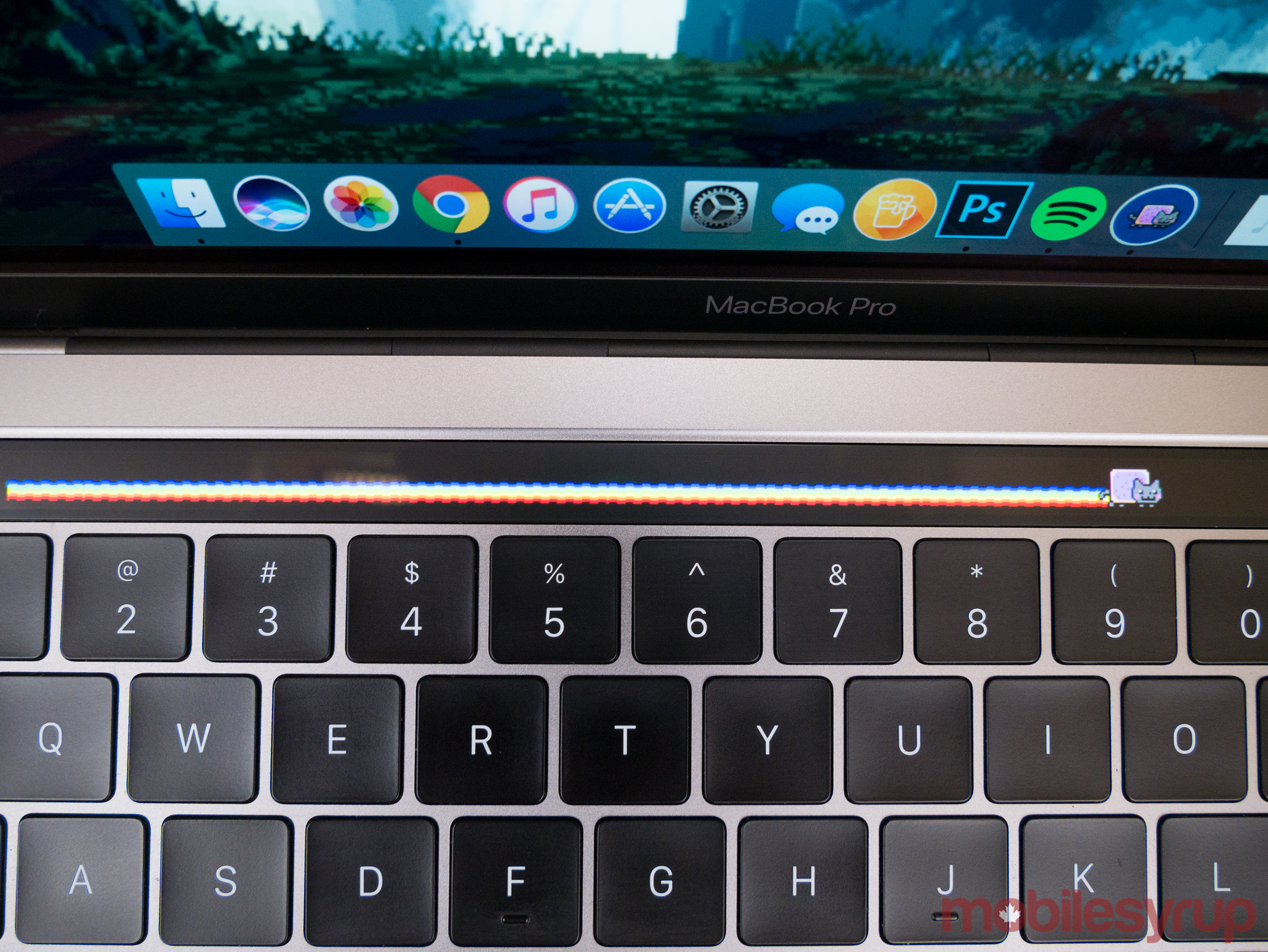
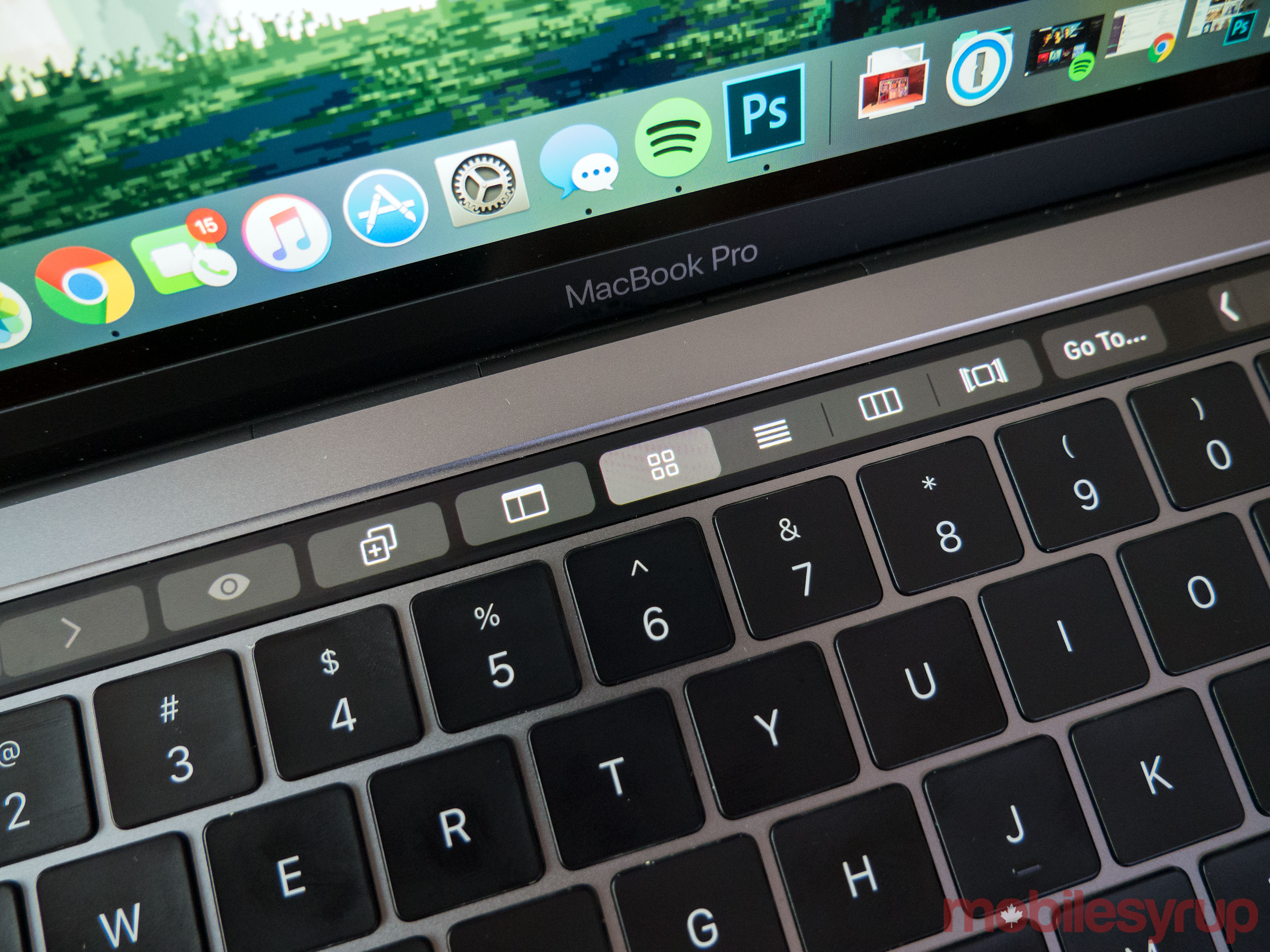
As I predicted in my MacBook Pro with Touch Bar preview, Apple’s new Pro touch interface is a fascinating experiment, though it doesn’t always make sense, especially when you need to actually access the computer’s virtual function keys.
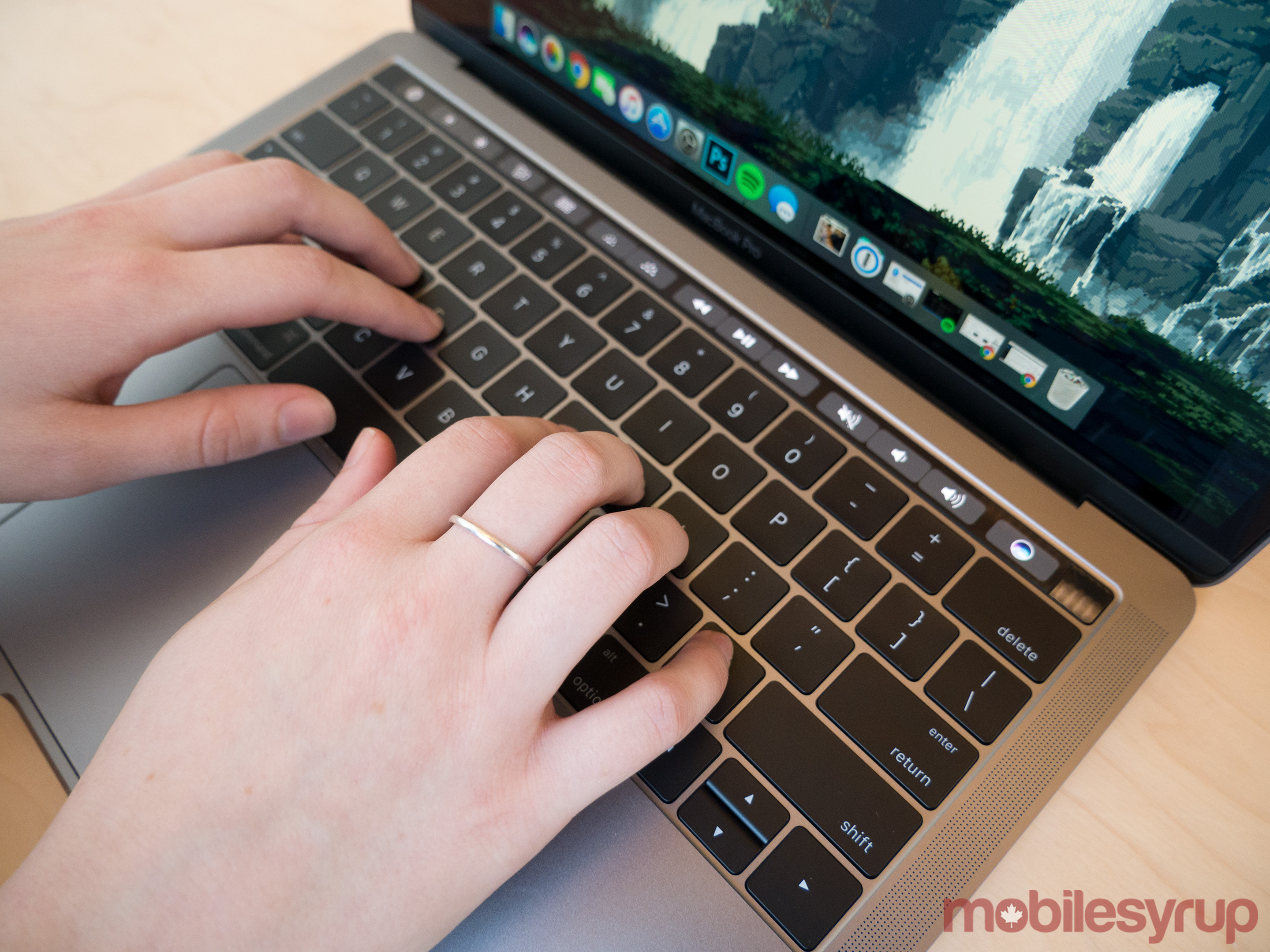
While the Touch Bar features a 2170 x 60 pixel OLED panel, it doesn’t look or feel like a traditional touch screen. My finger slides across its surface with ease, moving from left to right with a slight glide. In fact, the Touch Bar is so slick that it almost feels like it’s covered in some sort of greasy fluid, which I found off-putting at first, though after spending a few days with the 13-inch MacBook, it slowly grew on me.
There’s something inherently fascinating about sliding your finger across the new Touch Bar. It’s worth pointing out, however, that it also features a relatively low resolution. However, given the Touch Bar’s utility and its distance from your eyes, this isn’t an issue.
The apps where the Touch Bar makes sense like Photos, which allows users to move between images rapidly and with surprising accuracy, as well as Quick Time, a video and audio playing app that offers similar functionality through Apple’s new interface, are examples of the Touch Bar at its best. The way the secondary screen is used in the case of these apps is hopefully where Apple takes the interface element in the future.
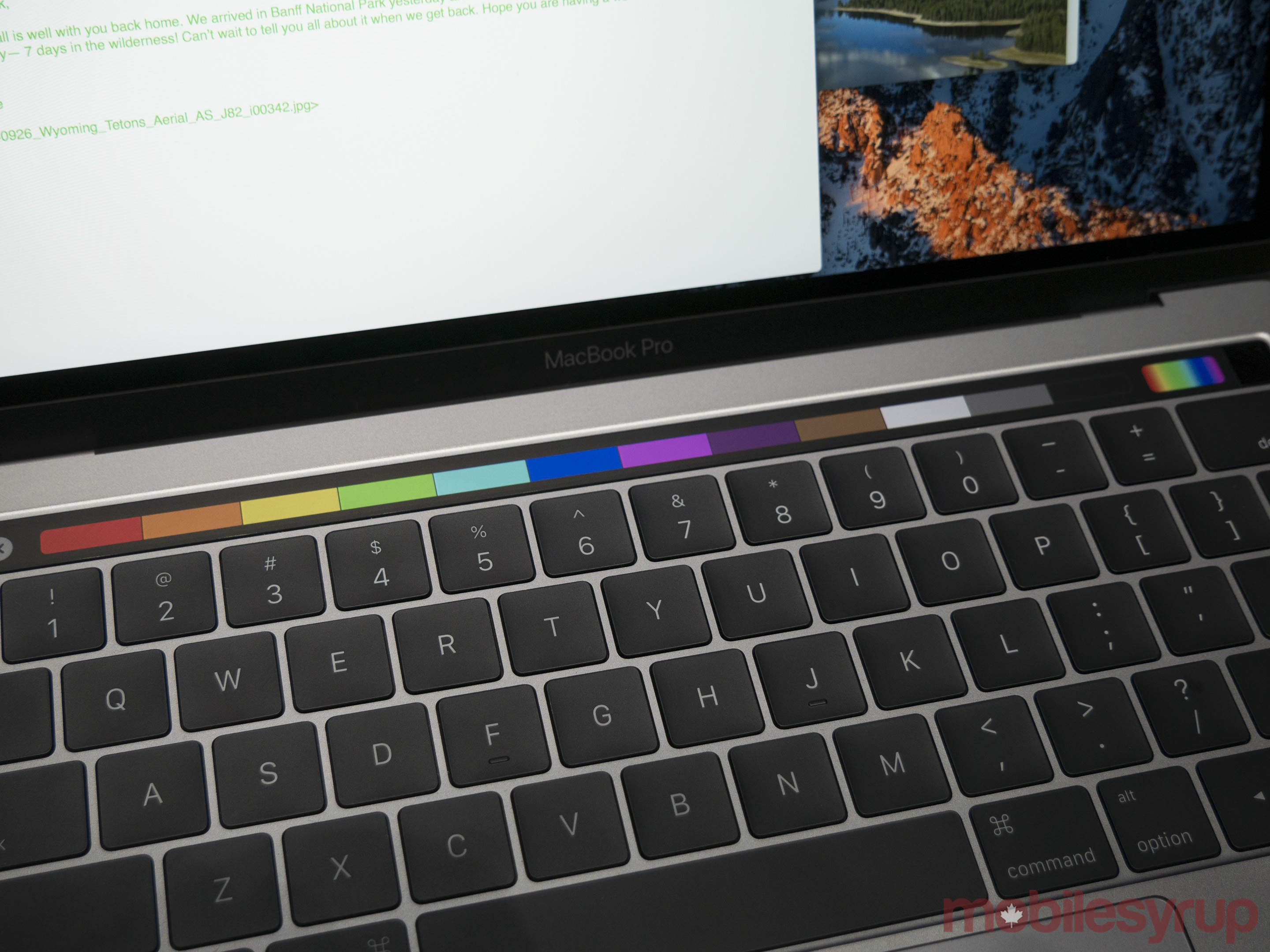
The experience, however, falls apart for me with Mail, where the Touch Bar displays quick-access typing shortcuts and contextual emojis. Similar to my experience with Nintendo’s ill-fated dual-screened Wii U, there’s a disconnect between looking at the screen and rapidly typing, and then needing to glance down to reach the Touch Bar.
Apple’s laptops have always been expensive
I found this input method neither intuitive or necessary. It’s also strange that so few apps currently support the secondary screen, though Apple does claim there are more than 20 Mac apps set to add to the unique functionality by the end November. To put this limitation in perspective, Chrome currently doesn’t support the Touch Bar and neither does Spotify.
Even Adobe’s suite of apps currently don’t include Touch Bar functionality, though support is reportedly coming in the near future. Of the apps that support the Touch Bar, the majority are from Apple, so if you’re like me and use Apple hardware but typically opt for third-party solutions from the likes of Adobe and Google, then the company’s new tech won’t be useful to you right now.
Like many of Apple’s supposed innovations, the Touch Bar isn’t exactly a new concept either, with keyboards from companies like Optimus predating the Touch Bar. What makes Apple’s Touch Bar drastically different is that the functionality is built directly into the macOS, giving developers a legitimate platform to develop for, as well as incentive to add the functionality to their apps.
Android and Windows fans often don’t want to admit this fact, but Apple often takes established concepts and improves on them significantly. In the case of the Touch Bar, that’s exactly what the Cupertino-based tech giant has done.
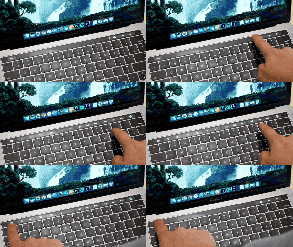
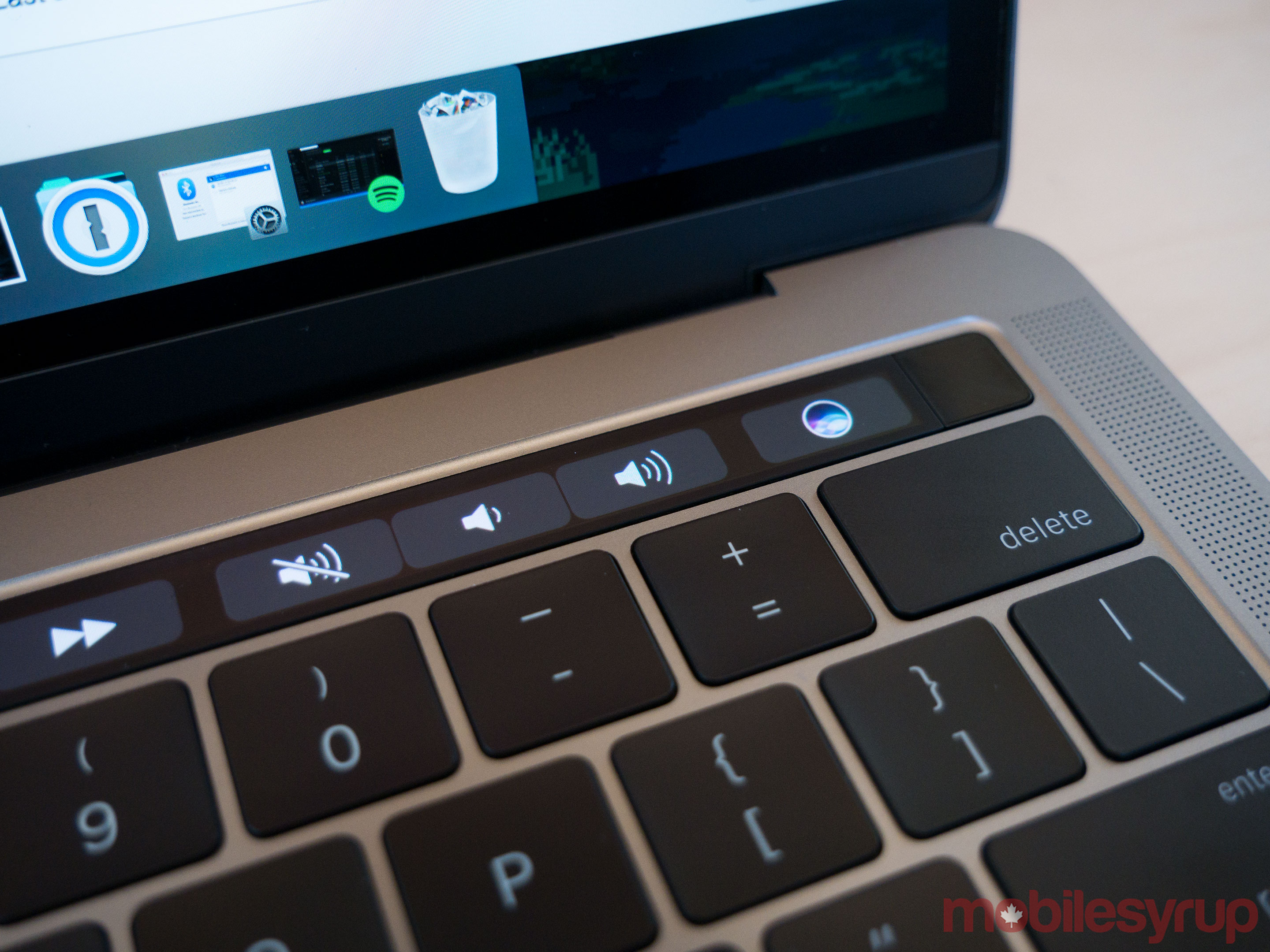
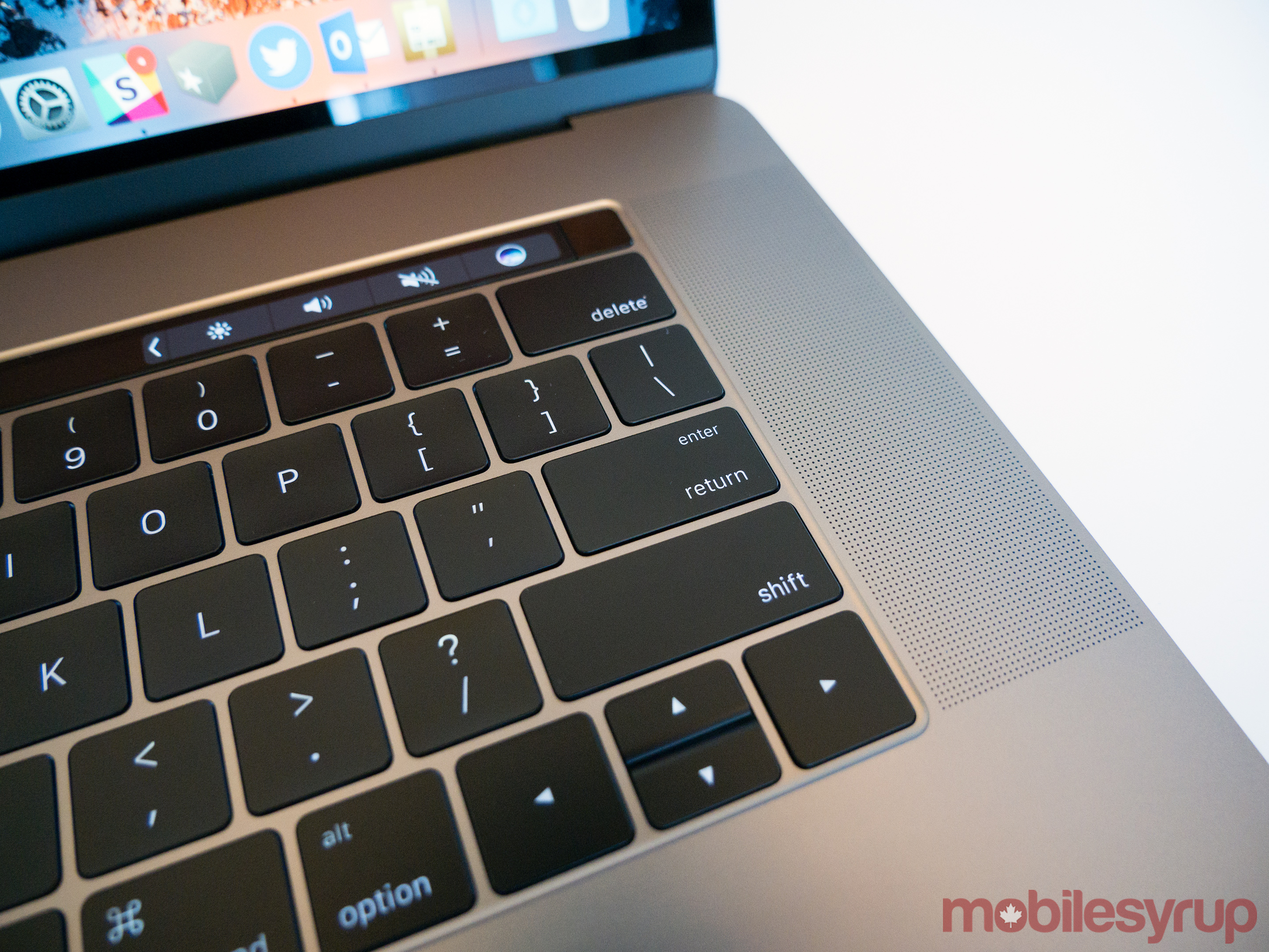
My biggest gripe with the Touch bar, however, is the fact that it doesn’t always display the full range of function keys most Mac users are familiar with. What it does instead is always show a customizable array of four function shortcuts.
I set my MacBook Pro’s Touch Bar to give me quick access to macOS’ screenshot functionality, as well as control over the computer’s brightness and volume sliders. In order to access the computer’s full array of function keys, you need to repeatedly press a tiny arrow on the left side of the Touch Bar — even when using an app that doesn’t currently utilize the Touch Bar.
This issue can be avoided by changing settings to ensure the entire Touch Bar is displayed at all times, defeating the purpose of the secondary screen’s contextual nature, or by delving deep into macOS’ unintuitive accessibility options. Apple needs to implement a feature that allows the Touch Bar’s functionality to be customized far beyond just the ability to swap our apps and altering their order.
What the Touch Bar amounts to right now is only a fascinating experiment with a significant amount of untapped potential. I have little doubt that Apple will improve on its functionality significantly over the next few months, but as it stands currently, the Pro’s Touch Bar isn’t as useful or even as functional as it could be.
On the right side of the Touch Bar though, rests one of my favourite new MacBook Pro feature, a Touch ID sensor. This sensor, which reads the user’s fingerprint, can be used for Apple Pay purchases and to log into your laptop as well as to validate App Store purchases. While you may not think this makes a big difference in terms of the time it takes to log into your computer, I hate passwords and any form of technology that allows me to avoid them, is a step in the correct direction.
Welcome to the dongle life
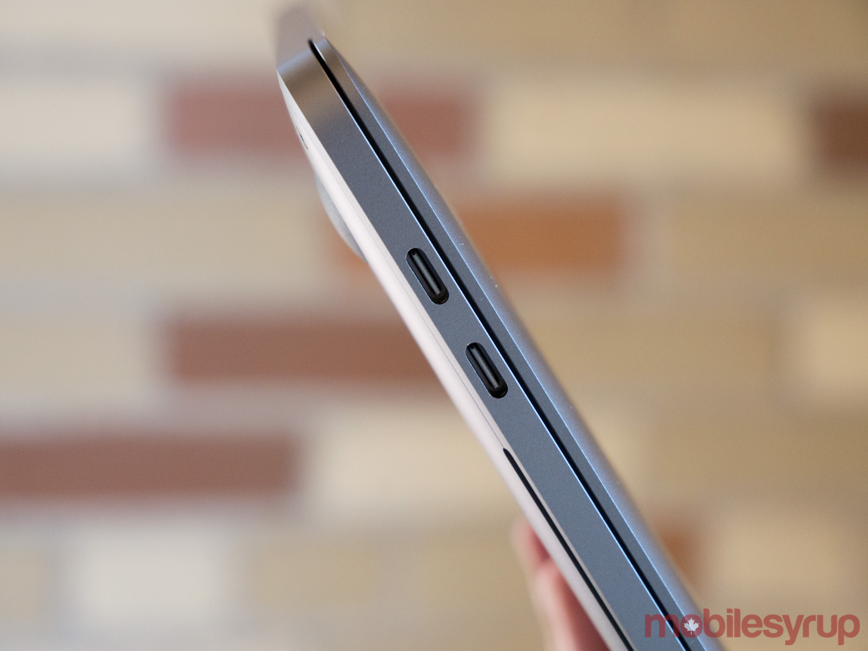
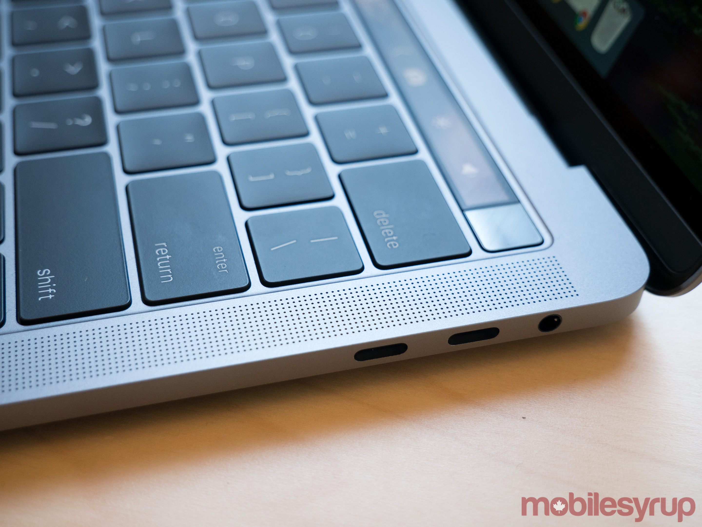
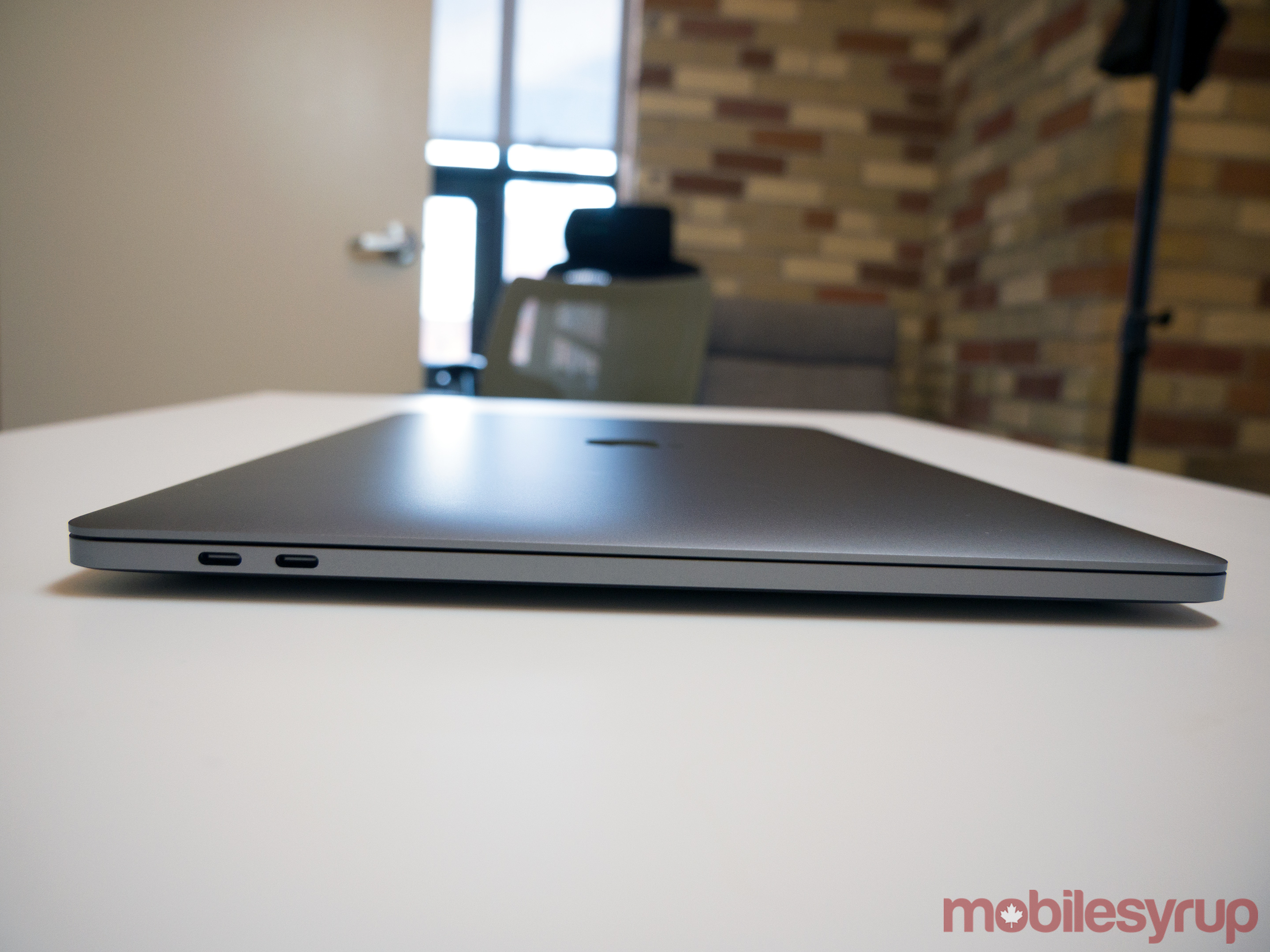
Apple’s new line of MacBook Pros utilizes four USB-C Thunderbolt 3.0 ports, a controversial choice on the company’s part, but one with which I agree. USB-C is the future of connectivity, but the relatively new port format suffers from issues right now.
Few devices support USB-C and some cables don’t hold to the format’s overarching purpose; a universal cable that can connect a display, charge a device and transfer data, all at the same time. This means that despite adopting USB-C being the correct move for Apple, until the format becomes widespread, using one of Apple’s new MacBook Pros is somewhat of a pain and will require most people to purchase at least one USB-C to A adapter.
As someone who rarely plugs devices into my laptop beyond a DSLR, which I’ve become accustomed to hooking up directly via a USB-C to A adapter, I fall into the market Apple is targeting with its new line of MacBook Pros.
Despite this fact, and while I do agree with the switch to USB-C, the new Pro really should have included an SD card slot. None of Apple’s “future-pushing” explanations can excuse this fact. Photos isn’t powerful enough for most professional or even semi-professional photographers and an SD card slot could have easily fit into the laptop’s thin body.
Given that Pro is short for ‘Professional’ in the context of Apple’s laptop, I question whether the laptop should even be called ‘Pro’ given the difficulties it will likely cause many long time professional Mac users. The Pro line has clearly shifted direction and is now a high-end consumer-focused laptop, at least in its current iteration.
Apple could have easily avoided these issues and rampant criticism by including a free USB-C dongle that came equipped with a variety of different plugs. While lowering the cost of USB-C adapters is a step in the right direction for the tech giant, it doesn’t make up for the fact that almost all new MacBook Pro owners will need to purchase an array of adapters.
In the end, USB-C is a hassle in the short term, but definitely a worthwhile shift for the overall industry. I dream of world where one cord can be used for charging, connecting devices and hooking up a display and this is a step in the right direction towards making that happen.
And yes, the new Pro does include a standard 3.5mm headphone jack, contrary to what many analysts expected.
That trackpad though
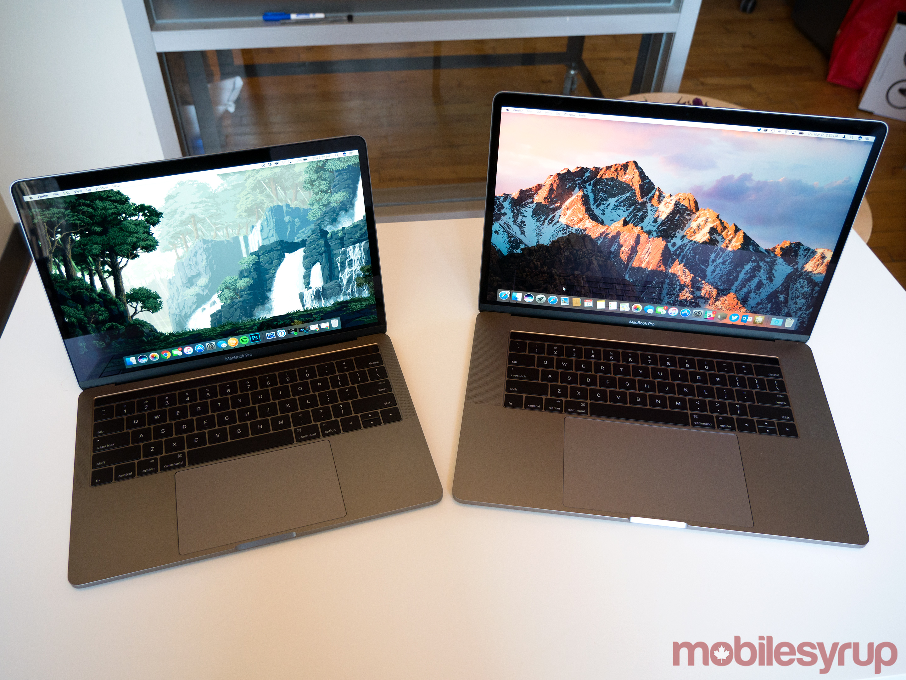
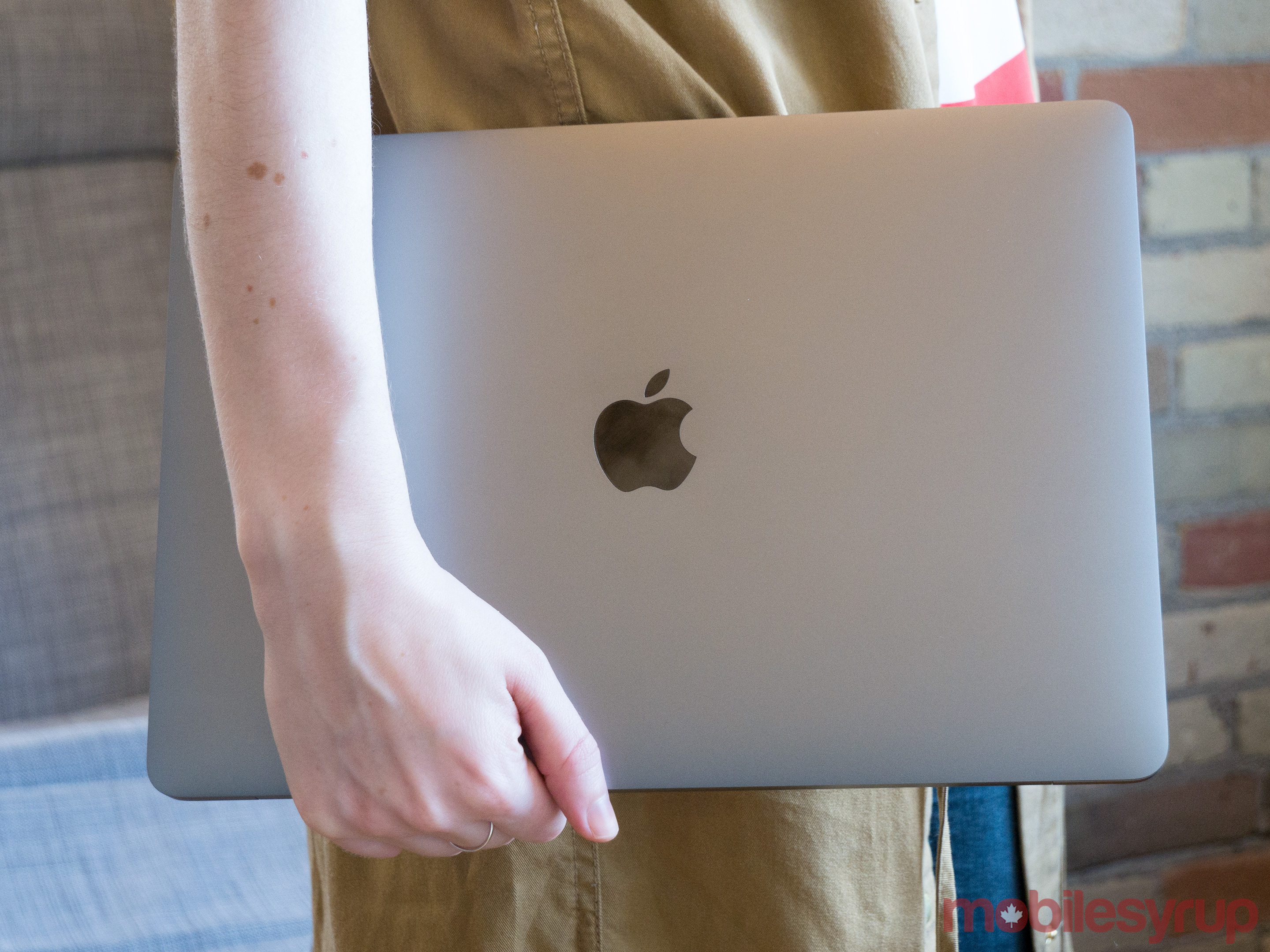
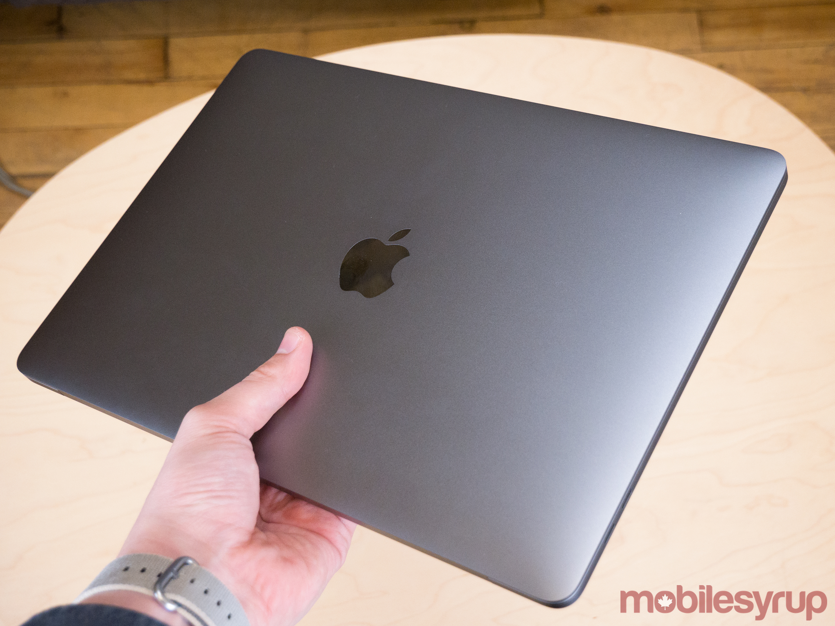
In typical Apple fashion, both the 15-inch Air — which looks identical to the 13-inch, though features a bigger trackpad, display and larger speaker grills — and 13-inch, are stunning looking laptops.
The 13-inch MacBook weighs in at just 1.36kg (3.02lbs), making it slightly heavier than the 1.3kg (2.96lb) MacBook Air, as well as 0.22kg (0.5kg) lighter than the previous generation MacBook Pro.
The 13-inch Pro is also 18 percent thinner, measuring in at 14.9mm, resulting in an overall 23 percent smaller footprint. The 15-inch, on the other hand, comes in at 15.mm thick, a 14 percent cut. It also weighs in at 1.8kg (4lbs), just slightly lighter than the previous model.
While these numbers may not sound like a significant shift on paper, the new MacBook Pro does feel considerably lighter and sleeker than its predecessor.
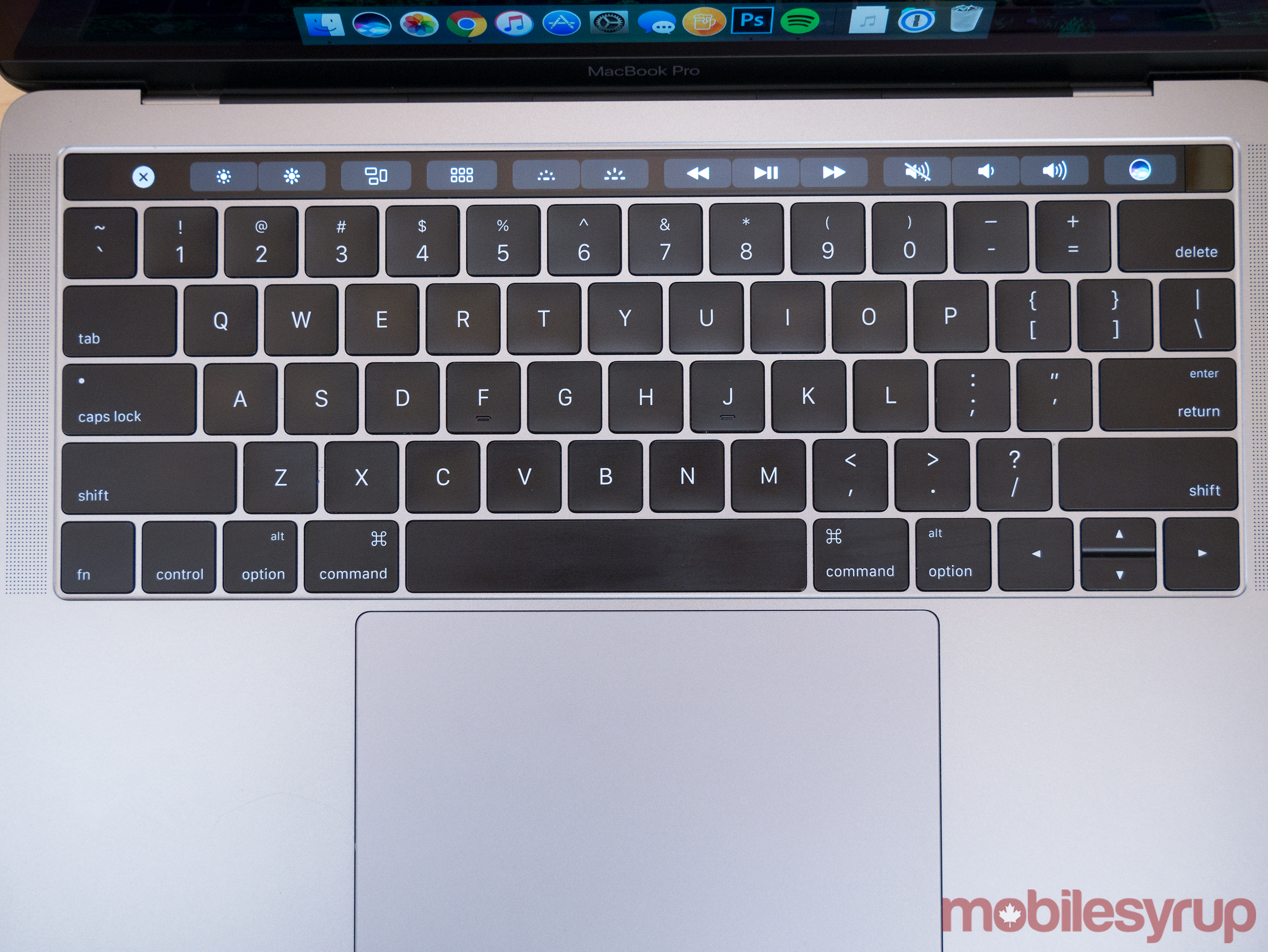
Its keyboard is also a step far above the 12-inch MacBook’s butterfly keyboard mechanism. It seems like keys have significantly more travel, though Apple says that’s not the case and that it has only reworked the second generation keyboard’s triggers to feel more tactile. The resulting keyboard present in both the 13-inch and 15-inch MacBook is probably the favourite one that I’ve ever used.
Those who hated the 12-inch MacBook’s keyboard, however, also won’t like the new Pro’s, though I still feel that if more people gave it a chance, they’d adjust to its low profile in just a few hours.
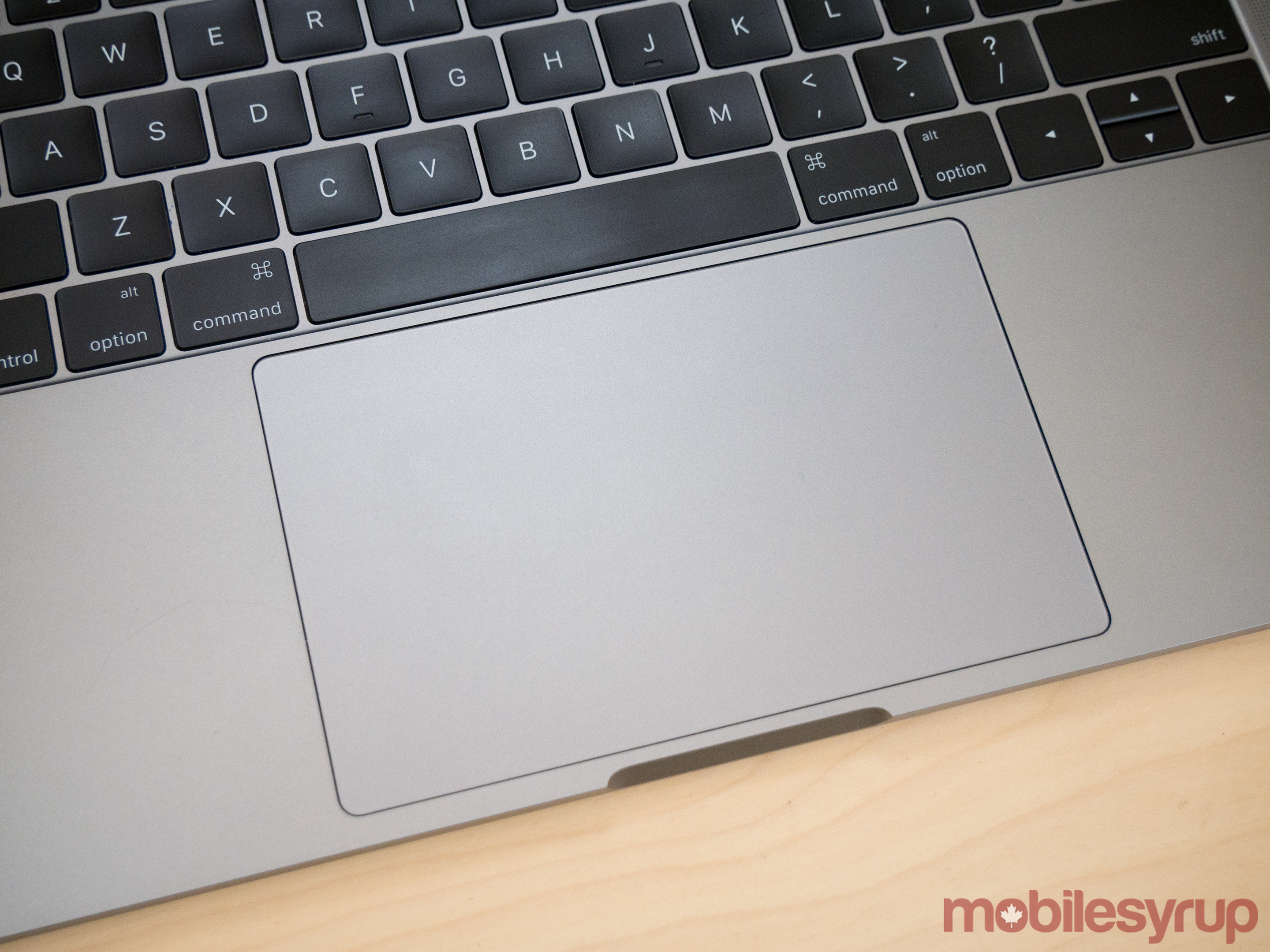
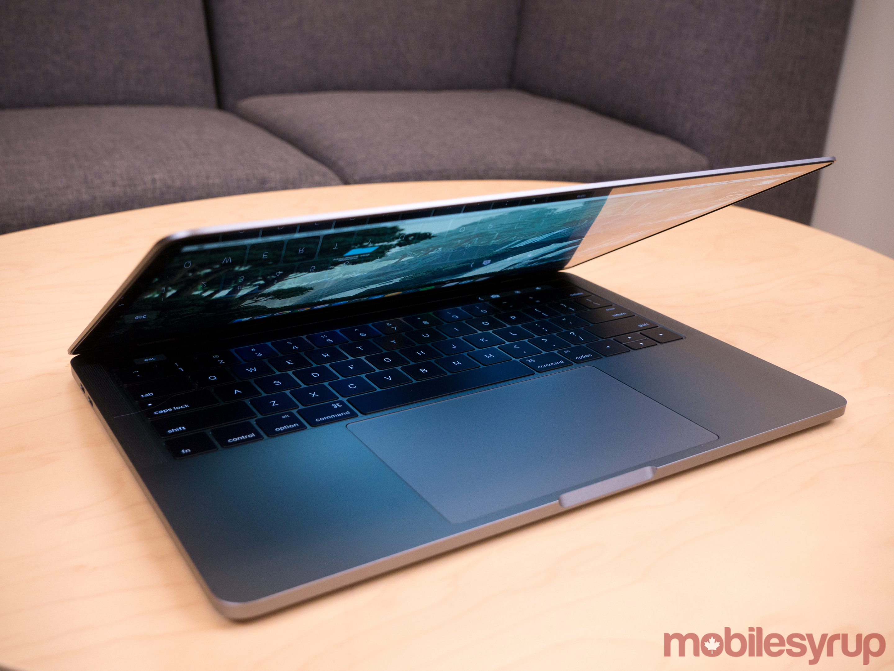
Beneath the keyboard is an absolutely massive trackpad that measures in at exactly 46 percent larger than the version featured in Apple’s previous 13-inch Pro. In the 15-inch iteration, the trackpad is twice as big. Seriously, take a look at it (below), it’s massive.
While some have scoffed at the new Pro’s massive trackpad size, when you actually test it out, it’s difficult to go back to the version featured in past MacBooks. The additional space gives ample room for navigation as well sliding, swiping and performing macOS’ more complicated gestures. The best in class palm detection Apple is known for is also back in the new Pro and more necessary than ever. I find that my palms actually regularly rest on both sides of the trackpad given its large size.
The trackpad also features Apple’s Force Touch technology, which means that it doesn’t actually click and instead simulates the sensation of clicking. This technology was introduced by the company with the 12-inch MacBook back in 2015. Similar to the butterfly keyboard, while some dislike this new trackpad, I’ve always thought it was great. With the new line of Pros, Force Touch has been improved significantly and actually feels somehow more tactile than even the click of a traditional trackpad.
Audio quality wise, the stereo speakers in both the 13-inch and 15-inch MacBook are impressive, offering users twice the dynamic range and 58 percent more volume.
It’s worth noting, however, that various outlets have reported that the speaker grills in the 13-inch model are purely cosmetic.
Last year’s specs
One of the main criticisms targeting Apple’s new line of Pros is the fact that they come equipped with Intel’s sixth generation Skylake processors and not the seventh generation of Intel Core CPUs. Apple claims it went with the older CPUs because the multi-core Kaby Lake processors the company would need for the new MacBook Pro aren’t available yet. Whether or not this is true, the reality is that if you want one of Apple’s new MacBooks, you’re paying a hefty price for last year’s technology.
That said, even with last year’s Intel chips, I didn’t run into any slowdowns during my roughly week and a half using the 13-inch MacBook Pro as my main laptop, whether I was running Adobe Premiere, Photoshop, or watching high-resolution video. Specifically, Apple claims that its new line of Pros, depending on what processor and graphics card the laptop comes equipped with, has 130 percent faster graphics performance in the 15-inch and 103 percent faster in the 13-inch.
The hard drive in both sized laptops are also reportedly 100 percent faster than the drives featured in the previous model of the MacBook pro, allowing for sequential read speeds of up to 3.1 gigabytes per second, with write speeds of up to 2.1GB/s on the 13-inch and up to 2.2GB/s on the 15-inch.
So while Apple’s laptop’s may not feature the latest hardware technology in terms of processor, and also caps out at 16GB of RAM (apparently to save battery life, according to Apple), both laptops perform excellently under almost any circumstances.
Where the Touch Bar iteration of the laptop has been disappointing to me in terms of hardware is when it comes to battery life. In my experience, I’ve been able to get through roughly an entire work day with the 13-inch MacBook, coming in at approximately seven to eight hours, depending on the tasks I’m performing. This is slightly under the 10 hours Apple claims the laptop is able to last and below the about nine hours I experienced with the 13-inch new MacBook Pro without the Touch bar. Battery life was similar with the 15-inch in my testing, coming it at maybe an hour to 45 minutes longer.
A painful interim
I’m conflicted when it comes to Apple’s new line of MacBook Pros. On one hand, I’m a huge fan of the new laptop line’s build quality, ergonomics and overall look. The keyboard is the best I’ve ever used and the trackpad is responsive, fast, enormous and more importantly, extremely accurate. There’s literally no comparison when it comes to high-end Windows PCs when considering build quality and the trackpad, even when Microsoft’s impressive high-end Surface Book is thrown into the competition (for the record, I really like the Surface Book).
I also find that the more I use the Touch Bar the more frequently it becomes integrated into how I use the new Pro on a daily basis. I feel like Apple has the track record to turn its second-screen experiment into a viable development platform for app creators. It’s, however, far from the revolution the company boasted about during the reveal of the new Pro at its recent keynote. What it is though is a subtle shift in interaction language that could potentially change how we traditionally interact with a standard laptop.
Cutting out USB-A in favour of USB-C creates problems, but sometimes it’s necessary to forcibly kill ageing technology in order to make way for the future, something Apple has done in the past with the three and half floppy drive and actually prides itself on as a company (cue the courage jokes). This time, however, the tech giant is too early, resulting in a confusing ecosystem of dongles. Including a hub of some sort with every laptop for free, as well as not removing the standard SD card slot, would have negated these issues altogether, making the new Pro more worthy of the ‘Pro’ moniker.
The future just isn't here yet
There's ultimately a lot to like about the new MacBook Pro, including the 13-inch version's bright and vibrant 2560 x 1600 pixel display (the 15-inch comes in at 2880 x 1800 pixels) and even with the criticisms levied in this review, it's still one of my favourite laptops ever released. Despite how hard the tech giant is pushing its 'reality distortion field' of how professionals should get work done in the context of its new laptop line, the 'Pro' likely won't be 'professional' enough for everyone. Apple's new Macs are the future of how we'll use laptops and computers in general, unfortunately, we still live in the present.
"There's ultimately a lot to like about the new MacBook Pro"
MobileSyrup may earn a commission from purchases made via our links, which helps fund the journalism we provide free on our website. These links do not influence our editorial content. Support us here.

