The days are shorter now, but not much. Maybe an hour less than the early days of summer, right after that chilly morning in California when Apple introduced its latest operating system. And as it does every year, the few migrant leaves falling to the ground in parchment colours of orange, red and brown represent a coming of age of a sort. Not for a person, but a thing. An operating system.
For the past few months, I’ve been testing Apple’s latest mobile OS, iOS 9. I had the opportunity to write about it back in early July, when a public beta was first released, but chose to hold off until it was good and ready, soaked in a month’s worth of user feedback and bug fixes. And I’m glad I did.
Because at the time, the rough edges were truly unforgiving, and in some cases overshadowed the niceties of the features Apple showed on stage. And those features, significant on iPhone but indispensable on iPad, are worth talking about.
About this preview
I am writing this preview on an iPad Air 2, loaned to me by Apple, with a Bluetooth-connected Logitech K480 keyboard (the reason for which will be revealed later on). It is running iOS 9 Public Beta 3.
In some instances, I am also referencing iOS 9 Public Beta 3 running on an iPhone 6.
An overview
Unlike previous versions, iOS 9 pares back the number of new user-facing feature, focusing on improved core competencies such as Siri, search, transit and, on the iPad, multitasking. While it may set the stage for some hardware-related updates unveiled in September, it has positively changed the usability of the iPad and iPhone in a number of ways.
At its core, iOS 9 is about refinement, a term used by Apple’s executive team when talking about it. The company knows that iOS is already approaching desktop-level functionality after last year’s release, which focused on, among other things, allowing apps to communicate with one another without sacrificing usability.
On the iPhone side, iOS 9 is about two things in my eyes: stability and intelligence. The former comes in the form of several new behind the scenes improvements, from low-power mode and better overall battery management to the ability for app developers to leave behind legacy 32-bit users in their new code.
The latter is likely a more easy sell, but also slightly controversial: iOS 9 introduces features that make it act, inevitably, more like a desktop operating system. While no one will mistake the three so-called multitasking features — Slide Over, Split View, and Picture in Picture — for OS X-like freedom, and all the power-hungry processes it requires, they are introduced with the careful deliberateness of a company all too aware of its users needs. The iPad, despite its quarter over quarter sales decline, still pulls in more revenue than Apple’s Mac line, and millions of iPad Air 2 customers will be able to relearn how to use their beloved tablets.
Moreover, the term intelligence falls under the auspice of Siri, which seems to dictate much of iOS’s future these days. No longer a wise-talking voice assistant, Siri has her hands all over the user experience, from the new left-side Search tab on the home screen to more seamless integration with Apple Watch. If multitasking is the feature that gets people in the door, intelligence is the glue that holds everything together.
iPad
We’ll start with iPad, since many of the most significant improvements can only be seen on Apple’s tablet, and the main one only on Apple’s latest, the iPad Air 2.
The iPad is a computer; of this there can be no dispute. But up ’til now it has been a limited one, by design. To maximize performance and battery life, and to simplify usability, iOS was designed with a single app that takes up the home screen. To leave that screen is to essentially close the app, save for a number of limited background functions like listening to music and using GPS.
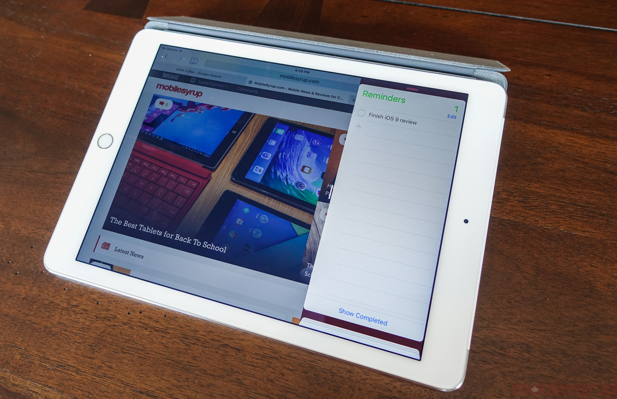
With iOS 9, iPads as far back as the iPad mini 2 will be able to access two apps at the same time using Slide Over, accessed by sliding from the right side of the screen. At the moment, compatible apps are limited to Apple’s own – Maps, Notes, Safari – but will expand when iOS is available to the public this fall.
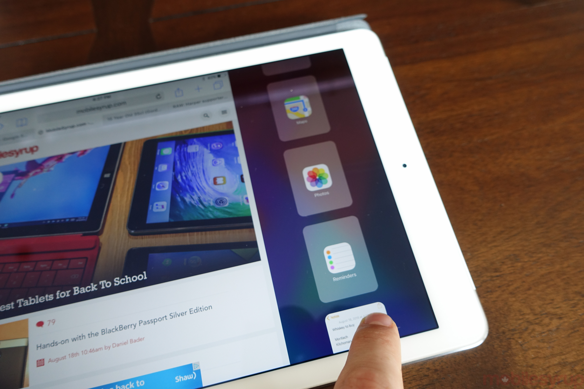
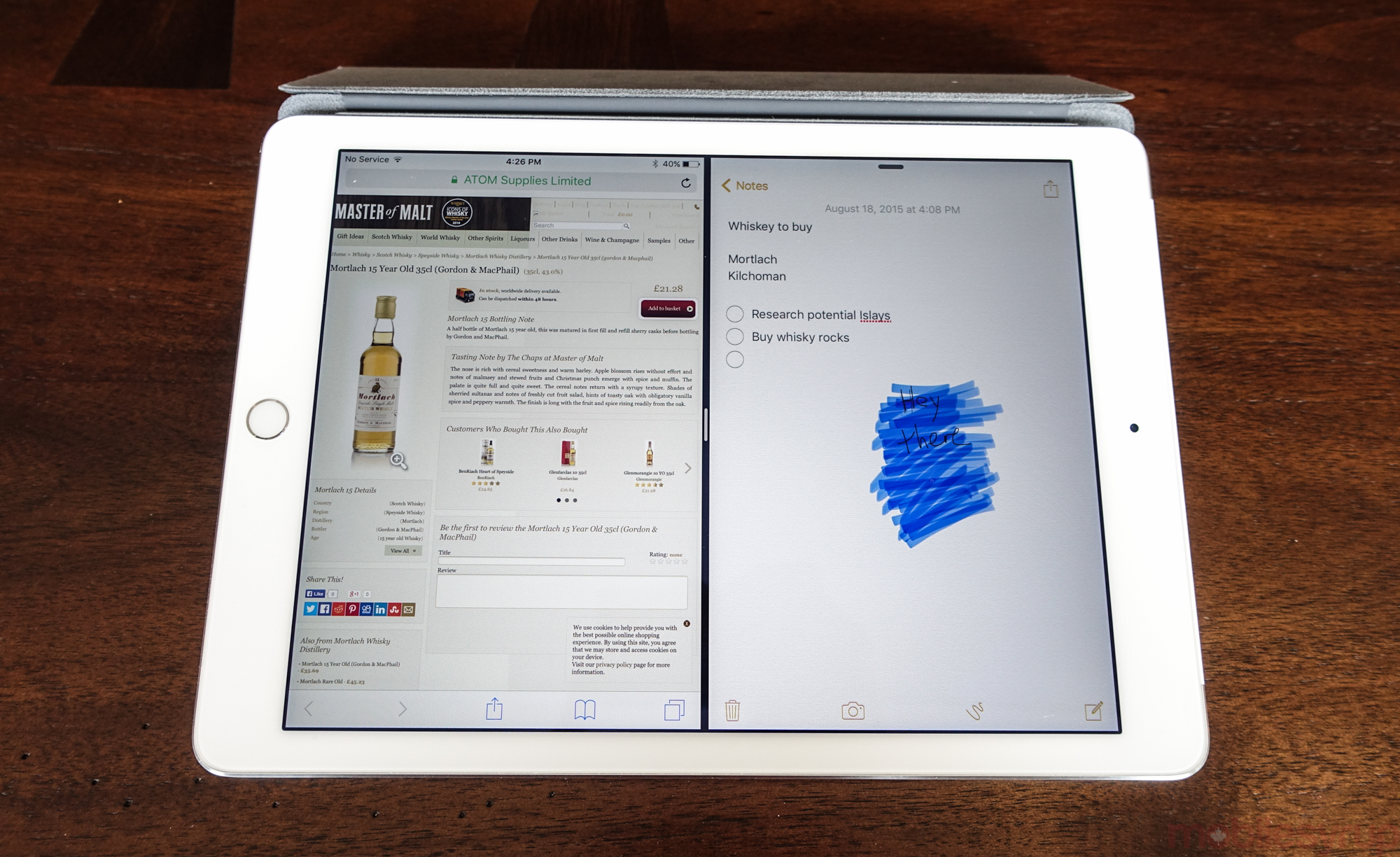
Slide Over is like a glance, an opportunity to not only check but contribute to apps without committing to them. In a world where we switch between screens so regularly, this quickly became invaluable to my experience on the iPad. When researching whisky in Safari, I kept opening Notes to refer back to my tasting notes from my latest sampling.
Of course, Split View is really the future of the platform, since Slide Over, while moonlighting as a feature for quick checks, is actually a hardware-dependent necessity. Split View, where two apps run simultaneously side by side, is currently only available on the iPad Air 2, since it has the tri-core A8 chip and 2GB of RAM to accommodate the additional memory requirements. Indeed, the A7 chip inside the iPad Air is likely capable of handling two processes side by side, but its singular gigabyte of RAM is the bottleneck.
Split View works really well, even with the limited number of apps available that support it. Writing an essay in Notes, for instance, while researching the project in Safari is the most obvious example, but there are so many others. Apple isn’t the first company to develop this technology – Samsung’s Multi Window has been around for years – but as with many of Cupertino’s endeavours it will come down to developer support, which the company has in droves.
Split View is the single most important change to iOS 9, and it cannot be overstated by how much it will change the way people use their iPads. The integration is absolutely seamless – perfect, in fact – and must have taken hundreds, if not thousands, of iterations to get right. From the translucent overlay given to a window while resizing to the effortless way in which an app disappears, returning to the single-screen paradigm, Apple got this correct the first time.
The feature isn’t static, either: most apps, except for Safari, support both one-half and one-third views, ensuring a limited flexibility without sacrificing usability. For example, referring to a shopping list in Reminders doesn’t require half the screen, so it can be set to take one-third while Safari, Maps or Photos – whatever – can fill the rest. And as with many iOS features, its virtue is not in its originality but its application.
iOS 9 also adds Picture in Picture to the iPad, along with new keyboard features, both on-screen and while connected to Bluetooth. PIP works as it sounds: when watching a video in any app, it’s possible to minimize return to the home screen and open another without interrupting playback. Resizing, hiding and other virtues are also there, though I preferred to merely keep a YouTube video in the corner.
On the keyboard side, apps like Note (which we’ll talk about next) get contextual actions in iOS 9, so iPad users can quickly bold, underline, italicize, undo and more, along with more esoteric things like activate a doodle. Hardware keyboards, too, receive more desktop-like shortcuts with iOS 9. I used a Bluetooth keyboard to write this entire preview, and it worked great. Shortcuts like Command-Tab, which switches between apps on the Mac, now work the same way on the iPad.
Along with all of the improvements to battery life, Siri, search and stability, which affect all devices and screen sizes, iOS 9 really seems tailor made for the iPad. With Apple pushing the tablet into more specialized industries, along with the education market, this initiative is likely no accident.
Notes
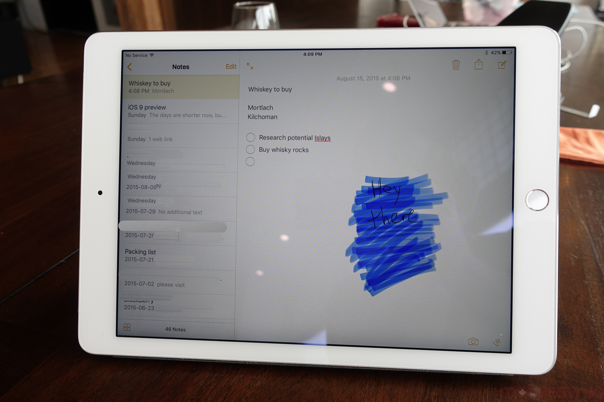
An oft-forgotten but well-used app within iOS since its release, Notes has been as bare-bones as possible until now. With iOS 9, though, the app not only syncs text with iCloud, but checklists, photos, sketches (Force Touch, anyone?) and more. In other words, Notes is now a viable Evernote or Simplenote competitor within the Apple ecosystem.
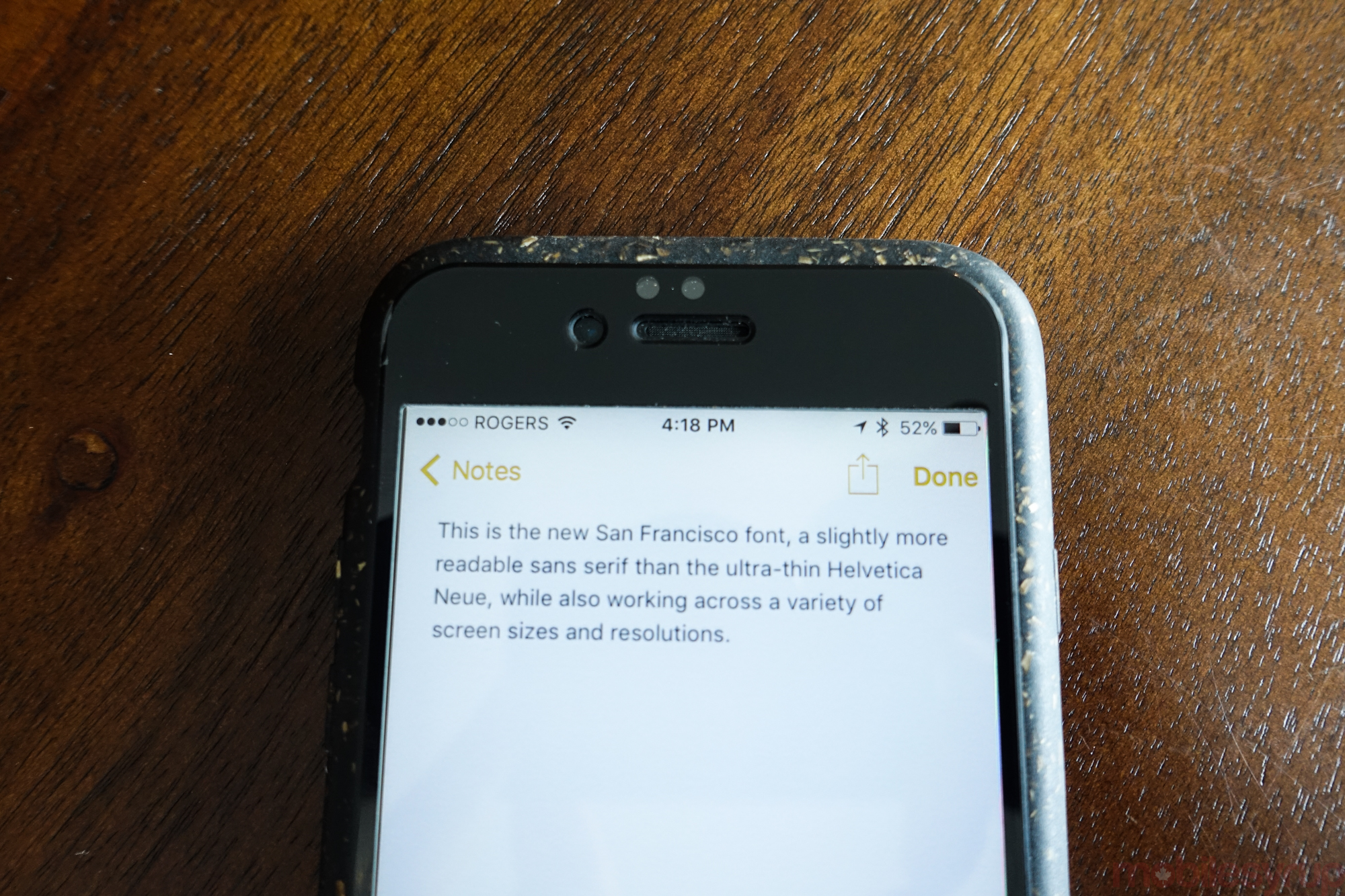
With the new San Francisco system font, Notes looks and feels great on both the iPad and iPhone. That you can integrate photos and checklists in-line makes it ever more versatile, though it will be difficult to win back customers from the aforementioned note-taking giants.

Maps
Oh, Apple Maps. A still-controversial topic in many ways, but Apple has done a lot to fix the problems of its launch.
If you haven’t opened Apple Maps in a couple of years, you’ll be immediately impressed. Even without the transit directions of iOS 9, available only in Toronto for now, Maps is much faster and more accurate, with 3D Flyover data for many Canadian cities.
After spending a lot of time with Maps for iOS 9, I can say that it didn’t lead me astray once, and its system-level integration put it on top of Google Maps for the first time since launch.
Transit directions are as expected, too: Apple leads you to the stop, the vehicle and, eventually, the correct exit, which in a foreign city is extremely useful. I got the chance to use this feature while travelling through New York City earlier this summer, and knowing which exit within the enormous Grand Central Terminal led me to the right intersection saved me 10 minutes of walking. I wish Google Maps had this.
Intelligence
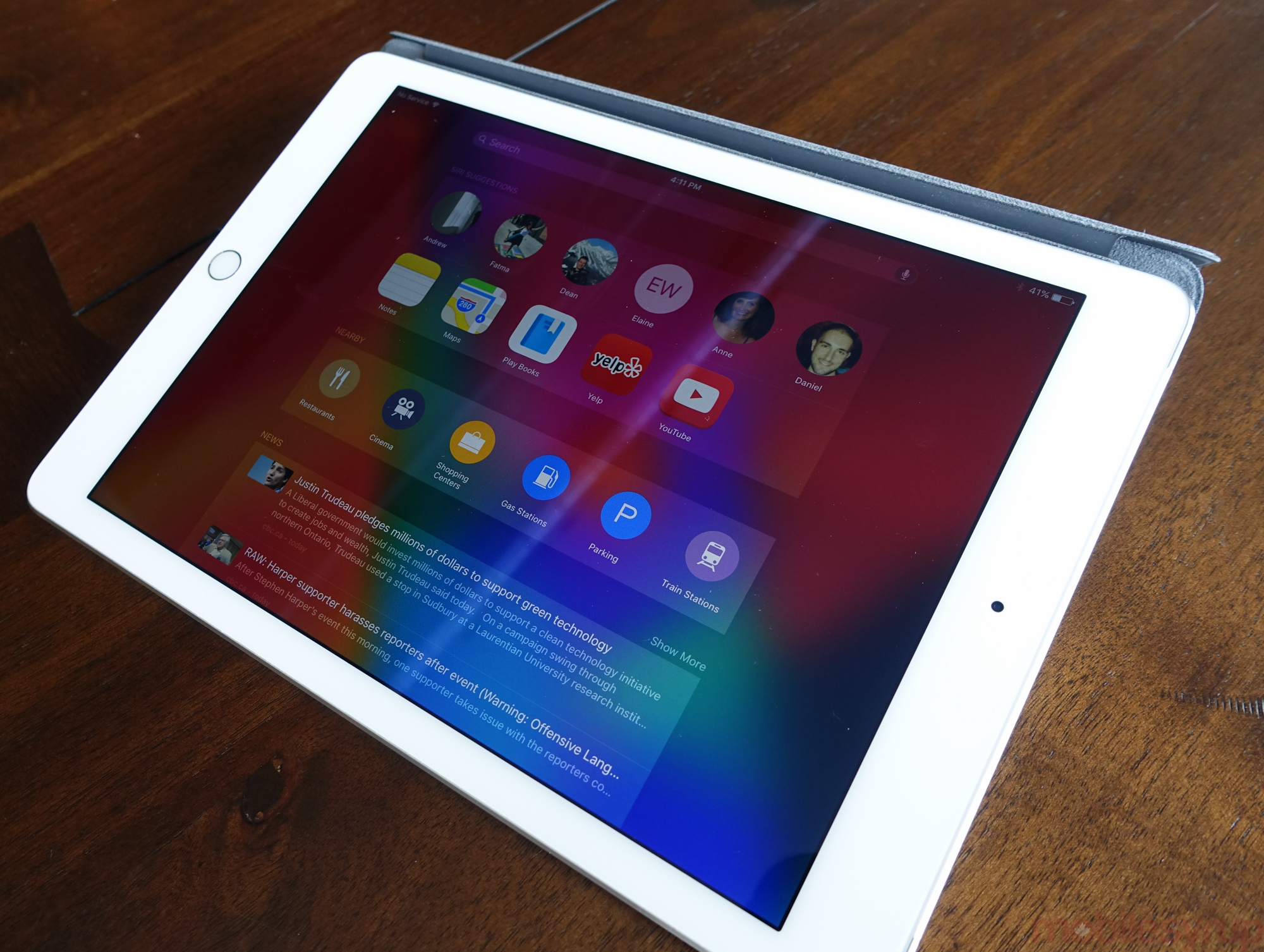
Probably my favourite new part of iOS 9 on the iPhone, Intelligence is both a part of Siri and completely separate, at least in the way we’ve traditionally interacted with the voice assistant. While Apple isn’t attempting to become Google by aggregating its own search results, users can now use both voice and text to ask questions of the system.
Accessible through a left-side pane of the home screen, Intelligence is a series of frequent contacts, apps and nearby locations, along with news snippets. Apple claims that Siri will learn through interaction and, over time, begin suggesting things more accurately.
Siri herself (or himself, whichever voice you prefer) is also considerably more intelligent, with deep app linking allowing the assistant to launch into specific areas within apps, and not just to the apps themselves. Asking Siri to play your favourite Alanis Morissette tune, or songs from just the early 90’s, will render usable actions.
At the same time, iOS 9 wants to complete actions before you even know you need them. Inserting a pair of headphones prompts users through an icon on the home screen to launch Music (which prior to Apple Music would have been unlikely, but is now, for me at least, quite common).

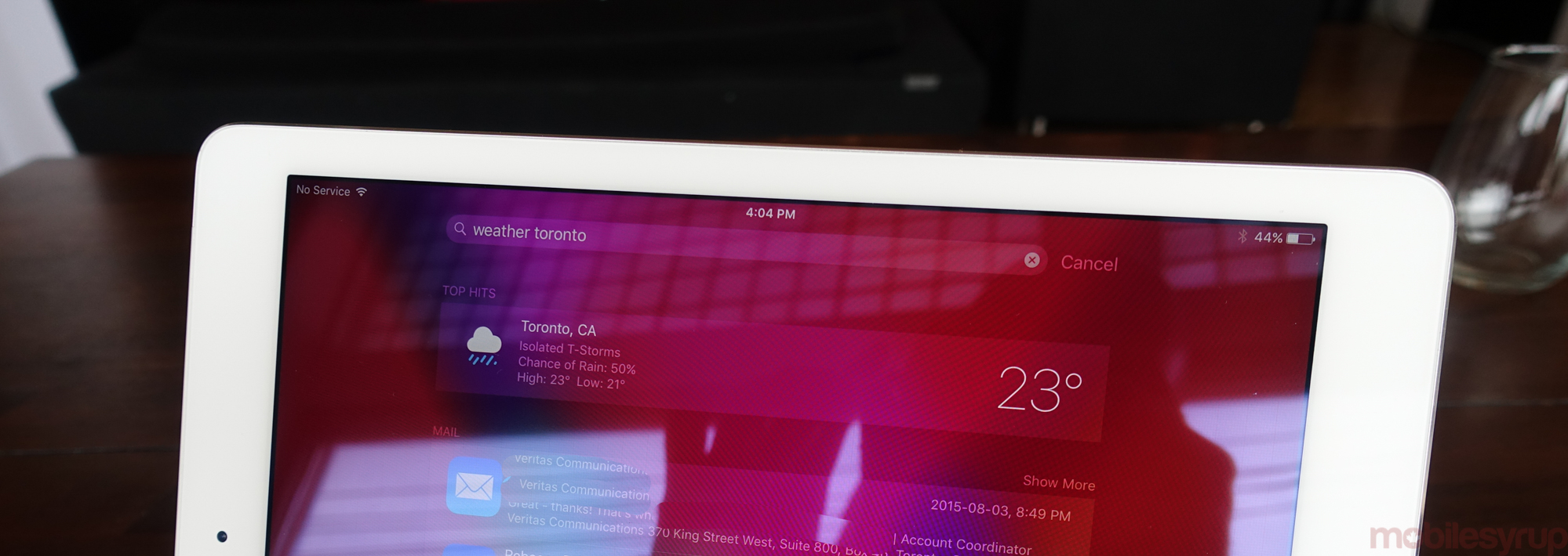
More importantly, typing queries into the new search pane yield results that were only accessible by opening up a browser window or using Siri itself. Sports scores, weather, movie times, and lots more can be ascertained by merely typing in the words, useful at numerous times during the day when talking out loud is either impossible or inadvisable. The input box even renders simple math equations.
I was reticent to preview iOS 9 before this feature was fully functioning, and prior to beta 5 and public beta 3 it was basically broken. Now, though, it’s easy to see how useful search will be when developers begin hooking into it once iOS 9 is released in the fall.
One aspect of Intelligence I’d like to see changed is the reliance on Apple’s first-party apps. For example, proactive suggestions, such as calendar events or transit reminders, only work with Apple’s built-in calendar or mapping app. I use Sunrise and Fantastical, which don’t appear to be compatible, but that could change in a future version.
Stability and Miscellany
iOS 9 doesn’t have dozens of user-facing features like iOS 7 and 8 did, but that’s by design; Apple is making the entire experience more fluid, stable and intuitive, even on older devices.
To that end, the new OS will be supported by devices as far back as the iPad 2 and iPad mini, both of which run the dual-core A5 chip. Apple says that install sizes are considerably smaller with iOS 9, so iPhones and iPods with just 8GB of storage won’t be forced to plug into a Mac to facilitate the upgrade.
On the iPhone side, as of public beta 3 I’ve definitely noticed the promised one hour of extra battery life. Indeed, an iPhone 6 that used to die well before 8pm now lasts well into the evening, a minor but important advantage on an aging device.
And as with all new iOS versions, Apple offers improved security with iOS 9. From the enforcement of six-digit pass codes (those without Touch ID), and an overhauled two-factor authentication system that no longer relies on one-time-use passwords, iOS and OS X devices can now work in tandem to ensure iCloud and App Store security.
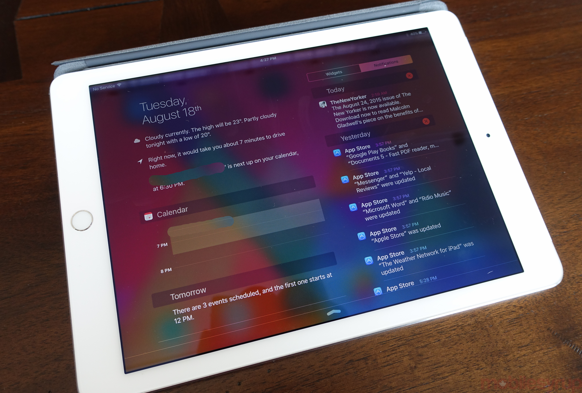
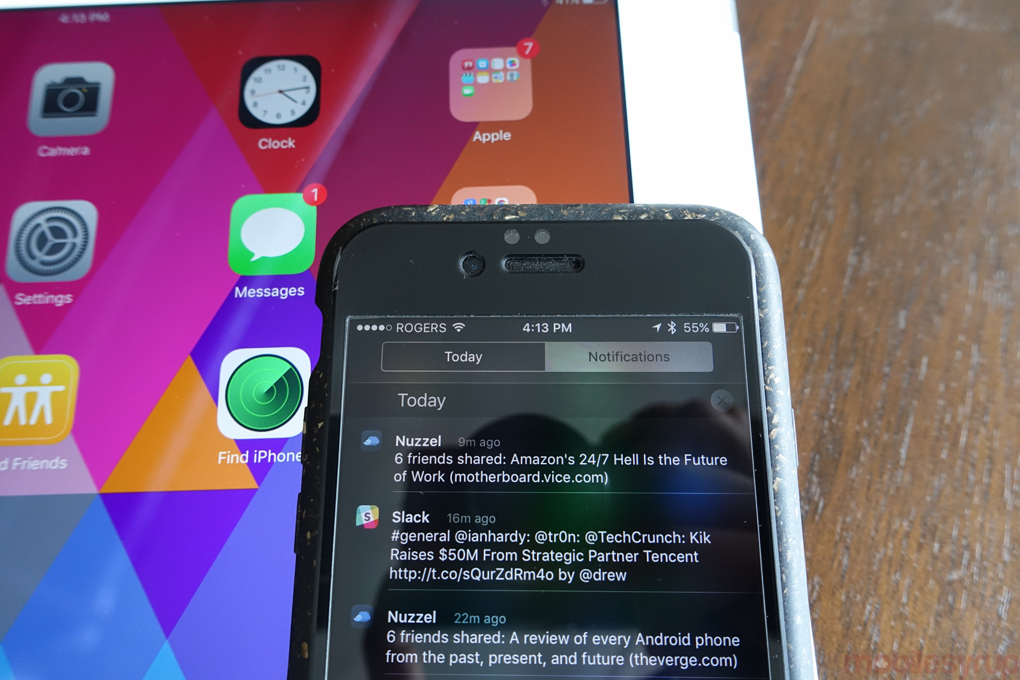
Finally, iOS 9 fixes what has been heretofore been my major complaint with the operating system’s notification system: the inability to clear all of them at once. Now, instead of having to agonizingly clear one or two notifications from individual apps, the default setting lumps all of them, from any app, chronologically. All you have to do to clear them is hit the “X” twice on a single day. Finally.
iOS and beyond
Apple’s annual upgrade cadence hasn’t slowed since 2007, but the company smartly slowed the parade of new features with iOS 9 in favour of reaching a level of stability and focus yet unseen on the increasingly-complex operating system.
With the iPad, Apple has broached the idea that it can indeed be a laptop replacement, opening the path for individuals, educators and businesses alike to use it as such. It’s always been possible to create content on the iPad, but it’s now an essential part of its value.
On the iPhone (and iPod touch), the benefits are less immediately apparent, but even if the update just gave me increased app stability and an hour extra battery per day I’d be happy. That Apple has added truly valuable contextual search and intelligence features is even more welcome.
MobileSyrup may earn a commission from purchases made via our links, which helps fund the journalism we provide free on our website. These links do not influence our editorial content. Support us here.

