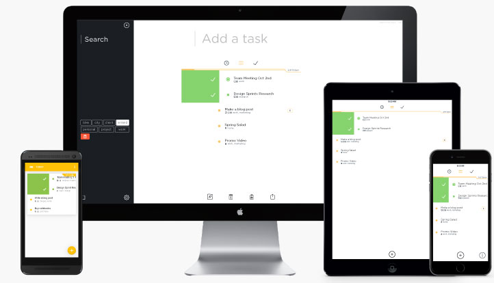
Swipes is by no means a new app — it’s been available on iOS since mid-2013 — but with its release on Android this week, and its impending availability through the Chrome App Store, it is quickly becoming my go-to task manager.
Part of the reason is its simplicity: like many other GTD-based to-do managers, Swipes breaks tasks down into a current Inbox, a Later planner and a Done overview. Swiping right on a task completes it, while swiping left activates a scheduler for a future reminder.
But the main advantage of Swipes, at least with my workflow, is its integration with Evernote. For a couple of years now, Evernote has allowed users to create To-Do lists using checkboxes. The implementation is fine, but because Evernote is still centred around text input, it’s rarely used by people (including me) as a dedicated task manager. Swipes decided to use Evernote’s API to pull in any note with the tag “Swipes”, with bi-directional synchronization; any changes made in Swipes will appear in Evernote, and vice versa.
Because Swipes is dedicated solely to tasks, it can work independently, or with Evernote, to create a useful to-do workflow.
The Android app adheres to Google’s Material Design guidelines, utilizing a Floating Action Button and Lollipop-friendly notification colouring to stand out among the many similar apps in its category. Swipes is also optimized for Android tablets, though only in landscape, with multiple panes support.
Swipes plans to roll out a $5 per month, $50 per year Premium tier in the coming weeks, presumably with support like file storage and collaboration, similar to the business model of apps like Wunderlist and Todoist.
[source]Swipes[/source]
MobileSyrup may earn a commission from purchases made via our links, which helps fund the journalism we provide free on our website. These links do not influence our editorial content. Support us here.


