Gmail for Android recently received a big usability upgrade, but the app’s design hasn’t changed much since it was overhauled for Android 4.0 Ice Cream Sandwich.
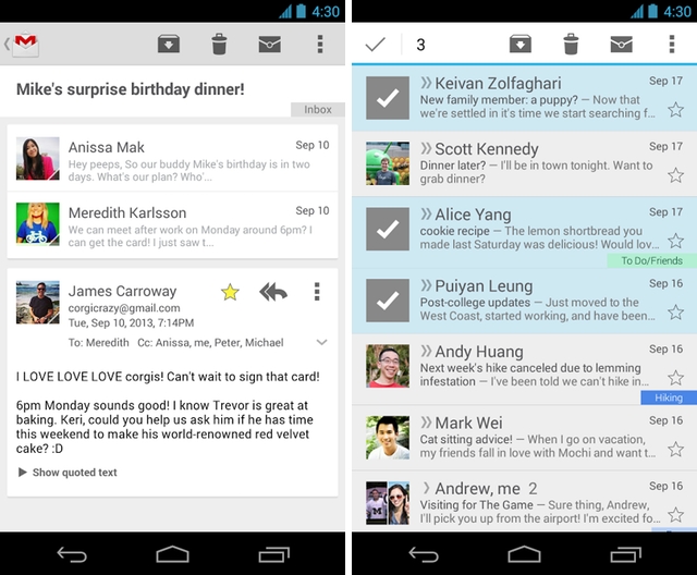
With the addition of a left-side sliding menu and, now, a move to a cards-based conversation view, Gmail for Android is beginning to look a lot like the rest of Google’s app ecosystem: clean, simple and white.
The new look also brings some improvements to multi-email selection; gone are the strange-looking avatar boxes in place of checkboxes. It’s a small but significant workflow alteration.
The app is rolling out over the next few days, so keep watching the Play Store for that Update button.
[source]Google Play[/source][via]Google+[/via]
MobileSyrup may earn a commission from purchases made via our links, which helps fund the journalism we provide free on our website. These links do not influence our editorial content. Support us here.


