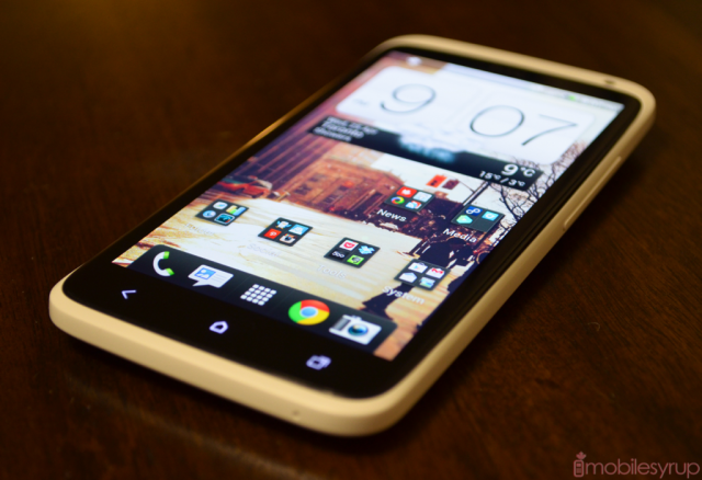
HTC had no choice but reinvent itself; it was necessary for its survival. After a disappointing year in 2011, the One X is HTC’s most important phone since the Hero, when it introduced Sense to the Android world and cemented itself within the industry as a promulgator of form and function.
At first glance, the One X is barely recognizable as a HTC smartphone. Though its singularly precise bodywork and outstanding balance reminds us in many ways of the Sensation, the move from aluminum to a matte polycarbonate and subtly-curved body speaks to the company’s willingness to experiment.
At the time of writing this review for the One X, it’s currently Canada’s most powerful Android device. On paper the device has it all, both outside and in. Let’s take a ride to the centre of the One X to see if the experience delivers on its promises.
Specs
– Android 4.0.3 with Sense 4.0
– 4.7-inch 720p Super LCD 2 display
– 1.5Ghz dual-core Snapdragon S4 processor
– 1GB RAM, 16GB internal storage (non-expandable)
– 8MP back camera w/ ImageSense, 1MP front camera
– 1080p video capture w/ image stabilization
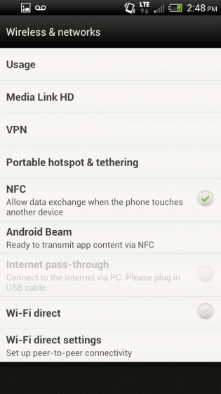
– WiFi (b/g/n), WiFi Direct, Bluetooth 4.0 w/ A2DP, GPS, NFC, Beats Audio
– 1800mAh non-removable battery
– 3G: 850/AWS/1900/2100Mhz, LTE: 1700/2100Mhz
– 3G: 21Mbps down/5.76Mbps up, LTE: 100Mbps down, 50Mbps up
– 134.8 x 69.9 x 8.9 mm
– 130g
Design
The One X is a big phone, given that it has a 4.7-inch screen. But there is nothing excessive about it despite its considerable height and width: in the hand it feels approximately the same size as the 4.3-inch Motorola RAZR. To cut down on thickness — the One X is a svelte 8.9mm — HTC has embedded an 1800mAh battery within the chassis. So too have they done away with expandable storage, limiting the user to 9GB of SD card space and 2GB for apps. I say this off the bat to set expectations: this is HTC at its minimalist best.
These are controversial changes, certainly, especially since the international version has 32GB of storage. Other than that (and the quad-core LTE-less Tegra 3 chip) both models are identical. A volume rocker, flush with the device, is on the right side. The left, three-quarters of the way up, is the microUSB charger, a curious location indeed. Most users I’ve spoken to prefer the charging port on the bottom, made standard by Samsung.
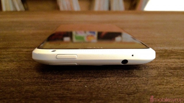
On top are the headphone jack and power button. Curiously the power button is on the right side, which caused some trouble when unlocking the phone straight out of pocket. Because of that whole-palm method of clutching the phone, it requires a subtle shift in the hand to reach the power button with the right index finger. For lefties this isn’t an issue, but it brings up an important question: is the HTC One X a one- or two-handed phone?
As thin as the One X is, much of the time I found myself needing to either shift the phone in my hand to reach the top of the screen, or to hold it steady in the palm of my right while manipulating the screen with the left. This is true of the camera, too, as we continue our tour of the phone. The 8MP camera module protrudes slightly, surrounded by a metallic plastic ring that matches shades with the HTC insignia below.
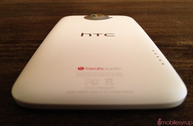
The mono speaker is elegantly etched into the bottom of the device using the same precision machine process as the Lumia 800. A Beats Audio logo above the speaker reminds us that we’re in for an aural treat, though ironically only when using headphones.
The two-handed question opens itself up again when using the phone’s superlative camera. While light enough at 130g to hold between thumb and middle finger, its length risks imbalance when tapping the on-screen shutter button. Cradling within the palm and stabilizing with the index finger while pressing the shutter with the thumb is also possible, but equally unstable.
All this is to say that the One X is somehow impressively compact and deceptively large. Because the polycarbonate finish is slippery — exacerbated by oily or clammy hands — having to reposition the phone to reach the notification bar is a trade off for an enormous, and triumphant, 4.7-inch display.
HTC has employed a slight curve to the phone, at both poles, ensuring a concave appearance from the side. But unlike truly concave displays such as the Nexus S, the glass on the One X is flat and the curve happens only to the plastic. Nevertheless, this slight outward glide helps fit the phone more comfortably in the hand — long phone calls were extremely comfortable on the One X.
Ultimately, HTC has made huge improvements to its overall design philosophy with the One X. Small quirks aside, the company hasn’t released a phone that feels this coherent, this singularly focused, in a very long time, and that speaks to how much I enjoyed using it on a daily basis.
Display
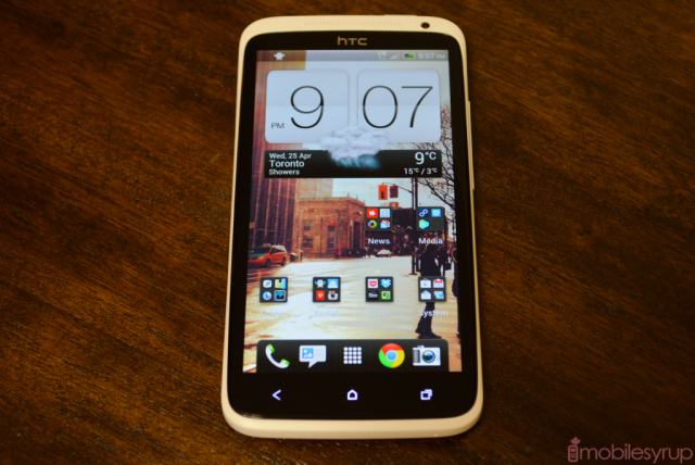
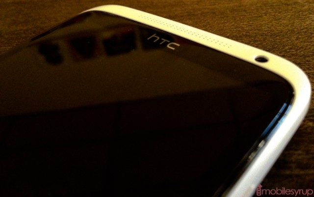
As I said in the Hands-On, the One X has the best display I’ve ever seen on a smartphone. The 720p revolution only started late last year with the Galaxy Nexus and Optimus LTE, but the quality of parts has proliferated immensely since that time.
With the One X, HTC has managed a non-Pentile with superb viewing angles, excellent maximum brightness and almost-perfect colour reproduction. This is the equivalent of the excellent Incredible S screen but with nearly three times the number of pixels.
I have two minor qualms with the One X’s display: its black levels don’t compare to that of an AMOLED display, and the phone’s automatic brightness levels leave the screen too bright in most situations. Let’s address each one individually. AMOLED displays will always have improved contrast levels over its rivals because they don’t employ a backlight; pixels are either on or off. A traditional LCD, even the Super variety, uses a backlight even on dark tones. But black levels on the One X are accurate and deep enough to offset many of the inherent advantages of AMOLED. The upside is that whites avoid the blueish hues that plague many of Samsung’s Galaxy devices, avoiding oversaturated colours in the process.
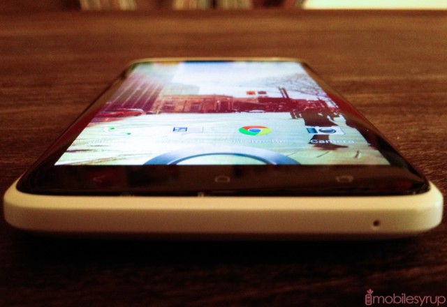
It’s easy to be seduced by the absolute clarity of the One X; reading text is like scrolling your finger up and down a laminated piece of paper. And because colours don’t lose their vivacity when angling the screen to and fro, the larger-than-average screen better mimics the effect of reading a book than any smartphone I’ve used.
The second slight issue I have with the One X’s display directly relates to that scenario: the auto-backlight is a bit liberal, leaving the screen too bright in most situations. Not only does this risk depleting the battery more quickly, but in many cases I prefer to read on a screen that is slightly darkened.
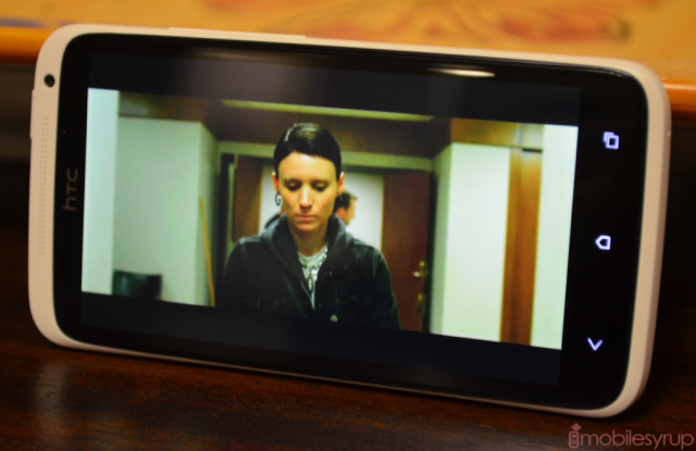
One of the first things I did with the One X was load up YouTube and watch some HD trailers. The device is so clear, so fantastically bright and spacious, that it’s the first mobile device on which I haven’t shied away from viewing full-length movies. HTC Watch, Google Play and Netflix were made for smartphone displays like this.
Performance
As I showed you in the hands-on, the One X blows away all other Android phones in the benchmark department. It nearly doubles its predecessor in CPU tests, and the upgraded Adreno 225 GPU smokes rivals such as the PowerVR SGX540.
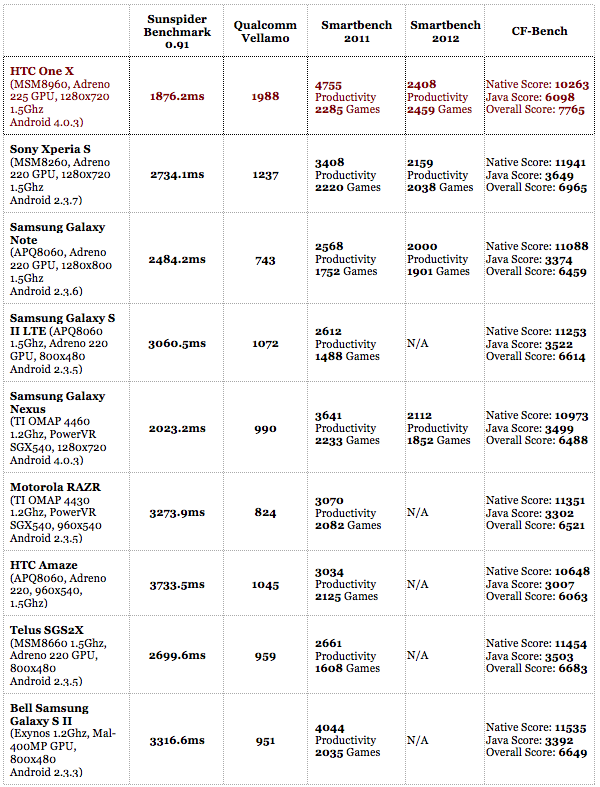
More importantly, the One X feels faster than any Android device I’ve used to date. Even the Galaxy Nexus, which was designed to run Ice Cream Sandwich, stutters in places that the One X does not. There were times that I didn’t even realize an app was open because there were no loading times.
I try to judge devices both objectively, using benchmarks, and subjectively, by performing “regular” activities such as browsing, consuming media, playing games and typing. As you can see above, the benchmark results speak for themselves, though the GPU is not quite as fast as, say, the Mali-400 in the Galaxy S II. But when browsing over LTE using Chrome for Android or typing a long email using SwiftKey 3 Beta — both have been known to cause the Galaxy Nexus to stutter — there is not a moment’s hesitation.
The potent combination of Android 4.0 and a Snapdragon S4 SoC seems to be the key here. Sense 4.0, too, is less overbearing than its predecessor, but the hardware acceleration in ICS and the inherent computational prowess of Qualcomm’s new chipset are the real winners.
Camera
The excellent performance extends to the camera, too. HTC has embedded an 8MP backside illuminated sensor with a f/2.0 aperture lens, plus a dedicated processing chip dubbed ImageSense. This allows the phone to take shots at speeds of 4fps by holding down the virtual shutter button.
Photo quality is uniformly excellent in well-lit scenes, and mostly good in low-light scenarios. In a future post we’ll take you through comparisons with the iPhone 4S, Sony Xperia S, Galaxy Note and Lumia 900, but for now we’ll show you some sample photos.
If you saw the depth of field examples from the Hands-On, take comfort in the fact that the One X gives you a premiere photo experience. Not only is the shutter instantaenous but shots are generally in-focus and sharp, especially when you take the time to frame it.
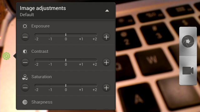
There are a number of guides, modes and settings to help you achieve that perfect shot, too. While ‘Auto’ will attempt to figure out white balance, exposure and ISO on its own, specific features like ‘HDR’, ‘Landscape’, ‘Close Up’ and ‘Low Light’ are meant to enhance photos for specific scenes. Many of them attempt to manipulate lens sensitivity or exposure levels to provide optimal results, but I found that ‘Auto’ did the best job in most scenarios.
HTC has taken a cue from Instagram and PicPlz by bundling its own set of playful filters which can be applied in real time. Company mainstays like ‘Monochrome’ and ‘Vintage’ are present alongside more interesting additions like an adjustable ‘Depth of Field’ filter.
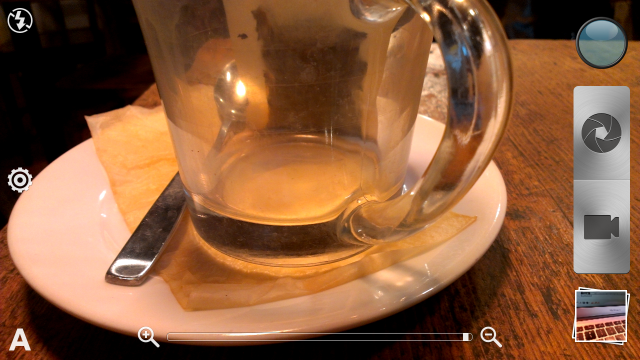
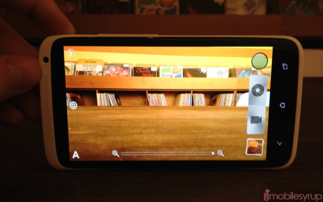
The camera UI has been largely overhauled to give you as much viewing area as possible for a given photo. There are no longer separate still photo and video modes; instead the recorder button is just below the main shutter, and can be activated at any time. When shooting 1080p video it is now possible to capture 5MP stills, something the Galaxy Nexus can boast of only at much lower quality.
The 1MP front-facing camera is good, but no better than the majority of its competition, while 1080p video is of high quality, but lacks effective image stabilization (despite the feature being present). There is plenty of detail in the video, and colours are deep and rich; the sensor also adjusts to light very quickly. But I found there to be a distinct shakiness to whatever I captured, exposing its smartphone roots. Samsung and Apple seem to have done a better job with image stabilization on the iPhone 4S and Galaxy S2 respectively, and I hope HTC figures out a way to improve it, since all the other aspects are there.
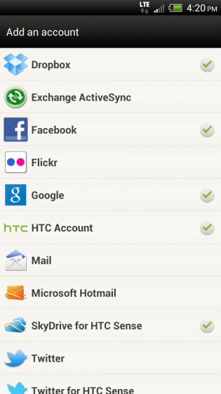
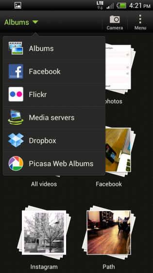
HTC has added the ability to auto-upload photos to Flickr or Facebook, alongside Dropbox’s native Camera Upload feature that is enabled by default. You can also sign into Microsoft’s Skydrive to access existing photos from the service, alongside mainstays like Facebook, Flickr, Dropbox, Picasa and Google+. The integration with the native Gallery app is seamless and fast, making it a standout feature against native Android Ice Cream Sandwich, which does not offer nearly the same number of integrated services.
Software
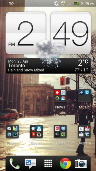
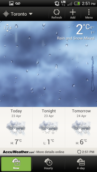
Sense 4.0 is, simply, a pared-down and de-bloated version of what HTC brought with the Sensation and Amaze. Its customizable dock, 2D floating widgets and vastly improved performance make the experience significantly better, and I have to commend them on creating one of the finest Android user experiences around.
Much of this fette is owed to Android 4.0, which is inherently more beautiful, intuitive and capable than Gingerbread. HTC has adopted the ICS method of creating folders and swiping away individual notifications, along with a horizontal app drawer and improved method of adding widgets to the home screen.
But there are areas within the operating system that they have either changed for change’s sake, or the improvements are so minute as to be inexplicable.
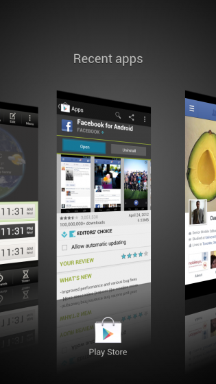
For example, the new multitasking menu, while seemingly more intuitive than the vertically-scrolling default ICS version, is ultimately finicky. Like on Windows Phone, the large 3D snapshots of your previously-used apps are arrayed in order of most- to least-recently used. You can flick upwards to end the process — the same as the horizontal motion in stock ICS — which is quite convenient. But the whole endeavour seems needlessly ostentatious, and is certainly no improvement over the very natural-feeling method in stock ICS. Even the One V, which is HTC’s low-end entry in the One Series, maintains the vertical multitasking menu in Sense 4.0.
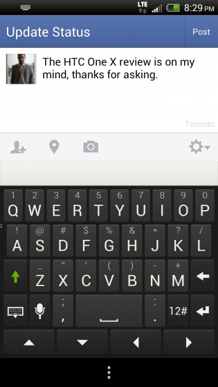
The keyboard, too, has been embiggened, with endlessly tall letters and permanent directional arrows that seem to be of little use to the regular user. Depending on the app, the directional arrows will be present if there is no legacy menu button, though at other times they will show up even if the menu button is in use, as with the Facebook app. This results in the keyboard letters being disproportionately high on the screen.
As always, HTC’s built-in autocorrect is excellent, often more intuitive than Google’s own ICS keyboard. But whereas Google made the space bar wide enough to mitigate accidental presses of the buttons on either side, HTC’s keyboard is not quite as lucky. Options to remove the directional arrows or increase the width of the space bar should be present but aren’t, ensuring that many users will go as quickly as possible to Google Play for SwiftKey X or Smart Keyboard Pro. For those who prefer to “Swype,” HTC has included a Trace feature that works much like the aforementioned newly-acquired namesake, but comes off as less functional overall.
Beyond those two annoyances, I’ve found Sense 4.0 — at least running on the One X, we’ll see about the One S and One V — to be the second best Android experience I’ve had next to the Galaxy Nexus and stock Ice Cream Sandwich. Why doesn’t it quite match up to the fantastic precedent set by AOSP Android? Because there are too many inconsistencies within the various apps to be overlooked. While on stock Android you select, copy and paste text the same way throughout the OS, Sense 4.0 incorporates elements of its unique (and quite intuitive, I must say) Sense style of copying and pasting, only to fall back to the stock ICS method on certain occasions.
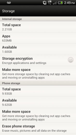
Some potential buyers of the One X are going to be put off by the now-standard 16GB of internal storage with no option to expand. Apple offers its iPhone in 16, 32 and 64GB versions, each $100 more than the last. But HTC has two models, a 16GB LTE version for North America , and a 32GB HSPA+ model for the rest of the world. It’s difficult to understand why they chose to cut in half the user storage, but it leaves users with few options but to stream more media content, since there is just over 9GB usable SD storage space, alongside 2GB for apps. HTC tries to mitigate the problem somewhat by extending a user’s Dropbox storage to 25GB (from the default free 2GB), and while music can be streamed from the service, the same can’t be said for other forms of media.
To sum up the One X, its overall experience with existing Android apps, the ones I use most every day on my Galaxy Nexus, is fantastic. App load times, scrolling through lists, looking at photos and watching videos, browsing the web — basically anything you’d think of doing on a smartphone today — is demonstrably faster on the One X. Not only faster, but better. And as soon as developers figure out their issues with HTC’s legacy menu button, my other knock against the design of the One X will be made moot.
Included Apps
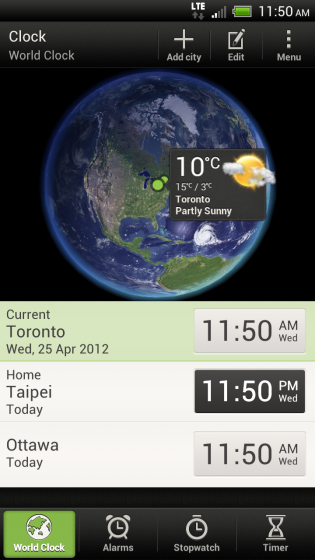
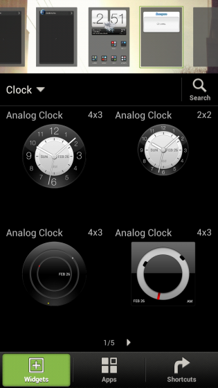
HTC has included a fair number of “stock” apps for your perusal, though few of them deserve more than a passing mention. As always, the Clock app, which opens when you touch the gorgeous new clock ticker widget on the main home screen, is a stunning piece of engineering. Now with a manipulable 3D globe looks fantastic on the high res screen, you can add up to 10 cities to your roster, and set alarms, a stopwatch and a timer. The Clock app, along with HTC Watch, is an example of an app that HTC put a lot of care and thought into.
Unfortunately the same can’t be said for the stock Notes, Tasks and Movie Editor which promise great things and greatly underdeliver.
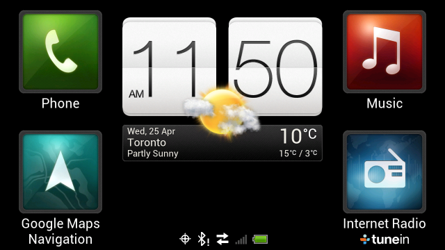
HTC’s Car Mode app is extremely functional and attractive. With the optional car dock, the ability to hook into music, internet radio, navigation or to make a phone call, will be an often-used feature for most drivers.
As usual, Rogers includes its own melange of bloatware, but the One X has the advantage of being able to disable any app from within the App Manager. While this doesn’t actually uninstall the app (if it takes up space, it continues to do so) it does “disappear” the icon and all associated relationships with other apps. This is as good as you’re going to get in this day and age and something we appreciate HTC allowing users to do — we’ll see if Samsung follows suit.
Network Speeds, Audio Quality & Call Quality
The HTC One X boasts some of the fastest overall speeds from any phone we’ve ever used, be it zipping around homescreens or downloading large files. This is owed to Qualcomm’s Snapdragon S4 processor with its integrated LTE baseband. As we showed you during the Hands-On, the One X is capable of some incredibly high speeds on the Rogers network, and it’s the first LTE device I’ve used where I felt like the CPU could finally keep up with the downloads.

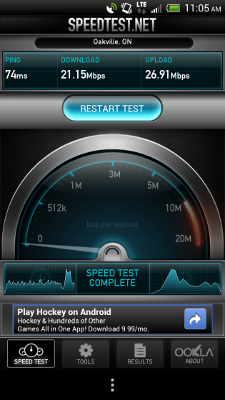
We were consistently able to get over 25Mbps both download and upload over the Rogers network, and when falling back to 4G in areas without LTE, the speeds were a very manageable 3-5Mbps down and 1-2Mbps up. As LTE expands across Canada, I’m excited for more Canadians to experience it — the difference is truly astounding, and you won’t want to go back.
As for call quality, the One X is definitely middle-of-the-road. Call volume was excellent from both the headpiece and the rear speaker, but there were times when those on the other end sounded hollow, almost like they were talking into a can. This wasn’t always the case — it depended on the connection and the recipient’s phone — but I’d love to see HTC take a more serious stance on this in future devices.
Reception also seemed to be an issue, especially in areas with weak LTE signals. The device would vacillate between one bar of LTE and five of HSPA+, but the handover disrupted downloads and caused web pages to stop loading. After a couple seconds, all activity would resume once again, but in certain pockets of the GTA I had to manually turn off LTE to keep the device from attempting to gain, and promptly lose, a signal.
I also found that the One X had trouble holding onto a LTE signal where the new iPad, my only other LTE-capable device on hand, had no issues maintaining two bars. This is likely due to the larger antenna system in the iPad, but also speaks to whether the One X baseband is optimized for the Rogers network.
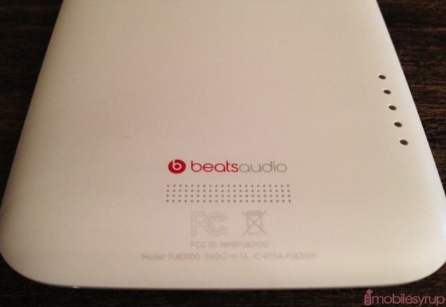
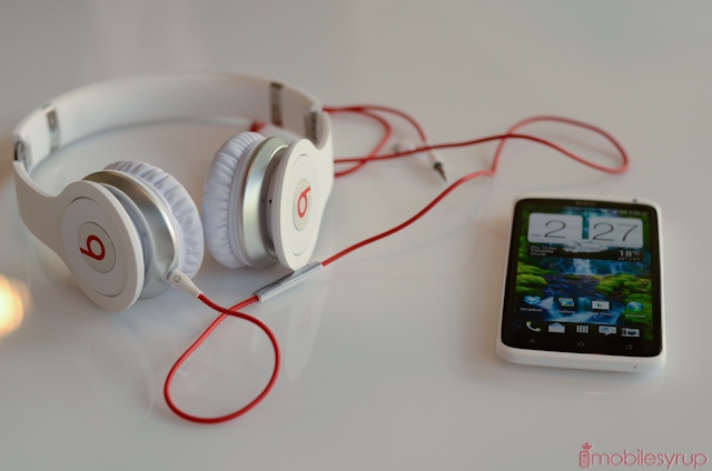
The Beats Audio integration is very cool, but certainly more a marketing vehicle than a true revolution in sound. I’ve demoed the One X with the very expensive Beats Studio headphones, and I’ll be honest when saying it was one of the truly best listening experiences I’ve had on a mobile device. That’s because HTC has included equalizer settings for the majority of the Beats line-up to match each can’s particular aural signature.
But the sheen wears off quickly when you plug in your own likely cheaper pair of headphones to discover that, despite the ability to use Beats with any set and in any app, the improvements are only as good as the quality of the equipment. The default “Other headphones” setting tends to compress the dynamic range, increasing low-end frequencies such as bass while decreasing the harsh sibilant treble range. This has the effect of making rock and rap music sound louder and punchier, but for any other genre of music that isn’t already heavily compressed in that range it sounds muddy and dull. In short, bad headphones will sound bad.
The One X is Canada’s first smartphone with Beats integration, and for the likely thousands of young folks already with a pair of Beats headphones, the combination will be music nirvana. For everyone else, not so much.
Battery Life
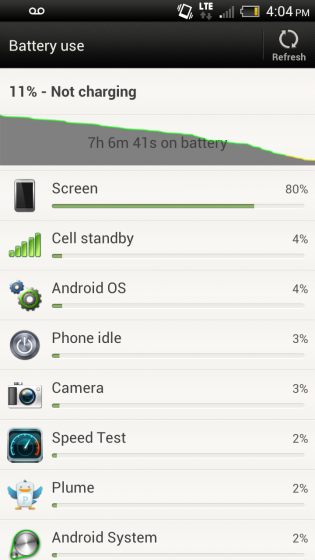
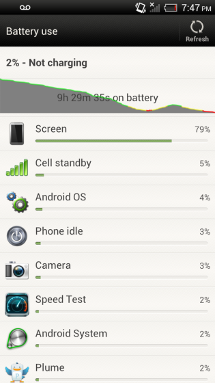
For the first smartphone with integrated LTE, I had high hopes for the One X’s battery life, and for the most part it delivers. For the first few days, when I was heavily testing the One X, the battery lasted between seven and nine hours. On one day I turned off LTE and it lasted nearly 15 hours on a single charge.
With “regular” use the One X is going to be fine for battery life. That’s not to say integrated LTE negates the relatively higher battery drain but it certainly improves upon it. With battery tests certain things must be taken into account: the strength of the signal, the brightness of the screen, and most importantly how many things are updating in the background.
I’ve already related my dissatisfaction with battery life on most Android phones, but the key thing to remember is that many apps, such as Twitter, Facebook, RSS readers and more, update in the background by default. This is impossible behaviour on iOS and Windows Phone (with a few exceptions) but it requires the user to be prudent in monitoring which apps are updating in the background and adjusting their frequency accordingly.
That isn’t to say I was happy with the battery life of the One X. HTC assured me that the ultra-efficient 28nm Snapdragon S4 chip would have no trouble lasting an entire day, which I took to mean from the time I take the phone off the charger in the morning until I go to sleep. As much as I tried, with LTE enabled this doesn’t seem possible. Let’s say I take the phone off the charger before I leave for work at 8:30am. Nine hours of uptime, with “regular” use, would deplete the battery by 5:30pm. Disabling LTE would add an extra five or six hours to that tally, bringing us to 10:30 or 11:30pm, more than enough time to get home after a busy day and plug in the phone.
As I said earlier, if HTC adjusted the Automatic Brightness setting to be a bit more conservative, some juice could be saved that way.
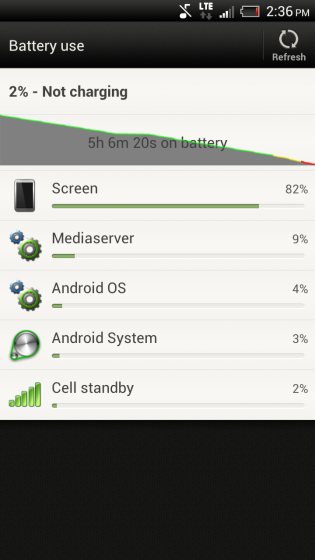
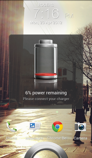
In order to test the One X under the most trying of circumstances, I played a 1080p video on loop until the phone almost died. Sound was off, but LTE was left turned on. The phone lasted 5 hours 6 minutes before it finally shut off.
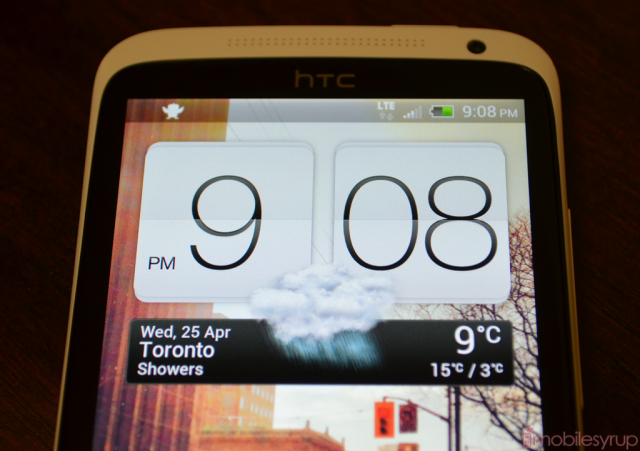
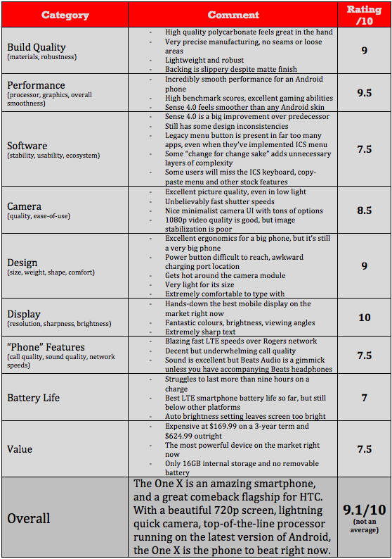
Summing it all up
The HTC One X is currently the best Android phone on the market, and its only competition hasn’t even been announced yet.
This is a tremendously powerful, intuitive and functional smartphone. Forget that it’s Android for a moment. Look at it from a user experience perspective: this is one of few smartphones that you can just pick up and use without having to fiddle with settings, widgets and apps. The out-of-the-box usability is better than any other Android phone in recent memory. Add the fact that the Android app ecosystem is strengthening every day — no app vendor can ignore the 300+ million devices out there — and you have an extremely viable content consumption device. From Google Play (apps, books, movies) to HTC Watch to Rdio to 7Digital to Netflix, the choices are varied and welcome.
Its problems are minor, and its potential huge. As soon as HTC allows users to unlock the device’s bootloader, thousands of developers are going to go crazy over the prospect of building custom ROMs for the One X. Throughout my time with the device I experienced no app crashes, minimal slowdown and, despite the eyesore legacy menu button, it rarely got in its own way.
While its size may be too much for some users, the One X has the screen, the speed and the network to justify its cost. As long as HTC doesn’t linger too long in updating the device to the next version of Android, this could be the first Android device in a long time I’d gladly sign a three-year term for.
MobileSyrup may earn a commission from purchases made via our links, which helps fund the journalism we provide free on our website. These links do not influence our editorial content. Support us here.


