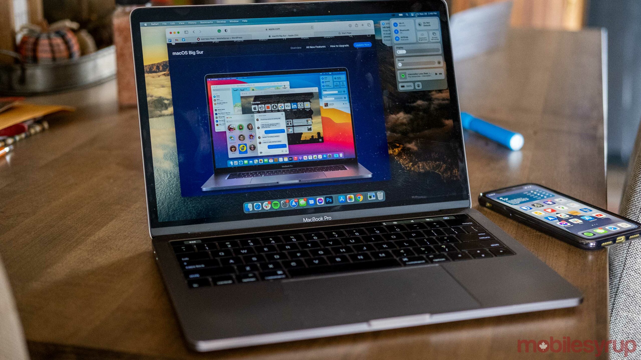
If you’ve downloaded the latest macOS version, there are a few new tips and tricks you can try.
While some Big Sur features like the Maps update are a little underwhelming, others apps like Safari have received useful updates that make them better platforms.
Safari
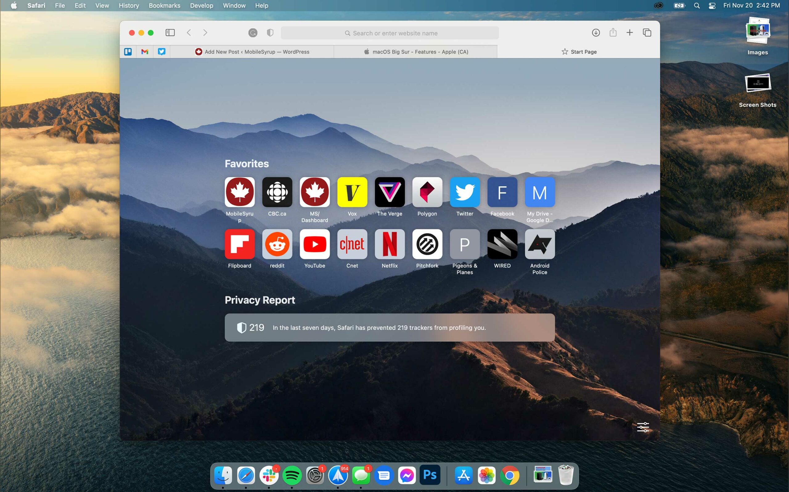
Safari is one of the best updates included in macOS Big Sur. There’s a new Privacy Report that helps show users what trackers are following users around the internet.
The new version of Safari also stops some trackers from following you, which is ideal if you don’t like being tracked online.
For instance, my Privacy Report says Safari has blocked 221 trackers and that 56 percent of the websites I visit use trackers. If you don’t see it, try clicking on the Safari Start Page Settings icon in the Start Page’s bottom right.
Once you open the settings, you can also customize the look of the page. My favourite look is using a customized wallpaper, displaying the favourites section and the Privacy Report.
Safari can also use Apple Translate, allowing it to translate webpages. This is a big move for Apple since it puts Safari on more level footing with Chrome and Edge.
Control Centre
Control Centre seems a bit simple now but will likely get better with future updates.
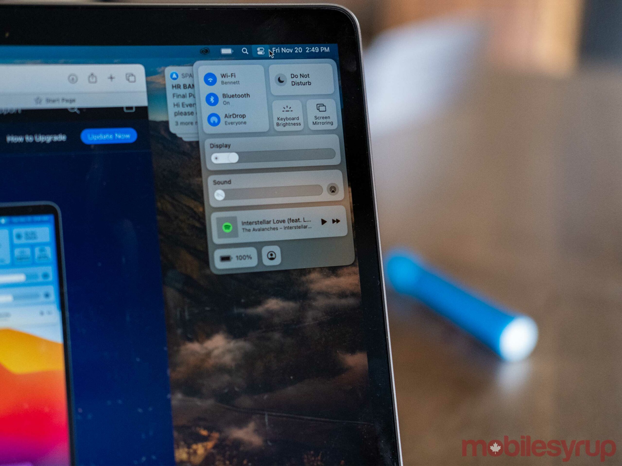
The new centre replaces the old Wi-Fi button on the macOS Menu Bar. When you click on it, a new menu lets you control your Wi-Fi, Bluetooth, screen brightness, and more. If you have music playing, this is where you can control playback.
If you go into the ‘Dock and Menu bar’ section of the Mac Settings app, you can add more things like accessibility controls and a profile switcher to Control Centre.
You can also drag quick actions out of Control Centre and onto the Menu bar for quick access to them. I like having as many things hidden inside of Control Centre as possible since it keeps the Menu bar uncluttered.
New Notification Centre
Alongside the Control Centre, Apple also revamped the Notification Centre with macOS.
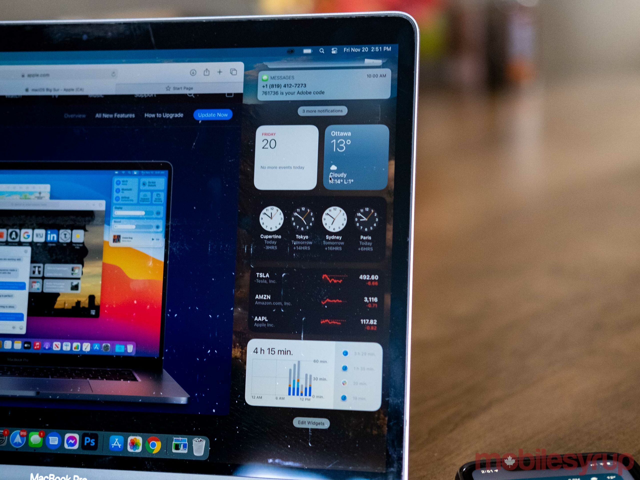
The first major change that’s a breath of fresh air is that notifications stack. This keeps the Notification Centre much more organized, much like it is on iOS.
The Notification Centre is also the new home of widgets on Mac. While there aren’t many Widgets to start with, many default Apple apps have them. Ideally, more third-party developers will add their widgets to the platform in the future.
To access the new Notification Centre, you need to click on the clock or the date in the Menu Bar’s top right corner.
MobileSyrup may earn a commission from purchases made via our links, which helps fund the journalism we provide free on our website. These links do not influence our editorial content. Support us here.


