Spark’s Android email app is getting a few quality of life improvements to bring it up to par with the Mac and iOS versions of the platform.
The app’s update is going live this morning and it includes profile pictures for email contacts, a customizable sidebar and folders. This should help make navigating the Spark easier since it’s now more visual and organized.
Avatars are turned off by default, but you can enable them in the ‘Theme’ section of the app’s settings. This feature is available on both Mac and iOS, but I don’t use them there, and I don’t think I will on Android, either. If you have several contacts with actual pictures that you email often, this might be nice, but for business use I think it makes things a little too cluttered.
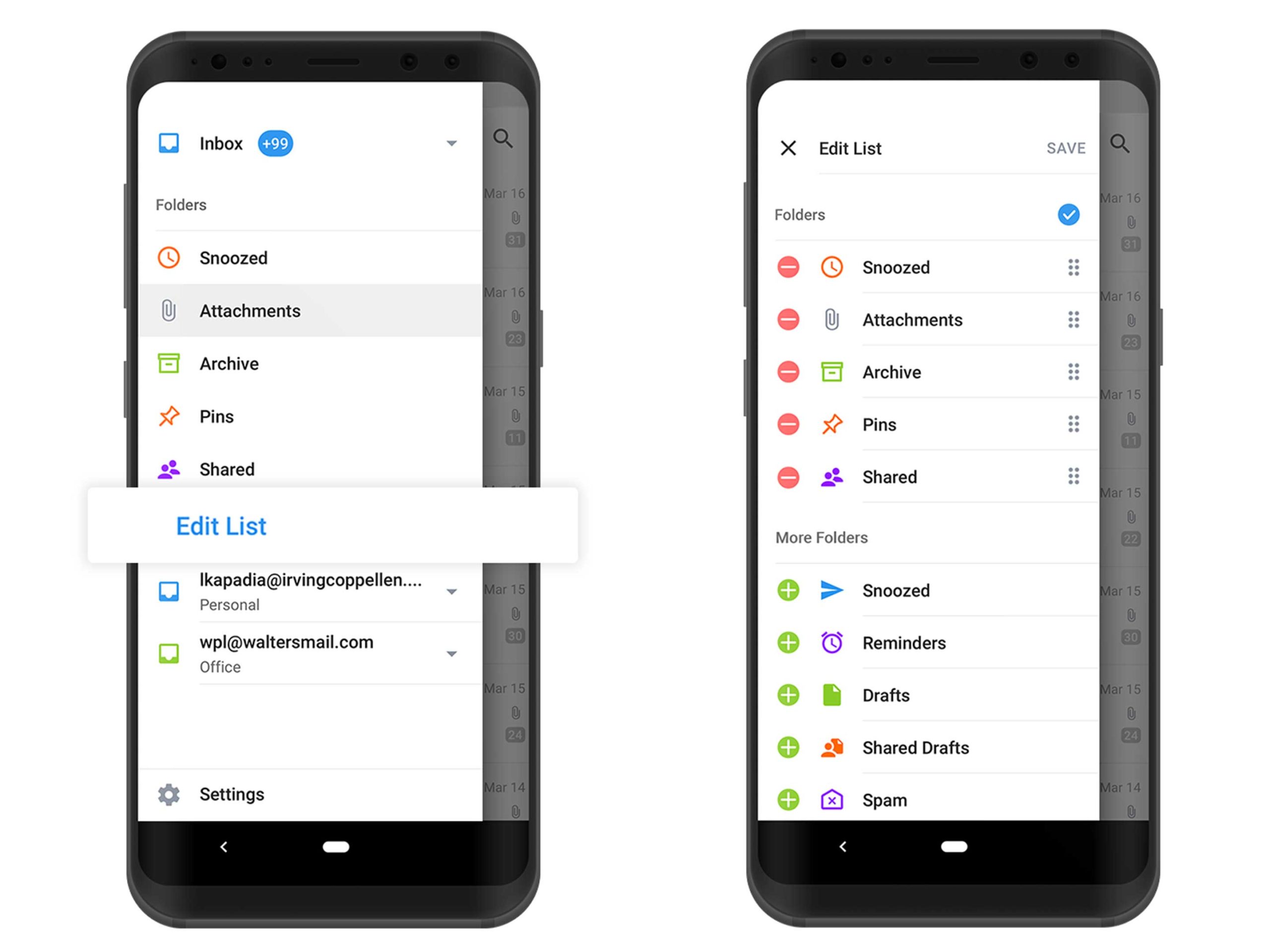
The app’s sidebar is where most of the update reveals itself. At first glance, the only new thing you’ll notice is a small ‘Edit List’ button above your email account names. From here, you can choose what main folders to see in the sidebar and how to organize the subfolders that are within each email account.
You can also add folders from your individual email accounts to the main sidebar menu, which is a nice touch. The final new feature is just the ability to create your own email folders.
Last fall, Spark updated its iOS app with a very clean and modern design and the promise that it’s coming to iOS later. It’s unclear if this is the update that was promised
You can download Spark for Android for free.
MobileSyrup may earn a commission from purchases made via our links, which helps fund the journalism we provide free on our website. These links do not influence our editorial content. Support us here.


