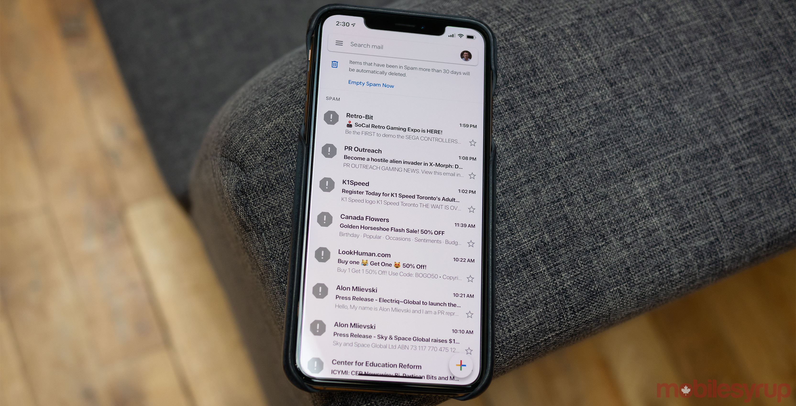
Gmail’s bright Material Design update is now rolling out to all iOS users across Canada.
Google announced that an iOS and Android update was set to make its way to its mail app last month. The update adds the ‘Google Sans’ front and a new search bar that sits at the top of the app’s user interface. As a result, Gmail’s recognizable red menu bar has disappeared from the mail client.
In general, the mail app’s overall design seems to have been cleaned up considerably.
The iOS version of Gmail also now indicates what emails include attachments directly in your inbox, which comes in handy if you’re like me and receive a seemingly neverending deluge of PDF press releases.
If you’re not a fan of the new look that includes attachments, you can always navigate to ‘Settings,’ and select ‘Conversation list density,’ in order to switch between ‘Default,’ ‘Comfortable’ and ‘Compact’ layouts. I eventually opted for the ‘Comfortable’ look since the multiple attachments I often receive in my inbox made scrolling difficult.
Just yesterday, February 20th, MobileSyrup reported that Gmail’s new look was rolling out to all Android users. If Gmails iOS redesign hasn’t made its way to your device, it should soon.
MobileSyrup may earn a commission from purchases made via our links, which helps fund the journalism we provide free on our website. These links do not influence our editorial content. Support us here.


