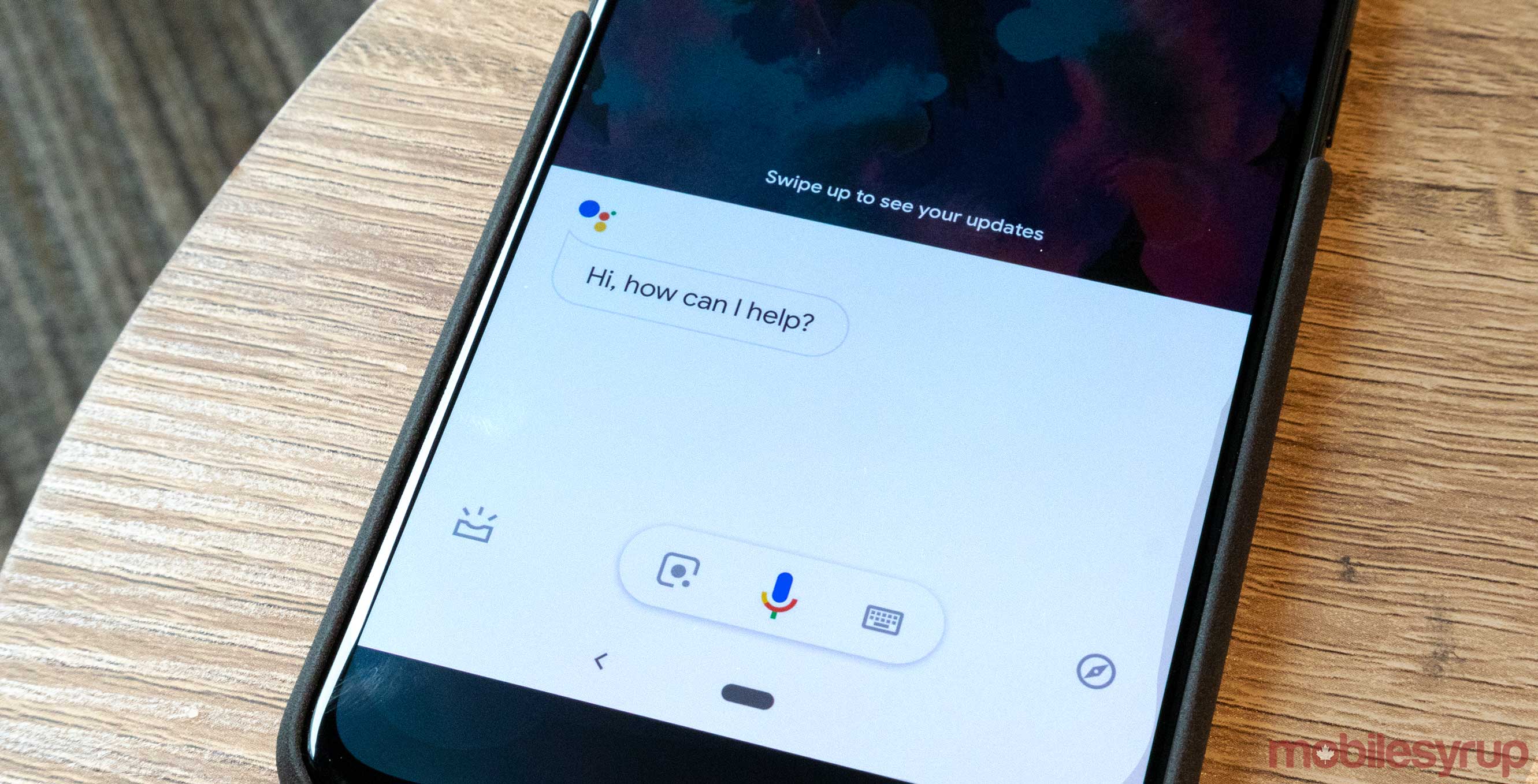
Google appears to be testing an Assistant Android interface tweak that makes the voice-activated assistant’s pop up easier to use with one hand.
In the updated interface, users are able to tap the microphone, Lens and keyboard icons all with their thumb. The three icons have been condensed into a single Floating Action Button (FAB). Design wise, this brings the pop up more in line with Google’s modern design language.
@AndroidPolice @technacity @Cody_Toombs @EvoWizz new Google assistant pop up pic.twitter.com/JHGqmT581I
— Philip Chang (@m4au312) December 14, 2018
The ‘Explore’ and ‘At a Glace’ buttons have been moved from the top right-hand side of the window to the bottom. They now reside where the Lens and keyboard buttons were previously.
The tweak appears to be server-side update. It hasn’t yet appeared on any of the Android phones in MobileSyrup’s office.
Source: Twitter, 9to5Google
MobileSyrup may earn a commission from purchases made via our links, which helps fund the journalism we provide free on our website. These links do not influence our editorial content. Support us here.


