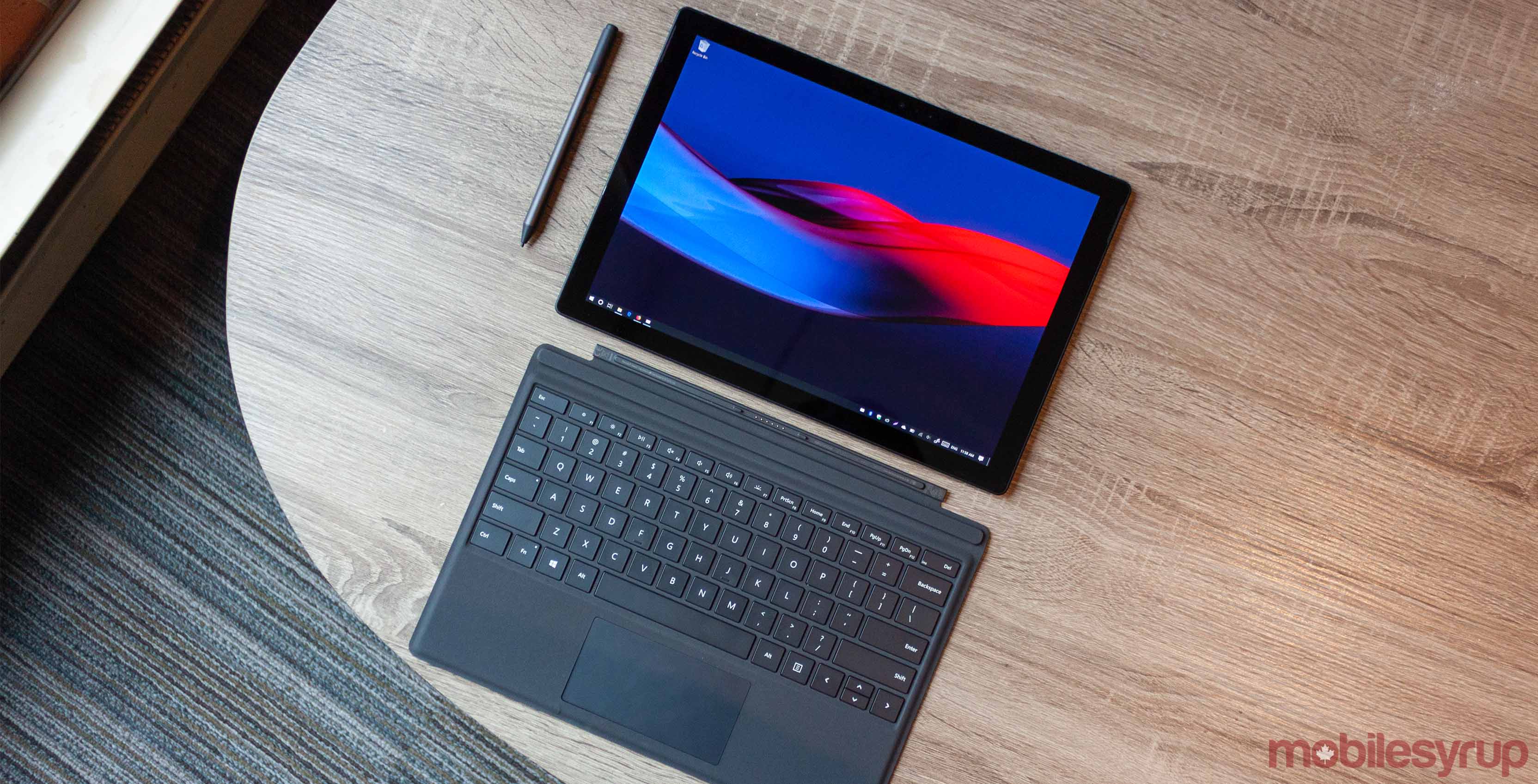
The Pros
- Adaptability; the Surface Pro 6 is an excellent laptop and great tablet
- Fast and quiet thanks to an i5 processor and fanless design
- Accessories like the Type Cover and Surface Pen complete the experience
The Cons
- Limited, last generation ports
- Battery life is middling
- Essential accessories can be quite expensive
Over the last six years, Microsoft has steadily improved its line of portable 2-in-1 Surface computers. The most recent addition to that line, the Surface Pro 6, continues to evolve the company’s offering.
Microsoft’s Surface line is the best it has ever been, but, for all its triumphs, a particular dedication to the past holds the Pro 6 back.
If you take a moment to consider the current climate of 2-in-1 offerings, there’s a lot of good out there. Google’s Pixel Slate will be here later this month and Apple’s new iPad Pro only just released. The competition has heated up in a space Microsoft once dominated.
For all it’s faults, I think the Surface Pro 6 still outshines the competition. Further, the Pro 6 demonstrates that not only does Microsoft know how to make a great computer, but it also has a plan for the future of portable computing.
The Surface is that future, and here’s why.
Converting a non-believer
I was never a fan of the 2-in-1 Surface devices. While I knew 2-in-1s had a place with consumers, I always assumed they offered terrible value — they were underpowered laptops contorted into something that might compete with an iPad. They tried to be the ‘everything’ computer and therefore weren’t particularly good at anything. I was wrong.
I’ve been a Windows guy for some time. I have a self-built desktop at home for when I need power for gaming or heavier photo/video editing workloads, and I have a traditional laptop for when I need portability. That laptop became my go-to computing device for work at MobileSyrup.
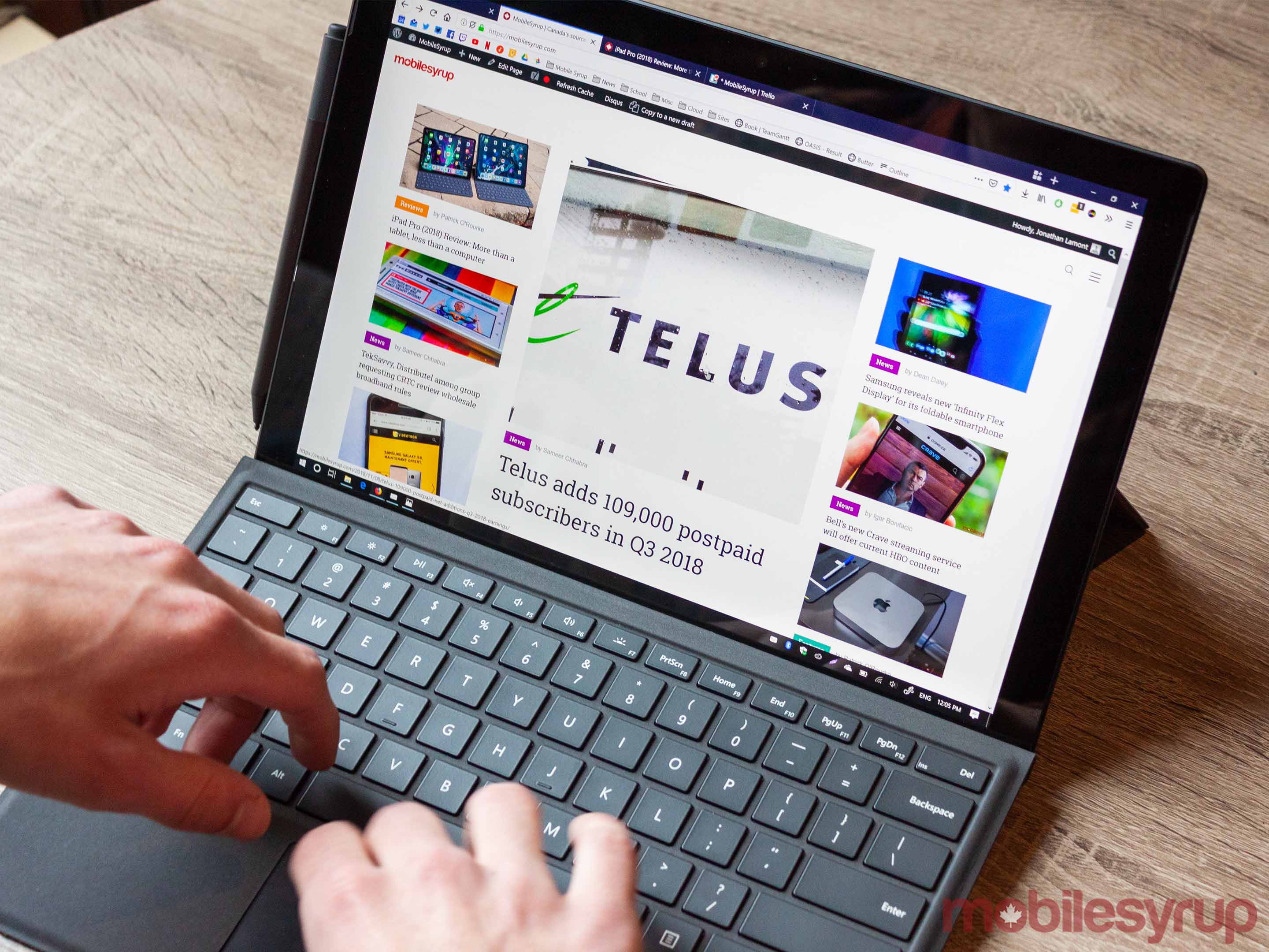
When I started with MobileSyrup, I quickly realized my old laptop wasn’t sufficient. I began searching for an upgrade. The Surface Laptop was high on my list at the time, but I almost immediately wrote off the Surface Pro. Further, Microsoft hadn’t rolled out its update yet, so I was looking at last year’s hardware.
Ultimately, I settled on an Acer Swift 3 because it didn’t break the bank and was decently specced on the inside. A few months later, when Microsoft provided us with a Surface Pro 6 to review, I was surprised to find that, on the inside, the devices were nearly identical.
Both sported Intel i5-8250U processors with 1.60GHz base clock and 3.40GHz turbo. Both devices featured 8GB of RAM as well. The only internal difference was the hard drive. Further, my Swift 3 had a 128GB SSD compared to the Pro 6’s 256GB SSD.
There was plenty different on the outside, which we’ll get into in a minute, but I want to focus on the internals for a moment. Despite the nearly identical internal set-ups, the Pro 6 consistently felt smoother and snappier than the Swift 3. Also, the Pro 6’s fanless design kept the device cooler than the fan system in the Swift 3 did.
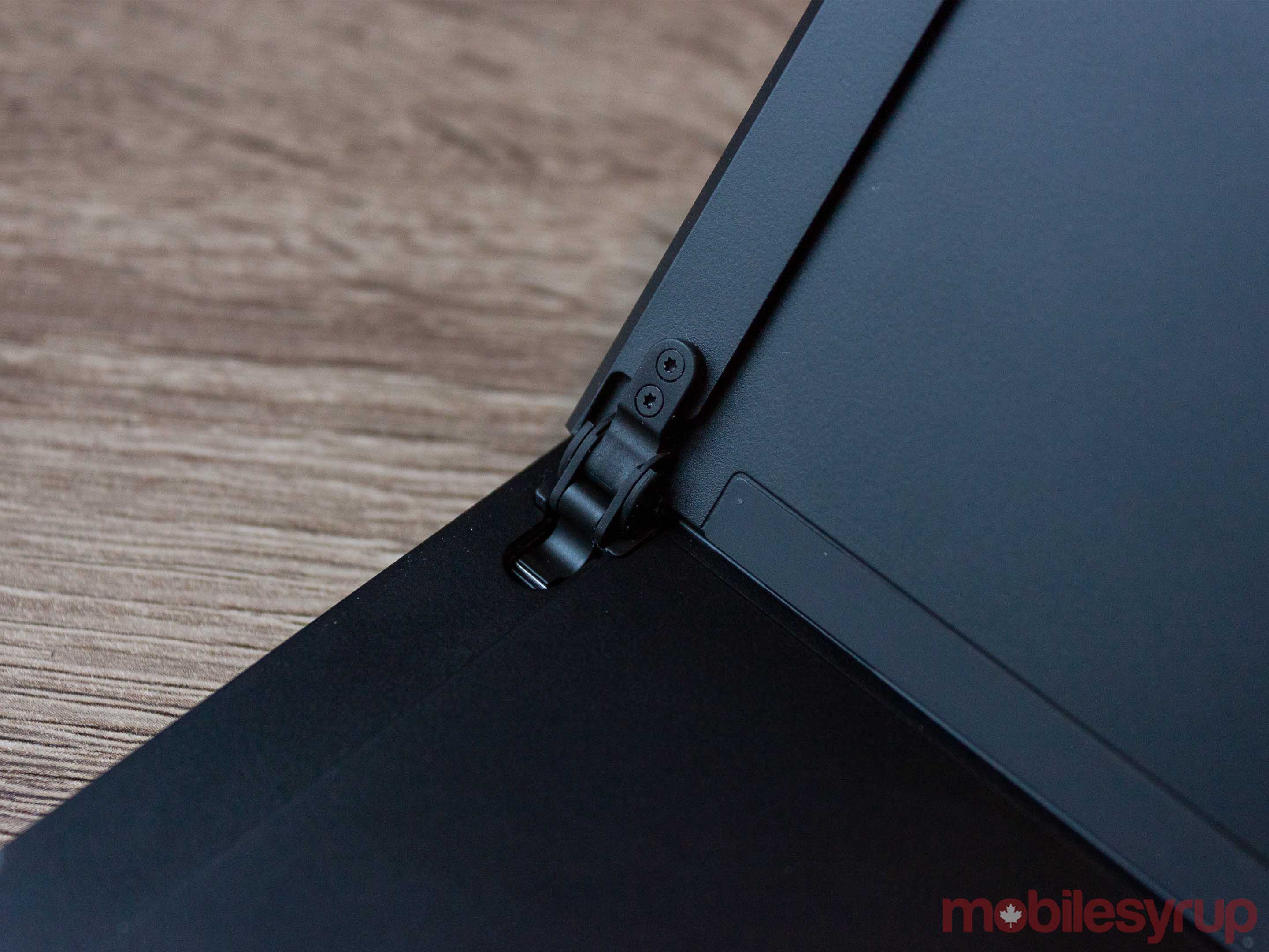
Further, the Surface Pro 6 far outlasted the Swift 3 in terms of battery life. Microsoft claims the Pro 6 lasts up to 14.5 hours, but the company tests by running a local video on loop until the device turns off.
In real world use, I found I got closer to five hours, but I could always eek out more by adjusting the battery settings. Typically I set it to ‘Best Performance’ when plugged in and ‘Better Performance’ when off power. I could get more juice by dropping to the ‘Recommended’ or ‘Battery Saving’ settings, but performance would suffer.
I highlight the comparisons to the Swift 3 not to deride Acer’s product — it was a good laptop that served me well. Instead, the differences were the beginnings of an understanding for me. Like Google’s line of Pixel smartphones, which consistently provide the best Android experience because Google tuned both hardware and software to its vision for a mobile device, the Surface is a marriage of hardware and software attuned to Microsoft’s vision for portable computing.
Specs and Benchmarks
- Display: 12.3-inch PixelSense display, 3:2 aspect ratio, 2736 x 1824 (267 PPI), 10 point multi-touch
- Processor: 8th gen Intel Core i5 or i7
- Memory: 8GB or 16GB RAM
- Storage: 128GB, 256GB, 512GB or 1TB SSD
- Dimensions: 292mm x 201mm x 8.5mm
- Weight: i5: 770g i7: 784g
- Camera: 5.0-megapixel front-facing camera with 1080p video capture, Windows Hello sign-in, 8.0-megapixel rear-facing camera with 1080p video capture
- Operating System: Windows 10
- Battery: Up to 14.5 hours of local video playback
- Connectivity: Wi-Fi 802.11 a/b/g/n/ac compatible, Bluetooth 4.1
- Sensors: Ambient light sensor, Accelerometer, and Gyroscope
- Ports: USB-A port, Mini DisplayPort, 3.5mm headphone jack, microSD card reader, Surface Connect Port
- Graphics: Intel UHD Graphics 620 (both for i5 and i7 variants)
I also ran a Geekbench benchmark test on the Pro 6. I don’t put much stock in benchmarks, as I find real-world use and experience to far outweigh the numbers on a page. However, it does paint a good picture for improvement over the previous year’s model.
Below, you can see the Pro 6 benchmark (left) alongside last year’s Surface Pro with its i5-7300 processor. The single-core score is slightly lower, but the multi-core score is significantly higher.
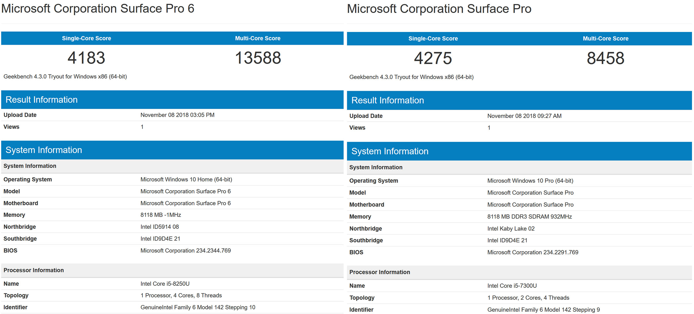
Overall, I’d say that the new processor options make a compelling argument for an upgrade, but on their own don’t offer enough. Unless you really need the extra power, the Pro 6 doesn’t offer much.
More of what you love
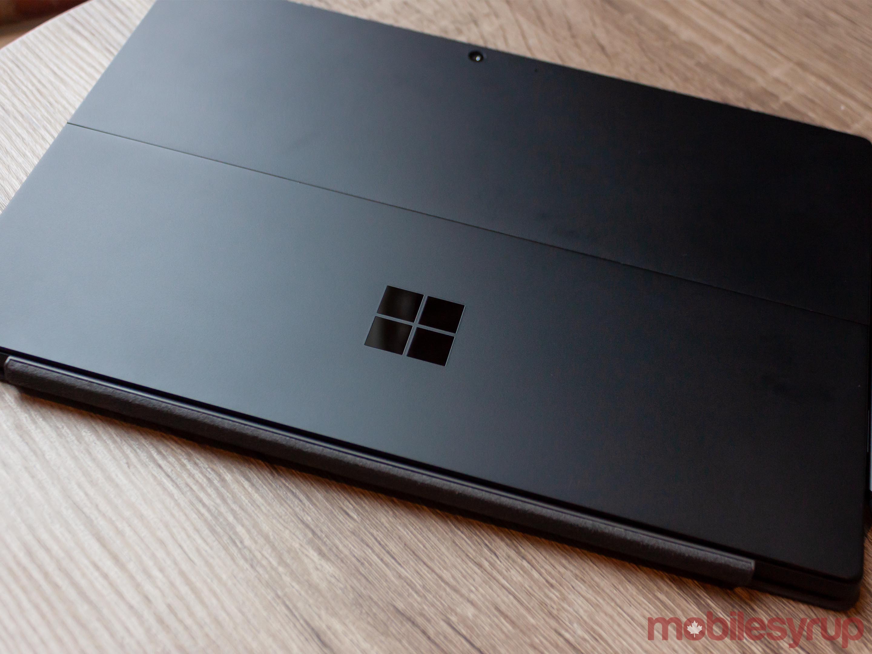
When it comes to the rest of the specs for the Surface Pro 6, longtime Surface users will notice not a lot has changed over its predecessor.
The Pro 6 is mostly an internal refresh and that’s fine. You can’t reinvent the wheel every year, and considering that Microsoft has nailed the form factor, the company doesn’t need to.
The most significant external change is the addition of a new black colour which looks absolutely stunning.
Ultimately, the Surface Pro 6 is an iteration on an almost-perfect formula. If you have an older Surface, you’re likely better off waiting for a 2019 refresh that hopefully will bring more than just a processor refresh. That said, the processor refresh in the Pro 6 is worth considering.
If you’re coming from a non-Surface Windows device like me, you should know that the Pro 6 is the most refined Surface Microsoft has ever offered.
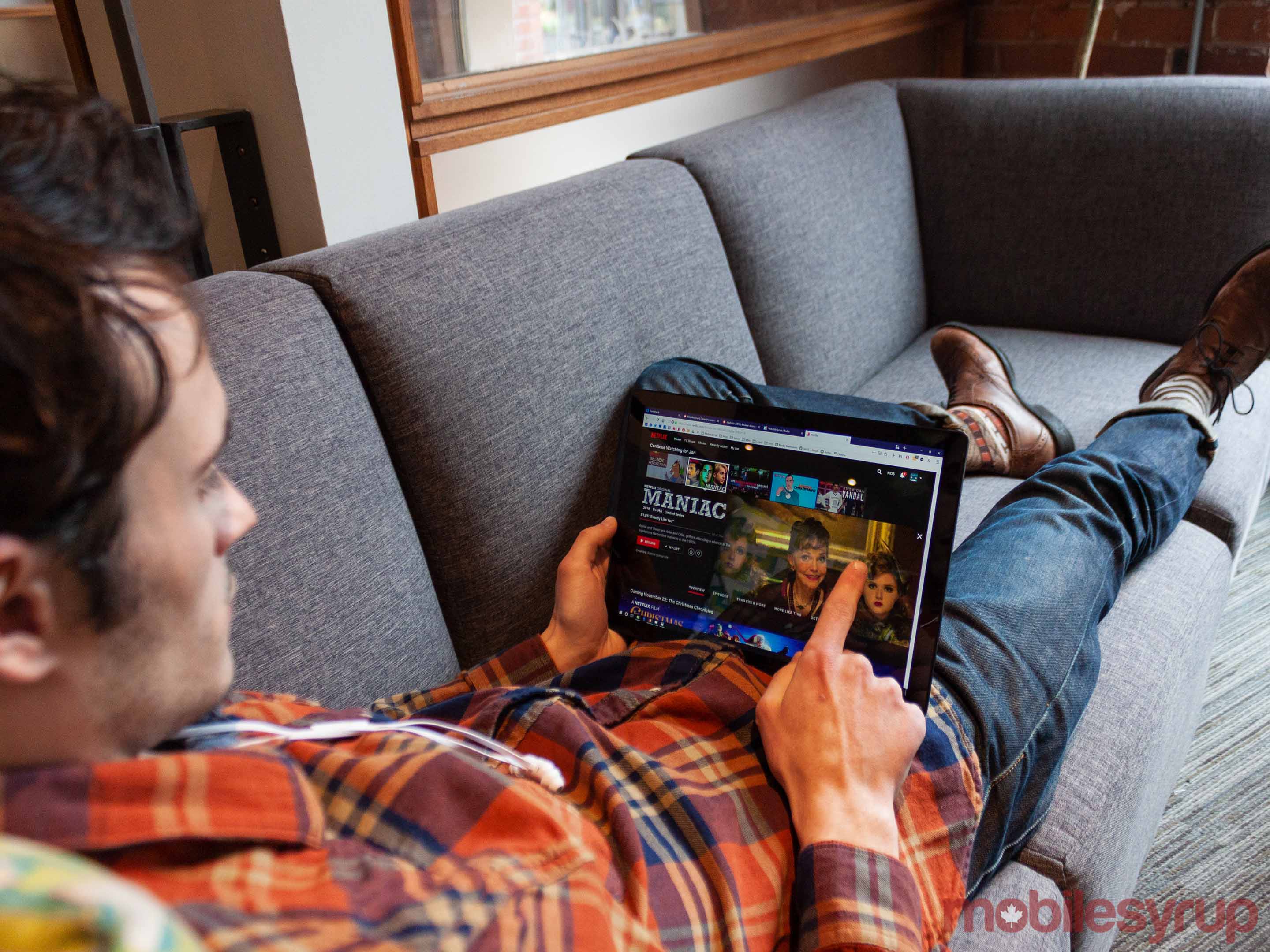
As someone who previously didn’t like the 2-in-1 format, I realized that it actually had some merit. Yes, there are some points where traditional laptops outshine 2-in-1 form factors. However, in using the Pro 6, I found those occurrences to be exceedingly rare.
If you use a Surface device, you probably already know this. You also probably already know how the Surface is adaptable to several different computing needs, how it’s really the ‘everything’ computer because it works so well in so many different ways.
If you aren’t a Surface user, you’ll probably spend your first weeks with the device as I did, marvelling over every instance it proves that a 2-in-1 can be better than a traditional laptop form factor.
I can go on about how the 3:2 display on the Pro 6 is an absolute pleasure to use, how Windows Hello makes signing into my laptop an enjoyable experience and more. But these features aren’t new and they aren’t different from what we had before.
Instead, we’ll look at the things Microsoft should have changed this time around, but didn’t.
A past that haunts
I’ve consistently enjoyed using the Pro 6. That enjoyment, unfortunately, makes the device’s drawbacks that much more painful.
First and foremost is the port situation.
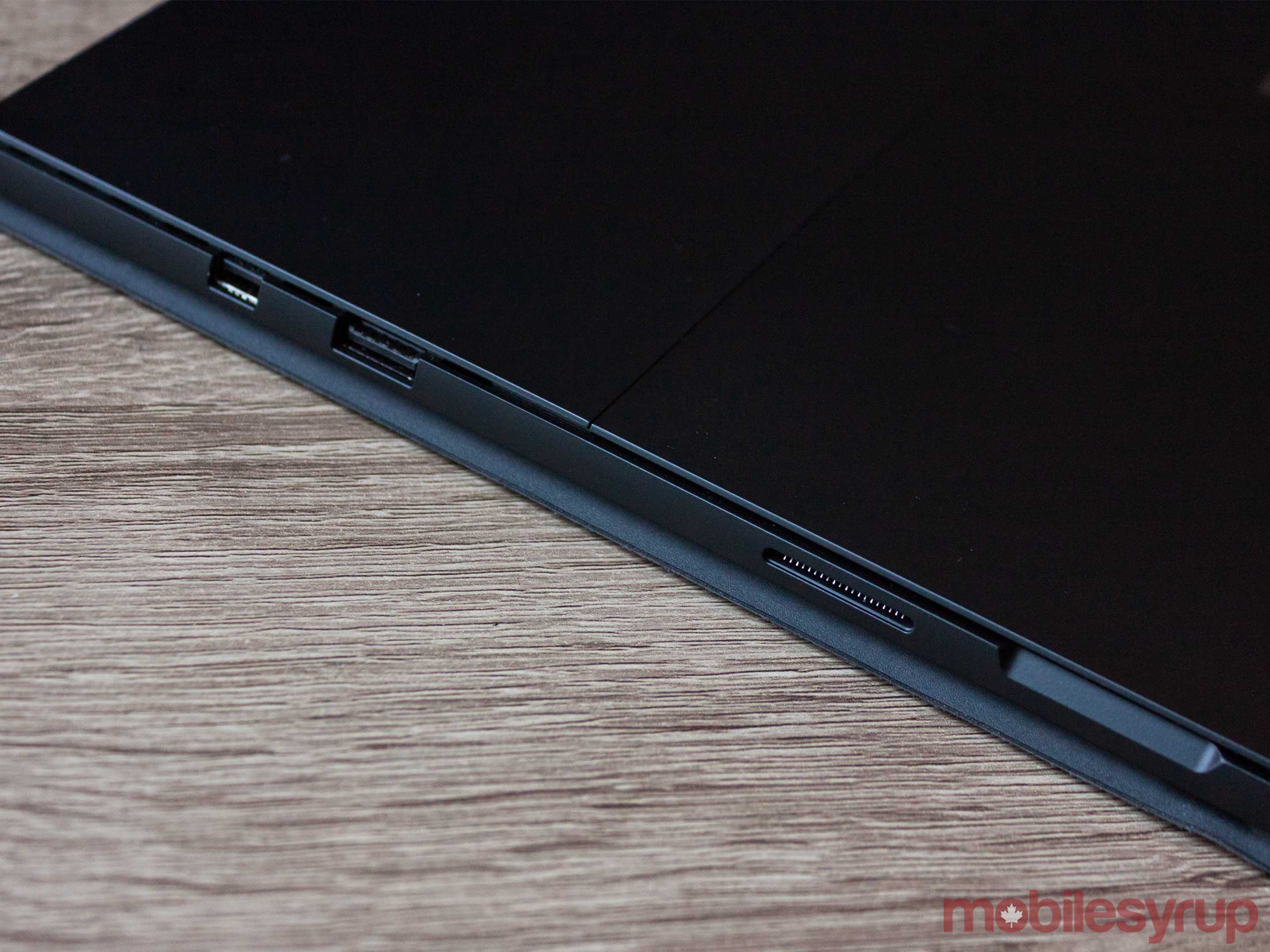
The Pro 6 comes equipped with USB-A port, a Mini DisplayPort, a 3.5mm headphone jack and a Microsoft Surface Connect port. It also features a microSD card slot under the kickstand — a nice touch, although I didn’t need it — and the Surface Type Cover port. That latter one is hardly worth mentioning, considering it only allows for one connection: the keyboard.
On a $1,179 CAD machine, that is not enough.
I want to be clear: I have nothing against the Surface Connect port. For charging, I loved it. The magnetic nature was great. I do not want Microsoft to get rid of that port because, quite frankly, I think it’s great. Further, Microsoft could learn from Apple here. The Cupertino-based company ditched its beloved MagSafe connector for USB-C. While the new format has its benefits, the peace-of-mind that came with MagSafe was second to none.
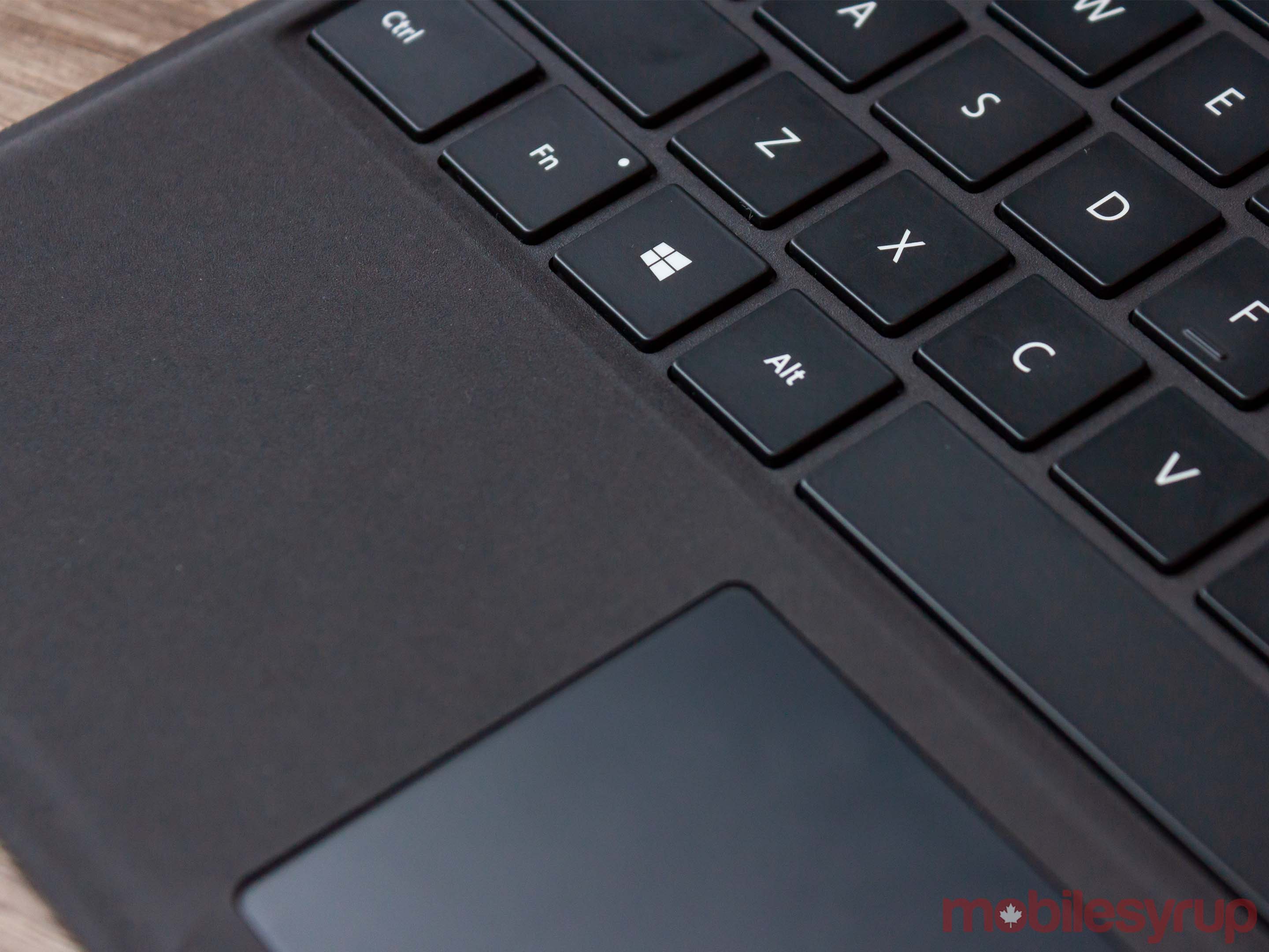
Microsoft’s Surface Connect port evokes that safety with the easy magnetic detach. Plus, the Surface Go had USB-C too, so users had their choice of port.
My issue is that Microsoft has continuously chosen to provide only two ports outside of the headphone jack and Surface Connect port. Those ports are incredibly limited, especially in 2018.
USB-A, while appreciated sometimes, is mostly useless. Outside of plugging a keyboard and mouse into my desktop, I haven’t needed USB-A in years.
Further, Mini DisplayPort is infuriating because it only does one thing — and not particularly well. I still need an adapter to connect the Surface Pro 6 to any of the monitors that I own. Worse, when I don’t need a second monitor, I can’t use the Mini DisplayPort for something else.
I cannot believe I’d ever write this, but I’d rather have just two USB-C ports. At least those can cover a variety of use-cases and, thanks to Apple’s recent MacBooks, there are plenty of USB-C adapters and dongles.
I must note that, to an extent, Microsoft is doing the right thing by including USB-A and Mini DisplayPort. It’s catering to enterprise and legacy users. That’s great, do that. But give us USB-C too. Everything is shifting that direction, so why not help enterprise by slowly shifting towards USB-C as well?
To make Microsoft’s decision even stranger, both the Surface Book and the Surface Go include USB-C.
Apple did this to an extent with the 2018 iPad Pro, eschewing the Lightning connector for a single USB-C port. While I feel one port still isn’t enough, that change offered more usability to iPad Pro customers that Lightning just couldn’t match.
A hint of greed
If a poor choice in ports is the worst of Microsoft’s problems, it’s a testament to how good the Pro 6 is.
Unfortunately, the company commits two other crimes with the Pro 6.
The first is the inclusion of bloatware. When I first opened the Swift 3 and set it up, I expected to spend half an hour deleting bloatware. At $750, it was an expectation.
At the $1,179 minimum for the Pro 6, I didn’t expect to spend another 30 minutes deleting bloatware. Worse, this is Microsoft’s OS on Microsoft’s product. No other company that provides products using its own hardware and software ecosystem does this.
The other crime is in the cost of accessories.
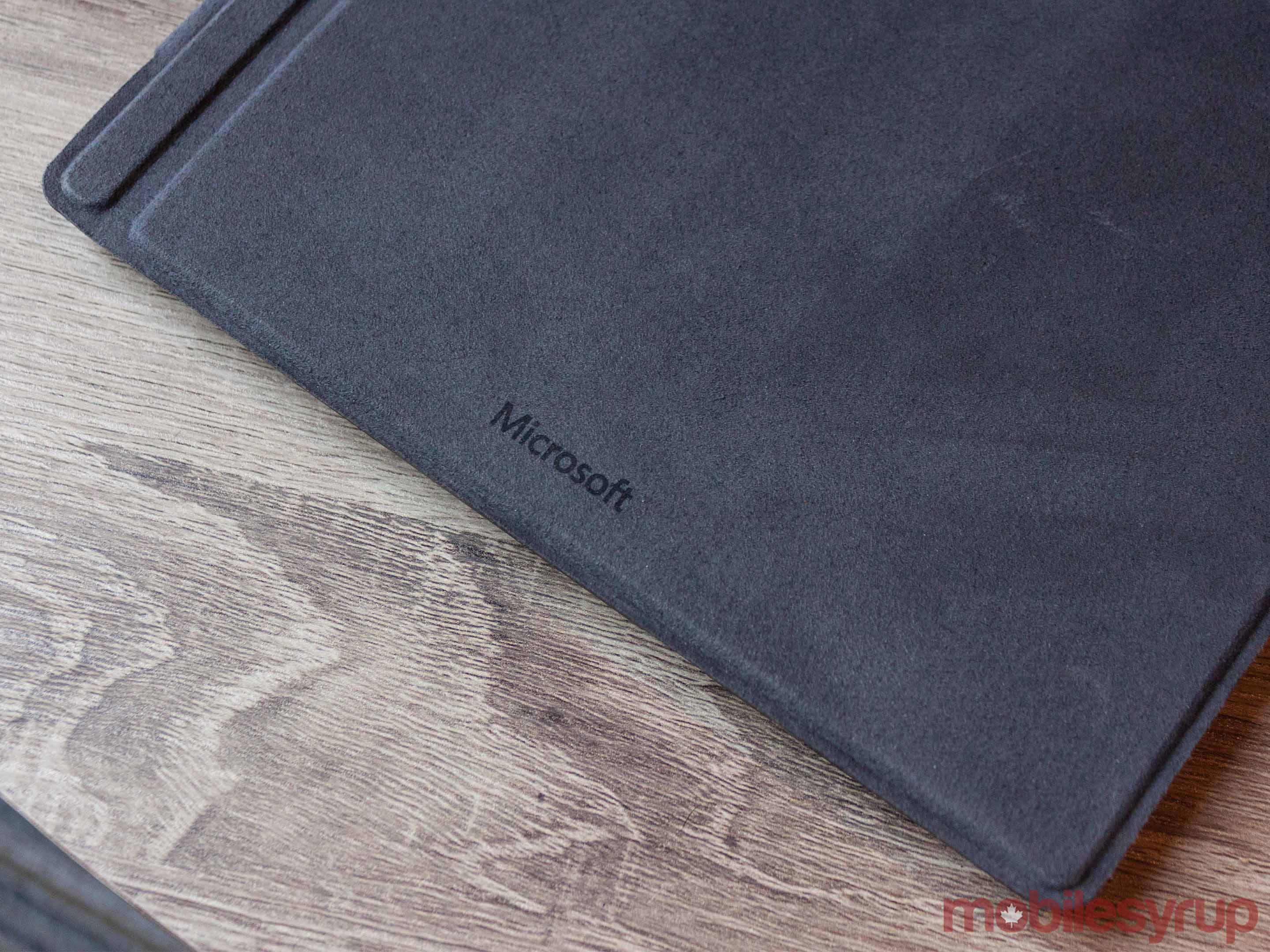
I know it isn’t a popular opinion, but the fact remains that the listed price of the Surface Pro 6 — that $1,179 minimum price for the device with an 8th gen i5 and 128GB of storage — is a misleading. The real cost of the Pro 6 is $1,348 because the Type Cover keyboard, which costs $169.99, is essential.
Yes, Google and Apple do the same thing. And yes, they do it worse. Both companies’ closest comparable base products and keyboards are more expensive than the Surface Pro 6. The Pixel Slate with an 8th gen i5 and 128GB of storage is $1,299, and the keyboard is $259 on top of that. The 12.9-inch iPad Pro with 64GB of storage is $1,249, and the Smart Keyboard Folio is $269.
Apple’s case is barely acceptable considering the iPad is a tablet first and foremost, and a productivity machine second. But even with that in mind, all of these devices are marketed as ultimate ‘do everything’ machines that can handle your workload, your creative projects and your entertainment. That makes the keyboard essential.
This argument extends to other Surface accessories as well, such as the Surface Pen or the Surface Dock. However, Microsoft’s expensive accessories are still significantly cheaper than the competitor’s offerings. Further, when you add in the cost of the Type Cover, the Surface Pro 6 is only $50 more than the Surface Laptop 2. Considering the extra tablet functionality of the Pro 6, an extra $50 isn’t that much.
I’d love to see Microsoft bring down the cost of essential accessories like the Type Cover, but honestly as long as it keeps costs below the competitors I’m content.
Improving the best 2-in-1 available today
Ultimately, the Surface Pro 6 is a refresh of the best 2-in-1 on the market. While we can’t fairly judge it against Google’s upcoming Pixel Slate yet, I can’t see it wresting the title from the Pro 6. Largely, this is based on the advertised price and the restrictions of Chrome OS. However, it remains to be seen and the Slate could be worth the wait.
The 2018 iPad Pro is an entirely different story. While measuring benchmarks is hardly an adequate method of comparison, especially between two very different CPUs, the fact remains that the iPad’s A12X Bionic scored higher on Geekbench than the i5-8250U.
However, I think the biggest differentiator between the two is the operating system, not the hardware. iOS is great, but it’s still very much a mobile operating system. Even with additions like full Photoshop, there are things the iPad won’t be able to do that a full desktop experience will provide.
The Surface Pro 6 is also the best portable Windows machine Microsoft offers. It’s only real competitor now is the Surface Laptop 2, which is an exercise in tradition.
Choose your Windows: past or present
If you're buying a Surface device, it's because you want the most refined Windows experience on offer.
The trick is choosing between the Pro 6 and the Surface Laptop 2. When you factor in the keyboard cost, the Pro 6 ends up almost $50 more than the Laptop 2. Other than the Laptop 2's slightly bigger 13.5-inch screen, there's little difference between them.
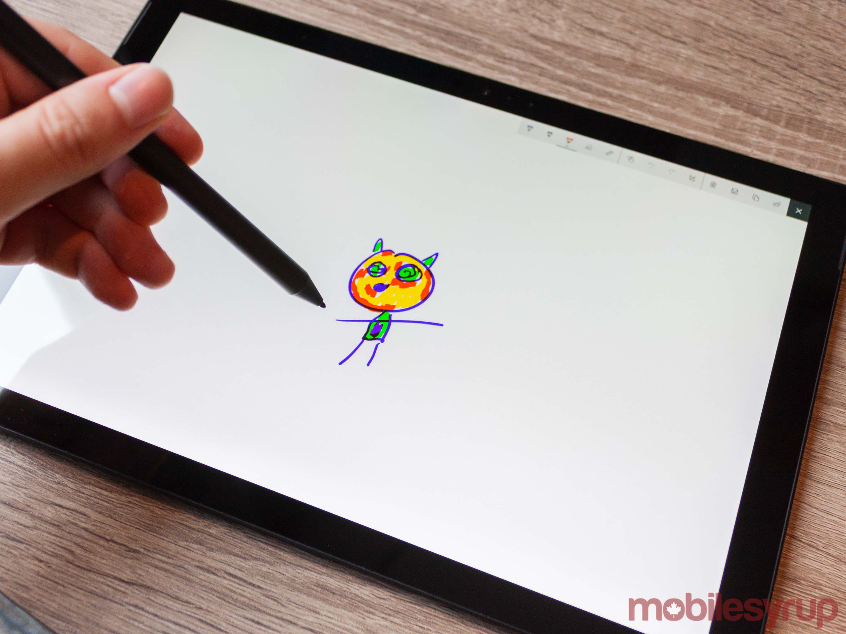
The choice comes down to the future. I found the adaptability of the Type Cover and kickstand combo to be refreshing compared to the traditional clamshell form factor. Further, I could do away with the Type Cover altogether when I didn't need it. Say, when I wanted to kick back and watch Netflix or jot a quick note with the Surface Pen.
Essentially, the Pro 6 can be more. For an extra $50, you can have an excellent laptop that does everything you need a portable computer to do with the bonus that it turns into a decent tablet when you need.
You don't get that adaptability with the Surface Laptop 2, and I think the option to adapt your computing experience at will is well worth the small extra cost.
"The Surface Pro 6 is the most refined product of Microsoft's vision for the future of portable computing. By correcting a few small flaws, the Surface could be the perfect Windows machine"
MobileSyrup may earn a commission from purchases made via our links, which helps fund the journalism we provide free on our website. These links do not influence our editorial content. Support us here.


