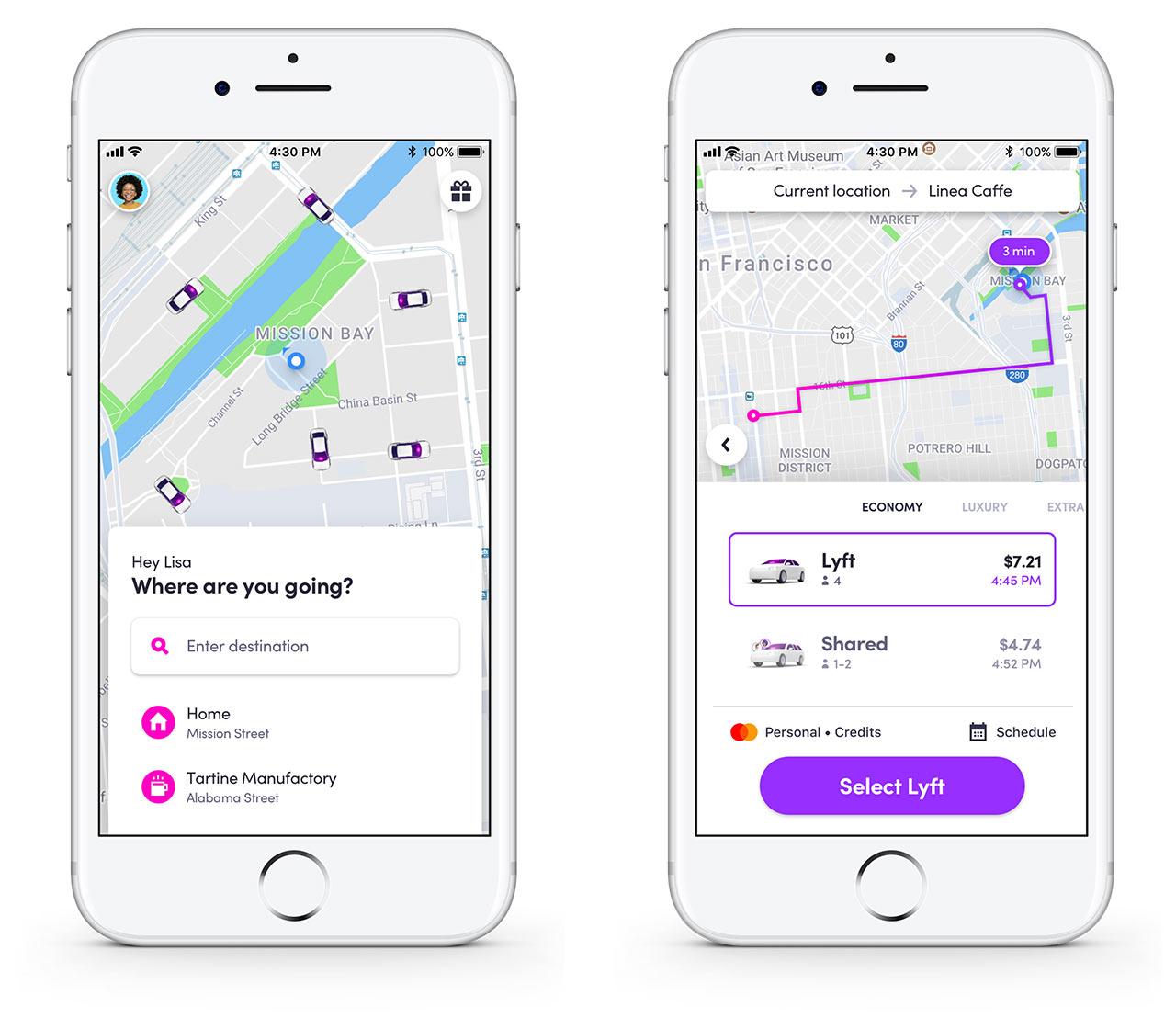
Ride-sharing app Lyft has been updated to provide a number of improvements including transit integration and a new search function.
There will be a few visual design changes that makes the app look a lot cleaner. It’s unclear if this design will roll out on both iOS and Android or if the Android version will have a Material Design influence.
To assist in its goal of making 50 percent of Lyft rides shared by 2020, Line rides will now be part of the Lyft Shared rides program. Line Rides follow common Lyft routes and the cars are often shared with multiple riders.
The app now works with a city’s public transit to help bring a form of transit to areas that are not serviced by trains, streetcars or buses. Currently there are no integrations between Lyft and Toronto transit.
Lyft also sought to make the app easier to use this time around with a new location-based ride set-up. The app now asks users where they want to go and then presents them with the best ways to get there. This new search will make it simpler for users to compare prices and times for rides.
The app has a new ‘one tap to ride’ button that will request a car that will take the user to their most frequent destination.
The company is also working with cities to automatically divert Lyft drivers around heavily trafficked areas so they can drop off their passengers in safer locations. This addition was tested in San Francisco, but Lyft says it will start rolling out to other major cities soon.
The update is rolling out now and should be available to all users by the end of July.
To download the Lyft app for iOS click here and Android here.
MobileSyrup may earn a commission from purchases made via our links, which helps fund the journalism we provide free on our website. These links do not influence our editorial content. Support us here.


