In the world of app development, “I want to build something like Uber but for X” is a common phrase and an even more common business plan.
U.S.-based Croissant is like Uber, but for co-working spaces. U.S.-based Postmates is like Uber, but for delivery. The Happy app is like Uber, but for unlicensed therapists.
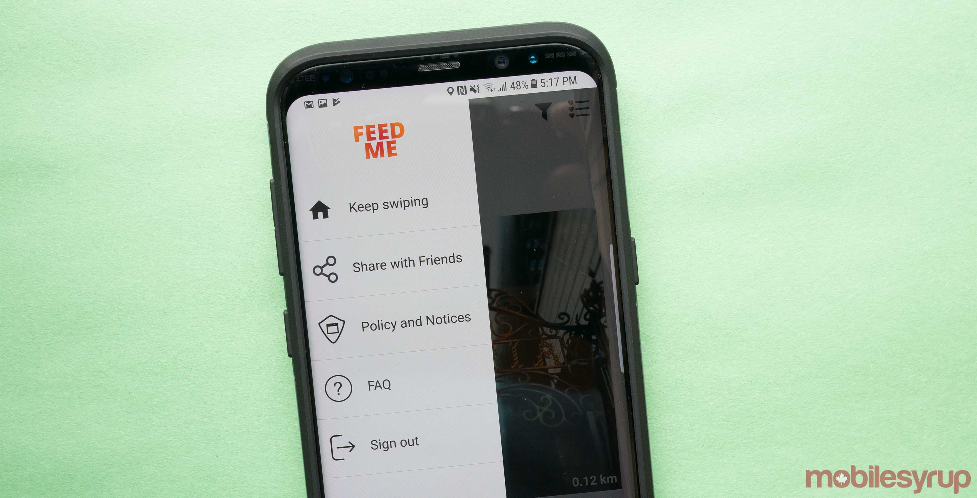
Now, Montreal-based Feed Me is bringing a new idea into the app development fray: Like Tinder, but for X. Feed Me, specifically, is like Tinder, but for restaurants.
It’s an incredibly simple idea that might seem excessively quirky, but be not afeared — in application, Feed Me is actually a lot of fun of to use.

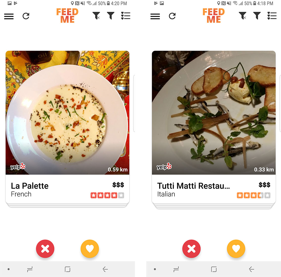
Feed Me looks and feels quite a bit like Tinder, even down to the app’s ad placement.
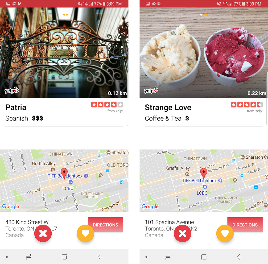
The Feed Me app accesses the user’s location, gathers a list of restaurants within a four-block radius and presents those restaurants like cards in a deck.
If you like a particular restaurant, you can swipe right. This adds it to a list of favourite places. If you don’t like a particular restaurant, you can swipe left, removing it from the rotation until the app runs out of restaurants. At that point, the app cycles through all of the restaurants in the user’s immediate vicinity all over again.
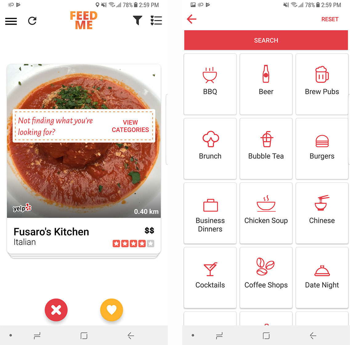
If particularly picky users reject too many nearby restaurants, Feed Me brings up a cuisine categories list, prompting them to select the exact kind of cuisine they’re looking for. It’s a novel feature that I imagine would make Tinder much more effective, but also much crueler.

It’s important to bring up Tinder to discuss a larger esoteric issue with apps that replicate features from more popular offerings. Tinder isn’t the first app that brought online dating to a mobile platform, but it was one of the first to transform online dating into something resembling a game.
Likewise, Feed Me isn’t the first mobile app aimed at making it easier to find somewhere to eat, but Feed Me mimics Tinder’s game-like interface almost perfectly. If you’re bored, or watching television, or you’ve got some time to waste during your daily commute, you can fire up Feed Me to learn about the restaurants in your area.

Feed Me probably isn’t going to revolutionize the way people decide where to eat. Instead, I believe the app is for those foodies with free-time, who simply want to learn more about the restaurants in their immediate vicinity.
At the very least, Feed Me is evidence that app developers and would-be digital revolutionaries should look beyond Uber for their next big idea.
MobileSyrup may earn a commission from purchases made via our links, which helps fund the journalism we provide free on our website. These links do not influence our editorial content. Support us here.


