Android Nougat’s successor, Android O, has made its first foray into the public eye with the launch of its initial developer preview, and while there aren’t too many show-stopping new features, the new OS brings with it a variety of interesting additions. Here are some of the most interesting changes that Android O brings to the table.
Notification Channels enable more user control

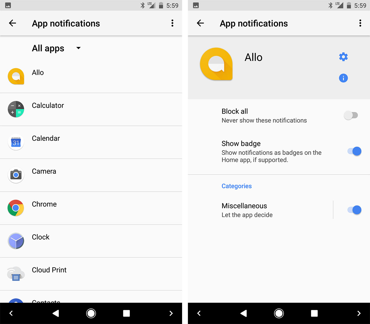
Depending on how apps implement Android O’s new Notification Channels feature, the endless tide of notifications that crashes down on most of us could soon become a little more relenting.
The idea behind notification channels is to give users more control over what they receive. Previously, Android users could block notifications from an app, but they had to block all notifications. Notification Channels breaks them into segments so that users can select, on a more granular level, what they want to hear about.
For instance, users might be able to turn off notifications for Facebook likes but keep them on for tags and @ mentions. Additionally, a chat app might break each conversation out into a separate channel, giving the user the ability to mute some conversations but not all.
While it’s a great idea, the most important question is how well apps will take advantage of Notifications Channels to provide a better user experience. Here’s hoping social media and messaging apps lead the way with a broad range of specific channel options.
Picture-in-picture video takes mobile multi-tasking to the next level
With Android O, Google is expanding its picture-in-picture (PiP) feature from Android TV to phones and tablets. Like Notification Channels, picture-in-picture depends on developer uptake, but it generally means that users will be able to take video content from one app with them while they browse another app. The video will shrink into a floating box that overlays itself on whatever app the user is currently operating.
Google specifies that apps can put themselves into PiP mode from a paused or resumed state and that developers can specify aspect ratios and custom interactions for video controls while the video is in PiP.
Users can expect to see the strongest early example of PiP on the mobile Android operating system through Google’s own YouTube.
Settings has a simplified new look

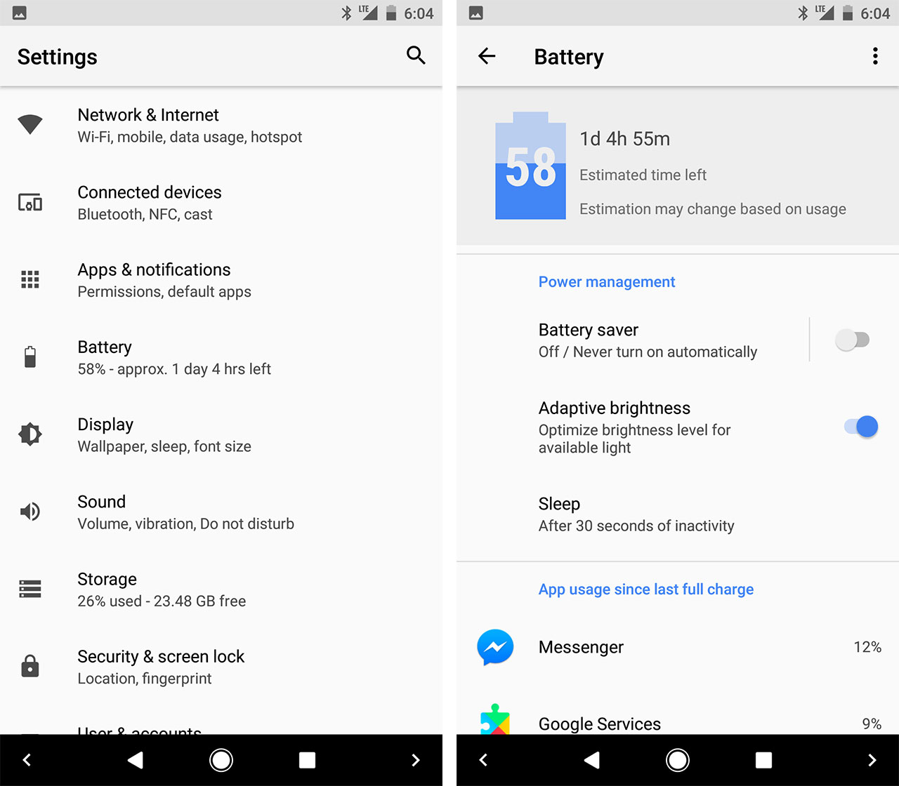
Google has redesigned its settings app yet again with Android O, this time with a strong focus on simplicity. There is no longer any slide-out menu and the categories on the main page of the Settings app are extremely high level. There are 13 main headings (with short descriptions of what’s inside) and nothing else — apart from the search tool in the top right corner and some suggestions that appear before the headings, which can be dismissed.
Further within the Settings app, some of the categories have also received design refreshes, including Battery, shown above.
Official autofill API makes filling out forms on mobile less annoying
Filling out forms and performing other typing-heaving activities has traditionally been much less enjoyable on Android than desktop, due to the lack of mobile autofill. Google’s aiming to change that with Android O, however, by providing apps with the ability to register as a system-wide provider of autofill services.
This means that autofill services will operate much like keyboard apps, which become an integral part of the phone’s essential functions. Google, for instance, will no doubt bring its own autofill expertise to the task and offer an autofill service.
Once chosen, users can navigate to and make changes to their autofill app by heading to settings > ‘Apps & notifications’ > ‘Default apps’ > ‘Autofill app.’
UI Tuner adds ability to set custom lockscreen shortcuts and nav buttons

The System UI Tuner, introduced with Android Marshmallow to provide users with more customization options, has been improved with Android O to offer control over the navigation bar and lockscreen shortcuts.
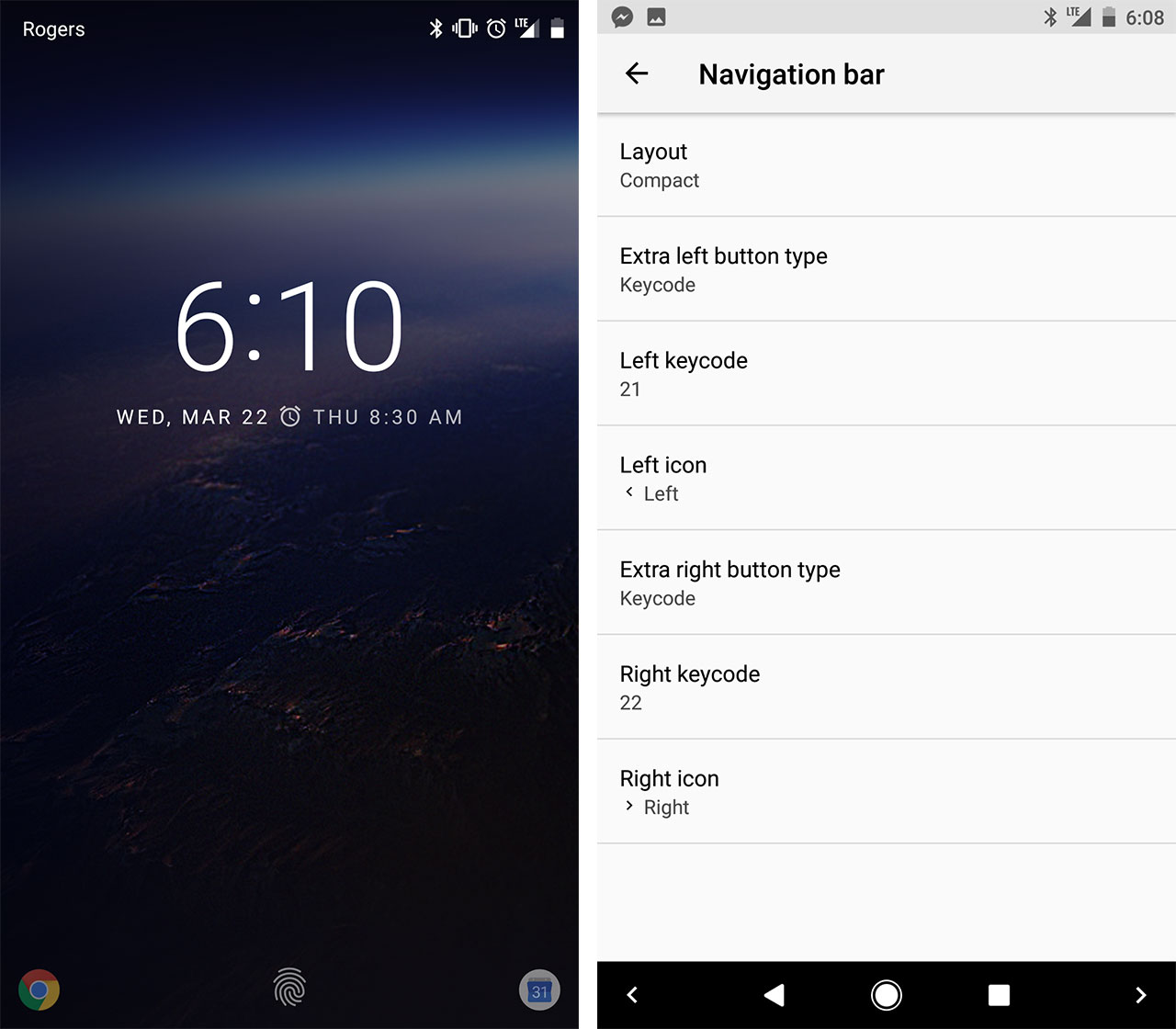
This means that users can now new navigation buttons (though it’s a multi-step process that currently requires special key codes) and choose left and right apps that can be launched from the lockscreen.
To get customizing, users first need to turn on the UI Tuner by long pressing on the Settings cog in the quick settings shade. Once that’s turned on, users can then head to System in the settings app and navigate to the System UI Tuner section, where you’ll see sections for the lock screen and navigation bar. The lock screen apps are simply changed with a few taps in that section, but the navigation bar is a little trickier. You’ll need to select the icon and then, separately, select the purpose using one of these keycodes.
There are great many to choose from, including a launch button for the camera or even a quick Caps Lock key, if you’re a digital shouter. In any case, it’s a lot of fun — but Google warns that these features are experimental and may break or disappear in future releases.
These are some of the most interesting elements of Android O, but far from all of them. For instance, there are the potential power savings that come with Android O and the fact that Google now directly supports building in screen notification badges — think the little notification alerts on home screen apps that are a hallmark of iOS and several Android skins.
Do you have your own additions to this list? Add them below in the comments!
MobileSyrup may earn a commission from purchases made via our links, which helps fund the journalism we provide free on our website. These links do not influence our editorial content. Support us here.


