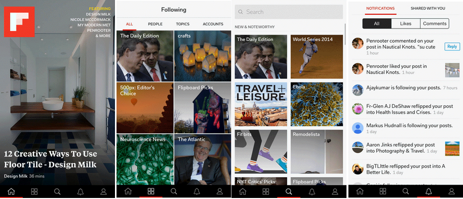
Flipboard has announced major updates for both its iOS and Android applications and is claiming that this third generation of its app is now more personal an experience.
This update alters both the UI and the functionality of the app itself so users will get additional features as well as a complete overhaul of the old Flipboard design. The company says today’s updated version is the most personal and magazine-like magazine app it has ever built and specifically mentions the experience has been improved for smartphone users with the addition of tabbed navigation and easier access to search.
To help boost the magazine aesthetic, the app now has full-screen covers and updated typography. There’s also a new navigational bar and launching the app takes you to an up-to-the-minute stream of articles and photos based on the areas of interest that you’ve highlighted within the application.
The other major new feature is the addition of a new daily magazine that is actually curated by Flipboard. Though this won’t be personal to you, it will be personal to where you live, provided you’re in one of the countries where this feature is applicable. In an effort to help you sift through its 34,000 topics, the goal with The Daily Edition is to deliver a newspaper that gives you a quick rundown of what’s been happening in the last 24 hours.
The Flipboard team will be curating a version of The Daily Edition for users in the U.S., UK, Latin America, U.S. Latino, Brazil, and India and will ship it out every morning at 7:00 a.m. local time so you’ll be able to catch up on what’s going on while you eat breakfast. No word on whether Flipboard plans to curate news for users in other locales over time.
The update is available for iOS and Android today.
[source]Flipboard[/source]
MobileSyrup may earn a commission from purchases made via our links, which helps fund the journalism we provide free on our website. These links do not influence our editorial content. Support us here.


