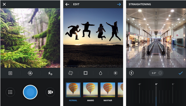
Instagram for Android is getting a much-needed design overhaul today, bringing it more in line with the latest crop of platform guidelines — flatter, with bigger images and sharper text — that many apps have taken advantage of.
While Instagram 5.1 for Android doesn’t add any new features, it really doesn’t need to: other than the recent addition of a slider for the Lux tool, added yesterday on iOS, it’s been at feature parity for some time. The big changes are where it counts: app size, performance and startup speed.

The app’s size has been halved by removing unnecessary assets like buttons and images; instead, the app now adapts those assets depending on how you interact with them. The advantage to this is two-fold: Instagram now scales better on smaller devices (which means better uptake in quickly-growing developing markets like Brazil, India and China) and it loads much, much faster. For example, the profile screen loads twice as fast as before, and everything else is roughly 20% quicker on the same hardware.
The app also launches more quickly as a result of the code cleanup, and performance throughout the app, from snapping photos to editing them, is much improved. Users on high-end devices may not notice a big difference, but users on entry- and mid-range handsets will be astounded, according to Instagram.
Instagram says that more than 60% of its user base is outside of the US, and Android makes up nearly half of all users on the service. The update is the first major design overhaul for the Android version, which launched nearly two years ago.
[source]Google Play[/source][via]Instagram Blog, The Verge[/via]
MobileSyrup may earn a commission from purchases made via our links, which helps fund the journalism we provide free on our website. These links do not influence our editorial content. Support us here.


