The Nexus line is a curious beast. The first of its ilk, the Nexus One, is largely considered to be both a huge success and dramatic failure depending on the context. Catering to both Android developers and purists alike, the Nexus One had, at the time, several major advantages over its competition. Firstly, the version of Android included with the device was completely stock: no carrier bloatware, no vendor skins. It was the first Google-endorsed phone, and was to receive over-the-air updates, ensuring that while it may be surpassed in hardware specs, it would always have the newest software for developers to play with. It also didn’t sell very well. Less than five months after its release, Google abandoned the online-only sales model and the Nexus lineage seemed dead.
But the Nexus Two does exist in the form of the Nexus S and it’s coming from Canada through multiple carriers in both subsidized and unsubsidized forms.
A Galaxy By Another Name: The Phone
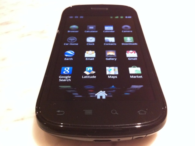
The Nexus S breathes its Samsung lineage from the moment you pick it up. Gone is the satisfying, aluminal heft of the Nexus One, replaced rather unceremoniously by a stiff, black plastic housing. Samsung graciously saw the need, however, to create a substantial device, and at 130g — 12g more than the Vibrant — it feels fantastic in the hand. Evenly weighted and not a hint of give, the battery cover snaps on securely with a generous ‘click.’ To put it simply, this phone doesn’t creak. The all-black housing does away with the chrome bezel of the Galaxy S, and its refinements make it an understated, attractive device.
Looking straight down on the Nexus S, it’s difficult to tell where the 4” screen ends and the bezel begins. Welcome to one of the nicest screens released so far on a mobile device. Anyone familiar with the Galaxy S series is going to feel right at home here, but to the uninitiated the Super AMOLED display on the Nexus S is gorgeous. Deep, full blacks; awesome, lively colours; eminently readable text; accurate multitouch sensitivity.
To differentiate between the Galaxy S series and the Nexus S, Samsung has given the latter a Contour Display. Much ado about marketing, the screen is laterally concave in the middle, rising on either side, apparently to improve text readability. It’s a nice effect, but I noticed no perceptible improvement in clarity over the Galaxy S.
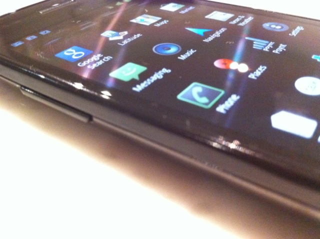
Sadly, the majority of the design improvements we hoped to see from the Galaxy S line are not here. The left-side volume rocker remains straight and sharp, and there is no differentiation between up and down. Clicking in the middle will often result in a frustrating up/down dual click. The lone button on the right side is power: no dedicated camera button here. The 3.5mm headphone jack and microUSB ports have been moved to the bottom, likely to keep the top as thin as possible for the curved screen, and from this we get the thicker back cover. Like on the Bell Galaxy S Vibrant, the Nexus S has a very utilitarian-looking front VGA camera. The back camera, thankfully, has a LED flash to go with its 5MP lens.
Full Plastic Jacket: Hardware Overview
Unlike the Nexus One, the Nexus S is in no way ahead of the performance curve; it has lately been surpassed not only by the myriad dual-core devices announced at World Mobile Congress 2011, but by its own kin, the Galaxy S II.
It shares much of the guts of its Galaxy S brethren: 480×800 pixel Super AMOLED display, a 1Ghz Hummingbird processor, 512MB RAM, 16GB internal storage, 5MP camera with LED flash, VGA forward camera, WiFi, Bluetooth, compass, gyroscope and NFC (Near Field Communications), though the latter two are new.
The 1Ghz Hummingbird processor is still a beast, despite its age; until the debut of Tegra 2 and its dual-core kin, the Hummingbird was arguably the fastest mobile processor on the market. What helps the cause is that the Nexus S runs a lean version of Android 2.3, and it is very fast. Since Google insists its Nexus line runs a bare bones version of Android, there are no carrier- or vendor-endorsed apps littered around the storage.
Perhaps more interesting than what’s inside the phone is what is omitted. Gone is the notification light of the Nexus One, a you-don’t-miss-it-till-it’s-gone feature.
More starkly absent is the microSD card. The Nexus One only had around 150MB of internal app storage, so the ability to store app data on the SD card was essential. Samsung clearly felt that including 16GB internal storage, and allocating just under 1GB for app storage was enough for its Nexus, but we can’t help but think of it as a deficiency.

The showstopper is still the Super AMOLED display, and though it too has been superseded by the upcoming Super AMOLED Plus displays of the Galaxy S II line, the old girl still looks great. Much has been said about the deep blacks of AMOLED displays, and that is due to the fact that when a black pixel is displayed on an AMOLED screen, it doesn’t turn on at all. It also uses less power, so battery life on such a device tends to be better than their LCD counterparts. Compared to the AMOLED display of the Nexus One, the colours on the Nexus S are more vibrant and the text more legible, especially when zoomed out.
The beauty of Super AMOLED is that there is no space between the glass and display; you feel much closer to what you’re interacting with. It’s a subtle but noticeable benefit.
Call Quality
This is a good phone to use if you want to make calls. I found the Galaxy S Vibrant to be a bit soft at its maximum volume, and the Nexus S rectifies that. Sound is clear on all the carriers I used the phone with.
Camera
The camera on the Nexus S seems to be the same 5MP lens that shipped with the Galaxy S series. Couple it with a flash and you’ve got yourself a decent point-and-shoot replacement. Too bad the camera software on Android is so ugly. The lack of a hardware shutter coupled with the slippery plastic shell means that holding the camera in landscape with one hand, and contorting your index finger to press the shutter button is uncomfortable.

When you do actually manage to snap a couple shots, the results are good. Even tones and an impressive amount of detail help make both macro and long-distance shots equally quaffable. Autofocus is relatively quick, and though there is no touch-to-focus like in Sense, there are a number of adjustable software settings to suite your needs.
Video shot on the Nexus S will not win any awards, and is actually crippled. It can only shoot at 720x480px, or 480p, a significant downgrade from most modern smartphones. It is unclear why Samsung chose to limit the hardware in such a way, but it seems like another inexplicably frustrating design choices. Video, though, is of generally good quality.
There is also a front-facing VGA camera to use in the many video-enabled VOIP apps littered across the Marketplace. Fring, Tango and Skype-owned Qik offer video calling over 3G, though the quality and frame rate depends on your data speeds.
Audio Quality
I had to comment on the improved headphone audio quality coming out of the Nexus S. The Galaxy S series was famous for its terrible midrange and overblown high frequencies, and this seems to have been corrected. Kudos.
Battery Life
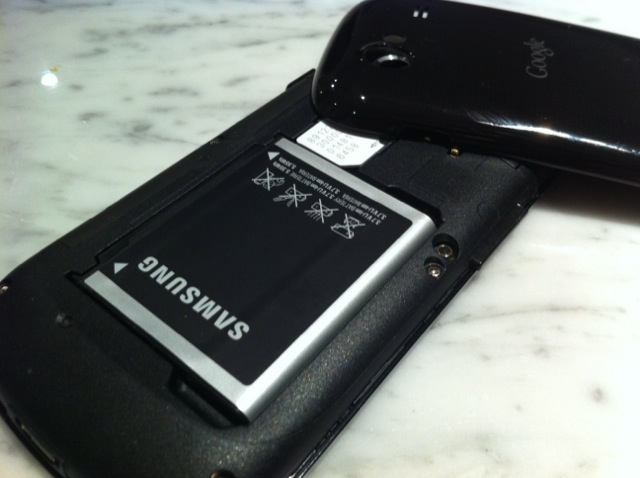
The 1500mAh battery in the Nexus S keeps the phone chugging along for most of the day. Using it as my daily driver, with approximately 1 hour of phone calls, regular internet usage, background Twitter and RSS updates and a couple photos, the device struck red after 15 hours. Not bad, considering the painful memories we have of the Galaxy S series, which uses the same sized battery. I suspect the bare bones version of Android helps eliminate vendor-loaded background processes.
What’s in a Name: Gingerbread Tastes Better Than It Looks
Google has blended Froyo with some minor UI and keyboard improvements and pumped out Gingerbread, and the improvements are understated but appreciated. Replacing the drab gray notification bar of previous versions, Gingerbread opts for a black, green and orange template. While not only more visually appealing, the Super AMOLED display benefits from the increased amount of black on the screen, lowering power usage and increasing battery life.
Copy-paste functionality has been given a Sense-like makeover, making it much easier to select text due to the OS-wide dual selection implementation. Hold down your finger in a text box and the option to Select Text will appear, and from there you can move the two selection bars back and forth until you are ready to hold down your finger again to copy or cut. Like many Android features, it’s inconsistent and frustrating, since it doesn’t appear to work in all text boxes across all apps, but when it does work, it’s a marked improvement over the poke-and-hope failure of previous versions.
Also given a makeover is the keyboard, now natively multitouch. Black and orange and a whole lot smarter, the Gingerbread keyboard is a big improvement over its predecessor. Much better at registering aberrant text input, the autocorrect now has a brain and will remember your most common mistakes. If you do happen to want to change a word, you merely have to press once on the word and a list of alternatives will appear atop the keyboard, replacing the incorrect word with your choice. Most of the time this works quite well, though occasionally the desired word will insert itself right into the middle of the one you’re trying to replace.
One problem with the keyboard is its tendency to double the first letter of a word at random, or to ignore spacebar presses. As a result, sentences will often look like, “What’s up, man, wwant to catchthe basketball gamelater?” Luckily there are a number of great alternative keyboards available for Android. I’d recommend Smart Keyboard Pro if you’re willing to spend a couple bucks.
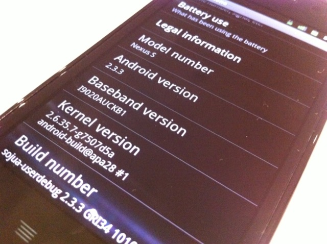
Android 2.3 is not necessarily the speed or feature jump that we experienced from Elclair to Froyo. Nor is it the UI overhaul we were hoping (that’s Honeycomb). But it’s the fastest, most feature-filled version of stock Android yet. And this is the only phone in which you’ll be able to experience a completely untarnished version of your favourite Google OS.
Identity Crisis, Time Crisis II: But Who Is It For?
I salivated at the idea of buying a Nexus S. Truly, after using and abusing several Nexus Ones, the idea of a device that fixed all, or most, of the problems I had with its hardware was like a dream come true. But I salivated for none of the reasons that I have written about so far, except for one: “fastboot oem unlock.”
The Nexus line was created for Android enthusiasts to mess around with. Very few Nexus One owners I know of every kept their versions of Android the way it came with the phone. No sooner had the plastic come off the box had they rooted it, loaded up a custom ROM, overclocked it, themed it, and made it generally unrecognizable. This is the beauty of the Nexus line, and runs perpendicular to the treatment of Android by many of the vendors and carriers creating and selling these devices through traditional retail channels. Strangely, the closest cousin to the Nexus would be the iPhone: at no time does the carrier or vendor have any influence on how the phone functions, or what is pre-loaded.
The Nexus One was sold predominantly as an unlocked, unsubsidized phone.
Whether its successor is sold in Canada carrier-locked or not, you are still going to get over-the-air software updates, you’re going to be able to easily hack the phone (though entering the aforementioned command will void your warranty) and you’re getting a clean version of Android. Best of both worlds? Maybe.
But the few people who look for these features and opportunities in an Android phone are the ones who are going to criticize it for having outdated hardware, or have already driven to the US to buy one from Best Buy. The rest are going to see a re-designed Galaxy S. One
All this begs the question: who is the Nexus S for? There is a reason HTC has done so well in the Android market; their high quality hardware and restrained, thoughtful additions to Android make for a very compelling product. When the Nexus S comes, carriers are going to have an interesting time marketing it: stock Android is fast, but it’s uninteresting. What is interesting is the canvas it leaves you to paint. This is the main advantage of the platform, its tabula rasa, its potential. But it’s that very reason vendors have felt they need to augment it with TouchWIZ, Sense, Timescape , MOTOBLUR. Android as a brand can’t really sell itself on its own, and that’s precisely the reason why us tweakers want the device, so we too can augment it.

Best of Both Worlds: A Summary
I think that Nexus S is a sturdy, functional Android device running the latest and fastest version of the platform. It’s got sufficiently powerful hardware that should hold up, and will continue to perform well as Android scales, much like the Nexus One continues to excel.
Your motivation for purchasing the Nexus S will derive from what your desires are in a smartphone, and how it can meet your expectations. Out of the box, the Android you will interact with on the Nexus S may not be exceedingly pretty (though some would argue it’s a heck of a lot more attractive and functional than many vendor skins) but with perpetual over-the-air updates, robust customization options, a great screen and camera, and a decent hardware build, it will likely fill most of those checkmarks.
Specs:
– 1Ghz Hummingbird Processor
– 512MB RAM
– 16GB internal storage (1GB app space)
– 480×800 pixel Super AMOLED display
– 5MP camera with flash, 480p video capture, front-facing VGA (0.3MP) camera
– WiFi (802.11n), A-GPS, NFC, Compass, Accelerometer, Gyroscope
– 1500mAh battery
– 4.88” x 2.48” x 0.43” (123.9 x 63 x 10.88 mm)
– 4.55 oz (130g)
– 850/900/1800/1900Mhz GSM, 850/1900Mhz, 1700/2100Mhz UMTS (3G)
– Android 2.3 Gingerbread
Pros:
– Beautiful, accurate 4” screen
– Just the right size for reading, typing, gaming
– Great performance, no slowdowns, sputters or typical Android lag
– 12-15hr battery life; better than comparable Galaxy S devices
– Good quality camera
– Excellent potential for customization: developers’ dream phone
– Great call quality, good audio quality in general
– Runs the newest version of Android, Gingerbread, out of the box
– Support for NFC, a burgeoning low-power communication protocol
Cons:
– Lack of microSD card, notification light, dedicated camera button
– Last year’s hardware today
– Little physical and internal differentiation to the Galaxy S series
– Lost its luster since WMC (name of the Android game)
– Full plastic jacket: hardware build disappointing coming from Nexus One
– Curved screen nothing more than marketing jargon
– Super AMOLED screen shows it weakness next to next-gen screens
– Doesn’t make toast
Rating
For the non-hacking type: 7/10
For the hacking type: 9/10
MobileSyrup may earn a commission from purchases made via our links, which helps fund the journalism we provide free on our website. These links do not influence our editorial content. Support us here.


