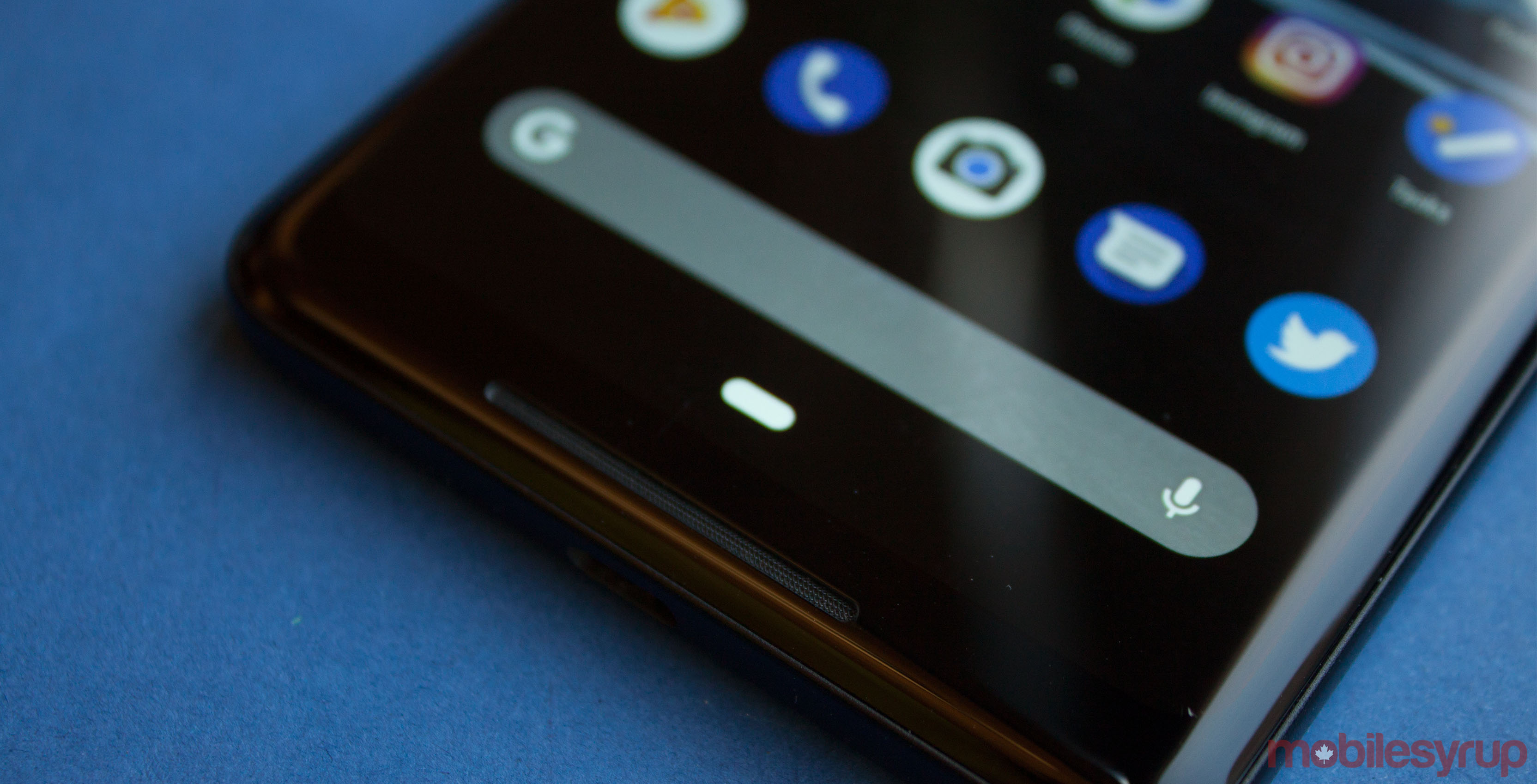
A post on the Google Issue Tracker picked up some steam earlier this week when it received comment from the development team.
The post suggested that Google add a swipe-to-go-back gesture to Android P. Specifically, the post requested Google add the gesture to restore balance to the navigation bar.
Right now in Android P, the bar has a small pill button in the centre. It also has a contextual back button that shows up when users can go back. The problem is the back button isn’t symmetrical. When the back button pops up, there’s nothing to balance it on the other side of the pill.
Furthermore, the pill can be flicked to the right to flip through recent apps. However, flicking left on the pill does nothing. Posters on the Issue Tracker board appealed to Google to kill two birds with one stone — replace the back button with a left-swipe gesture.
A comment from the development team said that the team was looking into options to be fully gestural. However, they need to balance that against app expectations and compatibility.
Another commenter replied, saying “that sounds like an extremely long-winded ‘No.'” To me, it sounds more like a maybe.
Better gesture concepts
While at first I thought that swiping left on the pill to go back was counter-intuitive, this blog post from writer Ollie Francis outlined a concept for using left-swipes that changed my mind.
He based his concept on Android P. Francis observes apps as a series of layers. Tapping something in an app creates a new layer. Swiping left on the pill pushes that layer away.
One example he used was the popular ‘left tray’ menu. Most apps feature one now. Users can swipe in from the left edge, pulling a tray out over the screen. Currently, tapping back slides the tray away. With Francis’ concept in mind, swiping left on the pill would be akin to pushing the drawer back.
Francis also outlined a way to deal with the keyboard. Instead of the current system, which places the keyboard above the navigation bar, the concept moves the pill up above the keyboard. To hide the keyboard, users just swipe down on the pill to push the keyboard out of the way.
While I doubt Google will ever attempt such a daring navigational change, I’d welcome it. It would be the epitome of Android gesture navigation.
MobileSyrup may earn a commission from purchases made via our links, which helps fund the journalism we provide free on our website. These links do not influence our editorial content. Support us here.


