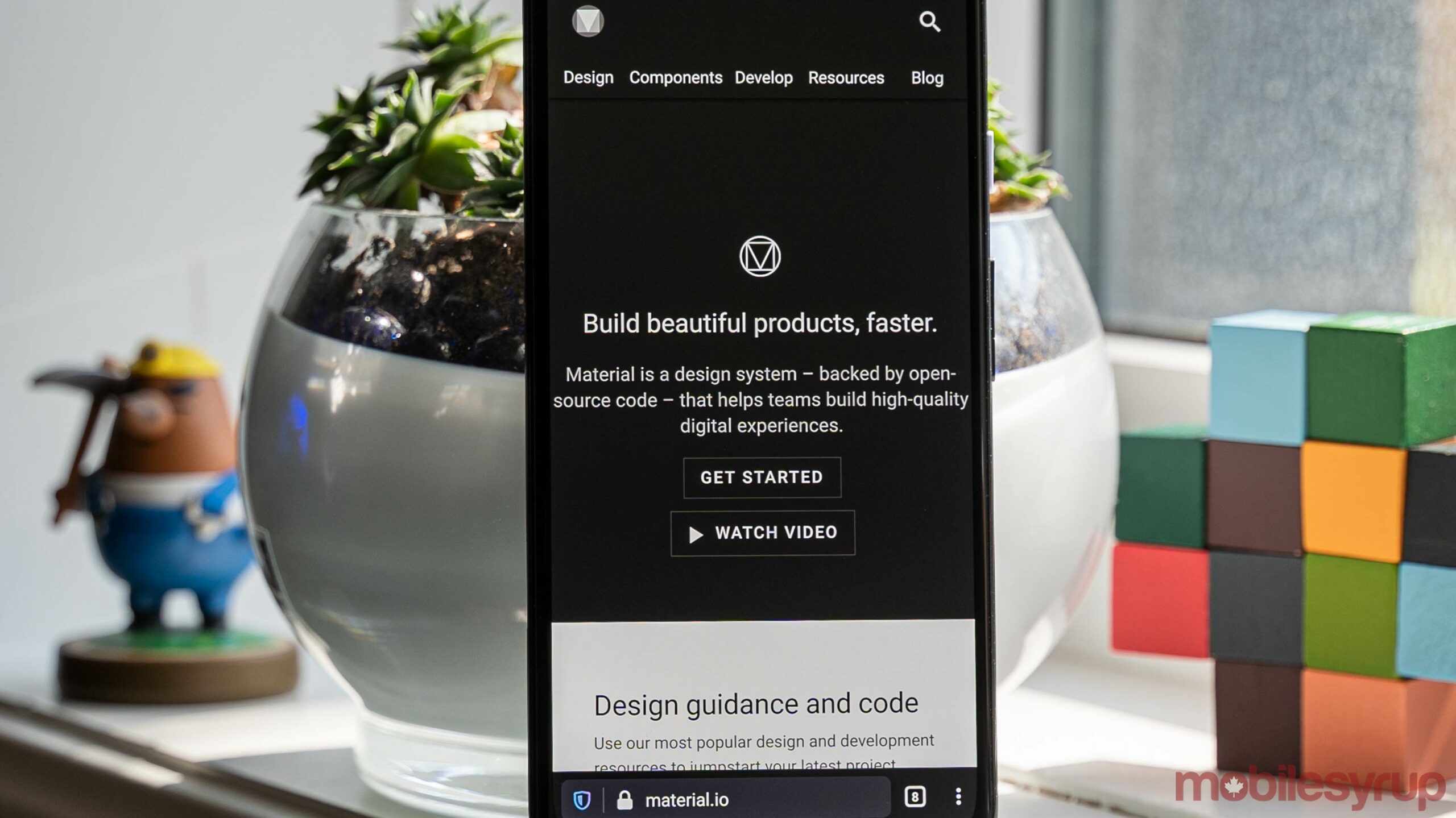
In the lead up to Google’s I/O developer conference next week, the search giant shared a Material Design update focused on designing for larger screens.
Specifically, the company added a new blog post to its Material Design website that explains Material Design’s expanded “adaptive capabilities [that will] help prepare your apps for all form factors, from phones to tablets, desktops and beyond.”
Although it’s tempting to read into that sentence and speculate if that means Google plans to announce some sort of large-screen device at I/O — perhaps a Pixel foldable, or a new tablet? — it’s important to remember that I/O is a conference with a focus on educating developers and helping them build better apps with Google’s tools. If you read a bit further down, the blog post indicates it’s a precursor to an I/O session about preparing apps for large screens.
Given Google’s current product suite, it makes sense that the company would want to push developers to leverage Material Design across screen sizes and different devices. As things stand, most Android developers build apps for phones, and leave it there. The Android tablet experience is sub-par, and have you ever tried using an Android app in Chrome OS? It’s dreadful. If Google can get developers to build high-quality, adaptable Material Design apps that look and work well across multiple types and sizes of screens, that’d be a huge win.
Along with the blog post, Google made new guidance, design documents and updated components available for developers looking to make apps adaptable for different screen sizes. Those interested can check out the full post here.
Source: Google Via: 9to5Google
MobileSyrup may earn a commission from purchases made via our links, which helps fund the journalism we provide free on our website. These links do not influence our editorial content. Support us here.


