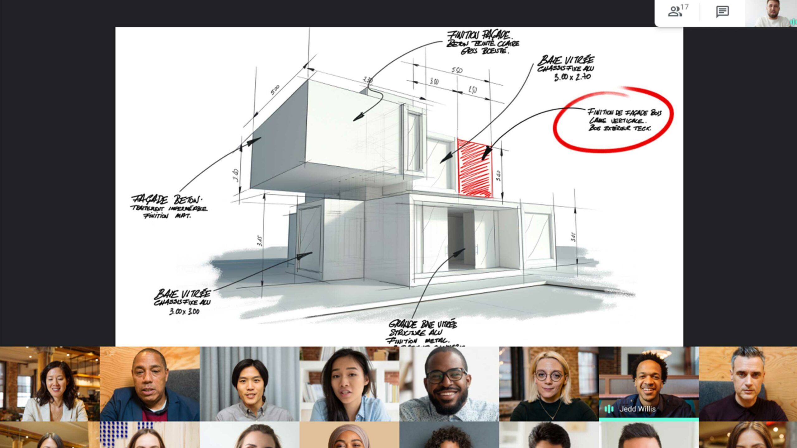
The latest Google Meet update brings a few UI tweaks to the business-focused video chat platform, making it easier to talk with your co-workers while someone is sharing a presentation.
This presentation update is an add-on to the latest ‘Tile’ layout that shows everyone on screen at once. When the presentation is displaying, all of the call’s participants are squeezed to the bottom half of the screen. The top part of the UI is reserved for the presentation, so everyone has a good view of both it and the people talking.
Alongside this change, Google is also making sure your last selected layout becomes the default the next time you log in. Beyond that, Google also tweaked the overall spacing of some items on the screen to maximize usable space.
The tech giant’s blog post mentions that these features are rolling out today for all Google account holders, not just G Suite users.
Source: Google
MobileSyrup may earn a commission from purchases made via our links, which helps fund the journalism we provide free on our website. These links do not influence our editorial content. Support us here.


