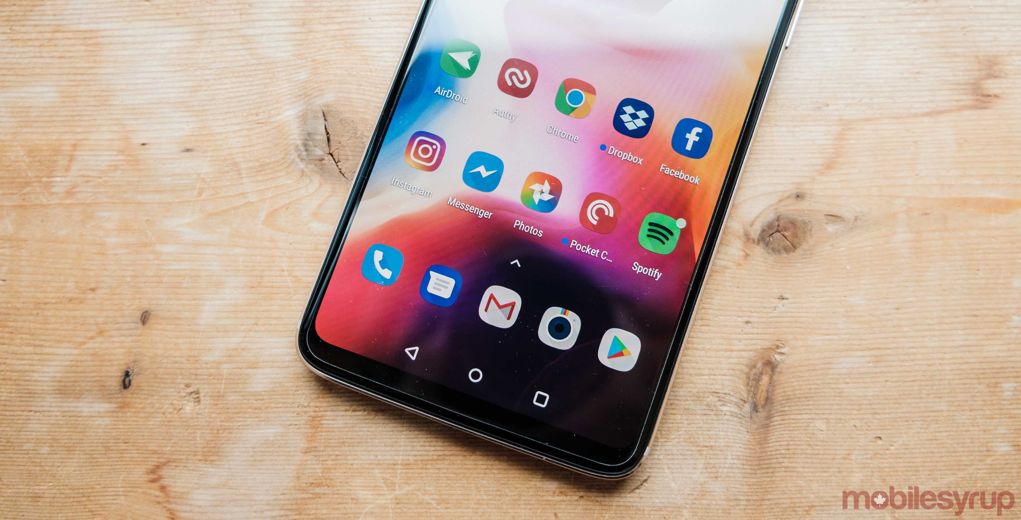
Google’s ‘Messages’ app is getting updated to Google’s modern Material Design language.
It seems lately that Google has been putting a lot of stock into its Android Messages app. There have been hints that it’s coming to Chrome OS and now its getting a design update on mobile.
9to5Google has done a tear down of the most recent Messages Android package kit (APK) and found a new design.
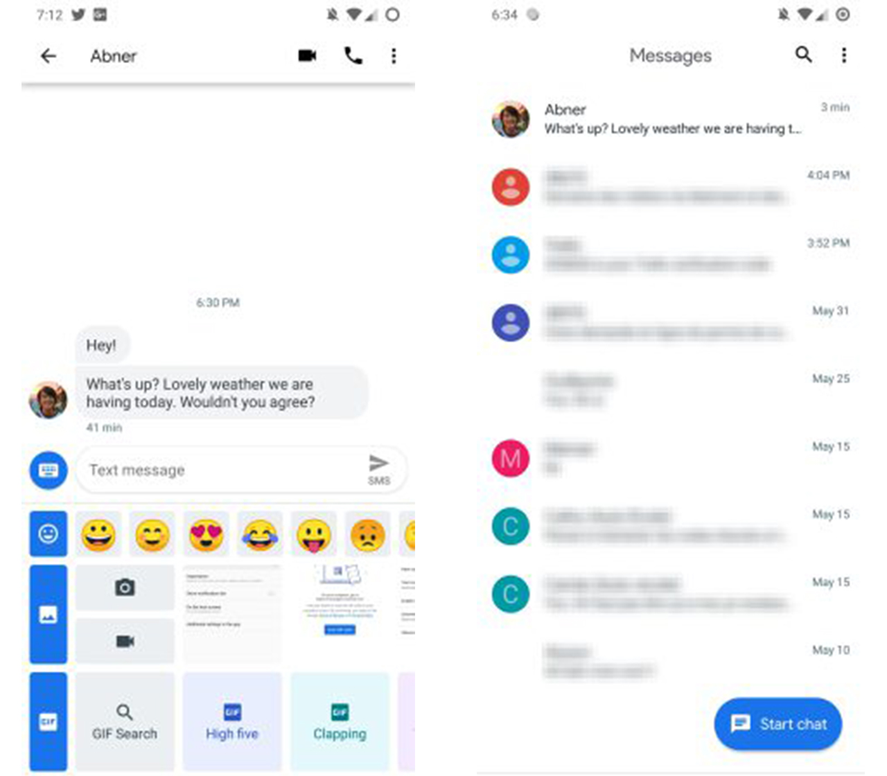
The design hasn’t changed that much, but it does look a bit more modern. Google has done away with the blue bar at the top of the screen. Instead, there is some simple white space with the Messenger title centred and written in Google Sans font.
The company has also changed the ‘start new conversation’ button. It’s currently a blue circle with a plus inside of it, but its going to change to a longer oval that has the words ‘Start chat’ and a small speech bubble icon.
The app is supposed to be gaining a dark mode toggle later, along with some sort of web integration.
Google is also adding a new feature that will let users search for GIFs inside of the app, instead of having to use the GIF search that is embedded in some keyboards.
This update isn’t available yet, but it’s interesting to see the direction that Google is taking with some of its most used apps.
Image credit: 9to5Google
Source: 9to5Google
MobileSyrup may earn a commission from purchases made via our links, which helps fund the journalism we provide free on our website. These links do not influence our editorial content. Support us here.


