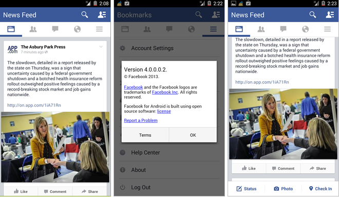
A while back, Facebook was testing a few A/B design scenarios on its iPhone and Android apps. Some users would have a left sliding menu, others a stationary tab bar at the bottom to access notifications, menus, etc. This change became permanent when iOS 7 rolled around and Facebook updated all iPhone users to the new bottom tab menu.
The same appears to be happening on Android, as Facebook has rolled out a new version which seems to be testing a similar variance on some users’ devices. Specifically, the test build moves the most important tabs to the top of the screen, re-situating the Status, Photo and Check In buttons to the bottom. Along with the removal of the left-side sliding menu, which in its current form appears to scroll forever and has lost much of its usefulness, the new look is much simpler and flatter — more like recent Holo-designed Android apps.
The change appears to be server-side, so even if you receive the update or download the APK, Facebook controls if and when you see the changes. It’s not clear whether this is just routinized testing from within the company or if the company will roll out the new look to all Android users. Many iOS 7 apps have rid themselves of the left sliding menu specifically because they can get confused with Apple’s system-wide “back” gesture; Android suffers from no such complication, and more developers seem to be adopting the sliding “hamburger” menu across the ecosystem.
Do let us know if you come across the new layout; it would be interesting to see how far it reaches.
[source]Android Police[/source]
MobileSyrup may earn a commission from purchases made via our links, which helps fund the journalism we provide free on our website. These links do not influence our editorial content. Support us here.


