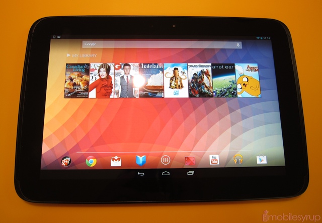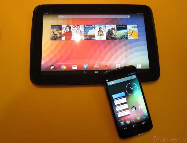
Also present at today’s launch event was Google’s new Nexus 10 tablet, manufactured by Samsung. At first glance it looks quite similar to Samsung’s other retinue of relatively low-quality Android slates, but immediately upon picking it up you get the sense Google had a lot more input in its design and build quality.
Not only is the tablet reasonably light, it is a dream to hold in one hand, thanks to a grippy matte material used to cover the back.
But the main draw, both in beauty and undoubtedly in power, is the screen. At 2560 x 1600 it is the most stunning mobile screen I’ve ever seen. It’s almost perfect to my untrained eye.
While I won’t say that the new tablet interface, which provides consistency among all Nexus device sizes, is an improvement over the old Honeycomb/ICS layout, I will say that it didn’t do anything to detract from my enjoyment of the device, at least in the brief time I had to use it.
Stay tuned for a full review in the coming days.

MobileSyrup may earn a commission from purchases made via our links, which helps fund the journalism we provide free on our website. These links do not influence our editorial content. Support us here.


