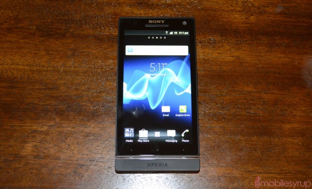
We just got our hands on the upcoming Sony Xperia S and thought, before a thorough review, let’s do a brief hands-on.
Out of the box it’s a stunning device. The Xperia S really does improve on many of the quality issues they had with the Xperia arc which, though thinner, felt flimsy. The Xperia S is a solid 2mm thicker than its predecessor, and does so with an enclosed battery, but the trade-offs are worth it. Let’s go quickly through a few areas in which the Xperia S shines, and a couple areas of concern.
Body and Design
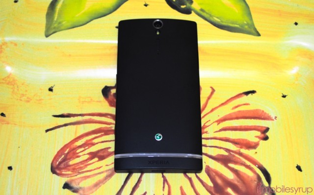
In the hand, the Xperia S feels extremely well built. It’s monolithic — you can’t tell where the screen starts and the bezel begins — and is made of premium polycarbonate that doesn’t creak or bend. It’s also finished with anti-stain material, though we found it held on to fingerprints just fine (too well, even). The light bar at the bottom is interesting: it stretches all the way around the phone, and one would logically think it would be touch-sensitive, but the three capacitive touch buttons (back, home and menu) are defined as tiny dots above the bar itself. It’s a strange irony that the bar, which points the way, would lead to such insensitive buttons. They’re difficult to press, and the action area is actually above the dot, closer to the screen that we’d like. They also take some serious force to activate.
The light bar is more than merely an aesthetic inclusion; it houses the phone’s antenna system and three LEDs that light up when the screen is interacted with. But because it is a visual representation of the ever-important capacitive Android buttons, users will be confused by their static nature, and not naturally disposed to touching the dots above them. This is a behavioural thing that is easily overcome, but we wonder why Sony made this decision in the first place.
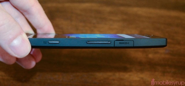
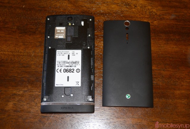
The USB and HDMI ports are enclosed with small clips that ensure an unbroken look to the perimeter, but are more frustrating than helpful, and we’d prefer they weren’t there. And while the front is flat, the back is rounded, with a smooth matte finish on across the battery cover. The camera lens, flash and mono speaker are aligned vertically from the top middle of the device, buffeted by a green Xperia logo on the bottom. Removing the thin plastic casing exposes two disappointing realizations: there is no expandable memory, nor a removable battery. The former, Sony argues, is unnecessary as the Xperia S has 32GB internal storage; it also allows them to avoid the often-messy problem of internal vs. external Android storage allocation. The latter keeps the device compact and optimizes the overall design of the phone, but at 1750mAh will disappoint a lot of users looking for improved battery life over the Xperia arc.
Display
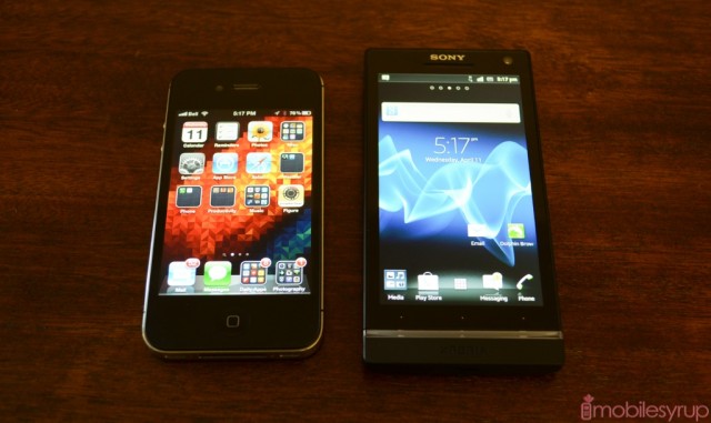
This is the phone’s best feature: a non-Pentile 720p LCD with Gorilla Glass reinforced scratch-resistant glass (much like the Galaxy Nexus). Its viewing angles are seemingly endless, its colour reproduction superlative and its viewability outdoors absolutely wonderful (at high brightness). Here’s the only problem: there is no automatic brightness setting. The phone relies on you adjusting its brightness manually, and while there is a convenient widget that cycles between 30% and 100%, there is no way to do it without either returning to the home screen or entering Settings. Sony is the only company that consistently leaves out such a light sensor, much to our dismay and puzzlement.
Other than the one serious issue, the screen is one of the best we’e ever seen. Colour reproduction is incredibly accurate, with smooth reds and understated yellow; there are no blown out, oversaturated OLED colours here. Similarly viewing angles are very wide for an LCD, though the screen does appear to invert at about 60 degrees. At the highest brightness setting, the Xperia S is easily one of the most luminous we’ve seen, so more tests will be needed to prove such a statement.
At 4.3-inches, the Xperia S also has a very high 342ppi pixel density, and it shows. Text is beyond sharp, making the device extremely pleasant to read on for long periods of time. The Mobile Bravia Engine supposedly adds more “oomph” to photos and video, but like a music engine trying to emulate virtual surround sound over headphones, it’s hard to say whether MBE adds anything substantive to the experience. Colours do indeed seem more saturated (read: more AMOLED-like) but the screen’s inherent sharpness is what is going to win over users here.
We’ll have to wait until we get our hands on the HTC One X, but until then the Xperia S is easily Canada’s best smartphone screen (above 3.5-inches, mind you — can’t discount the iPhone’s screen even two years later).
Camera
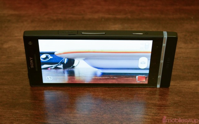
The 12MP back camera on the Xperia S is a joy to use. It goes “sleep-to-snap” in around 1.5 seconds, which is not as fast as the One X, but no slouch. Where it counts, in picture quality, it performs quite well though there is a substantial amount of software sharpness added to photos. By default the camera shoots in widescreen at 9MP, and has to be manually switched to 4:3 12MP shots, but even at the lower setting there is plenty of detail.
In daylight photos lack noise, and the sensor is able to keep the shutter speed high enough to prevent overexposure. The above shot was taken on Auto mode and ended up at ISO 50 and a shutter speed of 1/800 seconds with a f/2.4 aperture. A shot like this is difficult for a camera to capture properly because it has to gauge the correct exposure values based on the overall amount of light. Nevertheless, the Xperia S handily captures plenty of detail in both lower- and sufficient-light areas. If you look at the photo at 100% magnification, however, you can see a set of blue pixels surrounding the buildings in the centre, which is indicative of software sharpening techniques.
We’ll do a more thorough investigation of the Xperia S’ low-light capabilities in the full review, but let us leave you with this thought: the dedicated shutter button is a feature undervalued in the Android device market, and we’re very happy to see Sony include it here. Megapixel numbers aside, the Xperia S has a fast enough shutter to take multiple photos very quickly, and with the help of the “quick snap” feature (holding down the shutter button wakes up the phone from sleep and puts it straight into the camera app) it’s actually easy to take a photo of what you want, when you want it. That’s fundamentally the idea of a camera phone, right?
Software & Performance
We’ll save the meat of the matter for the review, but briefly: the Xperia S runs Android 2.3.7, and as much as Sony paints over the cracks of that year-old OS, it’s hard not to notice its frequent failings. Replete with a new name, UXP NXT, the interface pares back many of the excesses of previous versions, namely taking Timescape and other invasive widgets out of the centre, arraying them on the sides in an effort to make them more desirable.
While the widgets are optional, and removable, the core tenets of Gingerbread are not. Apps like Gmail and Google Talk have reverted to their former shells, and coming from running ICS on the Galaxy Nexus for four months it is a hard adjustment. More difficult is the perceptible scrolling lag, like the screen is only registering our touches momentarily after they are happening. This is evident across all apps, regardless of activity, from horizontal scrolling through the home screens to typing on the keyboard.
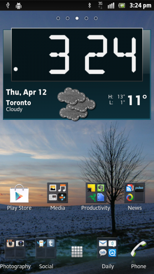
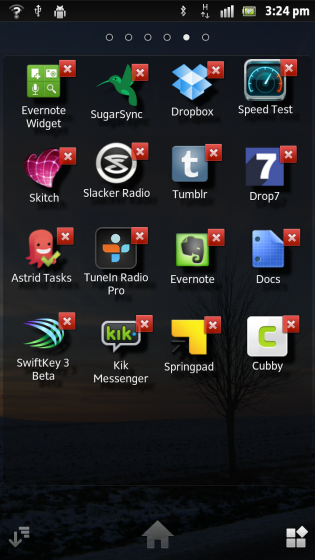
Certain apps fare better than others, and overall the experience on Gingerbread is largely positive. Sony has hacked a solution for folders that, while not as good as Google’s in ICS, gets the job done. Similarly the horizontal app drawer is attractive and customizable. We miss the ability to swipe away individual notifications, and the lack of granular data usage and storage options is missed.
But ultimately it comes down to performance, and the Xperia S does not disappoint, despite utilizing a processor is now considered old. Running a 1.5Ghz Snapdragon S3 SoC with Adreno 220 graphics, 1GB RAM, 32GB internal storage (2GB for apps), this is a robust smartphone with plenty of room for stuff, whereas the Xperia arc and Play were decisively not. Performing the Sunspider 0.9.1 Javascript test achieved a 2260ms score, better than most Android devices on the same chipset.
And there is no doubt that Sony is making the best of the hardware they have; this is easily the best Gingerbread experience we’ve had. But Gingerbread it is, and for many, in April 2012, that is unforgivable. We’re willing to give Sony a pass because the overall experience is quite positive; there is a consistent polish and maturity to all the native apps that Samsung and HTC could not boast in their respective Gingerbread builds.
But pit the Xperia S against the HTC One X (or even the One S) and we’d most likely be able to guess where the majority of the chips would fall.
Final Words
The testing is not over, and we’re quite happy with the Xperia S so far. Due to the limited time spent with it so far, we can’t say whether battery life meets our expectations, but we have been getting around 10 hours of usage from a single charge so far. That’s not a great number, but certainly better than many equivalent Android devices, and is on par with the Galaxy Nexus.
If you have any questions, let us know on Twitter and we’ll try to address them in our final review.
MobileSyrup may earn a commission from purchases made via our links, which helps fund the journalism we provide free on our website. These links do not influence our editorial content. Support us here.


