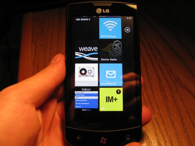
When Microsoft decided to create a new mobile operating system, it had a few key things in mind: keep it simple, fast and touch-friendly. Windows Phone 7 looked nothing like the desktop-emulating Windows Mobile that it had been shoehorning onto touchscreen devices for years.
It offered a usage model big on expansive, horizontal frames, swiping through monochromatically-drawn screens. It was pure 2D austerity. Where it excelled was in its tight integration with Microsoft products such as Office, XBox Live, Windows Live Messenger, and third-party services like Facebook. Its Live Tile feature promised less time inside apps to obtain basic info like the temperature, or your unread message count. It had a smooth browser and a fantastic keyboard. It had, for a 1.0 version, a lot of potential.
But in its rush to market, there were some important features missing. Without an accessible API, third-party music apps couldn’t play in the background. More importantly, push notifications, which were implemented well enough, were limited in what they could show and how often they could report. Internet Explorer, the backbone of any mobile OS, was based on code nearly four years old, without support for HTML5 or CSS3. Minor grievances were also levelled at the release: where was the threaded messaging?; why was scrolling so choppy inside third-party apps?; and why did each app have to “resume” for up to ten seconds each time you returned to it? Oh, and where was copy-and-paste?
Quickly after the initial release, updates were promised. First, an update to allow for better updates. Then the NoDo update added the copy-paste functionality that was missing from the beginning. And since then, promises. Promises of a Mango future that would herald a new era of Windows Phone dominance. Of multitasking and quick app resuming, of Twitter integration and built-in music discovery. Of threaded messaging, deep in-app Live Tile support; of a new standards-compliant web browser that screams. Promises of greatness.
Does it deliver? Can it possibly live up to expectations? We’re going to look at three of my favourite “WOW” features in Mango, and see how it differentiates itself from the competition in the process.
For a more detailed overview of the original Windows Phone release, read our ‘Is Windows Phone For You?‘
One
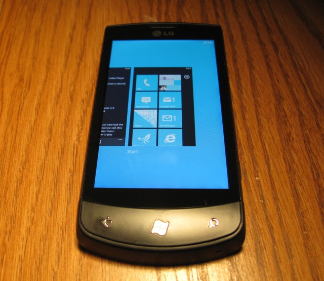
Multitasking on Windows Phone Mango is also known as fast-app switching. What this means is that, like in iOS, an app’s operation is suspended in the exact place you left it, and once returned, will presumably continue right where it left off. This feature, along with many benefits that traditionally come with multitasking like third-party music apps playing in the background, were conspicuously missing on the first release of Windows Phone. Microsoft promised they would do right by their loyal fanbase, and they’ve succeeded.
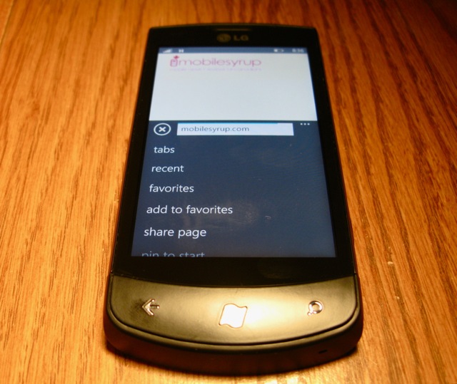
When I loaded Mango onto my LG Optimus 7, there were few apps that supported fast-app switching. To activate this, you hold down the back button until a static view of your open apps appears; swiping left and right navigates between them. If the app is not yet Mango-optimized, it will “Resume” for several seconds, as it was terminated, not suspended, when you left it. Mango-optimized apps resume instantly, popping back right into a game, or navigating right back to the tweet you were reading.
Since the OS is already smooth as butter, one of the most satisfying experiences was when Rdio was updated to support background music playing. Previously, the app would terminate, and music would stop playing, if you returned to the home screen. Now, you can not only continue to listen while doing other things, but from the lock screen you can control playback. By pinning the Live Tile to your home screen, it’s possible to see a photo of the album art, an example of one of Windows Phone’s many austere design aesthetics.
But more importantly than any individual tenet of Mango multitasking — hold back, swipe left or right, resume — it feels somehow more complete than its iOS or Android equivalent. More akin to the defunct webOS model, Mango ensures that workflow is uninterrupted. You still have toast notifications at the top of the screen, but if the application supports fast-switching, the transition is almost instantaneous. Multitasking, while an obvious choice, is my first WOW on Mango.
Two
Music discovery is a fairly new aspect to mobile operating systems. Apps like Shazam and Soundhound have built huge databases to fingerprint snippets of songs and identify them, forging relationships with content providers to hopefully sell you a song in the process.
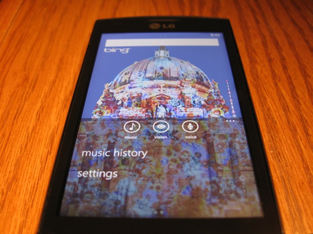
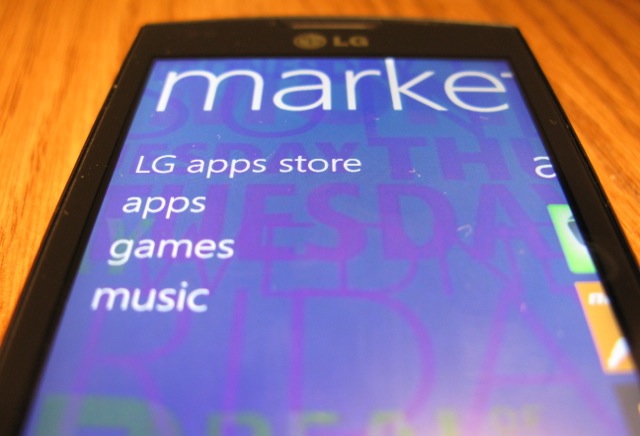
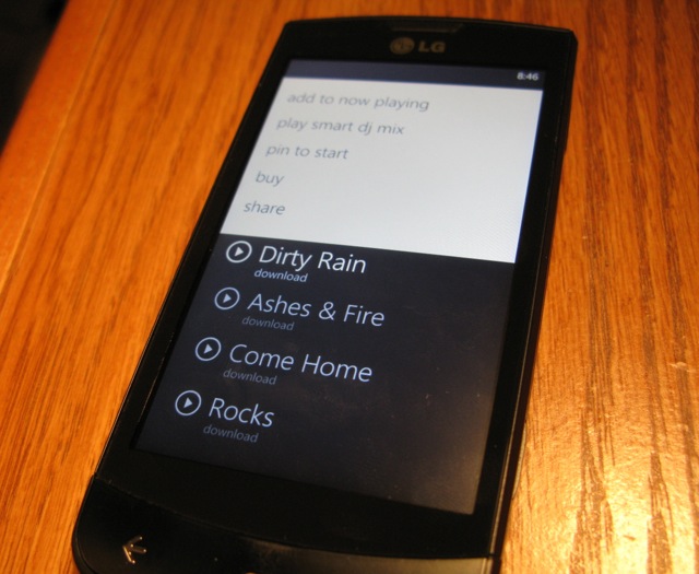
Microsoft makes mandatory a Search button on all its Windows Phone devices, and while in its first iteration took you to a rather comely Bing search screen, it has been entirely revamped for Mango. When you press the button you are taken to a familiar Bing dialog box, but on the bottom are three little symbols: a music note, an eye and a microphone. The former two are new, and flesh out the search experience entirely. The music icon will pick up the signature of a song with a high degree of accuracy, and display bits of information about the tune, including artist, year and album title. In addition to this, Canadians now have access to the Zune Music Pass, with its collection of millions of songs. If you subscribe to the Pass you can stream or download the song free of charge; if not, you can purchase the tune for 99c.
Again, this is not something particularly unique to Microsoft’s OS, but the smoothness and speed with which it picks up the notes (along with some beautiful equalizer animations), identifies the song and allows for playback through its own store is remarkable. Microsoft, perhaps like only RIM before it, has taken it upon itself to integrate essential and nominal services into the OS framework, which allows for phenomenal traction of content.
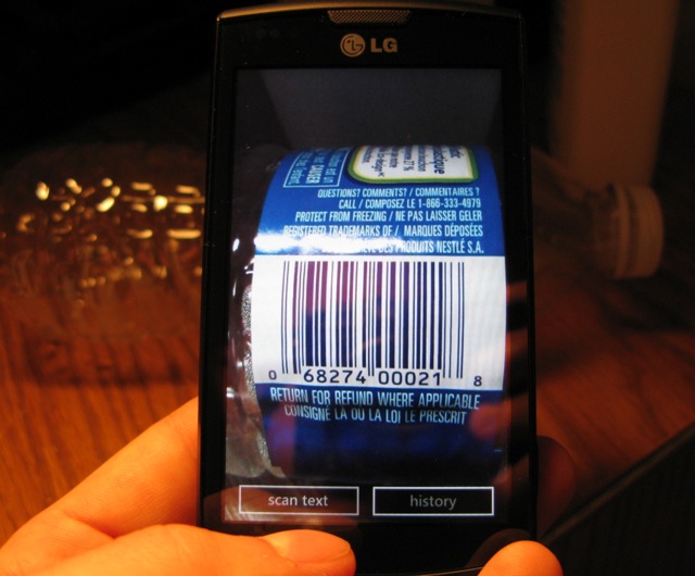
The discovery process extends to words as well. In addition to being able to identify bar codes using the built-in QR scanner, the search panel can also scan for words and sentences, translating them into dozens of languages. While the end result isn’t always perfect — I attempted to identify several French phrases, and the English was stilted but understandable — the speed at which it does so is incredible.
Three
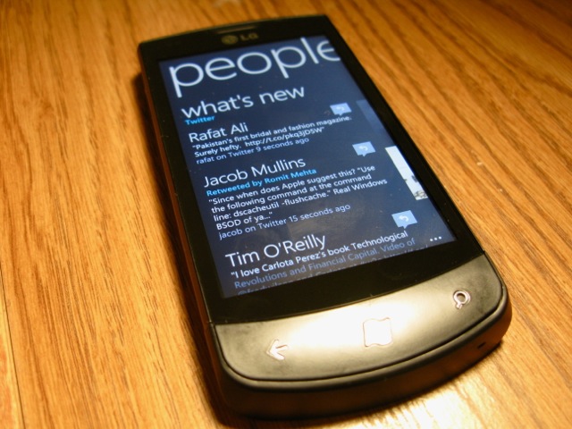
Social networking is fundamental to many of our daily lives. We check Twitter before we eat breakfast, and Facebook is the last thing we update before we go to sleep. While Facebook was tightly integrated into Windows Phone at launch, its featureset has been beefed up, and Microsoft has added Twitter integration to the mix.
Before you go thinking you won’t need dedicated apps for the services, much like HTC allows you to consolidate your feeds into its Friendstream widget, Microsoft uses your social networking accounts to augment your personal information, not others’. While you can see your friends’ status updates in the People app, what’s more interesting is how they relate to you. If someone sends you a reply on Twitter, your Me Live Tile will flip over every few seconds to inform you of an update. In the People column, it shows you the big, bright profile photos of the last four people you’ve interacted with. You can now create groups of your friends or family and filter your feed for only those people. It’s simple yet flexible, and highly efficient.
Thoughts on Efficiency
Microsoft has made it very clear they want nothing to do with the aesthetic or usage models of its main competitors. That is a good thing. I find that with Windows Phone Mango I am able to get in and get out without feeling like I’m missing anything. This was Microsoft’s big mistake during their initial marketing push for WP7: they didn’t understand that people don’t want to use their phones less. Instead, they should have argued that while you will end up using your phone less you won’t feel like you have. Time is saved by swiping, scrolling and tapping through menus that become like a larger mesh infrastructure; each app, modeled by necessity on Microsoft’s Metro styling, feels uniform in a way even Apple cannot enforce in iOS. There is something primordial about horizontal swiping; it’s hypnotic and practical, and becomes more so with repeated usage.
Little Victories
Mango is peppered with improvements, and it’s not one individual feature that helps it rise to the top, but an amalgam of all of them. Let me give you a small example: in the Messages hub, you can log in to Facebook chat and see all your friends online. Mark messages you on his way out: “Hey, just about to leave, what is the address again?” You reply, “I think it’s 1500 Maple View Rd, but let me check.” Mark leaves and logs off Facebook chat, and Windows Phone will seamlessly switch to texting Mark in your next message. It does this without making a show. It just works.
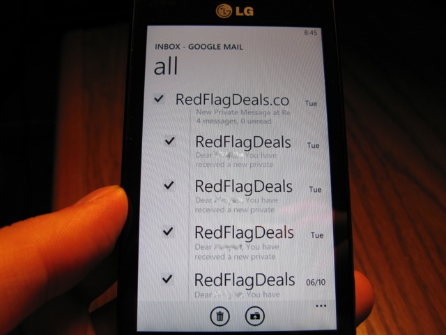
Similarly with threaded messaging. If you want to select an entire thread, just touch the left side of the screen; there is no indication to do so, but the first time I tried deleting multiple emails manually, a hint appeared directing me to the left side of the display.
The immersiveness continues with what we call “Deep Linking”. This allows, say, a weather app to pin a Live Tile on your home screen for a single city, or for a Google Reader app to pin a single category. Apps also have the ability to poll for changes once every 30 minutes; this allows for background updates without eating into battery life.
Lastly, the area in which Windows Phone has improved the most is in its browsing speed. Now based on Internet Explorer 9 code, it is not only faster but renders modern pages with aplomb. It can play HTML5 video from inside the browser (though, like in iOS it enforces full-screen watching) and is CSS3-compliant, so pages no longer break like they used to. I’d argue that while it is noticeably faster, and I’ve always liked the text rendering better on WP7 than Android, it cannot yet compete for sheer compliance; many HTML5-powered mobile sites still loaded their low-bandwidth mobile versions. But sites load quickly — much quicker than before — and look great, and that’s all you can really ask for in a mobile browsing experience.
I could go on…
I could continue to talk about the myriad bug fixes, or the way apps never seem to crash. I could remark on how drastically improved is scrolling through lists which, before, was jerky as all get-out. I could, and will in an upcoming article, talk about how fantastic the integration of the Zune Pass is into the whole Windows Phone ecosystem.
Mostly I just want to remark how, if I have two phones in my pocket — which I often do — I am more likely now than I was last week to pull out my Windows Phone to obtain the same piece of information. This is something a lot of people observed when they first picked up an iPhone, its remarkable ease of use. I also don’t have to worry about battery life: this thing lasts all day, and then some. The keyboard is ridiculously responsive, with an enviable autocorrect system that Android users wish they had.
There are limitations — tethering and WiFi hotspot support has not yet been enabled on my particular device– which will likely be addressed in a patch. The Marketplace is rife with barely-functioning apps, many of which haven’t, and probably won’t be updated for use with Mango. The toast notification system is limited in its function; like pre-iOS5 Apple products, once the notification disappears, there is no way to retrieve it. VoIP software, due to the limits on background updates, cannot run in the background, limiting the potential for Skype or Tango-like apps to inform you of an incoming VoIP call.
…but why don’t you try it?
Let’s be honest here: Microsoft isn’t going anywhere, the low market share of Windows Phone 7 is only poised to increase. As Nokia, Samsung, HTC and other big names begin releasing Mango devices on modern-day hardware, it’s going to become very clear that Redmond is building a pretty strong case for #3. They’re not pushing against Android quite yet, and iPhone users are likely going to scoff, but there’s plenty to like and a lot to love about Windows Phone Mango. It’s a great underdog story, and better, it’s a great product. There’s a lot of work to still be done in building a decent app portfolio — webOS lived and died on that shortcoming — but Microsoft, unlike HP, won’t let that happen. More than anything, it’s the most cohesive mobile platform since the introduction of the iPhone in 2007.
We’ll go more into Mango as the first new handsets become available.
MobileSyrup may earn a commission from purchases made via our links, which helps fund the journalism we provide free on our website. These links do not influence our editorial content. Support us here.


