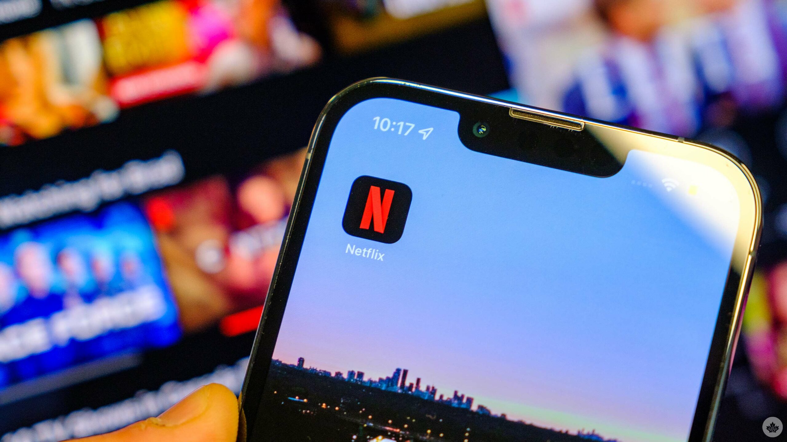
Netflix has revamped the design of its iOS app as part of a new update.
Now, the app sports a billboard layout that moves along with your device, new launch animations, wallpaper gradients, updated haptics and more.
The ‘Info’ tab at the bottom of cards (the shapes that display each Netflix title) has also been removed. Instead, users can click on the card to bring them to a separate page for the show or movie in question.
On Twitter, Janum Trivedi, a former UI designer for Netflix who worked on the update, shared a bit more insight. He says the update has been in the works over the past year and has been designed “to make Netflix feel more fluid, delightful and polished.”
You can see the update in action below:
This last year, I’ve been leading a UI refresh to make Netflix feel more fluid, delightful, and polished.
Today, all that work shipped!
Huge thanks to @nebson and @b3ll for helping bring this to life ❤️
Details below, but try it out yourself! pic.twitter.com/cZFb7c42Fd
— Janum Trivedi (@jmtrivedi) January 16, 2023
Trivedi also teased that an update to Netflix’s Apple TV app could be on the way.
In other Netflix news, the company recently shared a sizzle reel for its 2023 movie slate, offering first looks at the likes of Zack Snyder’s Rebel Moon and David Fincher’s The Killer.
MobileSyrup may earn a commission from purchases made via our links, which helps fund the journalism we provide free on our website. These links do not influence our editorial content. Support us here.


