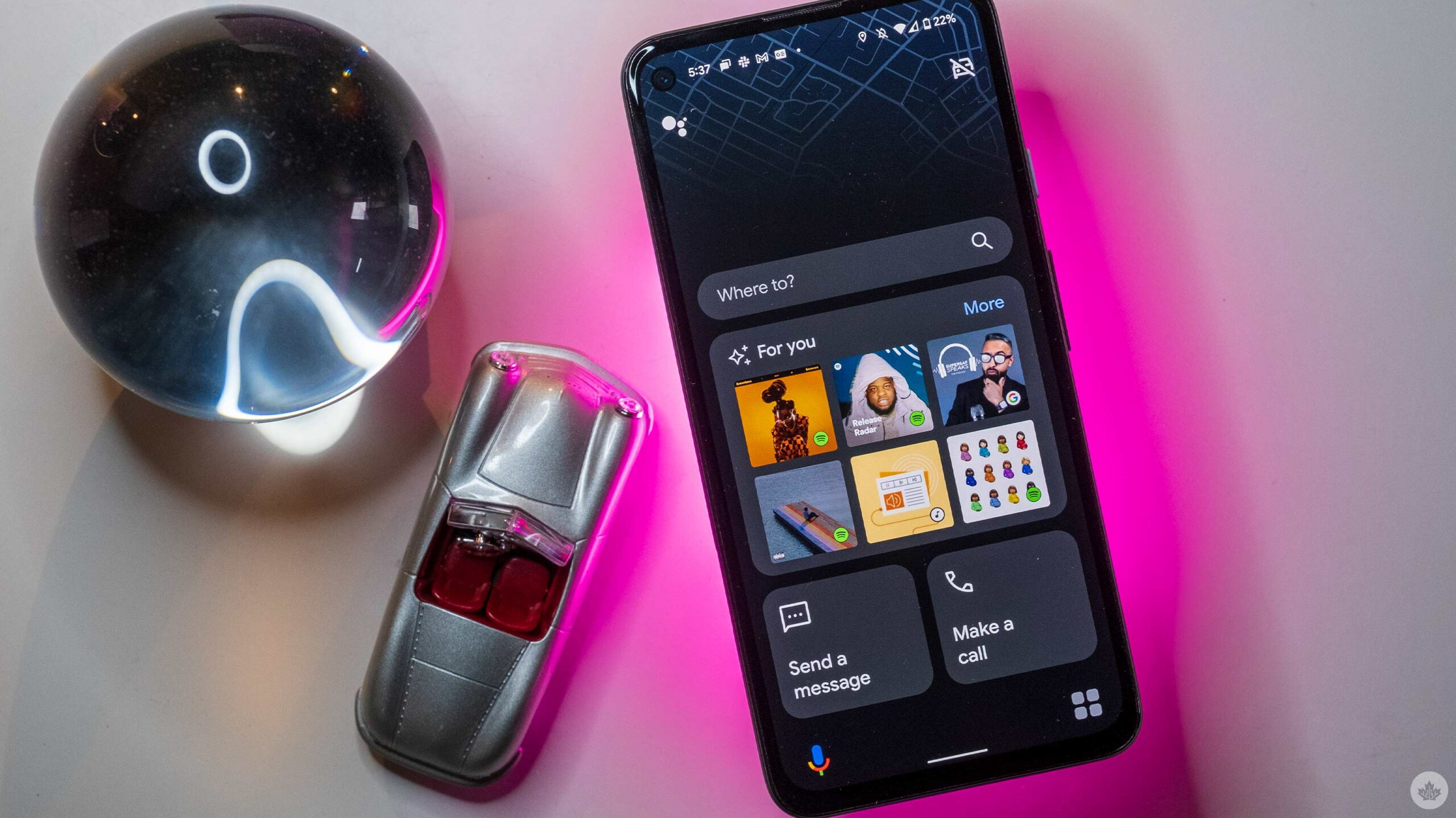
After years of teases and a boring twist that turned it into a Google Maps feature, Google Assistant’s ‘Driving Mode’ might finally start to look like Google promised it would all the way back in 2019.
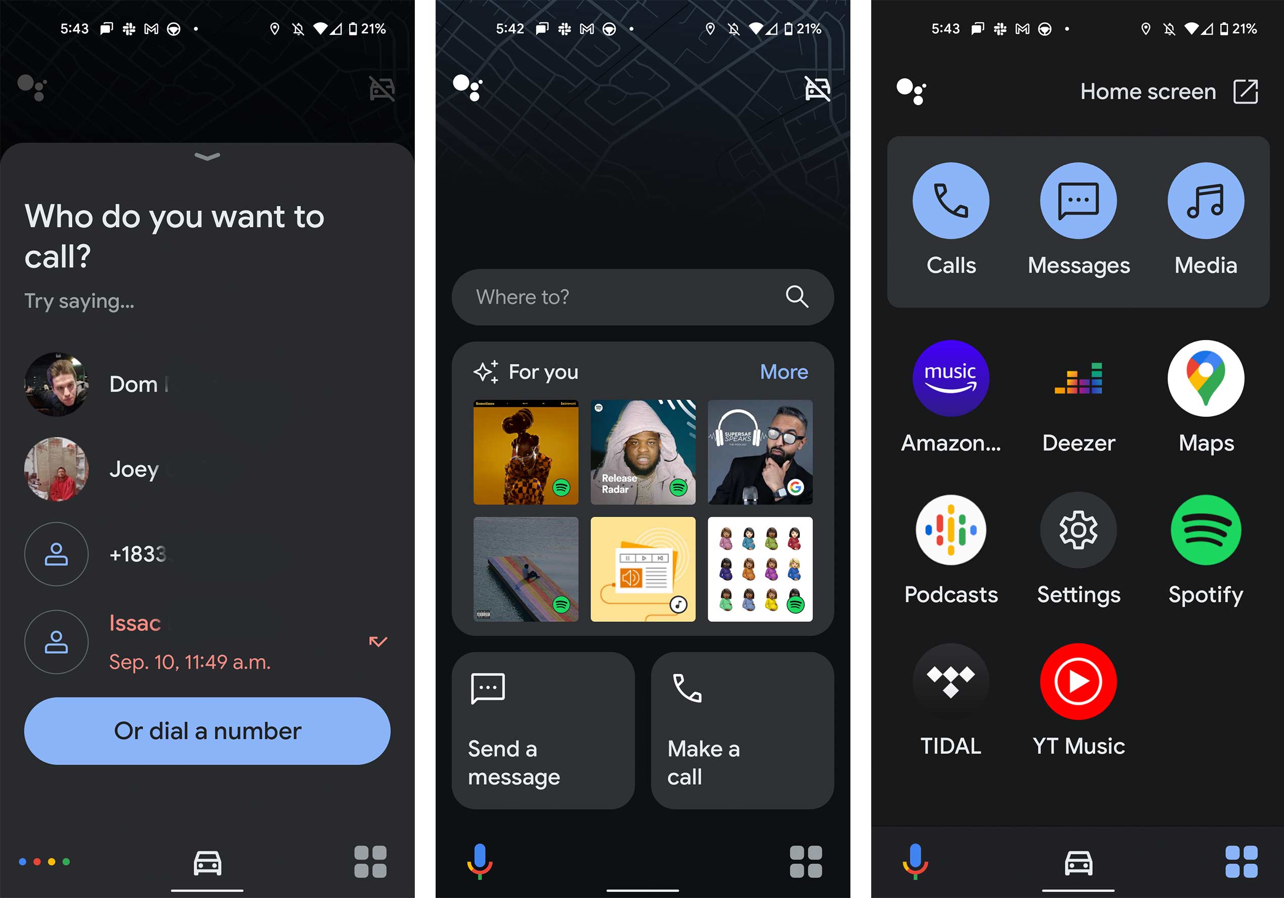
Since Google first announced it as a replacement for the on-phone version of Android Auto, the company has slowly released more multi-tasking within Google Maps — at least until now. With Android 12, you can say “Driving mode,” and your phone will shift into a simplified layout that’s more suited to driving.
That said, this worked for me the first two times I tried it, and then after that, it just kicked me to the Google Maps Driving Mode every other time. Also, whenever I tried to navigate somewhere in the app, it pushed me to Google Maps.

At the top, there’s either a search bar for you to use to set a nav point or a suggested route. Below, there are several music/podcast recommendations and buttons to send a message or call.
There’s a slimmed-down app drawer at the very bottom of the screen and a button to trigger Google Assistant.
Overall, it looks a lot cleaner than either Android Auto or the Assistant mode in Google Maps. It’s also worth noting that there’s a ‘Now Playing’ section that allows you to control the playback or shuffle your songs when you’re playing music.
If Google implemented buttons for some quick locations at that top of the screen, this would be a perfect Android Auto replacement for many people since, at its core, it needs to be good at navigating people to places. However, as of right now, it doesn’t adopt your device theme like other new Android ‘Material You’ elements.
Source: Droidlife
MobileSyrup may earn a commission from purchases made via our links, which helps fund the journalism we provide free on our website. These links do not influence our editorial content. Support us here.


