One of the big, fancy new features in Android 12 is the Material You design refresh and ‘Monet‘ dynamic colour changing system.
While it’s functional in the current beta (although missing some much-loved customization options from before), the true Material You experience largely isn’t available for beta testers.
This is because apps will be a crucial part of Material You. A main benefit of Material You is that apps will leverage the dynamic colours and adapt to the rest of your system. An example exists in the current beta — Android’s settings menu uses a subtle off-white shade based on your wallpaper. For example, someone with a red wallpaper might have a slightly pink settings menu. We’ve also seen a few instances of Google adding Material You and Monet theming to other apps, although so far most of those updates haven’t fully rolled out to users.
The most recent app to get the Material You treatment is Contacts. 9to5Google spotted the change and published several screenshots of the themed Contacts app. Unfortunately, my Contacts app hasn’t yet received a similar update.
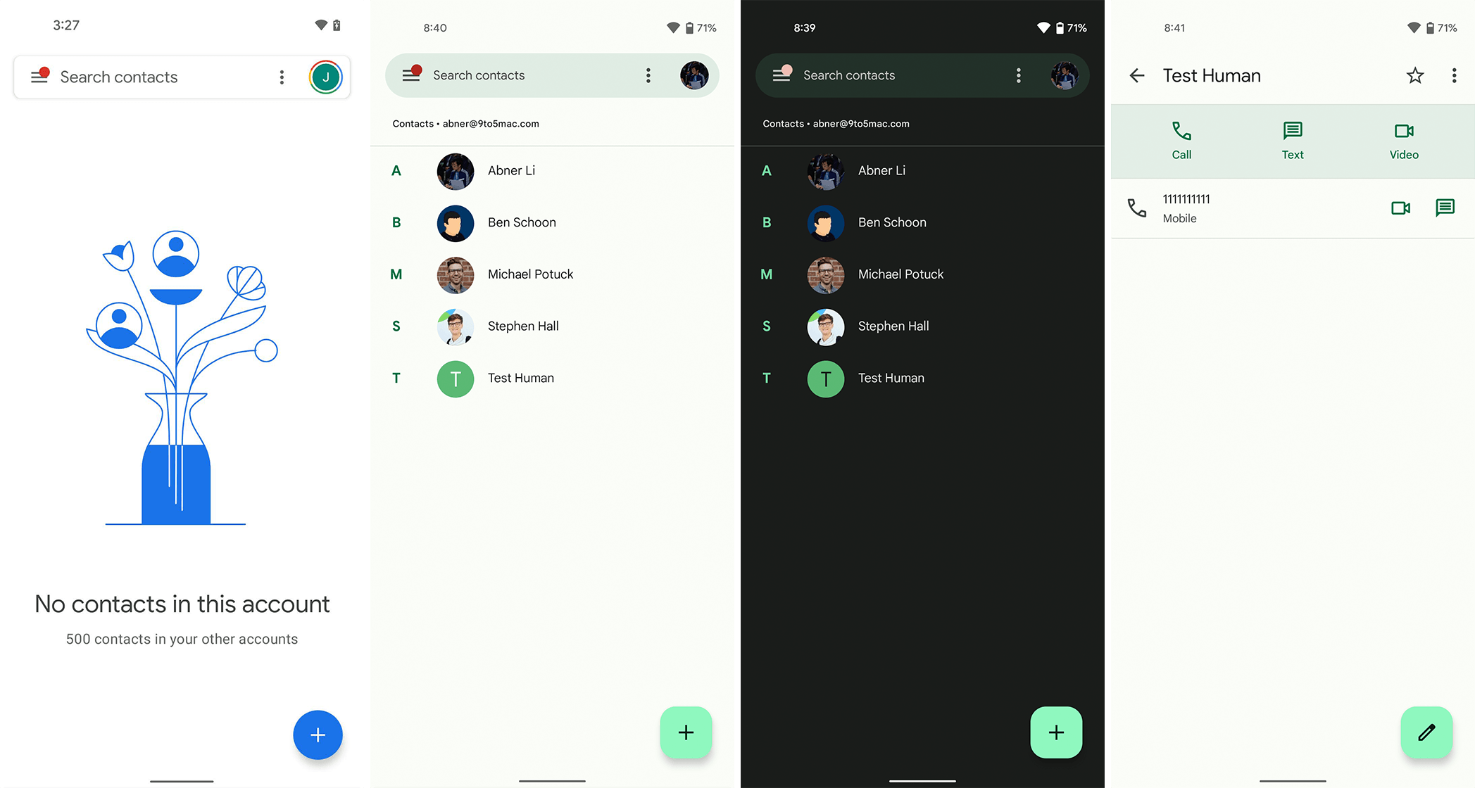
The most significant change with the refreshed Contacts app is the colour. In light mode, Contacts pulls in Material You colours for the new pill-shaped search bar, floating action button (FAB) and background. In 9to5’s screenshot, the theme colour is a light green and the app’s background is a subtle green-white mix.

Current Google Contacts (left) with new Material You design (right three images).
Contact’s search bar is also quite different, moving away from the rounded-rectangle for an elongated pill shape. Further, the FAB sports a new shape — a square with rounded corners, instead of the former circle. Perhaps that means Material You will give users some choice over the shape of elements like search bars and buttons, something from Android 11 that Google has removed and seemingly doesn’t plan to put back.
Overall, the Contacts refresh looks nice, and I hope that most Android apps adopt similar styling. Given Google’s track record with design changes, I don’t have a lot of hope, but even if Google can get its own apps on board, that’d be a win in my book.
9to5 says that the updated design is rolling out as part of Contacts version 3.50. Further, the changes show up on both Android 12 and Android 11, but Android 11 only has the different shapes and not the colour themes.
Image credit: 9to5Google
Source: 9to5Google
MobileSyrup may earn a commission from purchases made via our links, which helps fund the journalism we provide free on our website. These links do not influence our editorial content. Support us here.


